There’s No Formula for Great Designs
Before he combined them with fluid images and CSS3 media queries to coin responsive design, Ethan Marcotte described fluid grids — one of the most enjoyable parts of responsive design. Enjoyable that is, if you like working with math(s). But fluid grids aren’t perfect and, unless we’re careful when applying them, they can sometimes result in a design that feels disconnected.
Recapping fluid grids
If you haven’t read Ethan’s Fluid Grids, now would be a good time to do that. It centres around a simple formula for converting pixel widths to percentages:
(target ÷ context) × 100 = resultHow does that work in practice? Well, take that Fireworks or Photoshop comp you’re working on (I call them static design visuals, or just visuals.) Of course, everything on that visual — column divisions, inline images, navigation elements, everything — is measured in pixels. Now:
- Pick something in the visual and measure its width. That’s our target.
- Take that target measurement and divide it by the width of its parent (context).
- Multiply what you’ve got by 100 (shift two decimal places).
- What you’re left with is a percentage width to drop into your style sheets.
For example, divide this 300px wide sidebar division by its 948px parent and then multiply by 100: your original 300px is neatly converted to 31.646%.
.content-sub {
width : 31.646%; /* 300px ÷ 948px = .31646 */ }
That formula makes it surprisingly simple for even die-hard fixed width aficionados to convert their visuals to percentage-based, fluid layouts.
It’s a handy formula for those who still design using static visuals, and downright essential for those situations where one person in an organization designs in Fireworks or Photoshop and another develops with CSS. Why?
Well, although I think that designing in a browser makes the best sense — particularly when designing for multiple devices — I’ll wager most designers still make visuals in Fireworks or Photoshop and use them for demonstrations and get feedback and sign-off. That’s OK. If you haven’t made the transition to content-out designing in a browser yet, the fluid grids formula helps you carry on pushing pixels a while longer.
You can carry on moving pixel width measurements from your visuals to your style sheets, too, in the same way you always have. You can be precise to the pixel and even apply a grid image as a CSS background to help you keep everything lined up perfectly.
Once you’re done, and the fixed width layout in the browser matches your visual, loop back through your style sheets and convert those pixels to percentages using the fluid grids formula. With very little extra work, you’ll have a fluid implementation of your fixed width layout.
The fluid grids formula is simple and incredibly effective, but not long after I started working responsively I realized that the formula shouldn’t (always) be a one-fix, set-and-forget calculation. I noticed that unless we compensate for problems it sometimes creates, the result can be a disconnected design.
Staying connected
Good design relies on connectedness, a feeling of natural balance between elements and the grid they’re placed on. Give an element greater prominence or position in a visual hierarchy and you can fundamentally alter the balance and sometimes the meaning of a design.
Different from a browser’s page zooming feature — where images, text and overall layout change size by the same ratio — fluid grids flex a layout in response to a window or device width. Columns expand and contract, and within them fluid media (images and videos) can also change size. This can be one of the most impressive demonstrations of responsive design.
But not every element within a fluid grid can change size along with the window or device width. For example, type size and leading won’t change along with a column’s width.
When columns and elements within them change width, all too easily a visual hierarchy can be broken and along with it the relationship between element sizes and the outer window or viewport. This can happen quickly if you make just one set of fluid grid calculations and use those percentages across every screen width, from smartphones through tablets and up to large desktops.
The answer? Make several sets of fluid grids calculations, each one at a significant window or device width breakpoint. Then apply those new percentages, when needed, to help keep elements in proportion and maintain balance and connectedness. Here’s how I work.
Avoiding disconnection
I’ve never been entirely happy with grid frameworks such as the 960 Grid System, so I start almost every project by creating a custom grid to inform my layout decisions. Here’s a plain version of a grid from a recent project that I’ll use as an illustration.
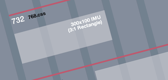
This project’s grid comprises 84px columns and 24px gutters. This creates an odd number of columns at common tablet and desktop widths, and allows for 300px fixed width assets — useful when I need to fit advertising into a desktop layout’s sidebar.
 Showing common advertising sizes (Larger image)
For this project I chose three 320 and Up breakpoints above 320px and, after placing as many columns as would fit those breakpoint widths, I derived three content widths:
| Breakpoint | Columns | Content width |
|---|---|---|
| 768px | 7 | 732px |
| 992px | 9 | 948px |
| 1,382px | 13 | 1,380px |
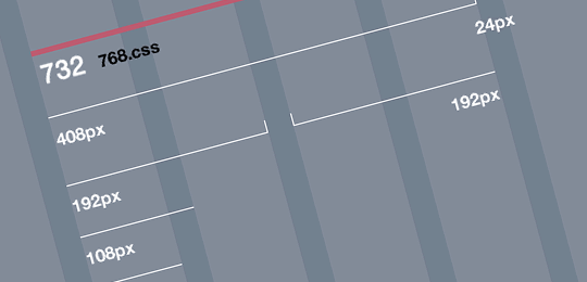
Here’s my grid again, this time with pixel measurements and breakpoints overlaid.
 Showing pixel measurements and breakpoints (Larger image)
Now cast your mind back to the fluid grids calculation I made earlier. I divided a 300px element by 948px and arrived at 31.646%. For some elements it’s possible to use that percentage across all screen widths, but others will feel too small in relation to a narrower 768px and too large inside 1,380px.
To help maintain connectedness, I make a set of fluid grids calculations based on each of the content widths I established earlier. Now I can shift an element’s percentage width up or down when I switch to a new breakpoint and content width. For example:
- 300px is 40.984% of 732px
- 300px is 31.646% of 948px
- 300px is 21.739% of 1,380px
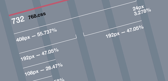
I’ll add all those fluid grid percentages to my grid image and save it for quick reference.
 Showing percentages at all breakpoints (Larger image)
Then I can apply those different percentage widths to elements at each breakpoint using CSS3 media queries. For example, that sidebar division again:
/*  732px, 7-column width */

@media only screen and (min-width: 768px) {

    .content-sub {
        width : 40.983%; /* 300px ÷ 732px = .40983 */ }

}

/*  948px, 9-column width */
@media only screen and (min-width: 992px) {

    .content-sub {
        width : 31.645%; /* 300px ÷ 948px = .31645 */ }

}

/*  1380px, 13-column width */
@media only screen and (min-width: 1382px) {

    .content-sub {
        width : 21.739%; /* 300px ÷ 1380px = .21739 */ }

}
The number of changes you make to a layout at different breakpoints will, of course, depend on the specifics of the design you’re working on. Yes, this is additional work, but the result will be a layout that feels better balanced and within which elements remain in harmony with each other while they respond to new screen or device widths.
Putting the design in responsive web design
Until now, many of the conversations around responsive web design have been about aspects of technical implementation, rather than design. I believe we’re only beginning to understand what’s involved in designing responsively. In future, we’ll likely be making design decisions not just about proportions but also about responsive typography. We’ll also need to learn how to adapt our designs to device characteristics such as touch targets and more.
Sometimes we’ll make decisions to improve function, other times because they make a design ‘feel’ right. You’ll know when you’ve made a right decision. You’ll feel it.
After all, there really is no formula for making great designs.
About the author
Andy Clarke is one of the world’s best-known website designers, consultant, speaker, and writer on art direction and design for products and websites. Andy founded Stuff & Nonsense in 1998 and for 20 years has helped companies big and small to improve their website and product designs. Andy’s the author of four web design books including ‘Transcending CSS,’ ‘Hardboiled Web Design’ and ‘Art Direction for the Web’. He really, really loves gorillas.


