Making Sites More Responsive, Responsibly

With digital projects we’re used to shifting our thinking to align with our target audience. We may undertake research, create personas, identify key tasks, or observe usage patterns, with our findings helping to refine our ongoing creations. A product’s overall experience can make or break its success, and when it comes to defining these experiences our development choices play a huge role alongside more traditional user-focused activities.
The popularisation of responsive web design is a great example of how we are able to shape the web’s direction through using technology to provide better experiences. If we think back to the move from table-based layouts to CSS, initially our clients often didn’t know or care about the difference in these approaches, but we did. Responsive design was similar in this respect – momentum grew through the web industry choosing to use an approach that we felt would give a better experience, and which was more future-friendly.
We tend to think of responsive design as a means of displaying content appropriately across a range of devices, but the technology and our implementation of it can facilitate much more. A responsive layout not only helps your content work when the newest smartphone comes out, but it also ensures your layout suitably adapts if a visually impaired user drastically changes the size of the text.
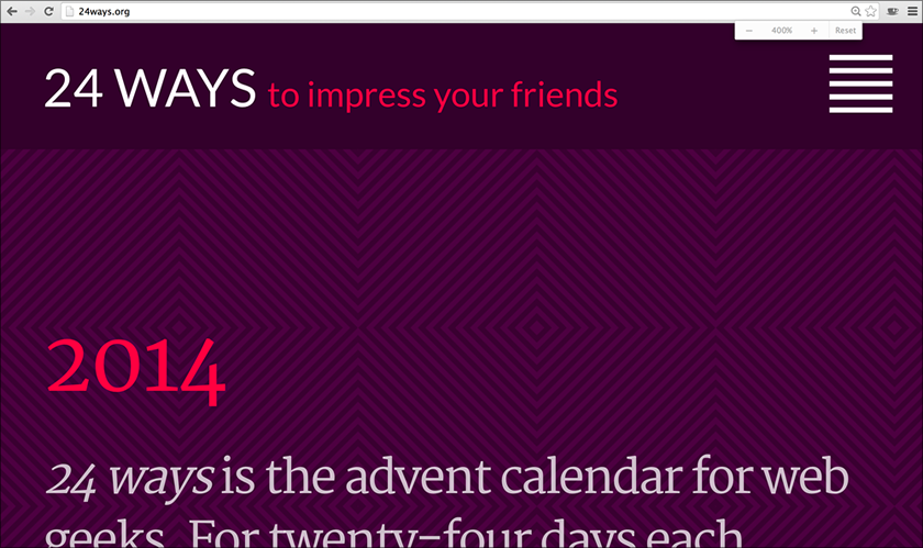 The 24 ways site at 400% on a Retina MacBook Pro displays a layout more typically used for small screens.
When we think more broadly, we realise that our technical choices and approaches to implementation can have knock-on effects for the greater good, and beyond our initial target audiences. We can make our experiences more responsive to people’s needs, enhancing their usability and accessibility along the way.
Being responsibly responsive
Of course, when we think about being more responsive, there’s a fine line between creating useful functionality and becoming intrusive and overly complex. In the excellent Responsible Responsive Design, Scott Jehl states that:
A responsible responsive design equally considers the following throughout a project:
- Usability: The way a website’s user interface is presented to the user, and how that UI responds to browsing conditions and user interactions.
- Access: The ability for users of all devices, browsers, and assistive technologies to access and understand a site’s features and content.
- Sustainability: The ability for the technology driving a site or application to work for devices that exist today and to continue to be usable and accessible to users, devices, and browsers in the future.
- Performance: The speed at which a site’s features and content are perceived to be delivered to the user and the efficiency with which they operate within the user interface.
Scott’s book covers these ideas in a lot more detail than I’ll be able to here (put it on your Christmas list if it’s not there already), but for now let’s think a bit more about our roles as digital creators and the power this gives us.
Our choices around technology and the decisions we have to make can be extremely wide-ranging. Solutions will vary hugely depending on the needs of each project, though we can further explore the concept of making our creations more responsive through the use of humble web technologies.
The power of the web
We all know that under the HTML5 umbrella are some great new capabilities, including a number of JavaScript APIs such as geolocation, web audio, the file API and many more. We often use these to enhance the functionality of our sites and apps, to add in new features, or to facilitate device-specific interactions.
You’ll have seen articles with flashy titles such as “Top 5 JavaScript APIs You’ve Never Heard Of!”, which you’ll probably read, think “That’s quite cool”, yet never use in any real work.
There is great potential for technologies like these to be misused, but there are also great prospects for them to be used well to enhance experiences. Let’s have a look at a few examples you may not have considered.
Offline first
When we make websites, many of us follow a process which involves user stories – standardised snippets of context explaining who needs what, and why.
“As a student I want to pay online for my course so I don’t have to visit the college in person.”
“As a retailer I want to generate unique product codes so I can manage my stock.”
We very often focus heavily on what needs doing, but may not consider carefully how it will be done. As in Scott’s list, accessibility is extremely important, not only in terms of providing a great experience to users of assistive technologies, but also to make your creation more accessible in the general sense – including under different conditions.
Offline first is yet another ‘first’ methodology (my personal favourite being ‘tea first’), which encourages us to develop so that connectivity itself is an enhancement – letting users continue with tasks even when they’re offline. Despite the rapid growth in public Wi-Fi, if we consider data costs and connectivity in developing countries, our travel habits with planes, underground trains and roaming (or simply if you live in the UK’s signal-barren East Anglian wilderness as I do), then you’ll realise that connectivity isn’t as ubiquitous as our internet-addled brains would make us believe. Take a scenario that I’m sure we’re all familiar with – the digital conference. Your venue may be in a city served by high-speed networks, but after overloading capacity with a full house of hashtag-hungry attendees, each carrying several devices, then everyone’s likely to be offline after all. Wouldn’t it be better if we could do something like this instead?
- Someone visits our conference website.
- On this initial run, some assets may be cached for future use: the conference schedule, the site’s CSS, photos of the speakers.
- When the attendee revisits the site on the day, the page shell loads up from the cache.
- If we have cached content (our session timetable, speaker photos or anything else), we can load it directly from the cache. We might then try to update this, or get some new content from the internet, but the conference attendee already has a base experience to use.
- If we don’t have something cached already, then we can try grabbing it online.
- If for any reason our requests for new content fail (we’re offline), then we can display a pre-cached error message from the initial load, perhaps providing our users with alternative suggestions from what is cached.
There are a number of ways we can make something like this, including using the application cache (AppCache) if you’re that way inclined. However, you may want to look into service workers instead. There are also some great resources on Offline First! if you’d like to find out more about this.
Building in offline functionality isn’t necessarily about starting offline first, and it’s also perfectly possible to retrofit sites and apps to catch offline scenarios, but this kind of graceful degradation can end up being more complex than if we’d considered it from the start. By treating connectivity as an enhancement, we can improve the experience and provide better performance than we can when waiting to counter failures. Our websites can respond to connectivity and usage scenarios, on top of adapting how we present our content. Thinking in this way can enhance each point in Scott’s criteria.
As I mentioned, this isn’t necessarily the kind of development choice that our clients will ask us for, but it’s one we may decide is simply the right way to build based on our project, enhancing the experience we provide to people, and making it more responsive to their situation.
Even more accessible
We’ve looked at accessibility in terms of broadening when we can interact with a website, but what about how? Our user stories and personas are often of limited use. We refer in very general terms to students, retailers, and sometimes just users. What if we have a student whose needs are very different from another student? Can we make our sites even more usable and accessible through our development choices?
Again using JavaScript to illustrate this concept, we can do a lot more with the ways people interact with our websites, and with the feedback we provide, than simply accepting keyboard, mouse and touch inputs and displaying output on a screen.
Input
Ambient light detection is one of those features that looks great in simple demos, but which we struggle to put to practical use. It’s not new – many satnav systems automatically change the contrast for driving at night or in tunnels, and our laptops may alter the screen brightness or keyboard backlighting to better adapt to our surroundings. Using web technologies we can adapt our presentation to be better suited to ambient light levels.
If our device has an appropriate light sensor and runs a browser that supports the API, we can grab the ambient light in units using ambient light events, in JavaScript. We may then change our presentation based on different bandings, perhaps like this:
window.addEventListener('devicelight', function(e) {
    var lux = e.value;

    if (lux < 50) {
        //Change things for dim light
    }
    if (lux >= 50 && lux <= 10000) {
        //Change things for normal light
    }
    if (lux > 10000) {
        //Change things for bright light
    }
});
Live demo (requires light sensor and supported browser).
Soon we may also be able to do such detection through CSS, with light-level being cited in the Media Queries Level 4 specification. If that becomes the case, it’ll probably look something like this:
@media (light-level: dim) {
  /*Change things for dim light*/
}

@media (light-level: normal) {
  /*Change things for normal light*/
}

@media (light-level: washed) {
  /*Change things for bright light*/
}
While we may be quick to dismiss this kind of detection as being a gimmick, it’s important to consider that apps such as Light Detector, listed on Apple’s accessibility page, provide important context around exactly this functionality.
“If you are blind, Light Detector helps you to be more independent in many daily activities. At home, point your iPhone towards the ceiling to understand where the light fixtures are and whether they are switched on. In a room, move the device along the wall to check if there is a window and where it is. You can find out whether the shades are drawn by moving the device up and down.”
Input can be about so much more than what we enter through keyboards. Both an ever increasing amount of available sensors and more APIs being supported by the major browsers will allow us to cater for more scenarios and respond to them accordingly. This can be as complex or simple as you need; for instance, while x-webkit-speech has been deprecated, the web speech API is available for a number of browsers, and research into sign language detection is also being performed by organisations such as Microsoft.
Output
Web technologies give us some great enhancements around input, allowing us to adapt our experiences accordingly. They also provide us with some nice ways to provide feedback to users.
When we play video games, many of our modern consoles come with the ability to have rumble effects on our controller pads. These are a great example of an enhancement, as they provide a level of feedback that is entirely optional, but which can give a great deal of extra information to the player in the right circumstances, and broaden the scope of our comprehension beyond what we’re seeing and hearing.
Haptic feedback is possible on the web as well. We could use this in any number of responsible applications, such as alerting a user to changes or using different patterns as a communication mechanism. If you find yourself in a pickle, here’s how to print out SOS in Morse code through the vibration API. The following code indicates the length of vibration in milliseconds, interspersed by pauses in milliseconds.
navigator.vibrate([100, 300, 100, 300, 100, 300, 600, 300, 600, 300, 600, 300, 100, 300, 100, 300, 100]);Live demo (requires supported browser)
With great power…
What you’ve no doubt come to realise by now is that these are just more examples of progressive enhancement, whose inclusion will provide a better experience if the capabilities are available, but which we should not rely on. This idea isn’t new, but the most important thing to remember, and what I would like you to take away from this article, is that it is up to us to decide to include these kind of approaches within our projects – if we don’t root for them, they probably won’t happen. This is where our professional responsibility comes in.
We won’t necessarily be asked to implement solutions for the scenarios above, but they illustrate how we can help to push the boundaries of experiences. Maybe we’ll have to switch our thinking about how we build, but we can create more usable products for a diverse range of people and usage scenarios through the choices we make around technology. Let’s stop thinking simply in terms of features inside a narrow view of our target users, and work out how we can extend these to cater for a wider set of situations.
When you plan your next digital project, consider the power of the web and the enhancements we can use, and try to make your projects even more responsive and responsible.
About the author
Sally Jenkinson is a consultant and digital solutions architect based in the UK, who, through her company Records Sound the Same, helps businesses from big to small with their discovery, requirements, and strategic digital decisions.
Central to this are Sally’s views of responsibly using technology to enhance experiences, improving older systems and processes through transformation work, and talking about technical things in a way that isn’t scary or boring to her clients. She has worked with people including Inghams, Nokia, Macmillan Cancer Support, and Electronic Arts, and is also a speaker, an author, and overenthusiastic jasmine tea drinker.
You can find out more about Sally’s work at recordssoundthesame.com, and she tweets as @sjenkinson when she’s not got her head stuck in a comic book or her hands wrapped around an Xbox One controller.
Brought to you by
Related articles
-
Being Responsive to the Small Things
Jonathan Snook considers the problem of container (or element) queries in the context of responsive web design and looks at the approach taken by current open source JavaScript solutions. Remember, no matter what size of box your Christmas gift comes in, it’s the thought that counts.
-
Putting My Patterns through Their Paces
Ethan Marcotte dashes through the wintry landscape, his sled of flexboxed content drawn faithfully by a team of well-ordered hierarchical HTML huskies. For when it comes to structure and presentation, we must take care not to put the sleigh before the hounds.
-
Responsive Enhancement
Jeremy Keith leads us gently back to the basics of progressive enhancement with a simple navigation example. Ask yourself: does Christmas need to look exactly the same in every browser? Nope. Well, as long as you’re reading 24 ways…
-
The Responsive Hover Paradigm
Jenn Lukas twinkles like a guiding star in the deep Christmas night, casting her light on the interactivity issues raised by combined hover- and touch-enabled devices. With a little thought about designing for our content, we can add some seasonal sparkle.
-
Animating Vectors with SVG
Brian Suda dashes out a quick technique for animating SVG line drawings using JavaScript. Way better than falling snowflakes and a Santa hat on your logo.
-
Redesigning the Media Query
Les James proposes an alternative to the fully fluid grid as an approach to responsive layout challenges. Sprinkle on some Sass fairy dust and, providing you’ve been good this year, watch your creation spring to life.


