Putting Design on the Map

The web can leave us feeling quite detached from the real world. Every site we make is really just a set of abstract concepts manifested as tools for communication and expression. At any minute, websites can disappear, overwritten by a newfangled version or simply gone. I think this is why so many of us have desires to create a product, write a book, or play with the internet of things. We need to keep in touch with the physical world and to prove (if only to ourselves) that we do make real things.
I could go on and on about preserving the web, the challenges of writing a book, or thoughts about how we can deal with the need to make real things. Instead, I’m going to explore something that gives us a direct relationship between a website and the physical world – maps.
A map does not just chart, it unlocks and formulates meaning; it forms bridges between here and there, between disparate ideas that we did not know were previously connected.
Reif Larsen, The Selected Works of T.S. Spivet
The simplest form of map on a website tends to be used for showing where a place is and often directions on how to get to it. That’s an incredibly powerful tool. So why is it, then, that so many sites just plonk in a default Google Map and leave it as that? You wouldn’t just use dark grey Helvetica on every site, would you? Where’s the personality? Where’s the tailored experience? Where is the design?
Jumping into design
Let’s keep this simple – we all want to be better web folk, not cartographers. We don’t need to go into the history, mathematics or technology of map making (although all of those areas are really interesting to research). For the sake of our sanity, I’m going to gloss over some of the technical areas and focus on the practical concepts.
Tiles
If you’ve ever noticed a map loading in sections, it’s because it uses tiles that are downloaded individually instead of requiring the user to download everything that they might need. These tiles come in many styles and can be used for anything that covers large areas, such as base maps and data. You’ve seen examples of alternative base maps when you use Google Maps as Google provides both satellite imagery and road maps, both of which are forms of base maps. They are used to provide context for the real world, or any other world for that matter. A marker on a blank page is useless.
The tiles are representations of the physical; they do not have to be photographic imagery to provide context. This means you can design the map itself. The easiest way to conceive this is by comparing Google’s road maps with Ordnance Survey road maps. Everything about the two maps is different: the colours, the label fonts and the symbols used. Yet they still provide the exact same context (other maps may provide different context such as terrain contours).
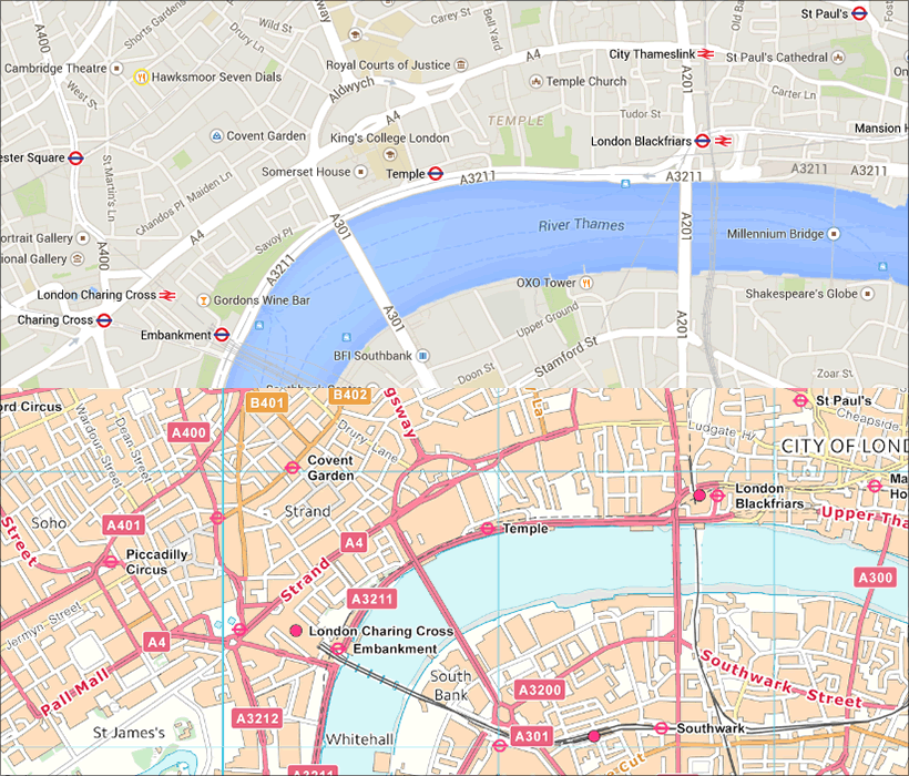 Comparison of Google Maps (top) and the Ordnance Survey (bottom).
Carefully designing the base map tiles is as important as any other part of the website. The most obvious, yet often overlooked, aspect are aesthetics and branding. Maps could fit in with the rest of the site; for example, by matching the colours and line weights, they can enhance the full design rather than inhibiting it. You’re also able to define the exact purpose of the map, so instead of showing everything you could specify which symbols or labels to show and hide.
I’ve not done any real research on the accessibility of base maps but, having looked at some of the available options, I think a focus on the typography of labels and the colour of the various elements is crucial. While you can choose to hide labels, quite often they provide the data required to make sense of the map. Therefore, make sure each zoom level is not too cluttered and shows enough to give context. Also be as careful when choosing the typeface as you are in any other design work. As for colour, you need to pay closer attention to issues like colour-blindness when using colour to convey information. Quite often a spectrum of colour will be used to show data, or to show the topography, so you need to be aware that some people struggle to see colour differences within a spectrum.
A nice example of a customised base map can be found on Michael K Owens’ check-in pages:
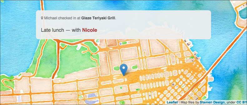 One of Michael K Owens’ check-in pages.
As I’ve already mentioned, tiles are not just for base maps: they are also for data. In the screenshot below you can see how Plymouth Marine Laboratory uses tiles to show data with a spectrum of colour.
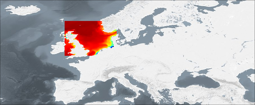 A map from the Marine Operational Ecology data portal, showing data of adult cod in the North Sea.
Technical
You’re probably wondering how to design the base layers. I will briefly explain the concepts here and give you tools to use at the end of the article. If you’re worried about the time it takes to design the maps, don’t be – you can automate most of it. You don’t need to manually draw each tile for the entire world!
We’ve learned the importance of web standards the hard way, so you’ll be glad (and I won’t have to explain the advantages) of the standard for web mapping from the Open Geospatial Consortium (OGC) called the Web Map Service (WMS). You can use conventional file formats for the imagery but you need a way to query for the particular tiles to show for the area and zoom level, that is what WMS does.
Features
Tiles are great for covering large areas but sometimes you need specific smaller areas. We call these features and they usually consist of polygons, lines or points. Examples include postcode boundaries and routes between places, or even something more dynamic such as borders of nations changing over time.
Showing features on a map presents interesting design challenges. If the colour or shape conveys some kind of data beyond geographical boundaries then it needs to be made obvious. This is actually really hard, without building complicated user interfaces. For example, in the image below, is it obvious that there is a relationship between the colours? Does it need a way of showing what the colours represent?
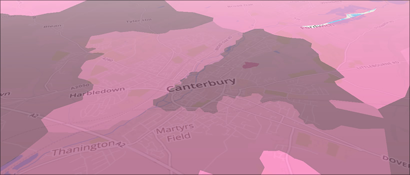 Choropleth map showing ranked postcode areas, using ViziCities.
Features are represented by means of lines or colors; and the effective use of lines or colors requires more than knowledge of the subject – it requires artistic judgement.
Erwin Josephus Raisz, cartographer (1893–1968)
Where lots of boundaries are small and close together (such as a high street or shopping centre) will it be obvious where the boundaries are and what they represent? When designing maps, the hardest challenge is dealing with how the data is represented and how it is understood by the user.
Technical
As you probably gathered, we use WMS for tiles and another standard called the web feature service (WFS) for specific features. I need to stress that the difference between the two is that WMS is for tiling, whereas WFS is for specific features. Both can use similar file formats but should be used for their particular use cases. You may be wondering why you can’t just use a vector format such as KML, GeoJSON (or even SVG) – and you can – but the issue is the same as for WMS: you need a way to query the data to get the correct area and zoom level.
User interface
There is of course never a correct way to design an interface as there are so many different factors to take into consideration for each individual project. Maps can be used in a variety of ways, to provide simple information about directions or for complex visualisations to explain large amounts of data. I would like to just touch on matters that need to be taken into account when working with maps.
As I mentioned at the beginning, there are so many Google Maps on the web that people seem to think that its UI is the only way you can use a map. To some degree we don’t want to change that, as people know how to use them; but does every map require a zoom slider or base map toggle? In fact, does the user need to zoom at all? The answer to that one is generally yes, zooming does provide more context to where the map is zoomed in on.
In some cases you will need to let users choose what goes on the map (such as data layers or directions), so how do they show and hide the data? Does a simple drop-down box work, or do you need search? Google’s base map toggle is quite nice since it doesn’t offer many options yet provides very different contexts and styling.
It isn’t until we get to this point that we realise just plonking a quick Google map is really quite ridiculous, especially when compared to the amount of effort we make in other areas such as colour, typography or how the CSS is written. Each of these is important but we need to make sure the whole site is designed, and that includes the maps as much as any other content.
Putting it into practice
I could ramble on for ages about what we can do to customise maps to fit a site’s personality and correctly represent the data. I wanted to focus on concepts and standards because tools constantly change and it is never good to just rely on a tool to do the work. That said, there are a large variety of tools that will help you turn these concepts into reality. This is not a comparison; I just want to show you a few of the many options you have for maps on the web.
OK, I’ve been quite critical so far about Google Maps but that is only because there is such a large amount of the default maps across the web. You can style them almost as much as anything else. They may not allow you to use custom WMS layers but Google Maps does have its own version, called styled maps. Using an array of map features (in the sense of roads and lakes and landmarks rather than the kind WFS is used for), you can style the base map with JavaScript. It even lets you toggle visibility, which helps to avoid the issue of too much clutter on the map. As well as lacking WMS, it doesn’t support WFS, but it does support GeoJSON and KML so you can still show the features on the map. You should also check out Google Maps Engine (the new version of My Maps), which provides an interface for creating more advanced maps with a selection of different base maps. A premium version is available, essentially for creating map-based visualisations, and it provides a step up from the main Google Maps offering. A useful feature in some cases is that it gives you access to many datasets.
Leaflet
You have probably seen Leaflet before. It isn’t quite as popular as Google Maps but it is definitely used often and for good reason. Leaflet is a lightweight open source JavaScript library. It is not a service so you don’t have to worry about API throttling and longevity. It gives you two options for tiling, the ability to use WMS, or to directly get the file using variables in the filename such as /{z}/{x}/{y}.png. I would recommend using WMS over dynamic file names because it is a standard, but the ability to use variables in a file name could be useful in some situations. Leaflet has a strong community and a well-documented API.
Mapbox
As a freemium service, Mapbox may not be perfect for every use case but it’s definitely worth looking into. The service offers incredible customisation tools as well as lots of data sources and hosting for the maps. It also provides plenty of libraries for the various platforms, so you don’t have to only use the maps on the web.
Mapbox is a service, though its map design tool is open source. Mapbox Studio is a vector-only version of their previous tool called Tilemill. Earlier I wrote about how typography and colour are as important to maps as they are to the rest of a website; if you thought, “Yes, but how on earth can I design those parts of a map?” then this is the tool for you. It is incredibly easy to use. Essentially each map has a stylesheet.
If you do not want to open a paid-for Mapbox account, then you can export the tiles (as PNG, SVG etc.) to use with other map tools.
OpenLayers
After a long wait, OpenLayers 3 has been released. It is similar to Leaflet in that it is a library not a service, but it has a much broader scope. During the last year I worked on the GIS portal at Plymouth Marine Laboratory (which I used to show the data tiles earlier), it essentially used OpenLayers 2 to create a web-based geographic information system, taking a large amount of data and permitting analysis (such as graphs) without downloading entire datasets and complicated software. OpenLayers 3 has improved greatly on the previous version in both performance and accessibility. It is the ideal tool for complex map-based web apps, though it can be used for the simple use cases too.
OpenStreetMap
I couldn’t write an article about maps on the web without at least mentioning OpenStreetMap. It is the place to go for crowd-sourced data about any location, with complete road maps and a strong API.
ViziCities
The newest project on this list is ViziCities by Robin Hawkes and Peter Smart. It is a open source 3-D visualisation tool, currently in the very early stages of development. The basic example shows 3-D buildings around the world using OpenStreetMap data. Robin has used it to create some incredible demos such as real-time London underground trains, and planes landing at an airport. Edward Greer and I are currently working on using ViziCities to show ideal housing areas based on particular personas. We chose it because the 3-D aspect gives us interesting possibilities for the data we are able to visualise (such as bar charts on the actual map instead of in the UI). Despite not being a completely stable, fully featured system, ViziCities is worth taking a look at for some use cases and is definitely going to go from strength to strength.
So there you have it – a whistle-stop tour of how maps can be customised. Now please stop plonking in maps without thinking about it and design them as you design the rest of your content.
About the author
Despite being a constant presence on Twitter, Shane Hudson occasionally does some work. He is a developer interested in all things web. Currently focussing on completing a degree in Artificial Intelligence, Shane has previously written a book called JavaScript Creativity, worked on a web-based geographic data portal at Plymouth Marine Laboratory and freelanced as a front-end developer.
Brought to you by
Related articles
-
Direction, Distance and Destinations
Brian Suda packs his compass and map (well, his smartphone) to guide us all home for Christmas. And there’ll be one jolly fellow who’ll find this little web app useful on that annual 24-hour world trip.
-
Finding Your Way with Static Maps
Drew McLellan opens our 2010 season by revisiting the way we implement maps to cater for all types of visitors. Should we be building all-or-nothing solutions when it comes to mapping, or can progressive enhancement play its part here, too?
-
Get To Grips with Slippy Maps
Andrew Turner helps us take our first steps into neogeography by creating interactive, draggable maps using the Mapstraction library. So if you’re aiming to mash-up more than swede and carrots over the holidays, or simply need to plan an effective pub-crawl there should be something here to get your chestnuts roasting.