Make Your Mockup in Markup
We aren’t designing copies of web pages, we’re designing web pages.
Andy Clarke, via Quotes on Design
The old way
I used to think the best place to design a website was in an image editor. I’d create a pixel-perfect PSD filled with generic content, send it off to the client, go through several rounds of revisions, and eventually create the markup.
Does this process sound familiar? You’re not alone. In a very scientific and official survey I conducted, close to 90% of respondents said they design in Photoshop before the browser.
That process is whack, yo!
Recently, thanks in large part to the influence of design hero Dan Cederholm, I’ve come to the conclusion that a website’s design should begin where it’s going to live: in the browser.
Die Photoshop, die
Some of you may be wondering, “what’s so bad about using Photoshop for the bulk of my design?” Well, any seasoned designer will tell you that working in Photoshop is akin to working in a minefield: you never know when it’s going to blow up in your face.
 The application Adobe Photoshop CS4 has unexpectedly ruined your day.
Photoshop’s propensity to crash at crucial moments is a running joke in the industry, as is its barely usable interface. And don’t even get me started on the hot, steaming pile of crap that is text rendering.
 Text rendered in Photoshop (left) versus Safari (right).
Crashing and text rendering issues suck, but we’ve learned to live with them. The real issue with using Photoshop for mockups is the expectations you’re setting for a client. When you send the client a static image of the design, you’re not giving them the whole picture — they can’t see how a fluid grid would function, how the design will look in a variety of browsers, basic interactions like :hover effects, or JavaScript behaviors. For more on the disadvantages to showing clients designs as images rather than websites, check out Andy Clarke’s Time to stop showing clients static design visuals.
A necessary evil?
In the past we’ve put up with Photoshop because it was vital to achieving our beloved rounded corners, drop shadows, outer glows, and gradients. However, with the recent adaptation of CSS3 in major browsers, and the slow, joyous death of IE6, browsers can render mockups that are just as beautiful as those created in an image editor. With the power of RGBA, text-shadow, box-shadow, border-radius, transparent PNGs, and @font-face combined, you can create a prototype that radiates shiny awesomeness right in the browser. If you can see this epic article through to the end, I’ll show you step by step how to create a gorgeous mockup using mostly markup.
Get started by getting naked
Content precedes design. Design in the absence of content is not design, it’s decoration.
In the beginning, don’t even think about style. Instead, start with the foundation: the content. Lay the groundwork for your markup order, and ensure that your design will be useable with styles and images turned off. This is great for prioritizing the content, and puts you on the right path for accessibility and search engine optimization. Not a bad place to start, amirite?
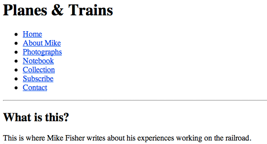 An example of unstyled content, in all its naked glory. View it large.
Flush out the layout
The next step is to structure the content in a usable way. With CSS, making basic layout changes is as easy as switching up a float, so experiment to see what structure suits the content best.
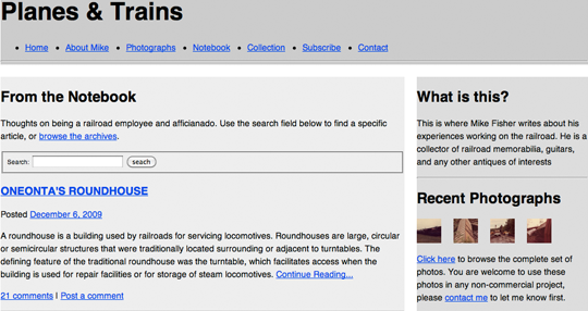 The mockup with basic layout work done.
Got your grids covered
There are a variety of tools that allow you to layer a grid over your browser window. For Mac users I recommend using Slammer, and PC users can check out one of the bookmarklets that are available, such as 960 Gridder.
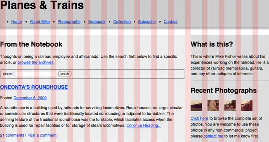 The mockup with a grid applied using Slammer.
Once you’ve found a layout that works well for the content, pass it along to the client for review. This keeps them involved in the design process, and gives them an idea of how the site will be structured when it’s live.
Start your styling
Now for the fun part: begin applying the presentation layer. Let usability considerations drive your decisions about color and typography; use highlighted colors and contrasting typefaces on elements you wish to emphasize.
RGBA? More like RGByay!
Introducing color is easy with RGBA. I like to start with the page’s main color, then use white at varying opacities to empasize content sections.
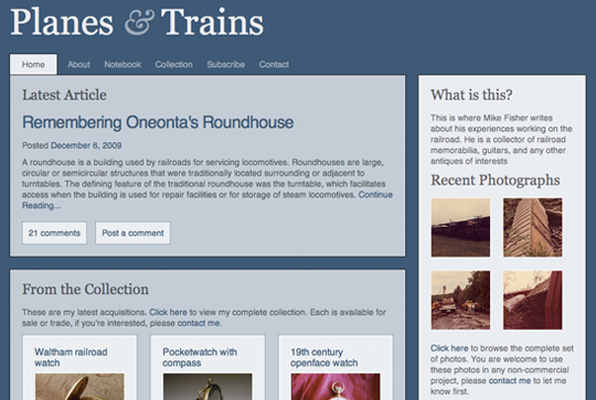 In the example mockup the body background is set to
 rgba(203,111,21), the content containers are set to rgba(255,255,255,0.7), and a few elements are highlighted with rgba(255,255,255,0.1) If you’re not sure how RGBA works, check out Drew McLellan’s super helpful 24ways article.
Laying down type
Just like with color, you can use typography to evoke a feeling and direct a user’s attention. Have contrasting typefaces (like serif headlines and sans-serif body text) to group the content into meaningful sections.
In a recent A List Apart article, the Master of Web Typography™ Jason Santa Maria offers excellent advice on how to choose your typefaces:
Write down a general description of the qualities of the message you are trying to convey, and then look for typefaces that embody those qualities.
Sounds pretty straightforward. I wanted to give my design a classic feel with a hint of nostalgia, so I used Georgia for the headlines, and incorporated the ornate ampersand from Baskerville into the header.
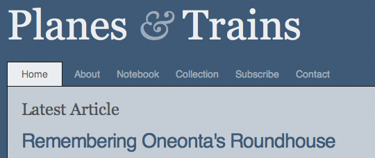 A closeup on the site’s header.
Let’s get sexy
The design doesn’t look too bad as it is, but it’s still pretty flat. We can do better, and after mixing in some CSS3 and a couple of PNGs, it’s going to get downright steamy in here.
Give it some glow
Objects in the natural world reflect light, so to make your design feel tangible and organic, give it some glow. In the example design I achieved this by creating two white to transparent gradients of varying opacities. Both have a solid white border across their top, which gives edges a double border effect and makes them look sharper. Using CSS3’s text-shadow on headlines and box-shadow on content modules is another quick way to add depth.
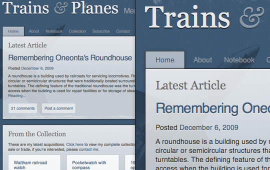 A wide and closeup view of the design with gradients,
 text-shadow and box-shadow added. For information on how to implement text-shadow and box-shadow using RGBA, check out the article I wrote on it last week.
37 pieces of flair
Okay, maybe you don’t need that much flair, but it couldn’t hurt to add a little; it’s the details that will set your design apart. Work in imagery and texture, using PNGs with an alpha channel so you can layer images and still tweak the color later on.
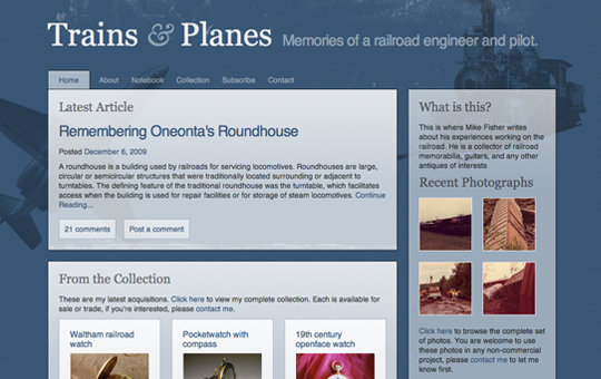 The design with grungy textures, a noisy diagonal stripe pattern, and some old transportation images layered behind the text. Because the colors are rendered using RGBA, these images bleed through the content, giving the design a layered feel. Best viewed large.
Send it off
Hey, look at that. You’ve got a detailed, well structured mockup for the client to review. Best of all, your markup is complete too. If the client approves the design at this stage, your template is practically finished. Bust out the party hats!
Not so fast, Buster!
So I don’t know about you, but I’ve never gotten a design past the client’s keen eye for criticism on the first go. Let’s review some hypothetical feedback (none of which is too outlandish, in my experience), and see how we’d make the requested changes in the browser.
Updating the typography
My ex-girlfriend loved Georgia, so I never want to see it again. Can we get rid of it? I want to use a font that’s chunky and loud, just like my stupid ex-girlfriend.
Fakey McClient
Yikes! Thankfully with CSS, removing Georgia is as easy as running a find and replace on the stylesheet. In my revised mockup, I used @font-face and League Gothic on the headlines to give the typography the, um, unique feel the client is looking for.
 The same mockup, using
 @font-face on the headlines. If you’re unfamiliar with implementing @font-face, check out Nice Web Type‘s helpful article.
Adding rounded corners
I’m not sure if I’ll like it, but I want to see what it’d look like with rounded corners. My cousin, a Web 2.0 marketing guru, says they’re trendy right now.
Fakey McClient
Switching to rounded corners is a nightmare if you’re doing your mockup in Photoshop, since it means recreating most of the shapes and UI elements in the design. Thankfully, with CSS border-radius comes to our rescue! By applying this gem of a style to a handful of classes, you’ll be rounded out in no time.
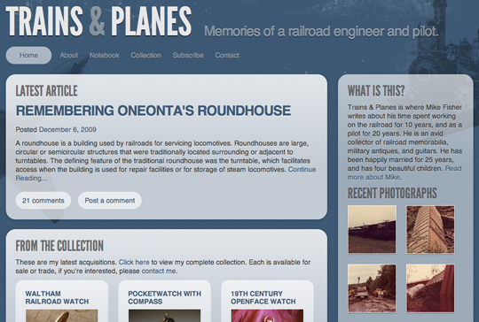 The mockup with rounded corners, created using
 border-radius. If you’re not sure how to implement border-radius, check out CSS3.info‘s quick how-to.
Making changes to the color
The design is too dark, it’s depressing! They call it ‘the blues’ for a reason, dummy. Can you try using a brighter color? I want orange, like Zeldman uses.
Fakey McClient
Making color changes is another groan-inducing task when working in Photoshop. Finding and updating every background layer, every drop shadow, and every link can take forever in a complex PSD. However, if you’ve done your mockup in markup with RGBA and semi-transparent PNGs, making changes to your color is as easy as updating the body background and a few font colors.
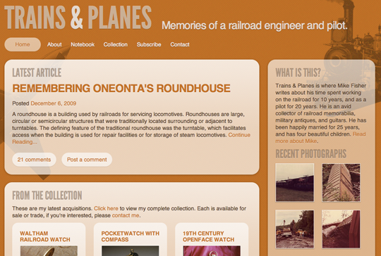 The mockup with an orange color scheme. Best viewed large.
Ahem, what about Internet Explorer?
Gee, thanks for reminding me, buzzkill. Several of the CSS features I’ve suggested you use, such as RGBA, text-shadow and box-shadow, and border-radius, are not supported in Internet Explorer. I know, it makes me sad too. However, this doesn’t mean you can’t try these techniques out in your markup based mockups. The point here is to get your mockups done as efficiently as possible, and to keep the emphasis on markup from the very beginning.
Once the design is approved, you and the client have to decide if you can live with the design looking different in different browsers. Is it so bad if some users get to see drop shadows and some don’t? Or if the rounded corners are missing for a portion of your audience? The design won’t be broken for IE people, they’re just missing out on a few visual treats that other users will see.
The idea of rewarding users who choose modern browsers is not a new concept; Dan covers it thoroughly in Handcrafted CSS, and it’s been written about in the past by Aaron Gustafson and Andy Clarke on several occasions. I believe we shouldn’t have to design for the lowest common denominator (cough, IE6 users, cough); instead we should create designs that are beautiful in modern browsers, but still degrade nicely for the other guy. However, some clients just aren’t that progressive, and in that case you can always use background images for drop shadows and rounded corners, as you have in the past.
Closing thoughts
With the advent of CSS3, browsers are just as capable of giving us beautiful, detailed mockups as Photoshop, and in half the time. I’m not the only one to make an argument for this revised process; in his article Time to stop showing clients static design visuals, and in his presentation Walls Come Tumbling Down, Andy Clarke makes a fantastic case for creating your mockups in markup.
So I guess my challenge to you for 2010 is to get out of Photoshop and into the code. Even if the arguments for designing in the browser aren’t enough to make you change your process permanently, it’s worthwhile to give it a try. Look at the New Year as a time to experiment; applying constraints and evaluating old processes can do wonders for improving your efficiency and creativity.
About the author
Meagan Fisher is passionate about owls, coffee, and web design. In her ongoing mission to make the web a better place, she’s partnered with some of the best designers in the industry, such as SimpleBits, Happy Cog, and Crush + Lovely. When she’s not creating interfaces, she’s speaking, tweeting, writing on Owltastic, or posting coffee art photography to Art in my Coffee.

