The (Switch)-Case for State Machines in User Interfaces
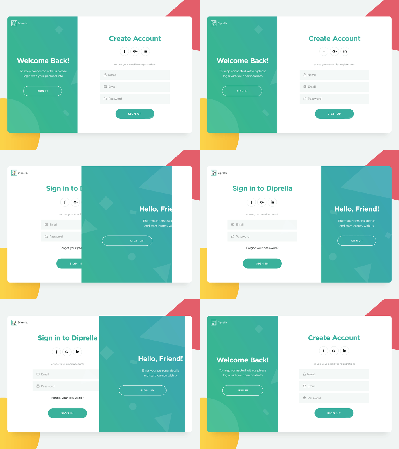
You’re tasked with creating a login form. Email, password, submit button, done.
“This will be easy,” you think to yourself.

You’ve made similar forms many times in the past; it’s essentially muscle memory at this point. You’re working closely with a designer, who gives you a beautiful, detailed mockup of a login form. Sure, you’ll have to translate the pixels to meaningful, responsive CSS values, but that’s the least of your problems.
As you’re writing up the HTML structure and CSS layout and styles for this form, you realize that you don’t know what the successful “logged in” page looks like. You remind the designer, who readily gives it to you. But then you start thinking more and more about how the login form is supposed to work.
- What if login fails? Where do those errors show up?
- Should we show errors differently if the user forgot to enter their email, or password, or both?
- Or should the submit button be disabled?
- Should we validate the email field?
- When should we show validation errors – as they’re typing their email, or when they move to the password field, or when they click submit? (Note: many, many login forms are guilty of this.)
- When should the errors disappear?
- What do we show during the login process? Some loading spinner?
- What if loading takes too long, or a server error occurs?
Many more questions come up, and you (and your designer) are understandably frustrated. The lack of upfront specification opens the door to scope creep, which readily finds itself at home in all the unexplored edge cases.
Modeling Behavior
Describing all the possible user flows and business logic of an application can become tricky. Ironically, user stories might not tell the whole story – they often leave out potential edge-cases or small yet important bits of information.
However, one important (and very old) mathematical model of computation can be used for describing the behavior and all possible states of a user interface: the finite state machine.
The general idea, as it applies to user interfaces, is that all of our applications can be described (at some level of abstraction) as being in one, and only one, of a finite number of states at any given time. For example, we can describe our login form above in these states:
start- not submitted yetloading- submitted and logging insuccess- successfully logged inerror- login failed
Additionally, we can describe an application as accepting a finite number of events – that is, all the possible events that can be “sent” to the application, either from the user or some other external entity:
SUBMIT- pressing the submit buttonRESOLVE- the server responds, indicating that login is successfulREJECT- the server responds, indicating that login failed
Then, we can combine these states and events to describe the transitions between them. That is, when the application is in one state, an an event occurs, we can specify what the next state should be:
- From the
startstate, when theSUBMITevent occurs, the app should be in theloadingstate. - From the
loadingstate, when theRESOLVEevent occurs, login succeeded and the app should be in thesuccessstate. - If login fails from the
loadingstate (i.e., when theREJECTevent occurs), the app should be in theerrorstate. - From the
errorstate, the user should be able to retry login: when theSUBMITevent occurs here, the app should go to theloadingstate. - Otherwise, if any other event occurs, don’t do anything and stay in the same state.
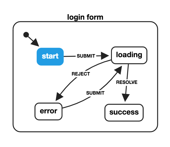
That’s a pretty thorough description, similar to a user story! It’s also a bit more symbolic than a user story (e.g., “when the SUBMIT event occurs” instead of “when the user presses the submit button”), and that’s for a reason. By representing states, events, and transitions symbolically, we can visualize what this state machine looks like:

Every state is represented by a box, and every event is connected to a transition arrow that connects two states. This makes it intuitive to follow the flow and understand what the next state should be given the current state and an event.
From Visuals to Code
Drawing a state machine doesn’t require any special software; in fact, using paper and pencil (in case anything changes!) does the job quite nicely. However, one common problem is handoff: it doesn’t matter how detailed a user story or how well-designed a visualization is, it eventually has to be coded in order for it to become part of a real application.
With the state machine model described above, the same visual description can be mapped directly to code. Traditionally, and as the title suggests, this is done using switch/case statements:
function loginMachine(state, event) {
    switch (state) {
        case 'start':
            if (event === 'SUBMIT') {
                return 'loading';
            }
            break;
        case 'loading':
            if (event === 'RESOLVE') {
                return 'success';
            } else if (event === 'REJECT') {
                return 'error';
            }
            break;
        case 'success':
            // Accept no further events
            break;
        case 'error':
            if (event === 'SUBMIT') {
                return 'loading';
            }
            break;
        default:
            // This should never occur
            return undefined;
    }
}

console.log(loginMachine('start', 'SUBMIT'));
// => 'loading'
This is fine (I suppose) but personally, I find it much easier to use objects:
const loginMachine = {
  initial: "start",
  states: {
    start: {
      on: { SUBMIT: 'loading' }
    },
    loading: {
      on: {
        REJECT: 'error',
        RESOLVE: 'success'
      }
    },
    error: {
      on: {
        SUBMIT: 'loading'
      }
    },
    success: {}
  }
};

function transition(state, event) {
  return machine
    .states[state] // Look up the state
    .on[event]     // Look up the next state based on the event
    || state;      // If not found, return the current state
}

console.log(transition('start', 'SUBMIT'));
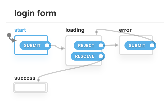
As you might have noticed, the loginMachine is a plain JS object, and can be written in JSON. This is important because it allows the machine to be visualized by a 3rd-party tool, as demonstrated here:

A Common Language Between Designers and Developers
Although finite state machines are a fundamental part of computer science, they have an amazing potential to bridge the application specification gap between designers and developers, as well as project managers, stakeholders, and more. By designing a state machine visually and with code, designers and developers alike can:
- identify all possible states, and potentially missing states
- describe exactly what should happen when an event occurs on a given state, and prevent that event from having unintended side-effects in other states (ever click a submit button more than once?)
- eliminate impossible states and identify states that are “unreachable” (have no entry transition) or “sunken” (have no exit transition)
- add features with full confidence of knowing what other states it might affect
- simplify redundant states or complex user flows
- create test paths for almost every possible user flow, and easily identify edge cases
- collaborate better by understanding the entire application model equally.
Not a New Idea
I’m not the first to suggest that state machines can help bridge the gap between design and development.
- Vince MingPu Shao wrote an article about designing UI states and communicating with developers effectively with finite state machines
- User flow diagrams, which visually describe the paths that a user can take through an app to achieve certain goals, are essentially state machines. Numerous tools, from Sketch plugins to standalone apps, exist for creating them.
- In 1999, Ian Horrocks wrote a book titled “Constructing the User Interface with Statecharts”, which takes state machines to the next level and describes the inherent difficulties (and solutions) with creating complex UIs. The ideas in the book are still relevant today.
- More than a decade earlier, David Harel published “Statecharts: A Visual Formalism for Complex Systems”, in which the statechart - an extended hierarchical state machine model - is born.
State machines and statecharts have been used for complex systems and user interfaces, both physical and digital, for decades, and are especially prevalent in other industries, such as game development and embedded electronic systems. Even NASA uses statecharts for the Curiosity Rover and more, citing many benefits:
- Visualized modeling
- Precise diagrams
- Automatic code generation
- Comprehensive test coverage
- Accommodation of late-breaking requirements changes
Moving Forward
It’s time that we improve how we communicate between designers and developers, much less improve the way we develop UIs to deliver the best, bug-free, optimal user experience. There is so much more to state machines and statecharts than just being a different way of designing and coding. For more resources:
- The World of Statecharts is a comprehensive guide by Erik Mogensen in using statecharts in your applications
- The Statechart Community on Spectrum is always full of interesting ideas and questions related to state machines, statecharts, and software modeling
- I gave a talk at React Rally over a year ago about how state machines (finite automata) can improve the way we develop applications. The latest one is from Reactive Conf, where I demonstrate how statecharts can be used to automatically generate test cases.
- I have also been working on XState, which is a library for “state machines and statecharts for the modern web”. You can create and visualize statecharts in JavaScript, and use them in any framework (and soon enough, multiple different languages).
I’m excited about the future of developing web and mobile applications with statecharts, especially with regard to faster design/development cycles, auto-generated testing, better error prevention, comprehensive analytics, and even the use of model-based reinforcement learning and artificial intelligence to greatly improve the user experience.
About the author
David Khourshid is a Florida-based web developer for Microsoft, a tech author, and speaker. Also a fervent open-source contributor, he is passionate about statecharts and software modeling, reactive animations, innovative user interfaces, and cutting-edge front-end technologies. When not behind a computer keyboard, he’s behind a piano keyboard or traveling.


