Design Systems and CSS Grid
Recently, my client has been looking at creating a few new marketing pages for their website. They currently have a design system in place but they’re looking to push this forward into 2018 with some small and possibly some larger changes.
To start with we are creating a couple of new marketing pages. As well as making use of existing components within the design systems component library there are a couple of new components. Looking at the first couple of sketch files I felt this would be a great opportunity to use CSS Grid, to me the newer components need to be laid out on that page and grid would help with this perfectly.
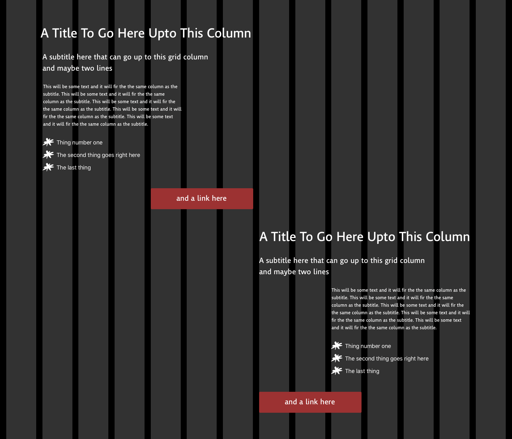
As well as this layout of the new components and the text within it, imagery would be used that breaks out of the grid and pushes itself into the spaces where the text is aligned.
The existing grid system
When the site was rebuilt in 2015 the team decided to make use of Sass and Susy, a “lightweight grid-layout engine using Sass”. It was built separating the grid system from the components that would be laid out on the page with a container, a row, an optional column, and a block.
To make use of the grid system on a page for a component that would take the full width of the row you would have to write something like this:
<div class="grid-container">
  <div class="grid-row">
    <div class="grid-column-4">
      <div class="grid-block">
        <!-- component code here -->
      </div>
    </div>
  </div>
</div>
Using a grid system similar to this can easily create quite the tag soup. It could fill the HTML full of divs that may become complex to understand and difficult to edit.
Although there is this reliance on several <div>s to lay out the components on a page it does allow a tidy way to place the component code within that page. It abstracts the layout of the page to its own code, its own system, so the components can ‘fit’ where needed.
The requirements of the new grid system
Moving forward I set myself some goals for what I’d like to have achieved in this new grid system:
It needs to behave like the existing grid systems
We are not ripping up the existing grid system, it would be too much work, for now, to retrofit all of the existing components to work in a grid that has a different amount of columns, and spacing at various viewport widths.
Allow full-width components
Currently the grid system is a 14 column grid that becomes centred on the page when viewport is wide enough. We have, in the past, written some CSS that would allow for a full-width component, but his had always felt like a hack. We want the option to have a full-width element as part of the new grid system, not something that needs CSS to fight against.
Less of a tag soup
Ideally we want to end up writing less HTML to layout the page. Although the existing system can be quite clear as to what each element is doing, it can also become a little laborious in working out what each grid row or block is doing where.
I would like to move the layout logic to CSS as much as is possible, potentially creating some utility classes or additional ‘layout classes’ for the components.
Easier for people to use and author
With many people using the existing design systems codebase we need to create a new grid system that is as easy or easier to use than the existing one. I think and hope this would be helped by removing as many <div>s as needed and would require new documentation and examples, and potentially some initial training.
Separating layout from style
There still needs to be a separation of layout from the styles for the component. To allow for the component itself to be placed wherever needed in the page we need to make sure that the CSS for the layout is a separate entity to the CSS for that styling.
With these base requirements I took to CodePen and started working on some throwaway code to get started.
Making the new grid(s)
The Full-Width Grid
To start with I created a grid that had three columns, one for the left, one for the middle, and one for the right. This would give the full-width option to components.
Thankfully, one of Rachel Andrew’s many articles on Grid discussed this exact requirement of the new grid system to break out with Grid.
I took some of the code in the examples and edited to make grid we needed.
.container {
  display: grid;
  grid-template-columns:
    [full-start]
      minmax(.75em, 1fr)
        [main-start]
          minmax(0, 1008px)
        [main-end]
      minmax(.75em, 1fr)
    [full-end];
}
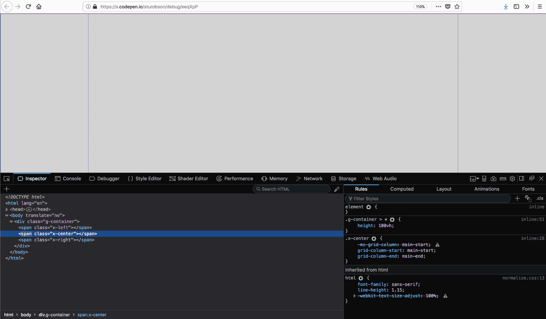
We are declaring a grid, we have four grid column lines which we name and we define how the three columns they create react to the viewport width. We have a left and right column that have a minimum of 12px, and a central column with a maximum width of 1008px.
Both left and right columns fill up any additional space if the viewport is wider that 1032px wide. We are also not declaring any gutters to this grid, the left and right columns would act as gutters at smaller viewports.
At this point I noticed that older versions of Sass cannot parse the brackets in this code. To combat this I used Sass’ unquote method to wrap around the value of the grid-template-column.
.container {
  display: grid;
  grid-template-columns:
  unquote("
    [full-start]
      minmax(.75em, 1fr)
        [main-start]
          minmax(0, 1008px)
        [main-end]
      minmax(.75em, 1fr)
    [full-end]
  ");
}
The existing codebase makes use of Sass variables, mixins and functions so to remove that would be a problem, but luckily the version of Sass used is up-to-date (note: example CodePens will be using CSS).
The initial full-width grid displays on a webpage as below:
The 14 column grid
I decided to work out the 14 column grid as a separate prototype before working out how it would fit within the full-width grid. This grid is very similar to the 12 column grids that have been used in web design. Here we need 14 columns with a gutter between each one.
Along with the many other resources on Grid, Mozilla’s MDN site had a page on common layouts using CSS Grid. This gave me the perfect CSS I needed to create my grid and I edited it as required:
.inner {
  display: grid;
  grid-template-columns: repeat(14, [col-start] 1fr);
  grid-gap: .75em;
}
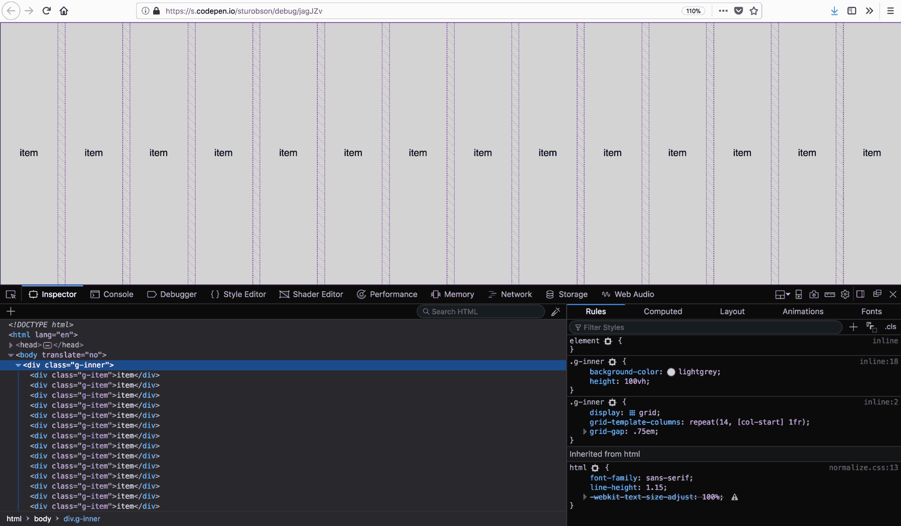
We, again, are declaring a grid, and we are splitting up the available space by creating 14 columns with 1 fr-unit and giving each one a starting line named col-start.
This grid would display on web page as below:
Bringing the grids together
Now that we have got the two grids we need to help fulfil our requirements we need to put them together so that they are actually we we need.
The subgrid
There is no subgrid in CSS, yet. To workaround this for the new grid system we could nest the 14 column grid inside the full-width grid.
In the HTML we nest the 14 column inner grid inside the full-width container.
<div class="container">
  <div class="inner">
  </div>
</div>
So that the inner knows where to be laid out within the container we tell it what column to start and end with, with this code it would be the start and end of the main column.
.inner {
  display: grid;
  grid-column: main-start / main-end;
  grid-template-columns: repeat(14, [col-start] 1fr);
  grid-gap: .75em;
}
The CSS for the container remains unchanged.
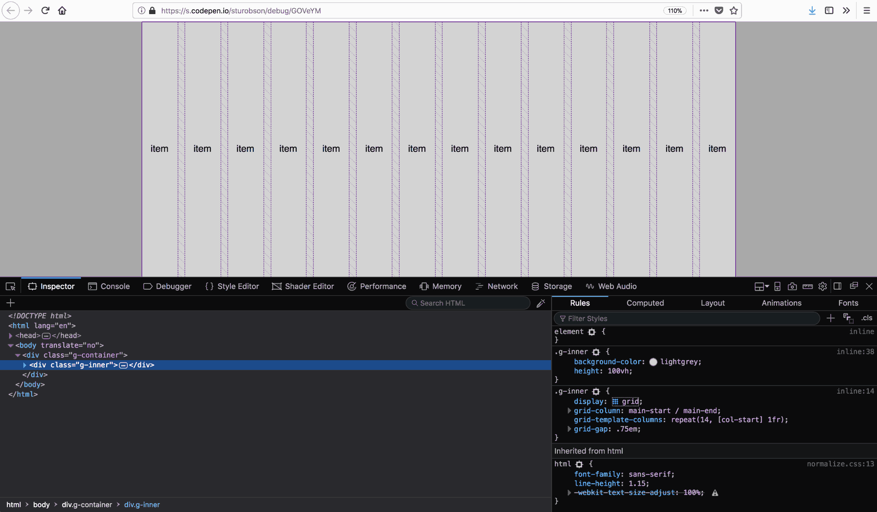
This works, but we have added another div to our HTML. One of our requirements is to try and remove the potential for tag soup.
The faux subgrid subgrid
I wanted to see if it would be possible to place the CSS for the 14 column grid within the CSS for the full-width grid. I replaced the CSS for the main grid and added the grid-column-gap to the .container.
.container {
  display: grid;
  grid-gap: .75em;
  grid-template-columns:
    [full-start]
      minmax(.75em, 1fr)
        [main-start]
          repeat(14, [col-start] 1fr)
        [main-end]
      minmax(.75em, 1fr)
    [full-end];
}
What this gave me was a 16 column grid. I was unable to find a way to tell the main grid, the grid betwixt main-start and main-end to be a maximum of 1008px as required.
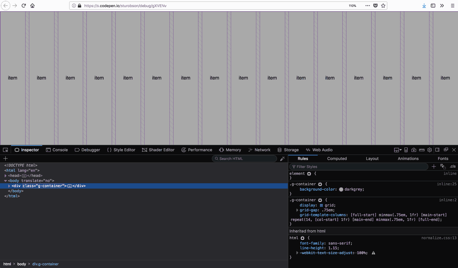
I trawled the internet to find if it was possible to create our main requirement, a 14 column grid which also allows for full-width components. I found that we could not reverse minmax to minmax(1fr, 72px) as 1fr is not allowed as a minimum if there is a maximum. I tried working out if we could make the min larger than its max but in minmax it would be ignored.
I was struggling, I was hoping for a cleaner version of the grid system we currently use but getting to the point where needing that extra <div> would be a necessity.
At 3 in the morning, when I was failing to get to sleep, my mind happened upon an question: “Could you use calc?”
At some point I drifted back to sleep so the next day I set upon seeing if this was possible. I knew that the maximum width of the central grid needed to be 1008px. The left and right columns needed to be however many pixels were left in the viewport divided by 2. In CSS it looked like I would need to use calc twice. The first time to takeaway 1008px from 100% of the viewport width and the second to divide that result by 2.
calc(calc(100% - 1008px) / 2)The CSS above was part of the value that I would need to include in the declaration for the grid.
.container {
  display: grid;
  grid-gap: .75em;
  grid-template-columns:
    [full-start]
      minmax(calc(calc(100% - 1008px) / 2), 1fr)
        [main-start]
          repeat(14, [col-start] 1fr)
        [main-end]
      minmax(calc(calc(100% - 1008px) / 2), 1fr)
    [full-end];
}
We have created the grid required. A full-width grid, with a central 14 column grid, using fewer <div> elements.
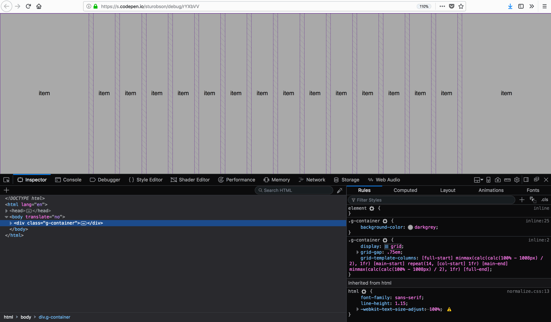
See the Pen Design Systems and CSS Grid, 6 by Stuart Robson (@sturobson) on CodePen.
Success!
Progressive enhancement
Now that we have created the grid system required we need to back-track a little.
Not all browsers support Grid, over the last 9 months or so this has gotten a lot better. However there will still be browsers that visit that potentially won’t have support. The effort required to make the grid system fall back for these browsers depends on your product or sites browser support.
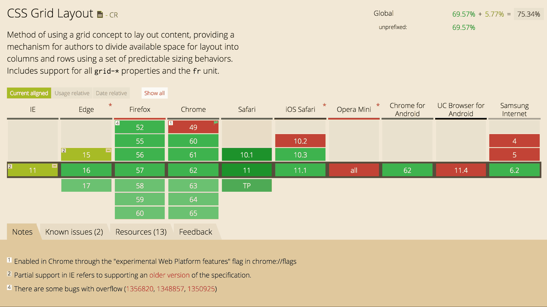
To determine if we will be using Grid or not for a browser we will make use of feature queries. This would mean that any version of Internet Explorer will not get Grid, as well as some mobile browsers and older versions of other browsers.
@supports (display: grid) {
 /* Styles for browsers that support Grid */
}
If a browser does not pass the requirements for @supports we will fallback to using flexbox where possible, and if that is not supported we are happy for the page to be laid out in one column.
A website doesn’t have to look the same in every browser after all.
A responsive grid
We started with the big picture, how the grid would be at a large viewport and the grid system we have created gets a little silly when the viewport gets smaller.
At smaller viewports we have a single column layout where every item of content, every component stacks atop each other. We don’t start to define a grid before we the viewport gets to 700px wide. At this point we have an 8 column grid and if the viewport gets to 1100px or wider we have our 14 column grid.
/*
 * to start with there is no 'grid' just a single column
 */
.container {
  padding: 0 .75em;
}

/*
 * when we get to 700px we create an 8 column grid with
 * a left and right area to breakout of the grid.
 */
@media (min-width: 700px) {
  .container {
    display: grid;
    grid-gap: .75em;
    grid-template-columns:
      [full-start]
        minmax(calc(calc(100% - 1008px) / 2), 1fr)
          [main-start]
            repeat(8, [col-start] 1fr)
          [main-end]
        minmax(calc(calc(100% - 1008px) / 2), 1fr)
      [full-end];
    padding: 0;
  }
}

/*
 * when we get to 1100px we create an 14 column grid with
 * a left and right area to breakout of the grid.
 */
@media (min-width: 1100px) {
  .container {
    grid-template-columns:
    [full-start]
      minmax(calc(calc(100% - 1008px) / 2), 1fr)
        [main-start]
          repeat(14, [col-start] 1fr)
        [main-end]
      minmax(calc(calc(100% - 1008px) / 2), 1fr)
    [full-end];
  }
}
Being explicit in creating this there is some repetition that we could avoid, we will define the number of columns for the inner grid by using a Sass variable or CSS custom properties (more commonly termed as CSS variables).
Let’s use CSS custom properties. We need to declare the variable first by adding it to our stylesheet.
:root {
  --inner-grid-columns: 8;
}
We then need to edit a few more lines. First make use of the variable for this line.
repeat(8, [col-start] 1fr)
/* replace with */
repeat(var(--inner-grid-columns), [col-start] 1fr)
Then at the 1100px breakpoint we would only need to change the value of the —inner-grid-columns value.
@media (min-width: 1100px) {
  .container {
    grid-template-columns:
    [full-start]
      minmax(calc(calc(100% - 1008px) / 2), 1fr)
        [main-start]
          repeat(14, [col-start] 1fr)
        [main-end]
      minmax(calc(calc(100% - 1008px) / 2), 1fr)
    [full-end];
  }
}
/* replace with */
@media (min-width: 1100px) {
  .container {
    --inner-grid-columns: 14;
  }
}
See the Pen Design Systems and CSS Grid, 8 by Stuart Robson (@sturobson) on CodePen.
The final grid system
We have finally created our new grid for the design system. It stays true to the existing grid in place, adds the ability to break-out of the grid, removes a <div> that could have been needed for the nested 14 column grid.
We can move on to the new component.
Creating a new component
Back to the new components we are needing to create.

To me there are two components one of which is a slight variant of the first. This component contains a title, subtitle, a paragraph (potentially paragraphs) of content, a list, and a call to action.
To start with we should write the HTML for the component, something like this:
<article class="features">
  <h3 class="features__title"></h3>
  <p class="features__subtitle"></p>
  <div class="features__content">
    <p class="features__paragraph"></p>
  </div>
  <ul class="features__list">
    <li></li>
    <li></li>
  </ul>
  <a href="" class="features__button"></a>
</article>
To place the component on the existing grid is fine, but as child elements are not affected by the container grid we need to define another grid for the features component.
As the grid doesn’t get invoked until 700px it is possible to negate the need for a media query.
.features {
  grid-column: col-start 1 / span 6;
}

@supports (display: grid) {
  @media (min-width: 1100px) {
    .features {
      grid-column-end: 9;
    }
  }
}
We can also avoid duplication of declarations by making use of the grid-column shorthand and longhand. We need to write a little more CSS for the variant component, the one that will sit on the right side of the page too.
.features:nth-of-type(even) {
  grid-column-start: 4;
  grid-row: 2;
}

@supports (display: grid) {
  @media (min-width: 1100px) {
    .features:nth-of-type(even) {
      grid-column-start: 9;
      grid-column-end: 16;
    }
  }
}
We cannot place the items within features on the container grid as they are not direct children. To make this work we have to define a grid for the features component.
We can do this by defining the grid at the first breakpoint of 700px making use of CSS custom properties again to define how many columns there will need to be.
.features {
  grid-column: col-start 1 / span 6;
  --features-grid-columns: 5;
}

@supports (display: grid) {
  @media (min-width: 700px) {
    .features {
      display: grid;
    grid-gap: .75em;
      grid-template-columns: repeat(var(--features-grid-columns), [col-start] 1fr);
    }
  }
}

@supports (display: grid) {
  @media (min-width: 1100px) {
    .features {
      grid-column-end: 9;
      --features-grid-columns: 7;
    }
  }
}
See the Pen Design Systems and CSS Grid, 10 by Stuart Robson (@sturobson) on CodePen.
Laying out the parts
Looking at the spec and reading several articles I feel there are two ways that I could layout the text of this component on the grid.
We could use the grid-column shorthand that incorporates grid-column-start and grid-column-end or we can make use of grid-template-areas.
grid-template-areas allow for a nice visual way of representing how the parts of the component would be laid out. We can take the the mock of the features on the grid and represent them in text in our CSS.

Within the .features rule we can add the relevant grid-template-areas value to represent the above.
.features {
  display: grid;
  grid-template-columns: repeat(var(--features-grid-columns), [col-start] 1fr);
  grid-template-areas:
   ". title     title     title     title     title    title"
   ". subtitle  subtitle  subtitle  subtitle  subtitle .    "
   ". content   content   content   content   .        .    "
   ". list      list      list      .         .        .    "
   ". .         .         .         link      link     link ";
}
In order to make the variant of the component we would have to create the grid-template-areas for that component too.
We then need to tell each element of the component in what grid-area it should be placed within the grid.
.features__title { grid-area: title; }
.features__subtitle { grid-area: subtitle; }
.features__content { grid-area: content; }
.features__list { grid-area: list; }
.features__link { grid-area: link; }
See the Pen Design Systems and CSS Grid, 12 by Stuart Robson (@sturobson) on CodePen.
The other way would be to use the grid-column shorthand and the grid-column-start and grid-column-end we have used previously.
.features .features__title {
  grid-column: col-start 2 / span 6;
}
.features .features__subtitle {
  grid-column: col-start 2 / span 5;
}
.features .features__content {
  grid-column: col-start 2 / span 4;
}
.features .features__list {
  grid-column: col-start 2 / span 4;
}
.features .features__link {
  grid-column: col-start 5 / span 3;
}
For the variant of the component we can use the grid-column-start property as it will inherit the span defined in the grid-column shorthand.
.features:nth-of-type(even) .features__title {
  grid-column-start: col-start 1;
}
.features:nth-of-type(even) .features__subtitle {
  grid-column-start: col-start 1;
}
.features:nth-of-type(even) .features__content {
  grid-column-start: col-start 3;
}
.features:nth-of-type(even) .features__list {
  grid-column-start: col-start 3;
}
.features:nth-of-type(even) .features__link {
  grid-column-start: col-start 1;
}
See the Pen Design Systems and CSS Grid, 14 by Stuart Robson (@sturobson) on CodePen.
I think, for now, we will go with using grid-column properties rather than grid-template-areas. The repetition needed for creating the variant feels too much where we can change the grid-column-start instead, keeping the components elements layout properties tied a little closer to the elements rather than the grid.
Some additional decisions
The current component library has existing styles for titles, subtitles, lists, paragraphs of text and calls to action. These are name-spaced so that they shouldn’t clash with any other components. Looking forward there will be a chance that other products adopt the component library, but they may bring their own styles for titles, subtitles, etc.
One way that we could write our code now for that near future possibility is to make sure our classes are working hard. Using class-attribute selectors we can target part of the class attributes that we know the elements in the component will have using *=.
.features [class*="title"]  {
  grid-column: col-start 2 / span 6;
}
.features [class*="subtitle"] {
  grid-column: col-start 2 / span 5;
}
.features [class*="content"] {
  grid-column: col-start 2 / span 4;
}
.features [class*="list"] {
  grid-column: col-start 2 / span 4;
}
.features [class*="link"]  {
  grid-column: col-start 5 / span 3;
}
See the Pen Design Systems and CSS Grid, 15 by Stuart Robson (@sturobson) on CodePen.
Although the component we have created have a title, subtitle, paragraphs, a list, and a call to action there may be a time where one ore more of these is not required or available. One thing I found out is that if the element doesn’t exist then grid will not create space for it. This may be obvious, but it can be really helpful in making a nice malleable component.
We have only looked at columns, as existing components have their own spacing for the vertical rhythm of the page we don’t really want to have them take up equal space in the component and just take up the space as needed. We can do this by adding grid-auto-rows: min-content; to our .features. This is useful if you also need your component to take up a height that is more than the component itself.
The grid of the future
From prototyping this new grid and components in CSS Grid, I’ve found it a fantastic way to reimagine how we can create a layout or grid system for our sites. It gives us options to create the same layouts in differing ways that could suit a project and its needs.
It allows us to carry on – if we choose to – using a <div>-based grid but swapping out floats for CSS Grid or to tie it to our components so they have specific places to go depending on what component is being used. Or we could have several ‘grid components’ in our design system that we could use to layout various components throughout a page.
If you find yourself tasked with creating some new components for your design system try it. If you are starting from scratch I believe you really should start with CSS Grid for your layout.
It really feels like the possibilities are endless in terms of layout for the web.
Resources
Here are just a few resources I have pawed over these last few weeks whilst getting acquainted with CSS Grid.
- A collection of CodePens from this article
- Grid by Example from Rachel Andrew
- A Complete Guide to CSS Grid on Codrops from Hui Jing Chen
- Rachel Andrew’s Blog Archive tagged: cssgrid
- CSS Grid Layout Examples
- MDN’s CSS Grid Layout
- A Complete Guide to Grid from CSS-Tricks
- CSS Grid Layout Module Level 1 Specification
About the author
Stuart Robson is a freelance front-end developer and design systems advocate who curates the design systems newsletter - news.design.systems


