Animating Your Brand

Let’s talk about how we add animation to our designs, in a way that’s consistent with other aspects of our brand, such as fonts, colours, layouts and everything else.
Animating is fun. Adding animation to our designs can bring them to life and make our designs stand out. Animations can show how the pieces of our designs fit together. They provide context and help people use our products.
All too often animation is something we tack on at the end. We put a transition on a modal window or sliding menu and we often don’t think about whether that animation is consistent with our overall design.
Style guides to the rescue
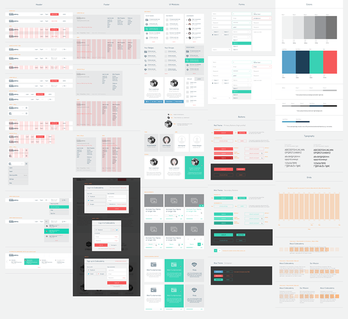
A style guide is a document that establishes and enforces style to improve communication. It can cover anything from typography and writing style to ethics and other, broader goals. It might be a static visual document showing every kind of UI, like in the Codecademy.com redesign shown below.
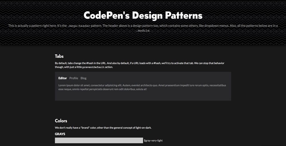
It might be a technical reference with code examples. CodePen’s new design patterns and style guide is a great example of this, showing all the components used throughout the website as live code.
A style guide gives a wide view of your project, it maintains consistency when adding new content, and we can use our style guide to present animations.
Living documents
Style guides don’t need to be static. We can use them to show movement. We can share CSS keyframe animations or transitions that can then go into production. We can also explain why animation is there in the first place.
Just as a style guide might explain why we chose a certain font or layout, we can use style guides to explain the intent behind animation. This means that if someone else wants to create a new component, they will know why animation applies.
If you haven’t yet set up a style guide, you might want to take a look at Pattern Lab. It’s a great tool for setting up your own style guide and includes loads of design patterns to get started.
There are many style guide articles linked from the excellent, open sourced, Website Style Guide Resources. Anna Debenham also has an excellent pocket book on the subject.
Adding animation
Before you begin throwing animation at all the things, establish the character you want to convey.
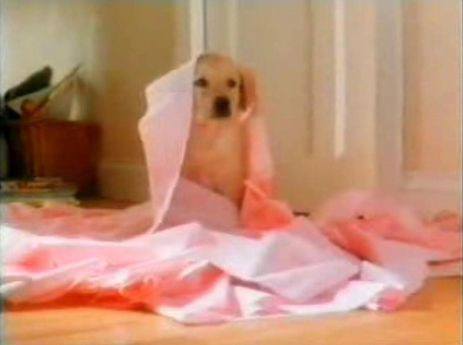
List some words that describe the character you’re aiming for. If it was the Andrex brand, they might have gone for: fun, playful, soft, comforting.
Perhaps you’re aiming for something more serious, credible and authoritative. Or maybe exciting and intense, or relaxing and meditative. For each scenario, the animations that best represent these words will be different.
In the example below, two animations both take the same length of time, but use different timing functions. One eases, and the other bounces around. Either might be good, depending on your needs.
Example: Kitman Labs
Working with Kitman Labs, we spent a little time working out what words best reflected the brand and came up with the following:
- Scientific
- Precise
- Fast
- Solid
- Dependable
- Helpful
- Consistent
- Clear
With such a list of words in hand, we design animation that fits. We might prefer a tween that moves quickly to its destination over one that drifts slowly or bounces.
We can use the list when justifying our use of animation, such as when it helps our customers understand the context of data on the page. Or we may even choose not to animate, when that might make the message inconsistent.
Create guidelines
If you already have a style guide, adding animation could begin with creating an overview section.
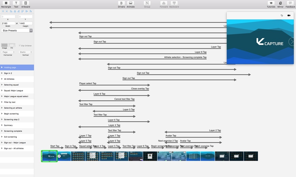
One approach is to create a local website and share it within your organisation. We recently set up a local site for this purpose.
This document becomes a reference when adding animation to components. Include links to related resources or examples of animation to help demonstrate the animation style you want.
Prototyping
You can explain the intent of your animation style guide with live animations. This doesn’t just mean waving our hands around. We can show animation through prototypes.
There are so many prototype tools right now. You could use Invision, Principle, Floid, or even HTML and CSS as embedded CodePens.
These tools help when trying out ideas and working through several approaches. Create videos, animated GIFs or online demos to share with others. Experiment. Find what works for you and work with whatever lets you get the most ideas out of your head fastest. Iterate and refine an animation before it gets anywhere near production.
Build up a collection
Build up your guide, one animation at a time.
Some people prefer to loosely structure a guide with places to put things as they are discovered or invented; others might build it one page at a time – it doesn’t matter. The main thing is that you collect animations like you would trading cards. Or Pokemon. Keep them ready to play and deliver that explosive result.
You could include animated GIFs, or link to videos or even live webpages as examples of animation. The use of animation to help user experience is also covered nicely in Val Head’s UI animation and UX article on A List Apart.
What matters is that you create an organised place for them to be found. Here are some ideas to get started.
Logos and brandmarks
Many sites include some subtle form of animation in their logos. This can draw the eye, add some character, or bring a little liveliness to an otherwise static page. Yahoo and Google have been experimenting with animation on their logos. Even a simple bouncing animation, such as the logo on Hop.ie, can add character.

Content transitions
Adding content, removing content, showing and hiding messages are all opportunities to use animation. Careful and deliberate use of animation helps convey what’s changing on screen.
For more detail on this, I also recommend “Transitional Interfaces” by Pasquale D’Silva.
Page transitions
On a larger scale than the changes to content, full-page transitions can smooth the flow between sections of a site. Medium’s article transitions are a good example of this.
Preparing a layout before the content arrives
We can use animation to draw a page before the content is ready, such as when a page calls a server for data before showing it.

Sometimes it’s good to show something to let the user know that everything’s going well. A short animation could cover just enough time to load the initial content and make the loading transition feel seamless.
Interactions
Hover effects, dropdown menus, slide-in menus and active states on buttons and forms are all opportunities. Look for ways you can remove the sudden changes and help make the experience of using your UI feel smoother.
Keep animation visible
It takes continuous effort to maintain a style guide and keep it up to date, but it’s worth it. Make it easy to include animation and related design decisions in your documentation and you’ll be more likely to do so. If you can make it fun, and be proud of the result, better still.
When updating your style guide, be sure to show the animations at the same time. This might mean animated GIFs, videos or live embedded examples of your components.
By doing this you can make animation integral to your design process and make sure it stays relevant.
Inspiration and resources
There are loads of great resources online to help you get started. One of my favourites is IBM’s design language site.
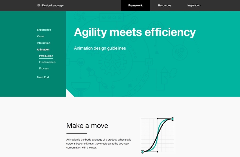
IBM describes how animation principles apply to its UI work and components. They break down the animations into five categories of animations and explain how they apply to each example.
The site also includes an animation library with example videos of animations and links to source code.
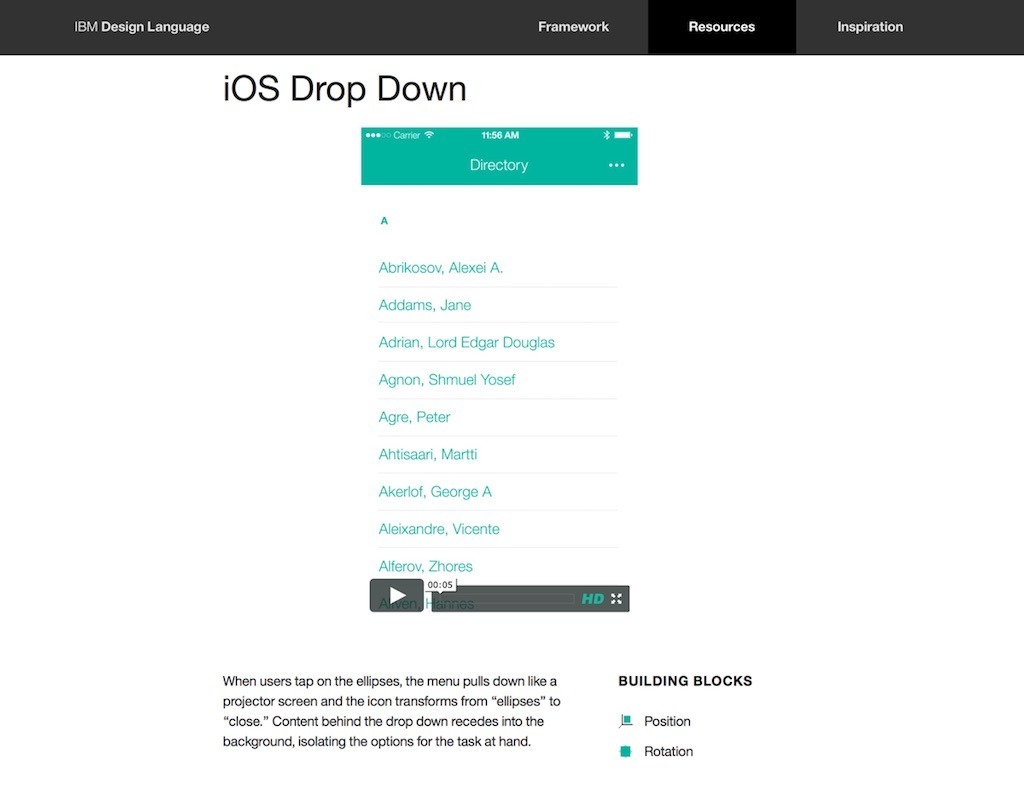
The way IBM sets out its aims and methods is helpful not only for their existing designers and developers, but also helps new hires. Furthermore, it’s a good way to show the world that IBM cares about these details.
Another popular animation resource is Google’s material design.
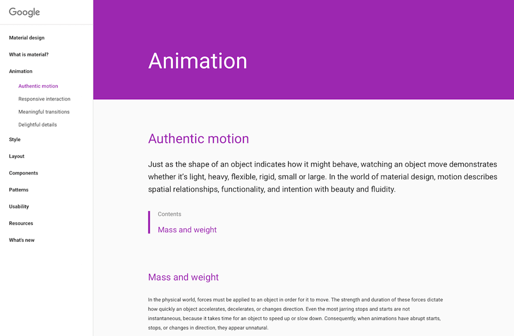
Google’s guidelines cover everything from understanding easing through to creating engaging and useful mobile UI.
This approach is visible across many of Google’s apps and software, and has influenced design across much of the web. The site is helpful both for learning about animation and as an showcase of how to illustrate examples.
Frameworks
If you don’t want to create everything from scratch, there are resources you can use to start using animation in your UI. One such resource is Salesforce’s Lightning design system.
The system goes further than most guides. It includes a downloadable framework for adding animation to your projects. It has some interesting concepts, such as elevation settings to handle positioning on the z-axis.
You should also check out Animate.css.
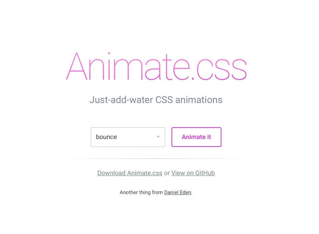
Animate.css gives you a set of predesigned animations you can apply to page elements using classes. If you use JavaScript to add or remove classes, you can then trigger complex animations. It also plays well with scroll-triggering, and tools such as WOW.js.
Learn, evolve and make it your own
There’s a wealth online of information and guides we can use to better understand animation. They can inspire and kick-start our own visual and animation styles. So let’s think of the design of animations just as we do fonts, colours and layouts. Let’s choose animation deliberately, making it part of our style guides.
Many thanks to Val Head for taking the time to proofread and offer great suggestions for this article.
About the author
Donovan Hutchinson is a front-end designer who loves making fun stuff for the web. He also writes tutorials on CSSAnimation.rocks. Find him on Twitter at @donovanh.
Brought to you by

Related articles
-
Beyond the Style Guide
Paul Robert Lloyd runs his finger along the seam between interface patterns and design systems, exploring how a visual design language can underpin and inform a web style guide, with judicious use of CSS preprocessing. Like a good Christmas jumper, sometimes you need to get creative with the rules.
-
Design Systems and CSS Grid
Stuart Robson tackles the thorny issue of integrating modern CSS Grid layouts into an existing design system, but in doing so reaps the benefits of leaner, more easily maintainable markup. It goes to show that with careful planning, there’s no reason old and new CSS layout methods cannot meet under the mistletoe.
-
Four Ways Design Systems Can Promote Accessibility – and What They Can’t Do
Amy Hupe prepares a four bird roast of tasty treats so we can learn how the needs of many different types of users can be served through careful implementation of components within a design system.
-
Refactoring Your Way to a Design System
Mina Markham brings a ray of hope that flitters in the sky with advice on refactoring an existing codebase into a design system. Greenfield projects are rare, so can we move forward with legacy styles in place? All across the land dawns a brand new morn, this comes to pass when a new design system is born.
-
There Is No Design System
Jina Anne silences the night to talk about how we talk about Design Systems. Can the language we use impact the effectiveness of the solution? Fear not, if mighty dread has seized your troubled mind. Design systems of great joy we bring to you and all mankind.
-
Design Systems and Hybrids
Jina Anne circles back to carefully look again at the popularity of design systems and how they impact the different roles within our teams. A good system enables all the reindeer to pull forward in a cohesive motion, yet has space for individuals with very shiny noses.