Accessibility Through Semantic HTML

Working on Better, a tracker blocker, I spend an awful lot of my time with my nose in other people’s page sources. I’m mostly there looking for harmful tracking scripts, but often notice the HTML on some of the world’s most popular sites is in a sad state of neglect.
What does neglected HTML look like? Here’s an example of the markup I found on a news site just yesterday. There’s a bit of text, a few links, and a few images. But mostly it’s div elements.
<div class="block_wrapper">
  <div class="block_content">
    <div class="box">
      <div id="block1242235">
        <div class="column">
          <div class="column_content">
            <a class="close" href="#"><i class="fa"></i></a>
          </div>
          <div class="btn account_login"></div>
          Some text <span>more text</span>
        </div>
      </div>
    </div>
  </div>
</div>divs and spans, why do we use them so much?
While I find tracking scripts completely inexcusable, I do understand why people write HTML like the above. As developers, we like to use divs and spans as they’re generic elements. They come with no associated default browser styles or behaviour except that div displays as a block, and span displays inline. If we make our page up out of divs and spans, we know we’ll have absolute control over styles and behaviour cross-browser, and we won’t need a CSS reset.
Absolute control may seem like an advantage, but there’s a greater benefit to less generic, more semantic elements. Browsers render semantic elements with their own distinct styles and behaviours. For example, button looks and behaves differently from a. And ul is different from ol. These defaults are shortcuts to a more usable and accessible web. They provide consistent and well-tested components for common interactions.
Semantic elements aid usability
A good example of how browser defaults can benefit the usability of an element is in the <select> option menu. In Safari on the desktop, the browser renders <select> as a popover-style menu. On a touchscreen, Safari overlays the same menu over the lower half of the screen as a “picker view.”
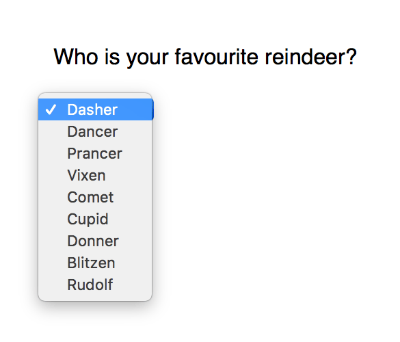
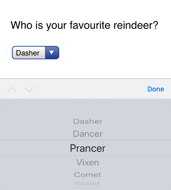
The iOS picker is a much better experience than struggling to pick from a complicated interface inside the page. The menu is shown more clearly than in the confined space on the page, which makes the options easier to read. The required swipe and tap gestures are consistent with the rest of the operating system, making the expected interaction easier to understand. The whole menu is scaled up, meaning the gestures don’t need such fine motor control. Good usability is good accessibility.
When we choose to use a div or span over a more semantic HTML element, we’re also doing hard work the browser could be doing for us. We don’t need to tie ourselves in knots making a custom div into a keyboard navigable option menu. Using select passes the bulk of the responsibility over to the browser.
Letting the browser do most of the work is also more future-friendly. More devices, with different expected interactions, will be released in the future. When that happens, the devices’ browsers can adapt our sites according to those interactions. Then we can spend our time doing something more fun than rewriting cross-browser JavaScript for each new device.
HTML’s impact on accessibility
Assistive technology also uses semantic HTML to understand how best to convey each element to its user.
For screen readers
Semantic HTML gives context to screen readers. Screen readers are a type of assistive technology that reads the content of the screen to the person using it. All sites have a linear page source. Sighted visitors can use visual cues on the page to navigate to their desired content in a non-linear fashion. As screen readers output audio (and sometimes braille), those visual cues aren’t usable in the same way.
Screen readers provide alternative means of navigation, enabling people to jump between different types of content, such as links, forms, headings, lists, and paragraphs. If all our content is marked up using divs and spans, we’re not giving screen readers a chance to index the valuable content.
For keyboard navigation
Keyboard-only navigation is also aided by semantic HTML. Forms, option menus, navigation, video, and audio are particularly hard for people relying on a keyboard to access. For instance, option menus and navigation can be very fiddly if you need to use a mouse to hover a menu open and move to select the desired item at the same time.
Again, we can leave much of the interaction to the browser through semantic HTML. Semantic form elements can convey if a check box has been checked, or which label is associated with which input field. These default behaviours can make the difference between a person being able to use a form or leaving the site out of frustration.
Did I convince you yet? I hope so. Let’s finish with some easy guidelines to follow.
1. Use the most semantic HTML element for the job
When you reach for a div, first check if there’s a better element to do the job. What is the role of that element? How should a person be interacting with the element?
Are you using class names like nav, header, or main? There are HTML5 elements for those sections! Using specific elements can also make writing CSS simpler, and ensure a consistent design with minimal effort.
2. Separate structure and style
Don’t choose HTML elements based on how they’re styled in your CSS. Nowadays, common practice is to use class names rather than elements for CSS selectors. You’re unlikely to wrap all your page content in an <h1> element because you want all the text to be big and bold. Still, it can be easy to choose an HTML element because it will be the easiest to style. Focusing on content without style will help us choose the most semantic HTML element without that temptation. For example, you could add a class of .btn to a div to make it look like a button. But we all know that only a button will really behave like a button.
3. Use progressive enhancement for enhanced functionality
Airbnb and Groupon recently proved we’re not past the laziness of “this site only works in X browser.” Baffling disregard for the open web aside, making complex interactive experiences work cross-browser and cross-device is not easy. We can use progressive enhancement to layer fancy or unsupported features on top of a baseline “it works” experience.
We should build the baseline experience on a foundation of accessible, semantic HTML. Then, if you really want to add a specific feature for a proprietary browser, you can layer that on top, without breaking the underlying experience.
4. Test your work
Validators are always valuable for checking the browser will be able to correctly interpret your markup. Document outline checkers can be valuable for testing your structure, but be aware that the HTML5 document outline is not actually implemented in browsers.
Once you’ve got something resembling a web page, test the experience! Ensure that semantic HTML element you chose looks and behaves in a predictable manner consistent with its use across the web. Test cross-browser, test cross-device, and test with assistive technology. Testing with assistive technology is not as expensive as it used to be, you can even use your smartphone for testing on iOS and Android. Your visitors will thank you!
Further reading
About the author
Laura Kalbag is a British designer living in Ireland, and author of Accessibility For Everyone from A Book Apart. She’s one third of Small Technology Foundation, a tiny two-person-and-one-husky not-for-profit organisation. At Small Technology Foundation, Laura works on a web privacy tool called Better Blocker, and initiatives to advocate for and build small technology to protect personhood and democracy in the digital network age.
Brought to you by

Related articles
-
Automating Your Accessibility Tests
Seren Davies reminds us that unlike Christmas, accessibility testing should not come but once a year with a look at how to apply automated testing. By configuring tests to run against each commit, you can ensure that your site’s accessibility compliance need not be left to chance.
-
Designing with Contrast
Mark Mitchell casts coarse salt upon the pale icy sheen of recent web design aesthetics to sound a warning that we may be on thin ice. The tension between low contrast tastes and high contrast needs is a story as old as the
<font>tag, and yet it bears frequent retelling. For snow has fallen snow on snow. -
Don’t Push Through the Pain
Carolyn Wood reminds us of what in recent years we’ve come to overlook, hunched as we are over laptop and tablet: our physical wellbeing. Sometimes, that tingle down your arm from shoulder to fingers isn’t Christmas magic.
-
Future Accessibility Guidelines—for People Who Can’t Wait to Read Them
Alan Dalton uses this, the International Day of Persons with Disabilities, to look back at where we’ve come from, to evaluate where we are, and to look forward to what’s coming next in the future of accessibility guidelines.
-
Inclusive Considerations When Restyling Form Controls
Scott O’Hara hogs the remote while he looks into the ever-present issue of custom form controls. We might brute-force an element to take on the styling we’re looking for, but will that interaction still make sense for all users? Let’s give the batteries a rub and find out.
-
Integrating Contrast Checks in Your Web Workflow
Geri Coady bends low the Christmas tree branches with bright and contrasting baubles. This isn’t some gaudy seasonal distraction, though. It’s responsible accessibility advice you can work with throughout the year.