Integrating Contrast Checks in Your Web Workflow

It’s nearly Christmas, which means you’ll be sure to find an overload of festive red and green decorating everything in sight—often in the ugliest ways possible.
While I’m not here to battle holiday tackiness in today’s 24 ways, it might just be the perfect reminder to step back and consider how we can implement colour schemes in our websites and apps that are not only attractive, but also legible and accessible for folks with various types of visual disabilities.
 This simulated photo demonstrates how red and green Christmas baubles could appear to a person affected by protanopia-type colour blindness—not as festive as you might think. Source: Derek Bruff
I’ve been fortunate to work with Simply Accessible to redesign not just their website, but their entire brand. Although the new site won’t be launching until the new year, we’re excited to let you peek under the tree and share a few treats as a case study into how we tackled colour accessibility in our project workflow. Don’t worry—we won’t tell Santa!
Create a colour game plan
A common misconception about accessibility is that meeting compliance requirements hinders creativity and beautiful design—but we beg to differ. Unfortunately, like many company websites and internal projects, Simply Accessible has spent so much time helping others that they had not spent enough time helping themselves to show the world who they really are. This was the perfect opportunity for them to practise what they preached.
After plenty of research and brainstorming, we decided to evolve the existing Simply Accessible brand. Or, rather, salvage what we could. There was no established logo to carry into the new design (it was a stretch to even call it a wordmark), and the Helvetica typography across the site lacked any character. The only recognizable feature left to work with was colour. It was a challenge, for sure: the oranges looked murky and brown, and the blues looked way too corporate for a company like Simply Accessible. We knew we needed to inject a lot of personality.
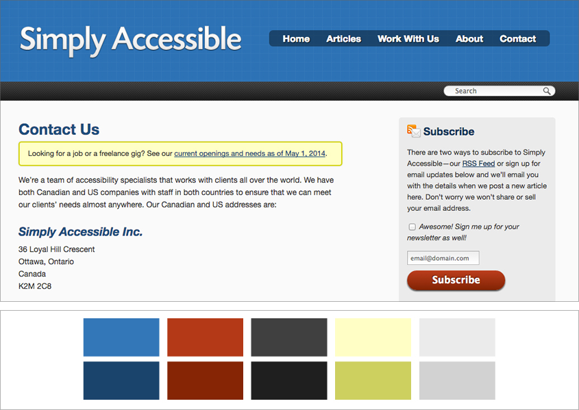 The old Simply Accessible website and colour palette.
After an audit to round up every colour used throughout the site, we dug in deep and played around with some ideas to bring some new life to this palette.
Choose effective colours
Whether you’re starting from scratch or evolving an existing brand, the first step to having an effective and legible palette begins with your colour choices. While we aren’t going to cover colour message and meaning in this article, it’s important to understand how to choose colours that can be used to create strong contrast—one of the most important ways to create hierarchy, focus, and legibility in your design.
There are a few methods of creating effective contrast.
Light and dark colours
The contrast that exists between light and dark colours is the most important attribute when creating effective contrast.
Try not to use colours that have a similar lightness next to each other in a design.
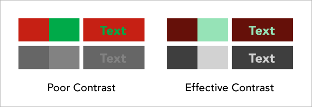
The red and green colours on the left share a similar lightness and don’t provide enough contrast on their own without making some adjustments. Removing colour and showing the relationship in greyscale reveals that the version on the right is much more effective.
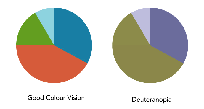
It’s important to remember that red and green colour pairs cause difficulty for the majority of colour-blind people, so they should be avoided wherever possible, especially when placed next to each other.
Complementary contrast
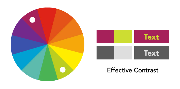
Effective contrast can also be achieved by choosing complementary colours (other than red and green), that are opposite each other on a colour wheel.
These colour pairs generally work better than choosing adjacent hues on the wheel.
Cool and warm contrast
Contrast also exists between cool and warm colours on the colour wheel.
Imagine a colour wheel divided into cool colours like blues, purples, and greens, and compare them to warm colours like reds, oranges and yellows.
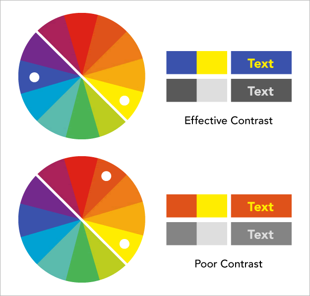
Choosing a dark shade of a cool colour, paired with a light tint of a warm colour will provide better contrast than two warm colours or two cool colours.
Develop colour concepts
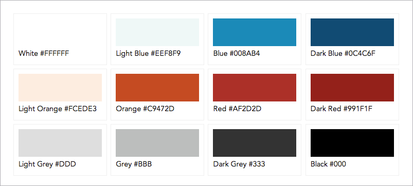
After much experimentation, we settled on a simple, two-colour palette of blue and orange, a cool-warm contrast colour scheme. We added swatches for call-to-action messaging in green, error messaging in red, and body copy and form fields in black and grey. Shades and tints of blue and orange were added to illustrations and other design elements for extra detail and interest.
 First stab at a new palette.
We introduced the new palette for the first time on an internal project to test the waters before going full steam ahead with the website. It gave us plenty of time to get a feel for the new design before sharing it with the public.
 Putting the test palette into practice with an internal report
It’s important to be open to changes in your palette as it might need to evolve throughout the design process. Don’t tell your client up front that this palette is set in stone. If you need to tweak the colour of a button later because of legibility issues, the last thing you want is your client pushing back because it’s different from what you promised.
As it happened, we did tweak the colours after the test run, and we even adjusted the logo—what looked great printed on paper looked a little too light on screens.
Consider how colours might be used
Don’t worry if you haven’t had the opportunity to test your palette in advance. As long as you have some well-considered options, you’ll be ready to think about how the colour might be used on the site or app.
Obviously, in such early stages it’s unlikely that you’re going to know every element or feature that will appear on the site at launch time, or even which design elements could be introduced to the site later down the road. There are, of course, plenty of safe places to start.
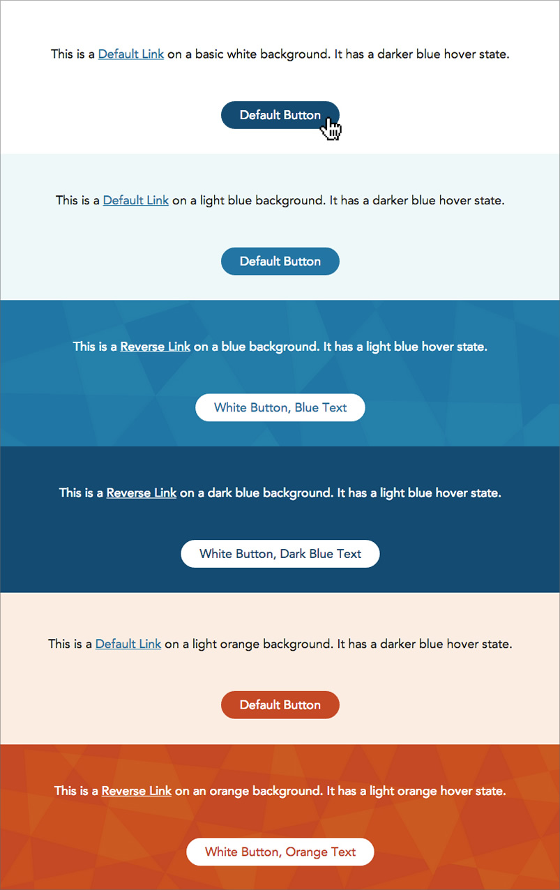
For Simply Accessible, I quickly mocked up these examples in Illustrator to get a handle on the elements of a website where contrast and legibility matter the most: text colours and background colours. While it’s less important to consider the contrast of decorative elements that don’t convey essential information, it’s important for a reader to be able to discern elements like button shapes and empty form fields.
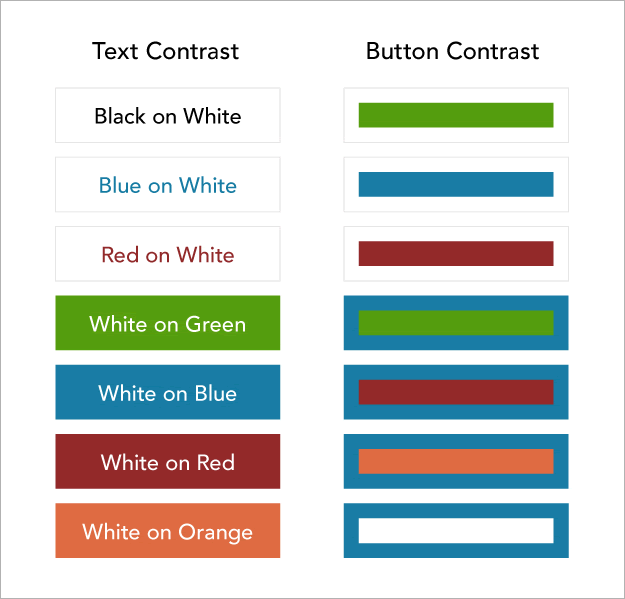 A basic list of possible colour combinations that I had in mind for the Simply Accessible website
Run initial tests
Once these elements were laid out, I manually plugged in the HTML colour code of each foreground colour and background colour on Lea Verou’s Contrast Checker. I added the results from each colour pair test to my document so we could see at a glance which colours needed adjustment or which colours wouldn’t work at all.
Note: Read more about colour accessibility and contrast requirements
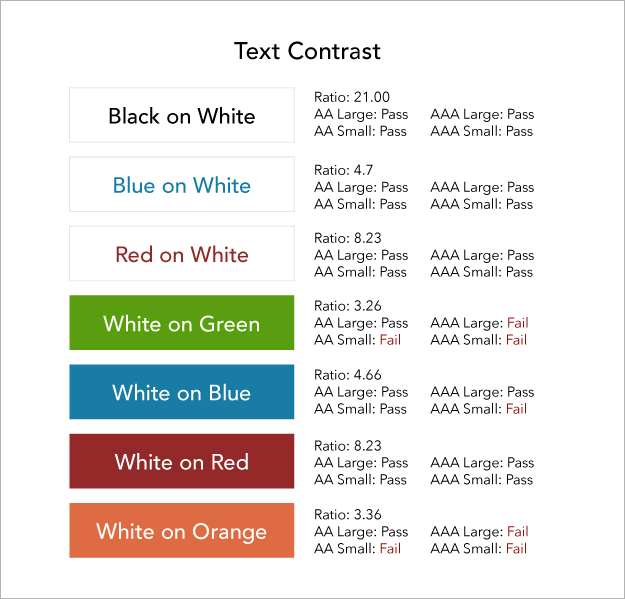
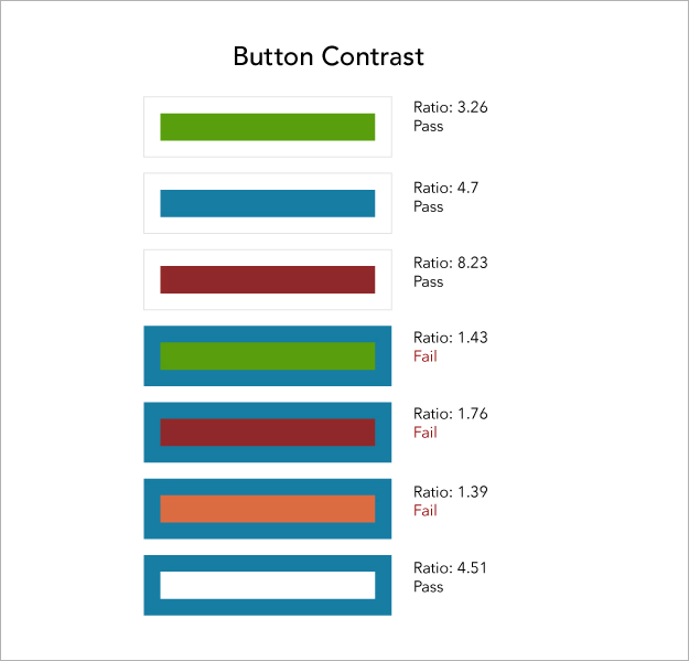
As you can see, a few problems were revealed in this test. To meet the minimum AA compliance, we needed to slightly darken the green, blue, and orange background colours for text—an easy fix. A more complicated problem was apparent with the button colours. I had envisioned some buttons appearing over a blue background, but the contrast ratios were well under 3:1. Although there isn’t a guide in WCAG for contrast requirements of two non-text elements, the ISO and ANSI standard for visible contrast is 3:1, which is what we decided to aim for.
We also checked our colour combinations in Color Oracle, an app that simulates the most extreme forms of colour blindness. It confirmed that coloured buttons over blue backgrounds was simply not going to work. The contrast was much too low, especially for the more common deuteranopia and protanopia-type deficiencies.
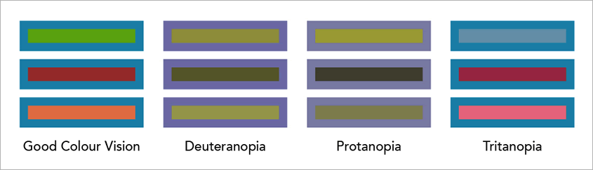 How our proposed colour pairs could look to people with three types of colour blindness
Make adjustments if necessary

As a solution, we opted to change all buttons to white when used over dark coloured backgrounds. In addition to increasing contrast, it also gave more consistency to the button design across the site instead of introducing a lot of unnecessary colour variants.
Putting more work into getting compliant contrast ratios at this stage will make the rest of implementation and testing a breeze. When you’ve got those ratios looking good, it’s time to move on to implementation.
Implement colours in style guide and prototype
Once I was happy with my contrast checks, I created a basic style guide and added all the colour values from my colour exploration files, introduced more tints and shades, and added patterned backgrounds. I created examples of every panel style we were planning to use on the site, with sample text, links, and buttons—all with working hover states. Not only does this make it easier for the developer, it allows you to check in the browser for any further contrast issues.
Run a final contrast check
During the final stages of testing and before launch, it’s a good idea to do one more check for colour accessibility to ensure nothing’s been lost in translation from design to code. Unless you’ve introduced massive changes to the design in the prototype, it should be fairly easy to fix any issues that arise, particularly if you’ve stayed on top of updating any revisions in the style guide.
One of the more well-known evaluation tools, WAVE, is web-based and will work in any browser, but I love using Chrome’s Accessibility Tools. Not only are they built right in to the Inspector, but they’ll work if your site is password-protected or private, too.
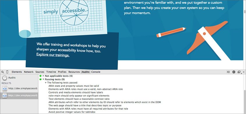 Chrome’s Accessibility Tools audit feature shows that there are no immediate issues with colour contrast in our prototype
The human touch
Finally, nothing beats a good round of user testing. Even evaluation tools have their flaws. Although they’re great at catching contrast errors for text and backgrounds, they aren’t going to be able to find errors in non-text elements, infographics, or objects placed next to each other where discernible contrast is important.
Our final palette, compared with our initial ideas, was quite different, but we’re proud to say it’s not just compliant, but shows Simply Accessible’s true personality. Who knows, it may not be final at all—there are so many opportunities down the road to explore and expand it further.

Accessibility should never be an afterthought in a project. It’s not as simple as adding alt text to images, or running your site through a compliance checker at the last minute and assuming that a pass means everything is okay. Considering how colour will be used during every stage of your project will help avoid massive problems before launch, or worse, launching with serious issues.
If you find yourself working on a personal project over the Christmas break, try integrating these checks into your workflow and make colour accessibility a part of your New Year’s resolutions.
About the author
Geri Coady is a colour-obsessed illustrator and designer from Newfoundland, Canada. She is a former Art Director at a Canadian advertising agency and is now pursuing her own clients through her website at hellogeri.com. Geri loves chatting about nerdy things on Twitter and has shared her thoughts in publications such as net magazine, The Pastry Box Project, and Digital Arts. She’s the author of the Pocket Guide to Colour Accessibility from Five Simple Steps, a sometimes-illustrator for A List Apart, and was voted Net Magazine’s Designer of the Year in 2014.
Brought to you by
Related articles
-
Accessibility Through Semantic HTML
Laura Kalbag takes us back to basics to make sure we consider accessibility when structuring our HTML. The Christmas tree needs to be standing firm before we drape it in lights and tinsel, and until you lot start doing it, we’re not going to stop preaching it.
-
Automating Your Accessibility Tests
Seren Davies reminds us that unlike Christmas, accessibility testing should not come but once a year with a look at how to apply automated testing. By configuring tests to run against each commit, you can ensure that your site’s accessibility compliance need not be left to chance.
-
Designing with Contrast
Mark Mitchell casts coarse salt upon the pale icy sheen of recent web design aesthetics to sound a warning that we may be on thin ice. The tension between low contrast tastes and high contrast needs is a story as old as the
<font>tag, and yet it bears frequent retelling. For snow has fallen snow on snow. -
Don’t Push Through the Pain
Carolyn Wood reminds us of what in recent years we’ve come to overlook, hunched as we are over laptop and tablet: our physical wellbeing. Sometimes, that tingle down your arm from shoulder to fingers isn’t Christmas magic.
-
Future Accessibility Guidelines—for People Who Can’t Wait to Read Them
Alan Dalton uses this, the International Day of Persons with Disabilities, to look back at where we’ve come from, to evaluate where we are, and to look forward to what’s coming next in the future of accessibility guidelines.
-
Inclusive Considerations When Restyling Form Controls
Scott O’Hara hogs the remote while he looks into the ever-present issue of custom form controls. We might brute-force an element to take on the styling we’re looking for, but will that interaction still make sense for all users? Let’s give the batteries a rub and find out.