Designing with Contrast
When an appetite for aesthetics over usability becomes the bellwether of user interface design, it’s time to reconsider who we’re designing for.
Over the last few years, we have questioned the signifiers that gave obvious meaning to the function of interface elements. Strong textures, deep shadows, gradients — imitations of physical objects — were discarded. And many, rightfully so. Our audiences are now more comfortable with an experience that feels native to the technology, so we should respond in kind.
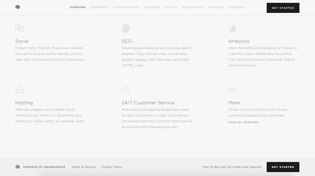
Yet not all of the changes have benefitted users. Our efforts to simplify brought with them a trend of ultra-minimalism where aesthetics have taken priority over legibility, accessibility and discoverability. The trend shows no sign of losing popularity — and it is harming our experience of digital content.

A thin veneer
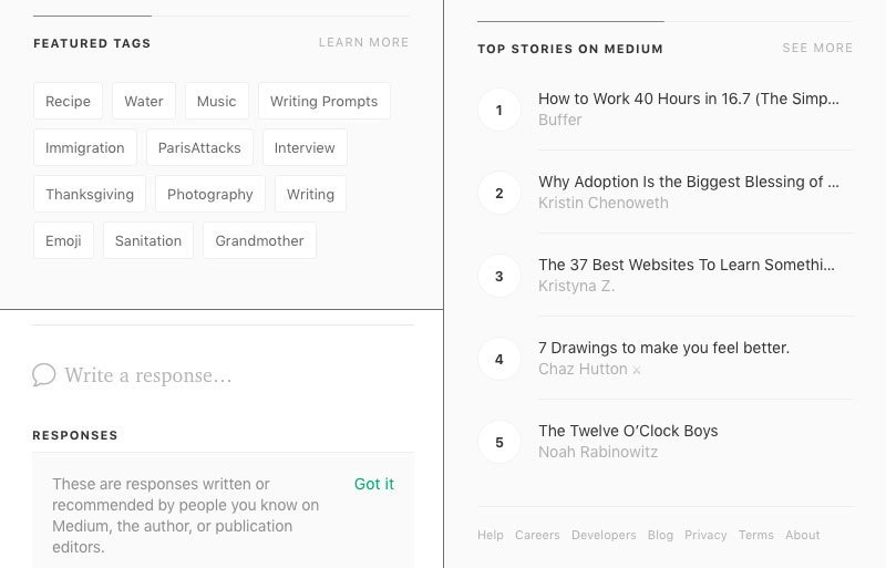
We are in a race to create the most subdued, understated interface. Visual contrast is out. In its place: the thinnest weights of a typeface and white text on bright color backgrounds. Headlines, text, borders, backgrounds, icons, form controls and inputs: all grey.
While we can look back over the last decade and see minimalist trends emerging on the web, I think we can place a fair share of the responsibility for the recent shift in priorities on Apple. The release of iOS 7 ushered in a radical change to its user interface. It paired mobile interaction design to the simplicity and eloquence of Apple’s marketing and product design. It was a catalyst. We took what we saw, copied and consumed the aesthetics like pick-and-mix.
New technology compounds this trend. Computer monitors and mobile devices are available with screens of unprecedented resolutions. Ultra-light type and subtle hues, difficult to view on older screens, are more legible on these devices. It would be disingenuous to say that designers have always worked on machines representative of their audience’s circumstances, but the gap has never been as large as it is now. We are running the risk of designing VIP lounges where the cost of entry is a Mac with a Retina display.
Minimalist expectations
Like progressive enhancement in an age of JavaScript, many good and sensible accessibility practices are being overlooked or ignored. We’re driving unilateral design decisions that threaten accessibility. We’ve approached every problem with the same solution, grasping on to the integrity of beauty, focusing on expression over users’ needs and content.
Someone once suggested to me that a client’s website should include two states. The first state would be the ideal experience, with low color contrast, light font weights and no differentiation between links and text. It would be the default. The second state would be presented in whatever way was necessary to meet accessibility standards. Users would have to opt out of the default state via a toggle if it wasn’t meeting their needs. A sort of first-class, upper deck cabin equivalent of graceful degradation. That this would divide the user base was irrelevant, as the aesthetics of the brand were absolute.
It may seem like an unusual anecdote, but it isn’t uncommon to see this thinking in our industry. Again and again, we place the burden of responsibility to participate in a usable experience on others. We view accessibility and good design as mutually exclusive. Taking for granted what users will tolerate is usually the forte of monopolistic services, but increasingly we apply the same arrogance to our new products and services.

Imitation without representation
All of us are influenced in one way or another by one another’s work. We are consciously and unconsciously affected by the visual and audible activity around us. This is important and unavoidable. We do not produce work in a vacuum. We respond to technology and culture. We channel language and geography. We absorb the sights and sounds of film, television, news. To mimic and copy is part and parcel of creating something an audience of many can comprehend and respond to. Our clients often look first to their competitors’ products to understand their success.
However, problems arise when we focus on style without context; form without function; mimicry as method. Copied and reused without any of the ethos of the original, stripped of deliberate and informed decision-making, the so-called look and feel becomes nothing more than paint on an empty facade.
The typographic and color choices so in vogue today with our popular digital products and services have little in common with the brands they are meant to represent.

For want of good design, the message was lost
The question to ask is: does the interface truly reflect the product? Is it an accurate characterization of the brand and organizational values? Does the delivery of the content match the tone of voice?
The answer is: probably not. Because every organization, every app or service, is unique. Each with its own personality, its own values and wonderful quirks. Design is communication. We should do everything in our role as professionals to use design to give voice to the message. Our job is to clearly communicate the benefits of a service and unreservedly allow access to information and content. To do otherwise, by obscuring with fashionable styles and elusive information architecture, does a great disservice to the people who chose to engage with and trust our products.
We can achieve hierarchy and visual rhythm without resorting to extreme reduction. We can craft a beautiful experience with fine detail and curiosity while meeting fundamental standards of accessibility (and strive to meet many more).
Standards of excellence
It isn’t always comfortable to step back and objectively question our design choices. We get lost in the flow of our work, using patterns and preferences we’ve tried and tested before. That our decisions often seem like second nature is a gift of experience, but sometimes it prevents us from finding our blind spots.
I was first caught out by my own biases a few years ago, when designing an interface for the Bank of England. After deciding on the colors for the typography and interactive elements, I learned that the site had to meet AAA accessibility standards. My choices quickly fell apart. It was eye-opening. I had to start again with restrictions and use size, weight and placement instead to construct the visual hierarchy.
Even now, I make mistakes. On a recent project, I used large photographs on an organization’s website to promote their products. Knowing that our team had control over the art direction, I felt confident that we could compose the photographs to work with text overlays. Despite our best effort, the cropped images weren’t always consistent, undermining the text’s legibility. If I had the chance to do it again, I would separate the text and image.
So, what practical things can we consider to give our users the experience they deserve?
Put guidelines in place
- Think about your brand values. Write down keywords and use them as a framework when choosing a typeface. Explore colors that convey the organization’s personality and emotional appeal.
- Define a color palette that is web-ready and meets minimum accessibility standards. Note which colors are suitable for use with text. Only very dark hues of grey are consistently legible so keep them for non-essential text (for example, as placeholders in form inputs).
- Find which background colors you can safely use with white text, and consider integrating contrast checks into your workflow.
- Use roman and medium weights for body copy. Reserve lighter weights of a typeface for very large text. Thin fonts are usually the first to break down because of aliasing differences across platforms and screens.
- Check that the size, leading and length of your type is always legible and readable. Define lower and upper limits. Small text is best left for captions and words in uppercase.
- Avoid overlaying text on images unless it’s guaranteed to be legible. If it’s necessary to optimize space in the layout, give the text a container. Scrims aren’t always reliable: the text will inevitably overlap a part of the photograph without a contrasting ground.
Test your work
- Review legibility and contrast on different devices. It’s just as important as testing the layout of a responsive website. If you have a local device lab, pay it a visit.
- Find a computer monitor near a window when the sun is shining. Step outside the studio and try to read your content on a mobile device with different brightness levels.
- Ask your friends and family what they use at home and at work. It’s one way of making sure your feedback isn’t always coming from a closed loop.
Push your limits
- You define what the user sees. If you’ve inherited brand guidelines, question them. If you don’t agree with the choices, make the case for why they should change.
- Experiment with size, weight and color to find contrast. Objects with low contrast appear similar to one another and undermine the visual hierarchy. Weak relationships between figure and ground diminish visual interest. A balanced level of contrast removes ambiguity and creates focal points. It captures and holds our attention.
- If you’re lost for inspiration, look to graphic design in print. We have a wealth of history, full of examples that excel in using contrast to establish visual hierarchy.
- Embrace limitations. Use boundaries as an opportunity to explore possibilities.
More than just a facade
Designing with standards encourages legibility and helps to define a strong visual hierarchy. Design without exclusion (through neither negligence or intent) gets around discussions of demographics, speaks to a larger audience and makes good business sense. Following the latest trends not only weakens usability but also hinders a cohesive and distinctive brand.
Users will make means when they need to, by increasing browser font sizes or enabling system features for accessibility. But we can do our part to take as much of that burden off of the user and ask less of those who need it most.
In architecture, it isn’t buildings that mimic what is fashionable that stand the test of time. Nor do we admire buildings that tack on separate, poorly constructed extensions to meet a bare minimum of safety regulations. We admire architecture that offers well-considered, remarkable, usable spaces with universal access.
Perhaps we can take inspiration from these spaces. Let’s give our buildings a bold voice and make sure the doors are open to everyone.
About the author
Mark Mitchell is a freelance digital designer & front-end developer in London. Find him on Twitter at @withoutnations and online at withoutnations.com.


