Beyond the Style Guide

Much like baking a Christmas cake, designing for the web involves creating an experience in layers. Starting with a solid base that provides the core experience (the fruit cake), we can add further layers, each adding refinement (the marzipan) and delight (the icing).
Don’t worry, this isn’t a misplaced cake recipe, but an evaluation of modular design and the role style guides can play in acknowledging these different concerns, be they presentational or programmatic.
The auteur’s style guide
Although trained as a graphic designer, it was only when I encountered the immediacy of the web that I felt truly empowered as a designer. Given a desire to control every aspect of the resulting experience, I slowly adopted the role of an auteur, exploring every part of the web stack: front-end to back-end, and everything in between. A few years ago, I dreaded using the command line. Today, the terminal is a permanent feature in my Dock.
In straddling the realms of graphic design and programming, it’s the point at which they meet that I find most fascinating, with each dicipline valuing the creation of effective systems, be they for communication or code efficiency. Front-end style guides live at this intersection, demonstrating both the modularity of code and the application of visual design.
Painting by numbers
In our rush to build modular systems, design frameworks have grown in popularity. While enabling quick assembly, these come at the cost of originality and creative expression – perhaps one reason why we’re seeing the homogenisation of web design.
In editorial design, layouts should accentuate content and present it in an engaging manner. Yet on the web we see a practice that seeks templated predictability. In ‘Design Machines’ Travis Gertz argued that (emphasis added):
Design systems still feel like a novelty in screen-based design. We nerd out over grid systems and modular scales and obsess over style guides and pattern libraries. We’re pretty good at using them to build repeatable components and site-wide standards, but that’s sort of where it ends. […] But to stop there is to ignore the true purpose and potential of a design system.
Unless we consider how interface patterns fully embrace the design systems they should be built upon, style guides may exacerbate this paint-by-numbers approach, encouraging conformance and suppressing creativity.
Anatomy of a button
Let’s take a look at that most canonical of components, the button, and consider what we might wish to document and demonstrate in a style guide.

Content
The most variable aspect of any component. Content guidelines will exert the most influence here, dictating things like tone of voice (whether we should we use stiff, formal language like ‘Submit form’, or adopt a more friendly tone, perhaps ‘Send us your message’) and appropriate language. For an internationalised interface, this may also impact word length and text direction or orientation.
Structure
HTML provides a limited vocabulary which we can use to structure content and add meaning. For interactive elements, the choice of element can also affect its behaviour, such as whether a button submits form data or links to another page:
<button type="submit">Button text</button><a href="/index.html">Button text</a>Note: One of the reasons I prefer to use <button> instead of <input type=“button”>, besides allowing the inclusion of content other than text, is that it has a markup structure similar to links, therefore keeping implementation differences to a minimum.
We should also think about each component within the broader scope of our particular product. For this we can employ a further vocabulary, which can be expressed by adding values to the class attribute. For a newspaper, we might use names like lede, standfirst and headline, while a social media application might see us reach for words like stream, action or avatar.
Presentation
The appearance of a component can never be considered in isolation. Informed by its relationship to other elements, style guides may document different stylistic variations of a component, even if the underlying function remains unchanged: primary and secondary button styles, for example.
Behaviour
A component can exhibit various states: blank, loading, partial, error and ideal, and a style guide should reflect that. Our button component is relatively simple, yet even here we need to consider hover, focused, active and disabled states.
Transcending layers
This overview reinforces Ethan’s note from earlier in this series:
I’ve found that thinking about my design as existing in broad experience tiers – in layers – is one of the best ways of designing for the modern web.
While it’s tempting to describe a component as series of layers, certain aspects will transcend several of these. The accessibility of a component, for example, may influence the choice of language, the legibility of text, colour contrast and which affordances are provided in different states.
Visual design language: documenting the missing piece
Even given this small, self-contained component, we can see several concerns at play, and in reviewing our button it seems we have most things covered. However, a few questions remain unanswered. Why does it have a blue background? Why are the borders 2px thick, with a radius of 4px? Why are we using that font, at that size and with that weight?
These questions can be answered by our visual design language. More than a set of type choices and colour palettes, a design language can dicate common measures, ratios and the resulting grid(s) these influence. Ideally governed by a set of broader design principles, it can also inform an illustration style, the type of photography sourced or commissioned, and the behaviour of any animations.
Whereas a style guide ensures conformity, having it underpinned by an effective design language will allow for flexibility; only by knowing the rules can you know how to break them!
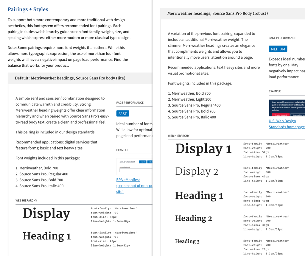
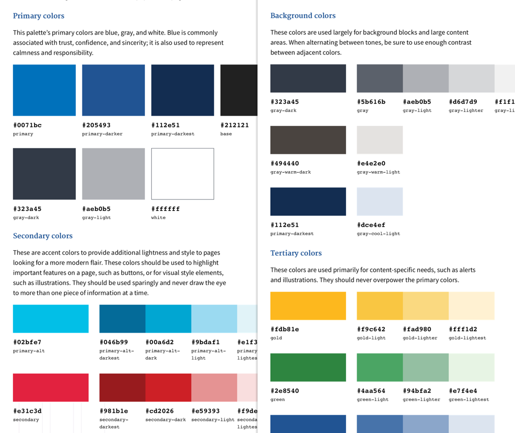
For a style guide to thoroughly articulate a visual design system, the spectrum of choices it allows for should be acknowledged. A fantastic example of this can be found in the US Web Design Standards. By virtue of being a set of standards designed to apply to a number of different sites, this guide offers a range of type pairings (that take into account performance considerations) and provides primary, secondary and tertiary palette relationships, with shades and tones thereof:
A visual language in code form
Properly documenting our design language in a style guide is a good start, yet even better if it can be expressed in code. This is where CSS preprocessors become a powerful ally.
In Sass, methods like mixins and maps can help us represent relationships between values. Variables (and CSS variables) extend the vocabulary provided natively by CSS, meaning we can describe patterns in terms of our own visual language. These tools effectively become an interface to our design system. Furthermore, they help maintain a separation of concerns, with visual presentation remaining where it should be: in our style sheets.
Take this simple example, an article summary on a website counting down the best Christmas movies:
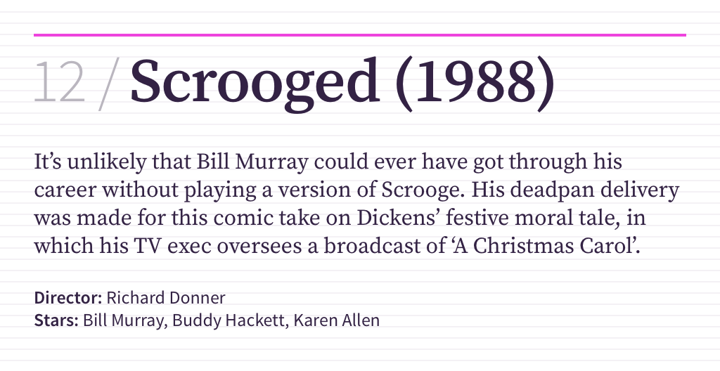
Our markup is as follows, using appropriate semantic HTML elements and incorporating the vocabulary from our collection of design patterns (expressed using the BEM methodology):
<article class="summary">
    <h1 class="summary__title">
        <a href="scrooged.html">
            <span class="summary__position">12</span>
            Scrooged (1988)
        </a>
    </h1>

    <div class="summary__body">
        <p>It’s unlikely that Bill Murray could ever have got through his career without playing a version of Scrooge…</p>
    </div>

    <footer class="summary__meta">
        <strong>Director:</strong> Richard Donner<br/>
        <strong>Stars:</strong> Bill Murray, Buddy Hackett, Karen Allen
    </footer>
</article>
We can then describe the presentation of this HTML by using Sass maps to define our palettes, mixins to include predefined font metrics, and variables to recall common measurements:
.summary {
margin-bottom: ($baseline * 4)
}
.summary__title {
@include font-family(display-serif);
@include font-size(title);
color: palette(neutral, dark);
margin-bottom: ($baseline * 4);
border-top: $rule-height solid palette(primary, purple);
padding-top: ($baseline * 2);
}
.summary__position {
@include font-family(display-sans, 300);
color: palette(neutral, mid);
}
.summary__body {
@include font-family(text-serif);
@include font-size(body);
margin-bottom: ($baseline * 2);
}
.summary__meta {
@include font-family(text-sans);
@include font-size(caption);
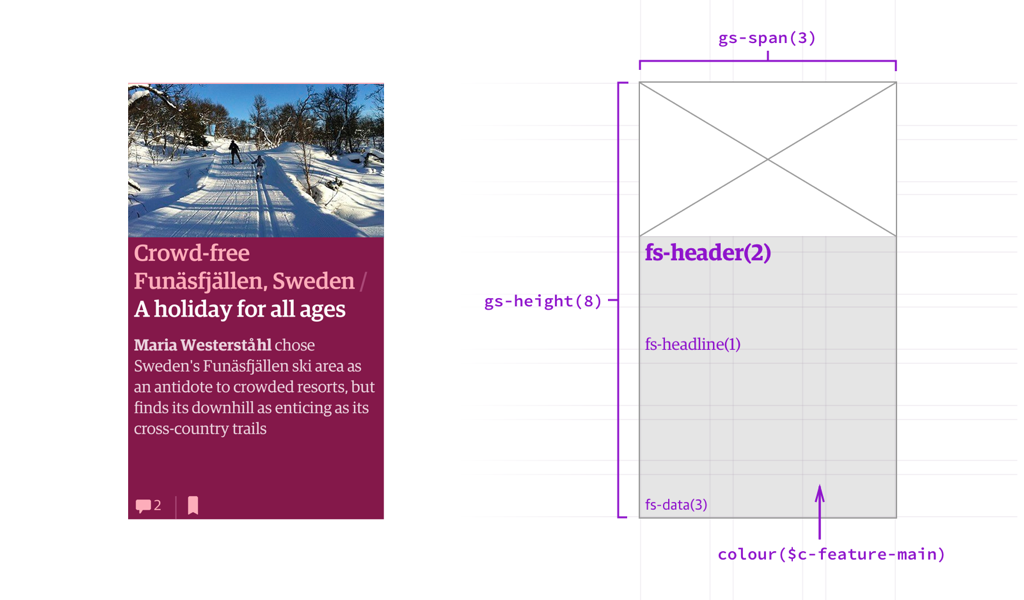
}Of course, this is a simplistic example for the purposes of demonstration. However, such thinking was employed at a much larger scale at the Guardian. Using a set of Sass components, complex patterns could be described using a language familar to everyone on the product team, be they a designer, developer or product owner:
Unlocking possibility
Alongside tools like preprocessors, newer CSS layout modules like flexbox and grid layout mean the friction we’ve long been accustomed to when creating layouts on the web is no longer present, and the full separation of presentation from markup is now possible. Now is the perfect time for graphic designers to advocate design systems that these developments empower, and ensure they’re fully represented in both documentation and code. That way, together, we can build systems that allow for greater visual expression. After all, there’s more than one way to bake a Christmas cake.
About the author
Brought to you by
Related articles
-
Animating Your Brand
Donovan Hutchinson stamps his snow-caked boots, unwinds his scarf and eases [See what we did there? Did you?] us into December with some tips and resources on integrating animation into our website style guides. A warm animated welcome to 24 ways 2015!
-
Design Systems and CSS Grid
Stuart Robson tackles the thorny issue of integrating modern CSS Grid layouts into an existing design system, but in doing so reaps the benefits of leaner, more easily maintainable markup. It goes to show that with careful planning, there’s no reason old and new CSS layout methods cannot meet under the mistletoe.
-
Four Ways Design Systems Can Promote Accessibility – and What They Can’t Do
Amy Hupe prepares a four bird roast of tasty treats so we can learn how the needs of many different types of users can be served through careful implementation of components within a design system.
-
Refactoring Your Way to a Design System
Mina Markham brings a ray of hope that flitters in the sky with advice on refactoring an existing codebase into a design system. Greenfield projects are rare, so can we move forward with legacy styles in place? All across the land dawns a brand new morn, this comes to pass when a new design system is born.
-
There Is No Design System
Jina Anne silences the night to talk about how we talk about Design Systems. Can the language we use impact the effectiveness of the solution? Fear not, if mighty dread has seized your troubled mind. Design systems of great joy we bring to you and all mankind.
-
Design Systems and Hybrids
Jina Anne circles back to carefully look again at the popularity of design systems and how they impact the different roles within our teams. A good system enables all the reindeer to pull forward in a cohesive motion, yet has space for individuals with very shiny noses.