Grid, Flexbox, Box Alignment: Our New System for Layout

Three years ago for 24 ways 2012, I wrote an article about a new CSS layout method I was excited about. A specification had emerged, developed by people from the Internet Explorer team, bringing us a proper grid system for the web. In 2015, that Internet Explorer implementation is still the only public implementation of CSS grid layout. However, in 2016 we should be seeing it in a new improved form ready for our use in browsers.
Grid layout has developed hidden behind a flag in Blink, and in nightly builds of WebKit and, latterly, Firefox. By being developed in this way, breaking changes could be safely made to the specification as no one was relying on the experimental implementations in production work.
Another new layout method has emerged over the past few years in a more public and perhaps more painful way. Shipped prefixed in browsers, The flexible box layout module (flexbox) was far too tempting for developers not to use on production sites. Therefore, as changes were made to the specification, we found ourselves with three different flexboxes, and browser implementations that did not match one another in completeness or in the version of specified features they supported.
Owing to the different ways these modules have come into being, when I present on grid layout it is often the very first time someone has heard of the specification. A question I keep being asked is whether CSS grid layout and flexbox are competing layout systems, as though it might be possible to back the loser in a CSS layout competition. The reality, however, is that these two methods will sit together as one system for doing layout on the web, each method playing to certain strengths and serving particular layout tasks.
If there is to be a loser in the battle of the layouts, my hope is that it will be the layout frameworks that tie our design to our markup. They have been a necessary placeholder while we waited for a true web layout system, but I believe that in a few years time we’ll be easily able to date a website to circa 2015 by seeing <div class="row"> or <div class="col-md-3"> in the markup.
In this article, I’m going to take a look at the common features of our new layout systems, along with a couple of examples which serve to highlight the differences between them.
To see the grid layout examples you will need to enable grid in your browser. The easiest thing to do is to enable the experimental web platform features flag in Chrome. Details of current browser support can be found here.
Relationship
Items only become flex or grid items if they are a direct child of the element that has display:flex, display:grid or display:inline-grid applied. Those direct children then understand themselves in the context of the complete layout. This makes many things possible. It’s the lack of relationship between elements that makes our existing layout methods difficult to use. If we float two columns, left and right, we have no way to tell the shorter column to extend to the height of the taller one. We have expended a lot of effort trying to figure out the best way to make full-height columns work, using techniques that were never really designed for page layout.
At a very simple level, the relationship between elements means that we can easily achieve full-height columns. In flexbox:
See the Pen Flexbox equal height columns by rachelandrew (@rachelandrew) on CodePen.
And in grid layout (requires a CSS grid-supporting browser):
See the Pen Grid equal height columns by rachelandrew (@rachelandrew) on CodePen.
Alignment
Full-height columns rely on our flex and grid items understanding themselves as part of an overall layout. They also draw on a third new specification: the box alignment module. If vertical centring is a gift you’d like to have under your tree this Christmas, then this is the box you’ll want to unwrap first.
The box alignment module takes the alignment and space distribution properties from flexbox and applies them to other layout methods. That includes grid layout, but also other layout methods. Once implemented in browsers, this specification will give us true vertical centring of all the things.
Our examples above achieved full-height columns because the default value of align-items is stretch. The value ensured our columns stretched to the height of the tallest. If we want to use our new vertical centring abilities on all items, we would set align-items:center on the container. To align one flex or grid item, apply the align-self property.
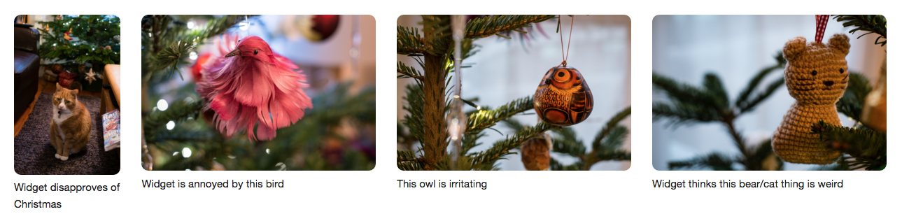
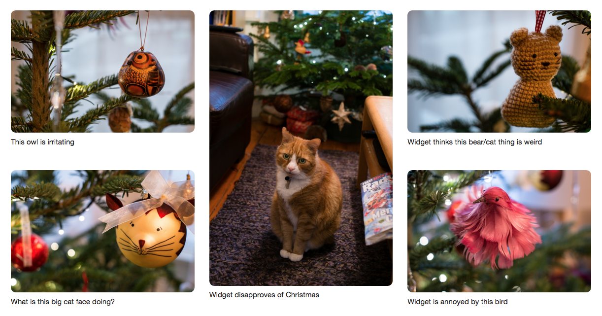
The examples below demonstrate these alignment properties in both grid layout and flexbox. The portrait image of Widget the cat is aligned with the default stretch. The other three images are aligned using different values of align-self.
Take a look at an example in flexbox:
See the Pen Flexbox alignment by rachelandrew (@rachelandrew) on CodePen.
And also in grid layout (requires a CSS grid-supporting browser):
See the Pen Grid alignment by rachelandrew (@rachelandrew) on CodePen.
Fluid grids
A cornerstone of responsive design is the concept of fluid grids.
“[…]every aspect of the grid—and the elements laid upon it—can be expressed as a proportion relative to its container.”
—Ethan Marcotte, “Fluid Grids”
The method outlined by Marcotte is to divide the target width by the context, then use that value as a percentage value for the width property on our element.
h1 {
  margin-left: 14.575%; /* 144px / 988px = 0.14575 */
  width: 70.85%; /* 700px / 988px = 0.7085 */
}
In more recent years, we’ve been able to use calc() to simplify this (at least, for those of us able to drop support for Internet Explorer 8). However, flexbox and grid layout make fluid grids simple.
The most basic of flexbox demos shows this fluidity in action. The justify-content property – another property defined in the box alignment module – can be used to create an equal amount of space between or around items. As the available width increases, more space is assigned in proportion.
In this demo, the list items are flex items due to display:flex being added to the ul. I have given them a maximum width of 250 pixels. Any remaining space is distributed equally between the items as the justify-content property has a value of space-between.
See the Pen Flexbox: justify-content by rachelandrew (@rachelandrew) on CodePen.
For true fluid grid-like behaviour, your new flexible friends are flex-grow and flex-shrink. These properties give us the ability to assign space in proportion.
The flexbox flex property is a shorthand for:
flex-growflex-shrinkflex-basis
The flex-basis property sets the default width for an item. If flex-grow is set to 0, then the item will not grow larger than the flex-basis value; if flex-shrink is 0, the item will not shrink smaller than the flex-basis value.
flex: 1 1 200px: a flexible box that can grow and shrink from a 200px basis.flex: 0 0 200px: a box that will be 200px and cannot grow or shrink.flex: 1 0 200px: a box that can grow bigger than 200px, but not shrink smaller.
In this example, I have a set of boxes that can all grow and shrink equally from a 100 pixel basis.
See the Pen Flexbox: flex-grow by rachelandrew (@rachelandrew) on CodePen.
What I would like to happen is for the first element, containing a portrait image, to take up less width than the landscape images, thus keeping it more in proportion. I can do this by changing the flex-grow value. By giving all the items a value of 1, they all gain an equal amount of the available space after the 100 pixel basis has been worked out.
If I give them all a value of 3 and the first box a value of 1, the other boxes will be assigned three parts of the available space while box 1 is assigned only one part. You can see what happens in this demo:
See the Pen Flexbox: flex-grow by rachelandrew (@rachelandrew) on CodePen.
Once you understand flex-grow, you should easily be able to grasp how the new fraction unit (fr, defined in the CSS grid layout specification) works. Like flex-grow, this unit allows us to assign available space in proportion. In this case, we assign the space when defining our track sizes.
In this demo (which requires a CSS grid-supporting browser), I create a four-column grid using the fraction unit to define my track sizes. The first track is 1fr in width, and the others 2fr.
grid-template-columns: 1fr 2fr 2fr 2fr;
See the Pen Grid fraction units by rachelandrew (@rachelandrew) on CodePen.
Separation of concerns
My younger self petitioned my peers to stop using tables for layout and to move to CSS. One of the rallying cries of that movement was the concept of separating our source and content from how they were displayed. It was something of a failed promise given the tools we had available: the display leaked into the markup with the need for redundant elements to cope with browser bugs, or visual techniques that just could not be achieved without supporting markup.
Browsers have improved, but even now we can find ourselves compromising the ideal document structure so we can get the layout we want at various breakpoints. In some ways, the situation has returned to tables-for-layout days. Many of the current grid frameworks rely on describing our layout directly in the markup. We add divs for rows, and classes to describe the number of desired columns. We nest these constructions of divs inside one another.
Here is a snippet from the Bootstrap grid examples – two columns with two nested columns:
<div class="row">
  <div class="col-md-8">
    .col-md-8
    <div class="row">
      <div class="col-md-6">
        .col-md-6
      </div>
      <div class="col-md-6">
        .col-md-6
      </div>
    </div>
  </div>
  <div class="col-md-4">
    .col-md-4
  </div>
</div>
Not a million miles away from something I might have written in 1999.
<table>
  <tr>
    <td class="col-md-8">
      .col-md-8
      <table>
        <tr>
          <td class="col-md-6">
            .col-md-6
          </td>
          <td class="col-md-6">
            .col-md-6
          </td>
        </tr>
      </table>
    </td>
    <td class="col-md-4">
      .col-md-4
    </td>
  </tr>
</table>
Grid and flexbox layouts do not need to be described in markup. The layout description happens entirely in the CSS, meaning that elements can be moved around from within the presentation layer.
Flexbox gives us the ability to reverse the flow of elements, but also to set the order of elements with the order property. This is demonstrated here, where Widget the cat is in position 1 in the source, but I have used the order property to display him after the things that are currently unimpressive to him.
See the Pen Flexbox: order by rachelandrew (@rachelandrew) on CodePen.
Grid layout takes this a step further. Where flexbox lets us set the order of items in a single dimension, grid layout gives us the ability to position things in two dimensions: both rows and columns. Defined in the CSS, this positioning can be changed at any breakpoint without needing additional markup. Compare the source order with the display order in this example (requires a CSS grid-supporting browser):
See the Pen Grid positioning in two dimensions by rachelandrew (@rachelandrew) on CodePen.
As these demos show, a straightforward way to decide if you should use grid layout or flexbox is whether you want to position items in one dimension or two. If two, you want grid layout.
A note on accessibility and reordering
The issues arising from this powerful ability to change the way items are ordered visually from how they appear in the source have been the subject of much discussion. The current flexbox editor’s draft states
“Authors must use
orderonly for visual, not logical, reordering of content. Style sheets that useorderto perform logical reordering are non-conforming.”
—CSS Flexible Box Layout Module Level 1, Editor’s Draft (3 December 2015)
This is to ensure that non-visual user agents (a screen reader, for example) can rely on the document source order as being correct. Take care when reordering that you do so from the basis of a sound document that makes sense in terms of source order. Avoid using visual order to convey meaning.
Automatic content placement with rules
Having control over the order of items, or placing items on a predefined grid, is nice. However, we can often do that already with one method or another and we have frameworks and tools to help us. Tools such as Susy mean we can even get away from stuffing our markup full of grid classes. However, our new layout methods give us some interesting new possibilities.
Something that is useful to be able to do when dealing with content coming out of a CMS or being pulled from some other source, is to define a bunch of rules and then say, “Display this content, using these rules.”
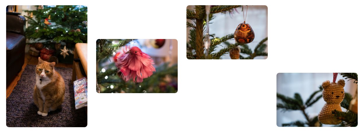
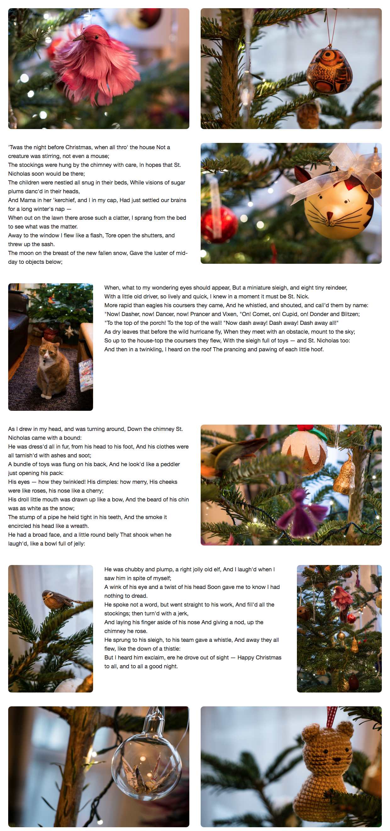
As an example of this, I will leave you with a Christmas poem displayed in a document alongside Widget the cat and some of the decorations that are bringing him no Christmas cheer whatsoever.
The poem is displayed first in the source as a set of paragraphs. I’ve added a class identifying each of the four paragraphs but they are displayed in the source as one text. Below that are all my images, some landscape and some portrait; I’ve added a class of landscape to the landscape ones.
The mobile-first grid is a single column and I use line-based placement to explicitly position my poem paragraphs. The grid layout auto-placement rules then take over and place the images into the empty cells left in the grid.
At wider screen widths, I declare a four-track grid, and position my poem around the grid, keeping it in a readable order.
I also add rules to my landscape class, stating that these items should span two tracks. Once again the grid layout auto-placement rules position the rest of my images without my needing to position them. You will see that grid layout takes items out of source order to fill gaps in the grid. It does this because I have set the property grid-auto-flow to dense. The default is sparse meaning that grid will not attempt this backfilling behaviour.
Take a look and play around with the full demo (requires a CSS grid layout-supporting browser):
See the Pen Grid auto-flow with rules by rachelandrew (@rachelandrew) on CodePen.
My wish for 2016
I really hope that in 2016, we will see CSS grid layout finally emerge from behind browser flags, so that we can start to use these features in production — that we can start to move away from using the wrong tools for the job.
However, I also hope that we’ll see developers fully embracing these tools as the new system that they are. I want to see people exploring the possibilities they give us, rather than trying to get them to behave like the grid systems of 2015. As you discover these new modules, treat them as the new paradigm that they are, get creative with them. And, as you find the edges of possibility with them, take that feedback to the CSS Working Group. Help improve the layout systems that will shape the look of the future web.
Some further reading
- I maintain a site of grid layout examples and resources at Grid by Example.
- The three CSS specifications I’ve discussed can be found as editor’s drafts: CSS grid, flexbox, box alignment.
- I wrote about the last three years of my interest in CSS grid layout, which gives something of a history of the specification.
- More examples of box alignment and grid layout.
- My presentation at Fronteers earlier this year, in which I explain more about these concepts.
About the author
Rachel Andrew is a Director of edgeofmyseat.com, a UK web development consultancy and creators of the small content management system, Perch; a W3C Invited Expert to the CSS Working Group; and Editor in Chief of Smashing Magazine. She is the author of a number of books including The New CSS Layout for A Book Apart and a Google Developer Expert for Web Technologies.
She curates a popular email newsletter on CSS Layout, and is passing on her layout knowledge over at her CSS Layout Workshop.
When not writing about business and technology on her blog at rachelandrew.co.uk or speaking at conferences, you will usually find Rachel running up and down one of the giant hills in Bristol, or attempting to land a small aeroplane while training for her Pilot’s license.
Brought to you by
Related articles
-
A History of CSS Through Fifteen Years of 24 ways
Rachel Andrew guides us through a tour of the last fifteen years in CSS layout, as manifested in articles here on 24 ways. From the days when Internet Explorer 6 was de rigueur, right up to the modern age of evergreen browsers, the only thing you can be sure of is that the web never stands still for long.
-
A Modern Typographic Scale
Rob Weychert reaches for the top notes to sing us a song of typographic scale. A little attention to scale and to the mathematics will help you to hit a high note with your designs this Christmas and beyond.
-
Beautiful Scrolling Experiences – Without Libraries
Michelle Barker appears as one of a heavenly host, coming forth with scroll in hand to pronounce an end to janky scrolljacking! Unto us a new specification is born, in the city of TimBL, and its name shall be called Scroll Snap.
-
Cascading Web Design with Feature Queries
Chen Hui Jing pulls off the dust covers, swings open the storm shutters and lets the winter light fall on the subject of CSS feature queries. The chestnuts may not yet be roasting, and the halls may be still be undecked, but pull up a chair and settle down. It’s Christmas.
-
Clip Paths Know No Bounds
Dan Wilson throws some Christmas shapes and gives us a run down of different ways to use CSS polygon clip paths to create interesting a flexible shapes with less code that you might have thought. It may be the time of year to follow a star, but was the star plotted with five or ten points?
-
Flexible Captioned Slanted Images
Eric Meyer gift wraps the most awkwardly shaped of boxes using nothing but CSS, HTML and a little curl of ribbon. No matter how well you plan and how much paper you have at your disposal, sometimes you just need to slant the gift to the side.


