Giving Content Priority with CSS3 Grid Layout

Browser support for many of the modules that are part of CSS3 have enabled us to use CSS for many of the things we used to have to use images for. The rise of mobile browsers and the concept of responsive web design has given us a whole new way of looking at design for the web. However, when it comes to layout, we haven’t moved very far at all. We have talked for years about separating our content and source order from the presentation of that content, yet most of us have had to make decisions on source order in order to get a certain visual layout.
Owing to some interesting specifications making their way through the W3C process at the moment, though, there is hope of change on the horizon. In this article I’m going to look at one CSS module, the CSS3 grid layout module, that enables us to define a grid and place elements on to it. This article comprises a practical demonstration of the basics of grid layout, and also a discussion of one way in which we can start thinking of content in a more adaptive way.
Before we get started, it is important to note that, at the time of writing, these examples work only in Internet Explorer 10. CSS3 grid layout is a module created by Microsoft, and implemented using the -ms prefix in IE10. My examples will all use the -ms prefix, and not include other prefixes simply because this is such an early stage specification, and by the time there are implementations in other browsers there may be inconsistencies. The implementation I describe today may well change, but is also there for your feedback.
If you don’t have access to IE10, then one way to view and test these examples is by signing up for an account with Browserstack – the free trial would give you time to have a look. I have also included screenshots of all relevant stages in creating the examples.
What is CSS3 grid layout?
CSS3 grid layout aims to let developers divide up a design into a grid and place content on to that grid. Rather than trying to fabricate a grid from floats, you can declare an actual grid on a container element and then use that to position the elements inside. Most importantly, the source order of those elements does not matter.
Declaring a grid
We declare a grid using a new value for the display property: display: grid. As we are using the IE10 implementation here, we need to prefix that value: display: -ms-grid;.
Once we have declared our grid, we set up the columns and rows using the grid-columns and grid-rows properties.
.wrapper {
    display: -ms-grid;
    -ms-grid-columns: 200px 20px auto 20px 200px;
    -ms-grid-rows: auto 1fr;
}
In the above example, I have declared a grid on the .wrapper element. I have used the grid-columns property to create a grid with a 200 pixel-wide column, a 20 pixel gutter, a flexible width auto column that will stretch to fill the available space, another 20 pixel-wide gutter and a final 200 pixel sidebar: a flexible width layout with two fixed width sidebars. Using the grid-rows property I have created two rows: the first is set to auto so it will stretch to fill whatever I put into it; the second row is set to 1fr, a new value used in grids that means one fraction unit. In this case, one fraction unit of the available space, effectively whatever space is left.
Positioning items on the grid
Now I have a simple grid, I can pop items on to it. If I have a <div> with a class of .main that I want to place into the second row, and the flexible column set to auto I would use the following CSS:
.content {
    -ms-grid-column: 3;
    -ms-grid-row: 2;
    -ms-grid-row-span: 1;
}
If you are old-school, you may already have realised that we are essentially creating an HTML table-like layout structure using CSS. I found the concept of a table the most helpful way to think about the grid layout module when trying to work out how to place elements.
Creating grid systems
As soon as I started to play with CSS3 grid layout, I wanted to see if I could use it to replicate a flexible grid system like this fluid 16-column 960 grid system.
I started out by defining a grid on my wrapper element, using fractions to make this grid fluid.
.wrapper {
    width: 90%;
    margin: 0 auto 0 auto;
    display: -ms-grid;
    -ms-grid-columns: 1fr (4.25fr 1fr)[16];
    -ms-grid-rows: (auto 20px)[24];
}
Like the 960 grid system I was using as an example, my grid starts with a gutter, followed by the first actual column, plus another gutter repeated sixteen times. What this means is that if I want to span two columns, as far as the grid layout module is concerned that is actually three columns: two wide columns, plus one gutter. So this needs to be accounted for when positioning items.
I created a CSS class for each positioning option: column position; rows position; and column span. For example:
.grid1 {-ms-grid-column: 2;} /* applying this class positions an item in the first column (the gutter is column 1) */
.grid2 {-ms-grid-column: 4;} /* 2nd column - gutter|column 1|gutter */
.grid3 {-ms-grid-column: 6;} /* 3rd column - gutter|column 1|gutter|column2|gutter */
.row1 {-ms-grid-row:1;}
.row2 {-ms-grid-row:3;}
.row3 {-ms-grid-row:5;}.colspan1 {-ms-grid-column-span:1;}
.colspan2 {-ms-grid-column-span:3;}
.colspan3 {-ms-grid-column-span:5;}I could then add multiple classes to each element to set the position on on the grid.
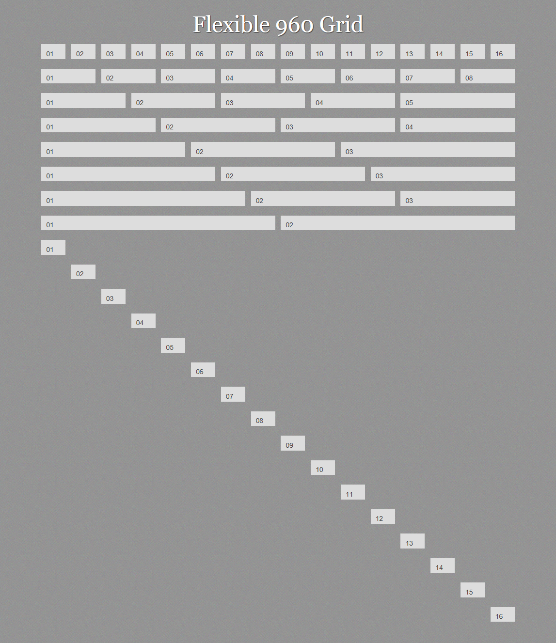
This then gives me a replica of the fluid grid using CSS3 grid layout. To see this working fire up IE10 and view Example 1.
This works, but…
This worked, but isn’t ideal. I considered not showing this stage of my experiment – however, I think it clearly shows how the grid layout module works and is a useful starting point. That said, it’s not an approach I would take in production. First, we have to add classes to our markup that tie an element to a position on the grid. This might not be too much of a problem if we are always going to maintain the sixteen-column grid, though, as I will show you that the real power of the grid layout module appears once you start to redefine the grid, using different grids based on media queries. If you drop to a six-column layout for small screens, positioning items into column 16 makes no sense any more.
Calculating grid position using LESS
As we’ve seen, if you want to use a grid with main columns and gutters, you have to take into account the spacing between columns as well as the actual columns. This means we have to do some calculating every time we place an item on the grid. In my example above I got around this by creating a CSS class for each position, allowing me to think in sixteen rather than thirty-two columns. But by using a CSS preprocessor, I can avoid using all the classes yet still think in main columns.
I’m using LESS for my example. My simple grid framework consists of one simple mixin.
.position(@column,@row,@colspan,@rowspan) {
    -ms-grid-column: @column*2;
    -ms-grid-row: @row*2-1;
    -ms-grid-column-span: @colspan*2-1;
    -ms-grid-row-span: @rowspan*2-1;
}
My mixin takes four parameters: column; row; colspan; and rowspan. So if I wanted to place an item on column four, row three, spanning two columns and one row, I would write the following CSS:
.box {
    .position(4,3,2,1);
}
The mixin would return:
.box {
    -ms-grid-column: 8;
    -ms-grid-row: 5;
    -ms-grid-column-span: 3;
    -ms-grid-row-span: 1;
}
This saves me some typing and some maths. I could also add other prefixed values into my mixin as other browsers started to add support.
We can see this in action creating a new grid. Instead of adding multiple classes to each element, I can add one class; that class uses the mixin to create the position. I have also played around with row spans using my mixin and you can see we end up with a quite complicated arrangement of boxes. Have a look at example two in IE10. I’ve used the JavaScript LESS parser so that you can view the actual LESS that I use. Note that I have needed to escape the -ms prefixed properties with ~"" to get LESS to accept them.
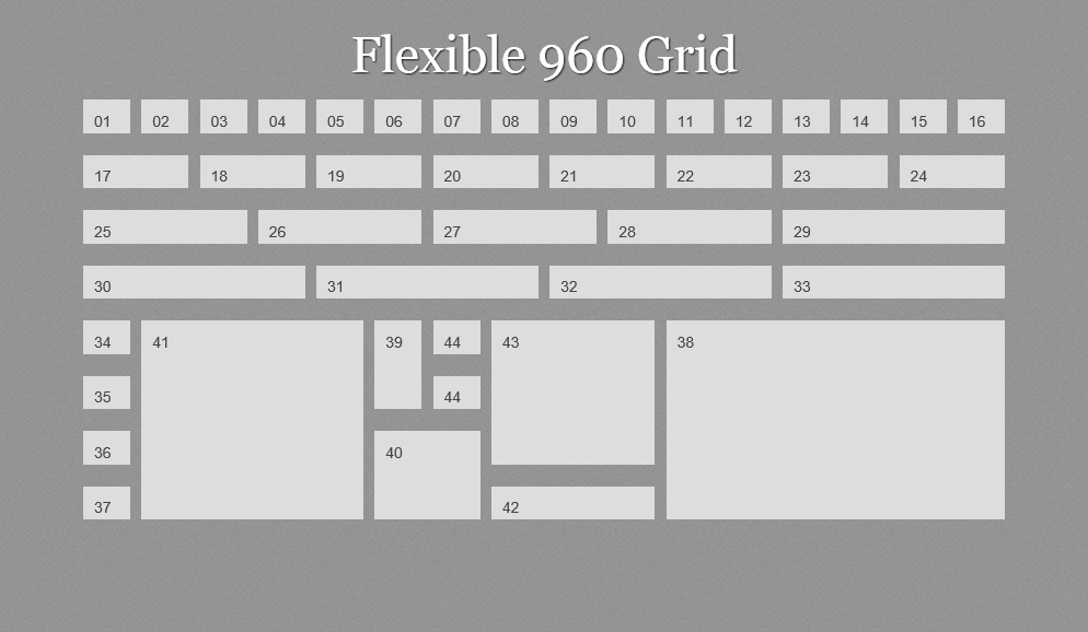
This is looking better. I don’t have direct positioning information on each element in the markup, just a class name – I’ve used grid(x), but it could be something far more semantic. We can now take the example a step further and redefine the grid based on screen width.
Media queries and the grid
This example uses exactly the same markup as the previous example. However, we are now using media queries to detect screen width and redefine the grid using a different number of columns depending on that width.
I start out with a six-column grid, defining that on .wrapper, then setting where the different items sit on this grid:
.wrapper {
    width: 90%;
    margin: 0 auto 0 auto;
    display: ~"-ms-grid"; /* escaped for the LESS parser */
    -ms-grid-columns: ~"1fr (4.25fr 1fr)[6]"; /* escaped for the LESS parser */
    -ms-grid-rows: ~"(auto 20px)[40]"; /* escaped for the LESS parser */
}
.grid1 { .position(1,1,1,1); }
.grid2 { .position(2,1,1,1); }
/* ... see example for all declarations ... */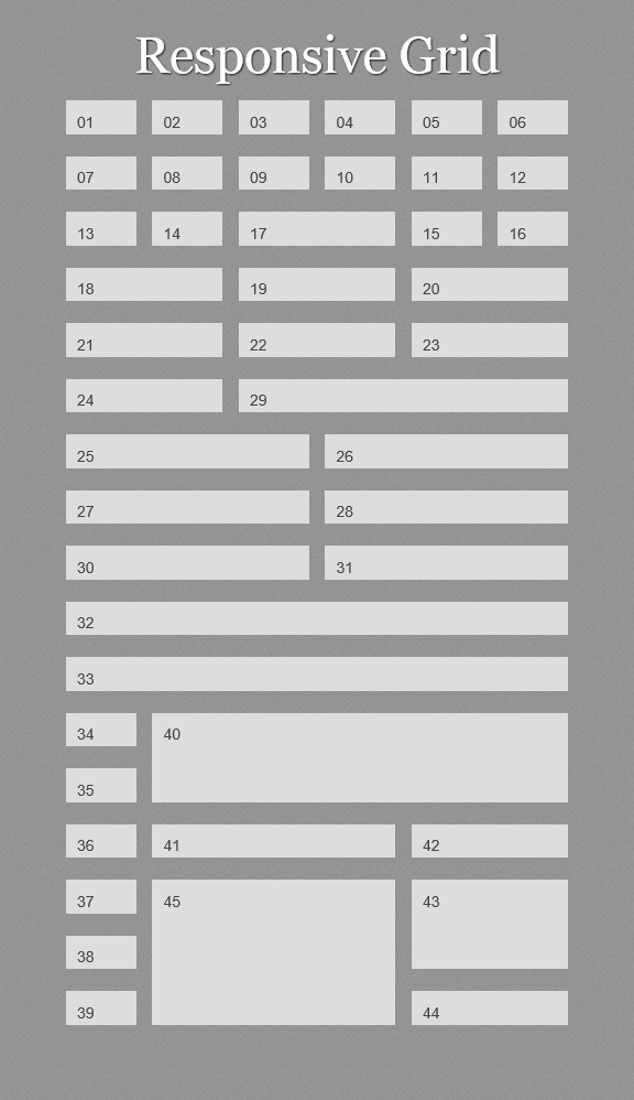
Using media queries, I redefine the grid to nine columns when we hit a minimum width of 700 pixels.
@media only screen and (min-width: 700px) {
.wrapper {
    -ms-grid-columns: ~"1fr (4.25fr 1fr)[9]";
    -ms-grid-rows: ~"(auto 20px)[50]";
}
.grid1 { .position(1,1,1,1); }
.grid2 { .position(2,1,1,1); }
/* ... */
}
Finally, we redefine the grid for 960 pixels, back to the sixteen-column grid we started out with.
@media only screen and (min-width:  940px) {
.wrapper {
    -ms-grid-columns:~" 1fr (4.25fr 1fr)[16]";
    -ms-grid-rows:~" (auto 20px)[24]";
}
.grid1 { .position(1,1,1,1); }
.grid2 { .position(2,1,1,1); }
/* ... */
}
If you view example three in Internet Explorer 10 you can see how the items reflow to fit the window size. You can also see, looking at the final set of blocks, that source order doesn’t matter. You can pick up a block from anywhere and place it in any position on the grid.
Laying out a simple website
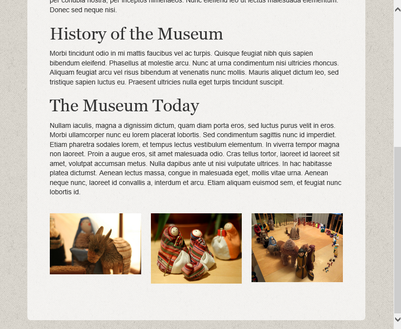
So far, like a toddler on Christmas Day, we’ve been playing with boxes rather than thinking about what might be in them. So let’s take a quick look at a more realistic layout, in order to see why the CSS3 grid layout module can be really useful. At this time of year, I am very excited to get out of storage my collection of odd nativity sets, prompting my family to suggest I might want to open a museum. Should I ever do so, I’ll need a website, and here is an example layout.

As I am using CSS3 grid layout, I can order my source in a logical manner. In this example my document is as follows, though these elements could be in any order I please:
<div class="wrapper">
  <div class="welcome">
  ...
  </div>
  <article class="main">
  ...
  </article>
  <div class="info">
  ...
  </div>
  <div class="ads">
  ...
  </div>
</div>
For wide viewports I can use grid layout to create a sidebar, with the important information about opening times on the top righ,t with the ads displayed below it. This creates the layout shown in the screenshot above.
@media only screen and (min-width:  940px) {
  .wrapper {
    -ms-grid-columns:~" 1fr (4.25fr 1fr)[16]";
    -ms-grid-rows:~" (auto 20px)[24]";
  }
  .welcome {
    .position(1,1,12,1);
    padding: 0 5% 0 0;
  }
  .info {
    .position(13,1,4,1);
    border: 0;
    padding:0;
   }
  .main {
    .position(1,2,12,1);
    padding: 0 5% 0 0;
  }
  .ads {
    .position(13,2,4,1);
    display: block;
    margin-left: 0;
  }
}
In a floated layout, a sidebar like this often ends up being placed under the main content at smaller screen widths. For my situation this is less than ideal. I want the important information about opening times to end up above the main article, and to push the ads below it. With grid layout I can easily achieve this at the smallest width .info ends up in row two and .ads in row five with the article between.
.wrapper {
  display: ~"-ms-grid";
  -ms-grid-columns: ~"1fr (4.25fr 1fr)[4]";
  -ms-grid-rows: ~"(auto 20px)[40]";
}
.welcome {
    .position(1,1,4,1);
}
.info {
    .position(1,2,4,1);
    border: 4px solid #fff;
    padding: 10px;
}
.content {
    .position(1,3,4,5);
}
.main {
    .position(1,3,4,1);
}
.ads {
    .position(1,4,4,1);
}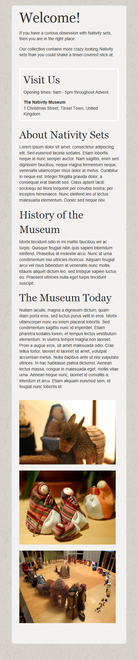
Finally, as an extra tweak I add in a breakpoint at 600 pixels and nest a second grid on the ads area, arranging those three images into a row when they sit below the article at a screen width wider than the very narrow mobile width but still too narrow to support a sidebar.
@media only screen and (min-width:  600px) {
  .ads {
    display: ~"-ms-grid";
    -ms-grid-columns: ~"20px 1fr 20px 1fr 20px 1fr";
    -ms-grid-rows: ~"1fr";
    margin-left: -20px;
  }
  .ad:nth-child(1) {
    .position(1,1,1,1);
  }
  .ad:nth-child(2) {
    .position(2,1,1,1);
  }
  .ad:nth-child(3) {
    .position(3,1,1,1);
  }
}
View example four in Internet Explorer 10.
This is a very simple example to show how we can use CSS grid layout without needing to add a lot of classes to our document. It also demonstrates how we can mainpulate the content depending on the context in which the user is viewing it.
Layout, source order and the idea of content priority
CSS3 grid layout isn’t the only module that starts to move us away from the issue of visual layout being linked to source order. However, with good support in Internet Explorer 10, it is a nice way to start looking at how this might work. If you look at the grid layout module as something to be used in conjunction with the flexible box layout module and the very interesting CSS regions and exclusions specifications, we have, tantalizingly on the horizon, a powerful set of tools for layout.
I am particularly keen on the potential separation of source order from layout as it dovetails rather neatly into something I spend a lot of time thinking about. As a CMS developer, working on larger scale projects as well as our CMS product Perch, I am interested in how we better enable content editors to create content for the web. In particular, I search for better ways to help them create adaptive content; content that will work in a variety of contexts rather than being tied to one representation of that content.
If the concept of adaptive content is new to you, then Karen McGrane’s presentation Adapting Ourselves to Adaptive Content is the place to start. Karen talks about needing to think of content as chunks, that might be used in many different places, displayed differently depending on context.
I absolutely agree with Karen’s approach to content. We have always attempted to move content editors away from thinking about creating a page and previewing it on the desktop. However at some point content does need to be published as a page, or a collection of content if you prefer, and bits of that content have priority. Particularly in a small screen context, content gets linearized, we can only show so much at a time, and we need to make sure important content rises to the top. In the case of my example, I wanted to ensure that the address information was clearly visible without scrolling around too much. Dropping it with the entire sidebar to the bottom of the page would not have been so helpful, though neither would moving the whole sidebar to the top of the screen so a visitor had to scroll past advertising to get to the article.
If our layout is linked to our source order, then enabling the content editor to make decisions about priority is really hard. Only a system that can do some regeneration of the source order on the server-side – perhaps by way of multiple templates – can allow those kinds of decisions to be made. For larger systems this might be a possibility; for smaller ones, or when using an off-the-shelf CMS, it is less likely to be. Fortunately, any system that allows some form of custom field type can be used to pop a class on to an element, and with CSS grid layout that is all that is needed to be able to target that element and drop it into the right place when the content is viewed, be that on a desktop or a mobile device.
This approach can move us away from forcing editors to think visually. At the moment, I might have to explain to an editor that if a certain piece of content needs to come first when viewed on a mobile device, it needs to be placed in the sidebar area, tying it to a particular layout and design. I have to do this because we have to enforce fairly strict rules around source order to make the mechanics of the responsive design work. If I can instead advise an editor to flag important content as high priority in the CMS, then I can make decisions elsewhere as to how that is displayed, and we can maintain the visual hierarchy across all the different ways content might be rendered.
Why frustrate ourselves with specifications we can’t yet use in production?
The CSS3 grid layout specification is listed under the Exploring section of the list of current work of the CSS Working Group. While discussing a module at this stage might seem a bit pointless if we can’t use it in production work, there is a very real reason for doing so. If those of us who will ultimately be developing sites with these tools find out about them early enough, then we can start to give our feedback to the people responsible for the specification. There is information on the same page about how to get involved with the disussions.
So, if you have a bit of time this holiday season, why not have a play with the CSS3 grid layout module? I have outlined here some of my thoughts on how grid layout and other modules that separate layout from source order can be used in the work that I do. Likewise, wherever in the stack you work, playing with and thinking about new specifications means you can think about how you would use them to enhance your work. Spot a problem? Think that a change to the specification would improve things for a specific use case? Then you have something you could post to www-style to add to the discussion around this module.
All the examples are on CodePen so feel free to play around and fork them.
About the author
Rachel Andrew is a Director of edgeofmyseat.com, a UK web development consultancy and creators of the small content management system, Perch; a W3C Invited Expert to the CSS Working Group; and Editor in Chief of Smashing Magazine. She is the author of a number of books including The New CSS Layout for A Book Apart and a Google Developer Expert for Web Technologies.
She curates a popular email newsletter on CSS Layout, and is passing on her layout knowledge over at her CSS Layout Workshop.
When not writing about business and technology on her blog at rachelandrew.co.uk or speaking at conferences, you will usually find Rachel running up and down one of the giant hills in Bristol, or attempting to land a small aeroplane while training for her Pilot’s license.
Brought to you by
Related articles
-
A History of CSS Through Fifteen Years of 24 ways
Rachel Andrew guides us through a tour of the last fifteen years in CSS layout, as manifested in articles here on 24 ways. From the days when Internet Explorer 6 was de rigueur, right up to the modern age of evergreen browsers, the only thing you can be sure of is that the web never stands still for long.
-
A Modern Typographic Scale
Rob Weychert reaches for the top notes to sing us a song of typographic scale. A little attention to scale and to the mathematics will help you to hit a high note with your designs this Christmas and beyond.
-
Beautiful Scrolling Experiences – Without Libraries
Michelle Barker appears as one of a heavenly host, coming forth with scroll in hand to pronounce an end to janky scrolljacking! Unto us a new specification is born, in the city of TimBL, and its name shall be called Scroll Snap.
-
Cascading Web Design with Feature Queries
Chen Hui Jing pulls off the dust covers, swings open the storm shutters and lets the winter light fall on the subject of CSS feature queries. The chestnuts may not yet be roasting, and the halls may be still be undecked, but pull up a chair and settle down. It’s Christmas.
-
Clip Paths Know No Bounds
Dan Wilson throws some Christmas shapes and gives us a run down of different ways to use CSS polygon clip paths to create interesting a flexible shapes with less code that you might have thought. It may be the time of year to follow a star, but was the star plotted with five or ten points?
-
Flexible Captioned Slanted Images
Eric Meyer gift wraps the most awkwardly shaped of boxes using nothing but CSS, HTML and a little curl of ribbon. No matter how well you plan and how much paper you have at your disposal, sometimes you just need to slant the gift to the side.


