Z’s Still Not Dead Baby, Z’s Still Not Dead
A reaction to overly ornamental designs, flat design has been the dominant aesthetic for almost a decade. As gradients, patterns, shadows, and three-dimensional skeuomorphism fell out of fashion, designers embraced solid colours, square corners, and sharp edges.
Anti-skeuomorphism no doubt helped designers focus on feature design and usability without the distraction of what some might still see as flourishes. But, reducing both product and website designs to a bare minimum has had unfortunate repercussions. With little to differentiate their designs, products and websites have adopted a regrettable uniformity which makes it difficult to distinguish between them.
Still, all fashions fade eventually. I’m hopeful that with the styling tools we have today, we’ll move beyond flatness and add an extra dimension. Here are five CSS properties which will bring depth and richness to your designs.
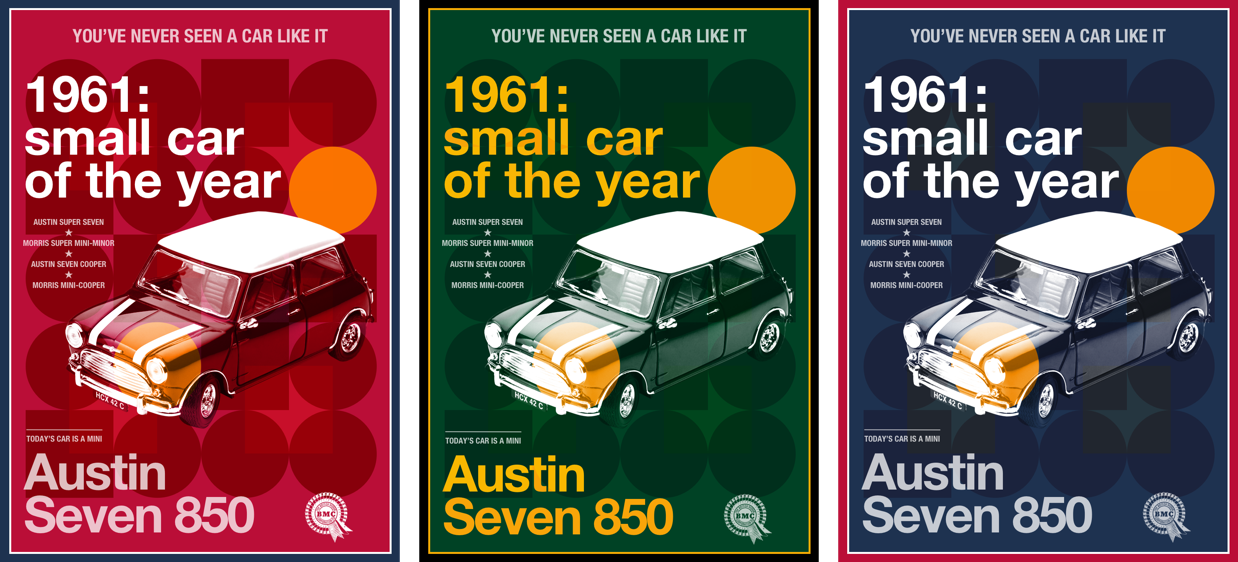
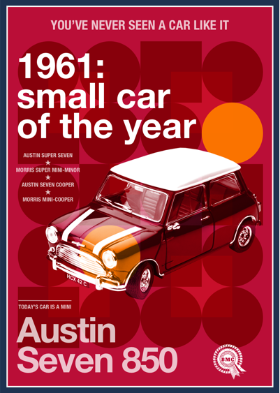
To illustrate how you might use them, I’ve made this design for the 1961 Austin Seven 850, the small car which helped define the swinging sixties.
Transparency with alpha values
The simplest way to add transparency to a background colour, border, or text element is using alpha values in your colour styles. These values have been available in combination with RGB (red, green, blue) for years. In RGBA, decimal values below 1 make any colour progressively more transparent. 0 is the most transparent, 1 is the most opaque:
body {
  color: rgba(255, 0, 153, .75);
}
Alpha values also combine with HSL (hue, saturation, lightness) to form HSLA:
body {
  color: hsla(0, 0, 100, .75);
}
Currently a Working Draft, CSS Color Module Level 4 enables alpha values in RGB and HSL without the additional “A”:
body {
  color: rgb(255, 0, 153, .75);
  /* color: hsl(0, 0, 100, .75); */
}
This new module also introduces hexadecimal colours with alpha values. In this new value, the last two digits represent the transparency level, with FF producing 100% opacity and 00 resulting in 100% transparency. For the 75% opacity in my design, I add BF to my white hexadecimal colour:
body {
  color: #ffffffbf;
}
Although there’s already wide support for hexadecimal, HSL, and RGB with alpha values in most modern browsers, the current version of Microsoft Edge for Windows has lagged behind. This situation will no doubt change when Microsoft move Edge to Chromium.
2. Use opacity
Using the opacity property specifies the amount of opacity of any element (obviously) which allows elements below them in the stacking order to be all or partially visible. A value of 0 is most transparent, whereas 1 is most opaque.

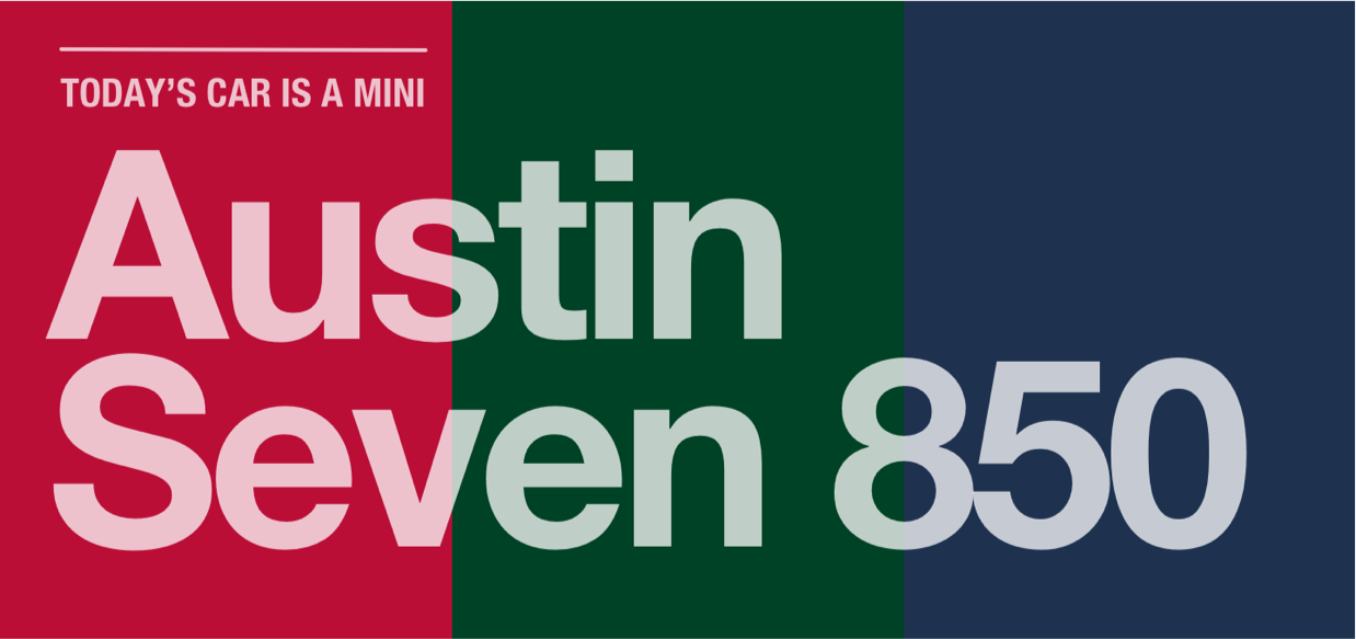
This property is especially useful for tinting the colour of elements by allowing any colour behind them to bleed through. The British Motor Corporation logo in the footer of my design is solid white, but reducing its opacity allows it to take on the colour of the body element behind:
[src*="footer"] {
  opacity: .75;
}
You might otherwise choose to use opacity values as part of a CSS filter. 0% opacity is fully transparent, while 100% is fully opaque and appears as if no filter has been applied. Applying a CSS filter is straightforward. First, declare the filter-function and then a value in parentheses:
[src*="footer"] {
  filter: opacity(75%);
}
3. Start blending
Almost universally, contemporary browsers support the same compositing tools we’ve used in graphic design and photo editing software for years. Blend modes including luminosity, multiply, overlay, and screen can easily and quickly add depth to a design. There are two types of blend-mode.
background-blend-mode defines how background layers blend with the background colour behind them, and with each other. My layered design requires three background images applied to the body element:
body {
  padding: 2rem;
  background-color: #ba0e37;
  background-image:
    url(body-1.png),
    url(body-2.png),
    url(body-3.png);
  background-origin: content-box;
  background-position: 0 0;
  background-repeat: no-repeat;
  background-size: contain;
}
You can apply different background-blend modes for each background image. Specify them in the same order as your background images and separate them with a comma:
body {
  background-blend-mode: multiply, soft-light, hard-light;
}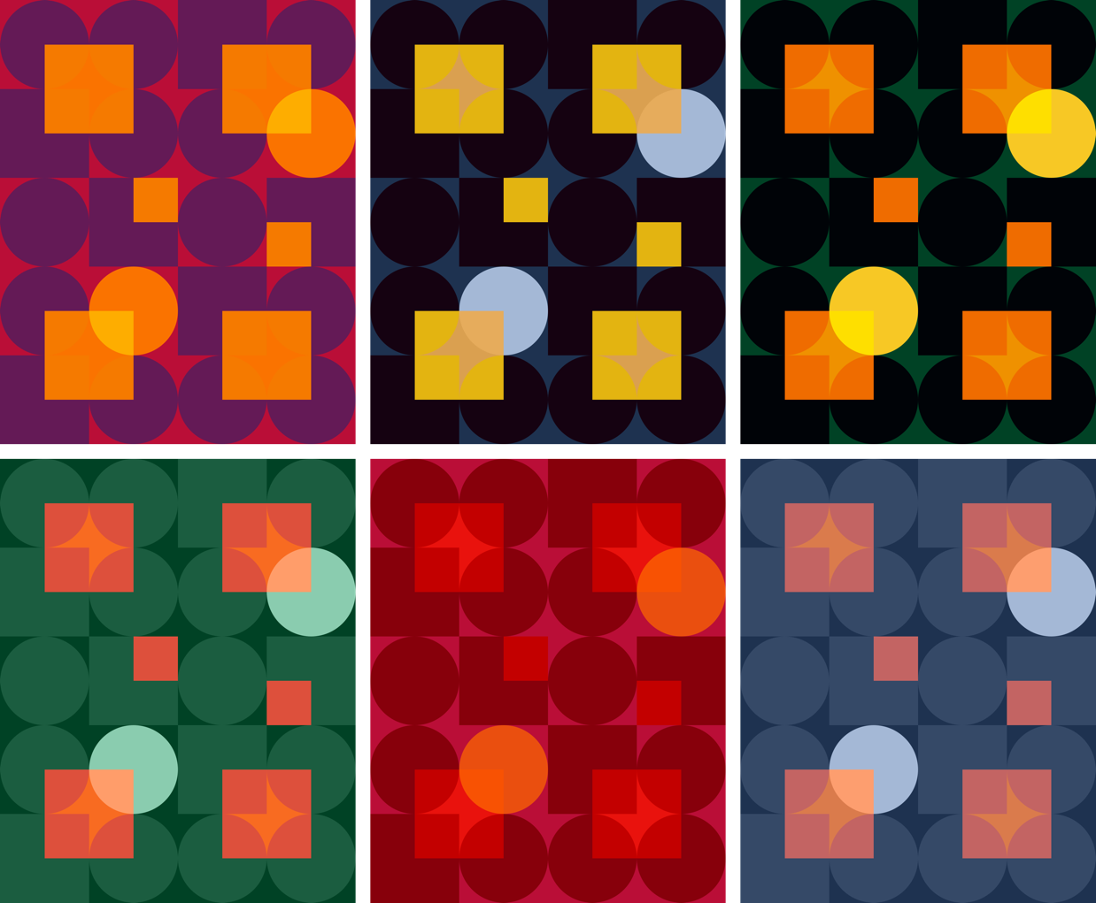
When I need to apply an alternative colour palette, there’s no need to export new background assets. I can achieve results simply by changing the background colour and these background-blend modes.
Sadly, there’s not yet support for blending modes in Edge, so provide an alternative background image for that browser:
@supports not (background-blend-mode: normal) {
  body {
    background-image: url(ihatetimvandamme.png);
  }
}mix-blend-mode, on the other hand, defines how an element’s content should blend with its ancestors.
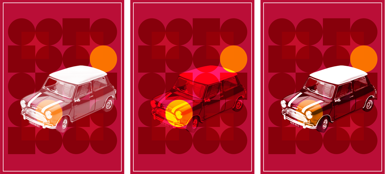
To blend my Mini image with the background colours and images on the body, I add a value of hard-light, plus a filter which converts my full-colour picture to greyscale:
[src*="figure"] {
  filter: grayscale(100%);
  mix-blend-mode: hard-light;
}
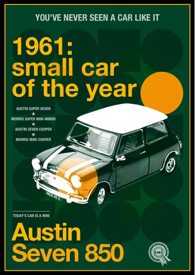
You can also use mix-blend-mode to add depth to text elements, like this headline and large footer paragraph in a green and yellow version of my design:
.theme-green h1,
.theme-green footer p:last-of-type {
  color: #f8Ef1c;
  mix-blend-mode: difference;
}
4. Overlap with CSS Grid
Whereas old-fashioned layout methods reinforced a rigid structure on website designs, CSS Grid opens up the possibility to layer elements without positioning or resorting to margin hacks. The HTML for my design is semantic and simple:
<body>

<p>You’ve never seen a car like it</p>

<h1><em>1961:</em> small car of the year</h1>

<figure>
  <img src="figure.png" alt="Austin Seven 850">
  <figcaption>
    <ul>
      <li>Austin Super Seven</li>
      <li>Morris Super Mini-Minor</li>
      <li>Austin Seven Cooper</li>
      <li>Morris Mini-Cooper</li>
    </ul>
  <figcaption>
</figure>

<footer>
  <p>Today’s car is a Mini</p>
  <p>Austin Seven 850</p>
  <img src="footer.png" alt="Austin Seven 850">
<footer>

</body>
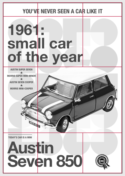
I begin by applying a three-column symmetrical grid to the body element:
@media screen and (min-width : 48em) {

  body {
    display: grid;
    grid-template-columns: 1fr 1fr 1fr;
  }

}
Then, I place my elements onto that grid using line numbers:
body > p {
  grid-column: 1 / -1;
}

h1 {
  grid-column: 1 / 3;
}

figure {
  grid-column: 1 / -1;
}

footer {
  display: contents;
}

footer div {
  grid-column: 1 / 3;
}

[src*="footer"] {
  grid-column: 3 / -1;
  align-self: end;
}
As sub-grid has yet to see wide adoption, I apply a second grid to my figure element, so I may place my image and figcaption:
figure {
  display: grid;
  grid-template-columns: 1fr 3fr;
}

figcaption {
  grid-column: 1;
}

[src*="figure"] {
  grid-column: 2;
}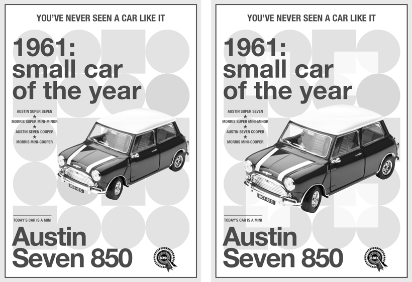
Previewing the result in a browser shows me the energy associated with driving this little car is missing. To add movement to my design, I change the image’s grid-column values so it occupies the same space as my caption:
figcaption {
  grid-column: 1;
  grid-row: 3;
}

[src*="figure"] {
  grid-column: 1 / -1;
  grid-row: 3;
  padding-left: 5vw;
}
5. Stack with z-index
In geometry, the x axis represents horizontal, the y axis represents vertical. In CSS, the z axis represents depth. Z-index values can be either negative or positive and the element with the highest value appears closest to a viewer, regardless of its position in the flow. If you give more than one element the same z-index value, the one which comes last in source order will appear on top.
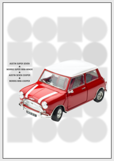
It’s important to remember that z-index is only applied to elements which have their position property set to either relative or absolute. Without positioning, there is no stacking. However, z-index can be used on elements placed onto a grid.
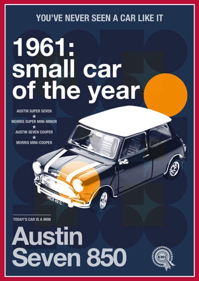
As the previous figure image and figcaption occupy the same grid columns and row, I apply a higher z-index value to my caption to bring it closer to the viewer, despite it appearing before the picture in the flow of my content:
figcaption {
  grid-column: 1;
  grid-row: 3;
  z-index: 2;
}

[src*="figure"] {
  grid-column: 1 / -1;
  grid-row: 3;
  z-index: 1;
}
Z’s not dead baby, Z’s not dead
While I’m not advocating a return to the worst excesses of skeuomorphism, I hope product and website designers will realise the value of a more vibrant approach to design; one which appreciates how design can distinguish a brand from its competition.
I’m incredibly grateful to Drew and his team of volunteers for inviting me to write for this incredible publication every year for the past fifteen years. As I closed my first article here on this day all those years ago, “Have a great holiday season!” Z’s still not dead baby, Z’s still not dead.
About the author
Andy Clarke is one of the world’s best-known website designers, consultant, speaker, and writer on art direction and design for products and websites. Andy founded Stuff & Nonsense in 1998 and for 20 years has helped companies big and small to improve their website and product designs. Andy’s the author of four web design books including ‘Transcending CSS,’ ‘Hardboiled Web Design’ and ‘Art Direction for the Web’. He really, really loves gorillas.
