How to Do a UX Review
A UX review is where an expert goes through a website looking for usability and experience problems and makes recommendations on how to fix them.
I’ve completed a number of UX reviews over my twelve years working as a user experience consultant and I thought I’d share my approach.
I’ll be talking about reviewing websites here; you can adapt the approach for web apps, or mobile or desktop apps.
Why conduct a review
Typically, a client asks for a review to be undertaken by a trusted and, ideally, detached third party who either works for an agency or is a freelancer. Often they may ask a new member of the UX team to complete one, or even set it as a task for a job interview. This indicates the client is looking for an objective view, seen from the outside as a user would see the website.
I always suggest conducting some user research rather than a review. Users know their goals and watching them make (what you might think of as) mistakes on the website is invaluable. Conducting research with six users can give you six hours’ worth of review material from six viewpoints. In short, user research can identify more problems and show how common those problems might be.
There are three reasons, though, why a review might better suit client needs than user research:
- Quick results: user research and analysis takes at least three weeks.
- Limited budget: the £6–10,000 cost to run user research is about twice the cost of a UX review.
- Users are hard to reach: in the business-to-business world, reaching users is difficult, especially if your users hold senior positions in their organisations. Working with consumers is much easier as there are often more of them.
There is some debate about the benefits of user research over UX review. In my experience you learn far more from research, but opinions differ.
Be objective
The number one mistake many UX reviewers make is reporting back the issues they identify as their opinion. This can cause credibility problems because you have to keep justifying why your opinion is correct.
I’ve had the most success when giving bad news in a UX review and then finally getting things fixed when I have been as objective as possible, offering evidence for why something may be a problem.
To be objective we need two sources of data: numbers from analytics to appeal to reason; and stories from users in the form of personas to speak to emotions. Highlighting issues with dispassionate numerical data helps show the extent of the problem. Making the problems more human using personas can make the problem feel more real.
Numbers from analytics
The majority of clients I work with use Google Analytics, but if you use a different analytics package the same concepts apply. I use analytics to find two sets of things.
1. Landing pages and search terms
Landing pages are the pages users see first when they visit a website – more often than not via a Google search. Landing pages reveal user goals. If a user landed on a page called ‘Yellow shoes’ their goal may well be to find out about or buy some yellow shoes.
It would be great to see all the search terms bringing people to the website but in 2011 Google stopped providing search term data to (rightly!) protect users’ privacy. You can get some search term data from Google Webmaster tools, but we must rely on landing pages as a clue to our users’ goals.
The thing to look for is high-traffic landing pages with a high bounce rate. Bounce rate is the percentage of visitors to a website who navigate away from the site after viewing only one page. A high bounce rate (over 50%) isn’t good; above 70% is bad.
To get a list of high-traffic landing pages with a high bounce rate install this bespoke report.
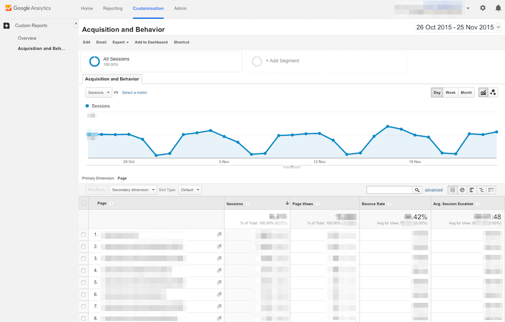
This is the list of pages with high demand and that have real problems as the bounce rate is high. This is the main focus of the UX review.
2. User flows
We have the beginnings of the user journey: search terms and initial landing pages. Now we can tap into the really useful bit of Google Analytics. Called behaviour flows, they show the most common order of pages visited.
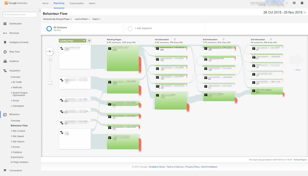
Here we can see the second and third (and so on) pages users visited. Importantly, we can also see the drop-outs at each step.
If your client has it set up, you can also set goal pages (for example, a post-checkout contact us and thank you page). You can then see a similar view that tracks back from the goal pages. If your client doesn’t have this, suggest they set up goal tracking. It’s easy to do.
We now have the remainder of the user journey.
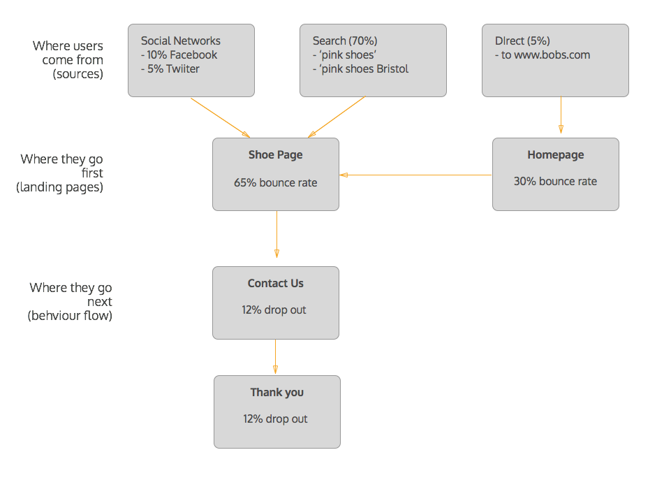
Expect the work in analytics to take up to a day.
We may well identify more than one user journey, starting from different landing pages and going to different second- and third-level pages. That’s a good thing and shows we have different user types. Talking of user types, we need to define who our users are.
Personas
We have some user journeys and now we need to understand more about our users’ motivations and goals.
I have a love-hate relationship with personas, but used properly these portraits of users can help bring a human touch to our UX review.
I suggest using a very cut-down view of a persona. My old friends Steve Cable and Richard Caddick at cxpartners have a great free template for personas from their book Communicating the User Experience.
The first thing to do is find a picture that represents that persona. Don’t use crappy stock photography – it’s sometimes hard to relate to perfect-looking people) – use authentic-looking people. Here’s a good collection of persona photos.
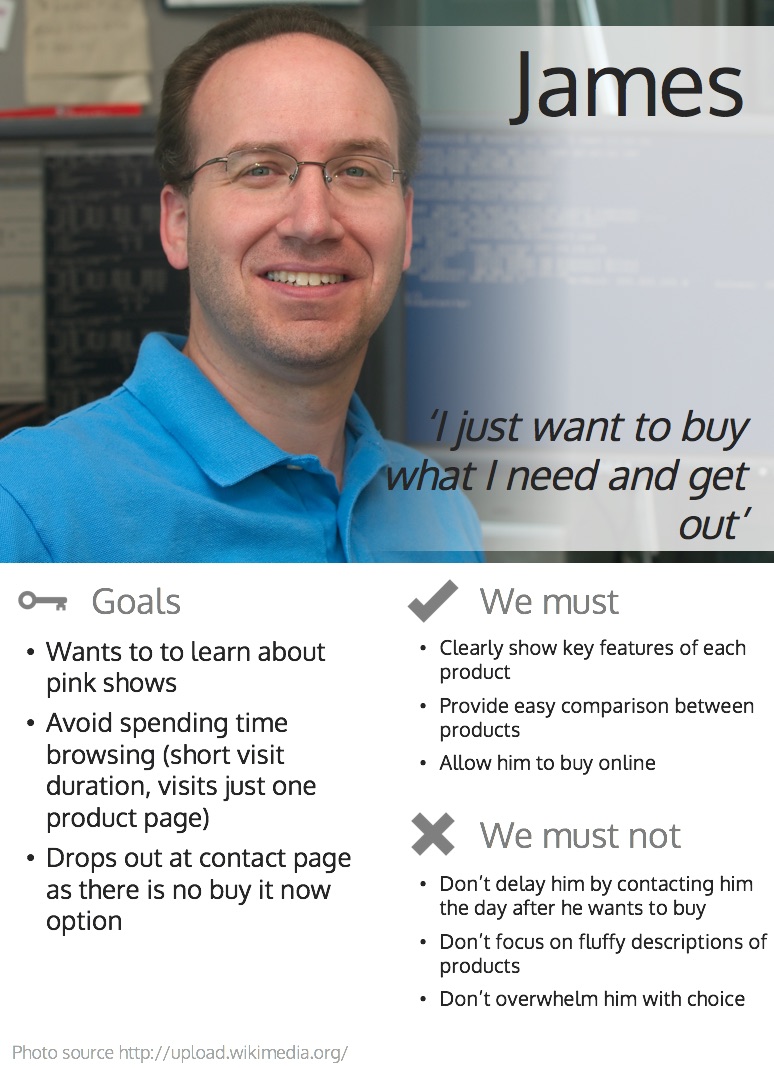
The personas have three basic attributes:
- Goals: we can complete these drawing on the analytics data we have (see example).
- Musts: things we have to do to meet the persona’s needs.
- Must nots: a list of things we really shouldn’t do.
Completing points 2 and 3 can often be done during the writing of the report.
Let’s take an example. We know that the search term ‘yellow shoes’ takes the user to the landing page for yellow shoes. We also know this page has a high bounce rate, meaning it doesn’t provide a good experience.
With our expert hat on we can review the page. We will find two types of problem:
- Usability issues: ineffective button placement or incorrect wording, links not looking like links, and so on.
- Experience issues: for example, if a product is out of stock we have to contact the business to ask them to restock.
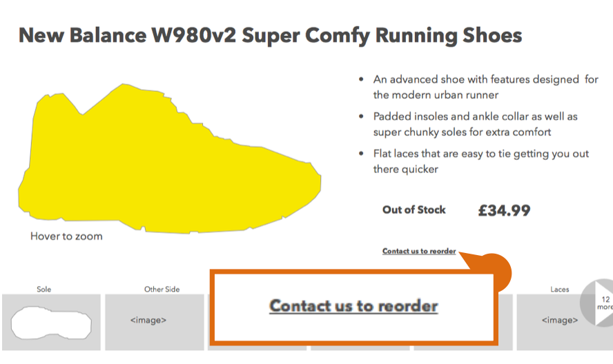
We could identify that the contact button isn’t easy to find (a usability issue) but that’s not the real problem here. That the user has to ask the business to restock the item is a bad user experience. We add this to our personas’ must nots. The big experience problems with the site form the musts and must nots for our personas.
We now have a story around our user journey that highlights what is going wrong.
If we’ve identified a number of user journeys, multiple landing pages and differing second and third pages visited, we can create more personas to match. A good rule of thumb is no more than three personas. Any more and they lose impact, watering down your results.
Expect persona creation to take up to a day to complete.
Let’s start the review
We take the user journeys and we follow them step by step, working through the website looking for the reasons why users drop out at each step. Using Keynote or PowerPoint, I structure the final report around the user journey with separate sections for each step.
For each step we’ll find both usability and experience problems. Split the results into those two groups.
Usability problems are fairly easy to fix as they’re often quick design changes. As you go along, note the usability problems in one place: we’ll call this ‘quick wins’. Simple quick fixes are a reassuring thing for a client to see and mean they can get started on stuff right away. You can mark the severity of usability issues. Use a scale from 1 to 3 (if you use 1 to 5 everything ends up being a 3!) where 1 is minor and 3 is serious.
Review the website on the device you’d expect your persona to use. Are they using the site on a smartphone? Review it on a smartphone.
I allow one page or slide per problem, which allows me to explain what is going wrong. For a usability problem I’ll often make a quick wireframe or sketch to explain how to address it.
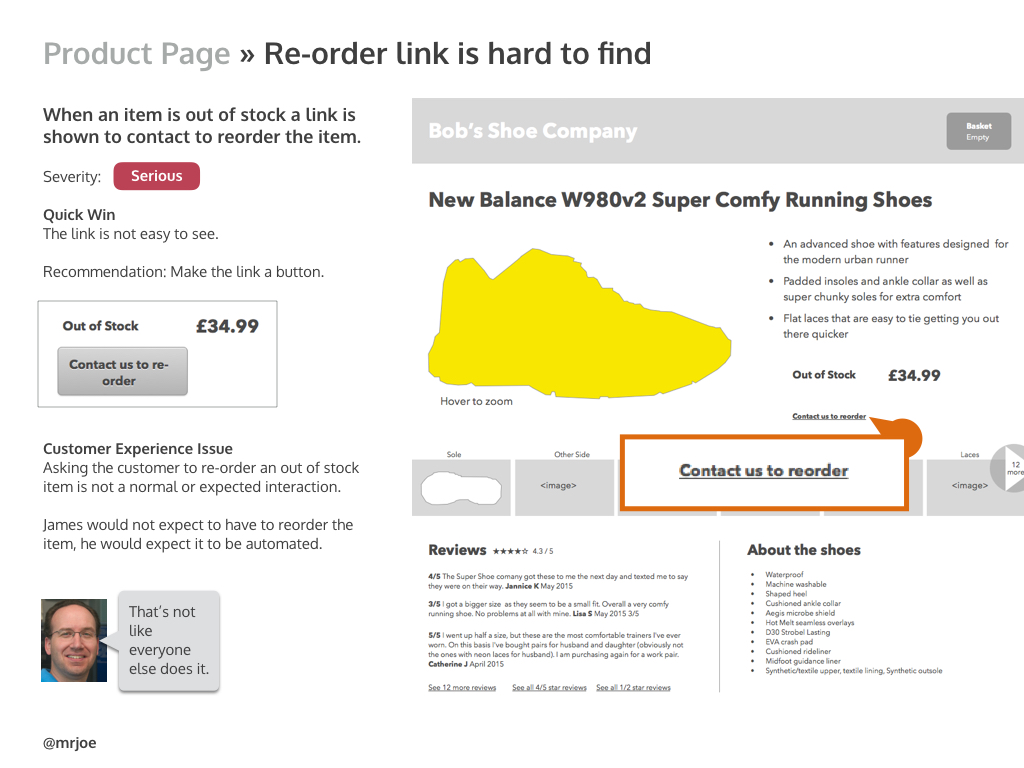
(Quick tip: if you use Google Chrome, try Awesome Screenshot to capture screens.)
When it comes to the more severe experience problems – things like an online shop not offering next day delivery, or a business that needs to promise to get back to new customers within a few hours – these will take more than a tweak to the UI to fix.
Call these something different. I use the terms like business challenges and customer experience issues as they show that it will take changes to the organisation and its processes to address them. It’s often beyond the remit of a humble UX consultant to recommend how to fix organisational issues, so don’t try.
Again, create a page within your document to collect all of the business challenges together.
Expect the review to take between one and three days to complete.
The final report should follow this structure:
- The approach
- Overview of usability quick wins
- Overview of experience issues
- Overview of Google Analytics findings
- The user journeys
- The personas
- Detailed page-by-page review (broken down by steps on the user journey)
There are two academic theories to help with the review.
Heuristic evaluation is a set of criteria to organise the issues you find. They’re great for categorising the usability issues you identify but in practice they can be quite cumbersome to apply.
I prefer the more scientific and much simpler cognitive walkthrough that is focused on goals and actions.
A workshop to go through the findings
The most important part of the UX review process is to talk through the issues with your client and their team.
A document can only communicate a certain amount. Conversations about the findings will help the team understand the severity of the issues you’ve uncovered and give them a chance to discuss what to do about them.
Expect the workshop to last around three hours.
When presenting the report, explain the method you used to conduct the review, the data sources, personas and the reasoning behind the issues you found. Start by going through the usability issues. Often these won’t be contentious and you can build trust and improve your credibility by making simple, easy to implement changes.
The most valuable part of the workshop is conversation around each issue, especially the experience problems. The workshop should include time to talk through each experience issue and how the team will address it.
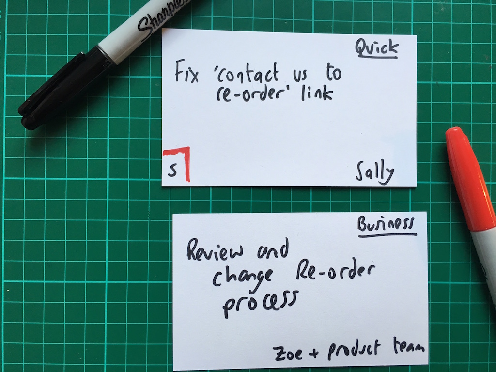
I collect actions on index cards throughout the workshop and make a note of who will take what action with each problem.
When talking through the issues, the person who designed the site is probably in the room – they may well feel threatened. So be nice. When I talk through the report I try to have strong ideas, weakly held.
At the end of the workshop you’ll have talked through each of the issues and identified who is responsible for addressing them. To close the workshop I hand out the cards to the relevant people, giving them a physical reminder of the next steps they have to take.
That’s my process for conducting a review. I’d love to hear any tips you have in the comments.
About the author
@MrJoe, Joe to his friends, is the author of the book Psychology for Designers.
A recovering neuroscientist, then a spell as a elementary school teacher, Joe started his UX career 12 years ago. He has worked with organisations like Disney, eBay, Glenfiddich and Marriott.


