Art Direction and the New WordPress Editor
The New York Times release of Snowfall in 2012 took the web industry by storm. Media-rich and captivating, its design evoked wonder, fear, and desperation in the face of an avalanche. Snowfall was one of the first great art directed digital experiences in this era of the modern web (Space Jam, obviously, being one of the great experiences of the era prior).
“Art direction combines art and design to evoke a cultural and emotional reaction. …Art direction is about evoking the right emotion, it’s about creating that connection to what you’re seeing and experiencing.”
Art Direction and Design by Dan Mall
Art direction isn’t a new concept. Pick up any magazine or print publication — designers have long been creating evocative media experiences. Then the web came and messed that up. Fonts and even colors were limited at first, especially if you wanted to create something using semantic HTML rather than Flash. Early HTML and CSS didn’t offer great ways to create dynamic layouts like you’d see in a magazine. Floats, am I right?
A lot’s changed in the past decade. We have reliable ways to serve fonts, opening up vast typographic possibilities. CSS features like Flexbox and Grid allow for complex layouts. Plus, our hardware is getting better and better. We live in exciting times.
Behind the curve
But not everyone’s kept up. For most of its history, the WordPress editor was a text-first writing experience, shining with simple blogs but falling flat in the face of a complex website. Want some columns on your page? Well, there’s a plugin for that, it lets you write some pseudo-code WordPress called shortcodes, and yeah you just need to wrap your columns in this code in your editor… Or, uh, maybe you could hand-code a template for your theme that offers three columns of widget areas and put everything in there? Or maybe…
You get the point.
The new WordPress editor (codenamed “Gutenberg”) introduces the concept of blocks, like building blocks or bricks or LEGO. Rather than needing to hand-code anything, you have an interface for editing all sorts of content, even the aforementioned former nightmare of columns. Blocks can come with placeholders, so you can fill-in-the-blanks rather than having to build from scratch.
The new WordPress block editor allows me to focus on the best way of presenting my content instead of focusing on how I’m going to technically enter the content. The block editor allows my designer brain to think more creatively. I can go about creating an appropriate emotional reaction for a site’s content, rather than focusing on implementation.
Block it to me
The building blocks of the new editor (text, media) are the same, but the new ways to combine and build upon those blocks makes for a better art direction experience.
New to the WordPress editor is the Media and Text block, which combines — you guessed it — media and text into a new way to approach layouts.
This is the foundation of the new WordPress editor. Take atomic pieces, and combine them to make whole sections and layouts. Best yet, no fumbling with floats if you want to put some text next to an image!
Do you want to build a website?
Let’s imagine I’m building a website for a non-profit that rescues black cats. They offer adoption services, run a fostering program, and take in abandoned, feral, or other cats in need. The primary goal of the site is to connect people to the rescue organization. Raising awareness and soliciting donations are secondary, but still important factors.
Because so much of a person’s experience with WordPress is contingent on their particular setup — themes, plugins, and admin customizations — I’ve decided to keep this site pretty light.
The Twenty Twenty Theme
WordPress releases a new default theme pretty much every year. This year’s theme, Twenty Twenty, was built with Gutenberg in mind. It supports optional features like color schemes and wider block alignments. The design is clean and modern, and offers some additional customization options. I think it’s a good choice for this website.
Columns
While there’s no internal grid system in WordPress (yet!), the Columns block comes close to allowing complex layouts within a post or page. With it, you can start to break out of one column and think more like a print designer.
The most straightforward layout we could do is a familiar pattern on the web — three feature columns consisting of a heading, some text, and a button.
To accomplish this, I loaded up the editor and started planning.
First, I added a group block to contain my columns, and provide a background color. (The columns block does not currently support background colors, but it might in the future.)
I want my columns to stand out from the white background of the page, so I opt for a light grey.
Within the group, I placed my Column block, which features a convenient placeholder to help me pick which layout I want:
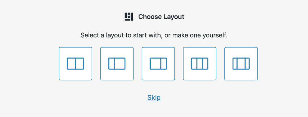
I opt for the three column option.
From here, it’s easy to build out my section — headings, paragraphs, and buttons are all existing blocks I can plop right into my columns:
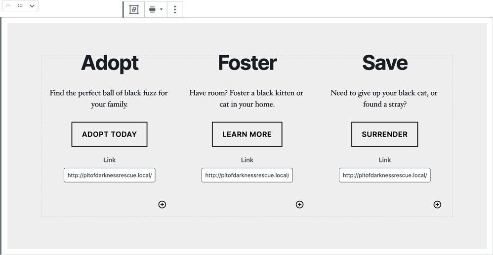
It looks really good on the front-end of my site, too:

This is all fairly straightforward, but by changing up a couple columns widths and some sizing, I can get something that looks more dynamic and draws attention to the adoption process, which is the most important feature:
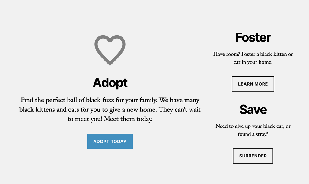
I could even add an image, change up my background color to match, and nest “Foster” and “Save” into another set of columns beneath “Adopt”:
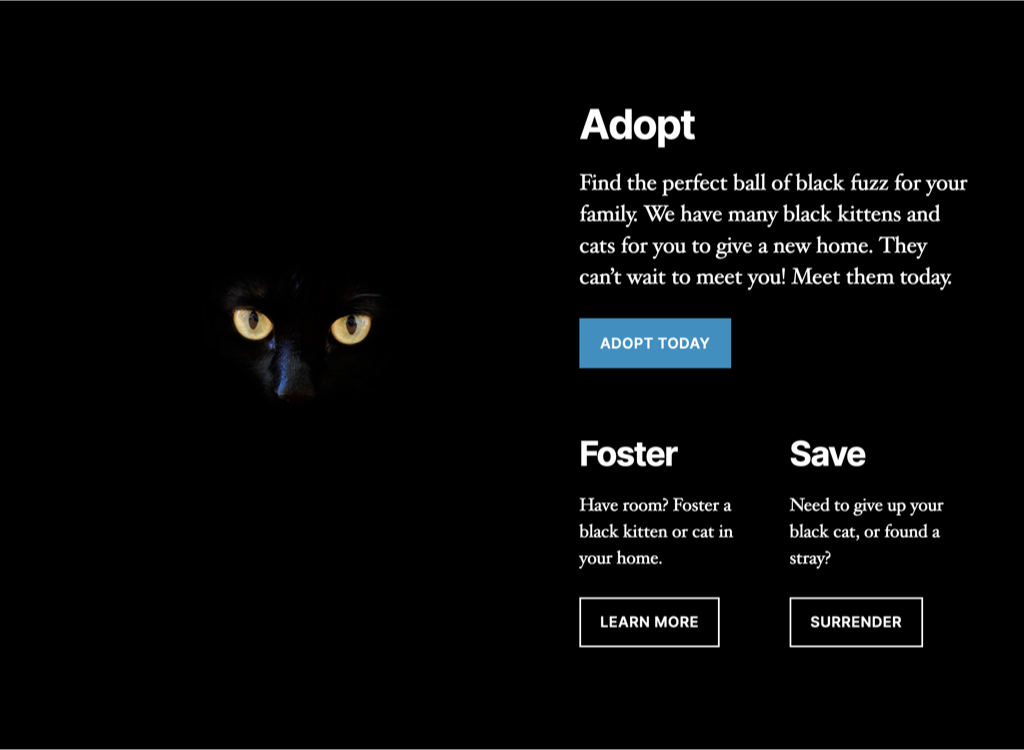
All of this from the same set of blocks, yet each variation strikes a different impact. …And, you know, feels a little less like this:
which one of the two possible websites are you currently designing? pic.twitter.com/ZD0uRGTqqm
— Jon Gold (@jongold) February 2, 2016
But if I wanted to start looking like that, uh, second example — I can!
Media and Text
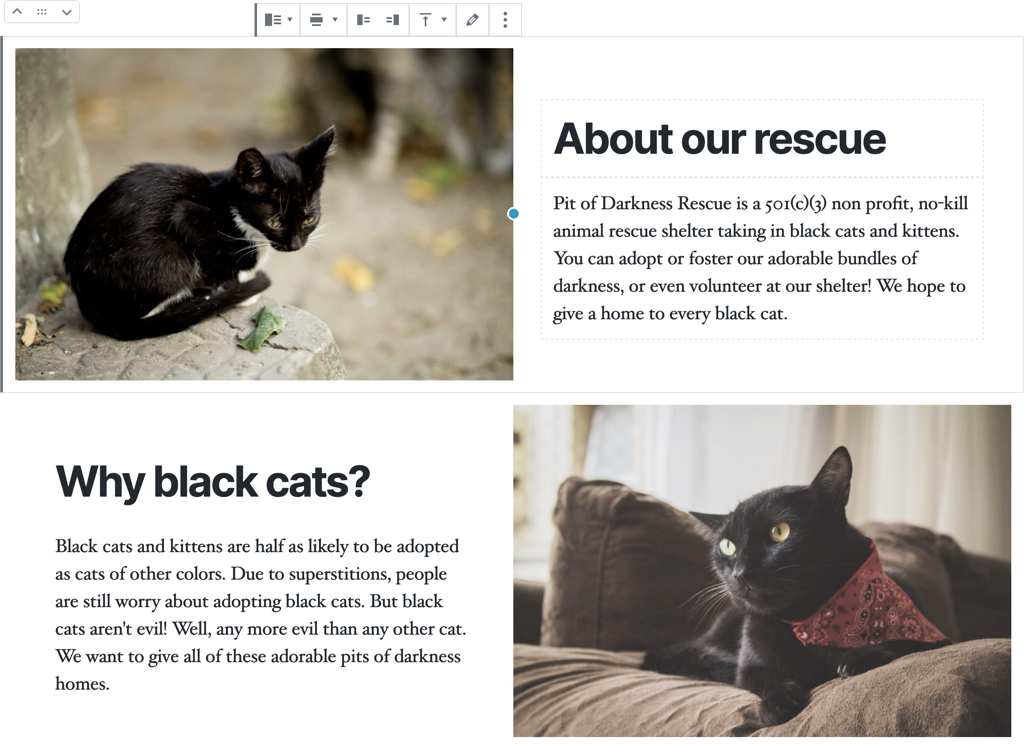
The aforementioned Media and Text block is a great building block for some eye-catching, informational parts of my homepage.
Galleries
To break up all that text content and get my site looking less like it’s for a startup, how about adding even more cute cats in between? You can never have too many cat photos on the internet.
CoBlocks is a fantastic plugin that adds new blocks to WordPress, among them the icon block I used above, as well as a couple of different gallery layouts. I think carousels are terrible when they’re used for showcasing features or content, but I think they’re a good gallery format, and having something horizontal means my cats aren’t taking up too much space (unlike my own black cat, who likes to hog all my leg room in bed).
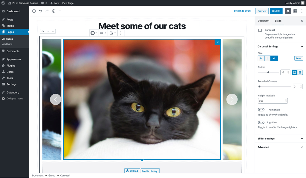
CoBlocks comes with Carousel, Collage, Masonry, Offest, and Stacked gallery blocks. The default Gallery block in WordPress is also pretty good — much better than it used to be.
Buttons
Alright, where am I? I have my intro columns featuring the primary information about site, some informational text, lots of cute cat photos, more informational text… I think my homepage is shaping up. I just need one final element: a donation section. Can’t take care of those kitties without some cash.
The only way to integrate payments into WordPress is to either link to a third party platform, or use a plugin. I’ve used ActBlue quite a bit when making candidate websites, so I’m going to pretend that this site uses a third party service that, like ActBlue, lets me link to specific donation increments off-site.
WordPress has a Buttons block underway that lets you add a row of buttons, without needing to rely on another block like Columns, but in the meantime, CoBlocks has an equivalent block I can use for now.
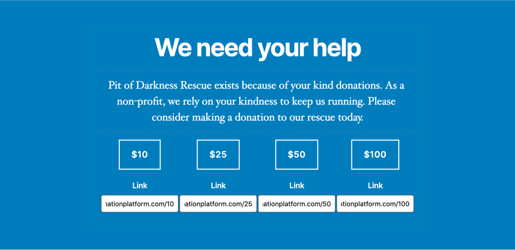
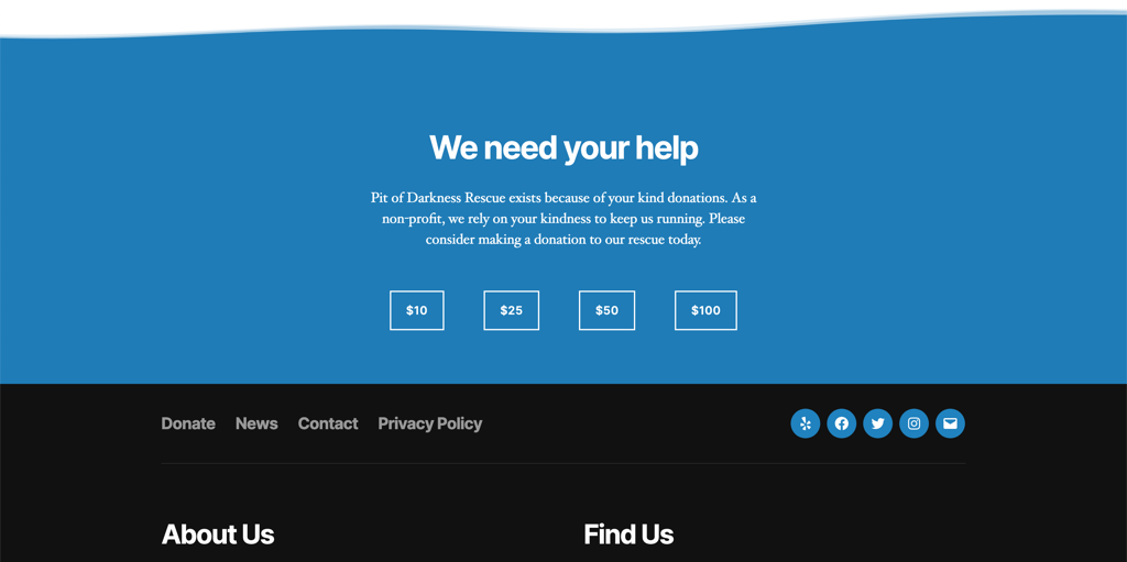
Great. It’s got a bold color, and I can link to a couple different donation increments.
But it could really use… something, you know, that draws the eye even more?
Shape Divider
CoBlocks has another great block, Shape Divider, which lets you add a decorative border that sits nicely above or below any container element, like the group block I’m using here. It comes with a variety of shape styles, like hills, rounded, and pointed. I settle on waves, which includes some overlapping transparencies along the top. It’s different from the rest of my page, but in a good way — it’s a subtle way for that section to stand out.
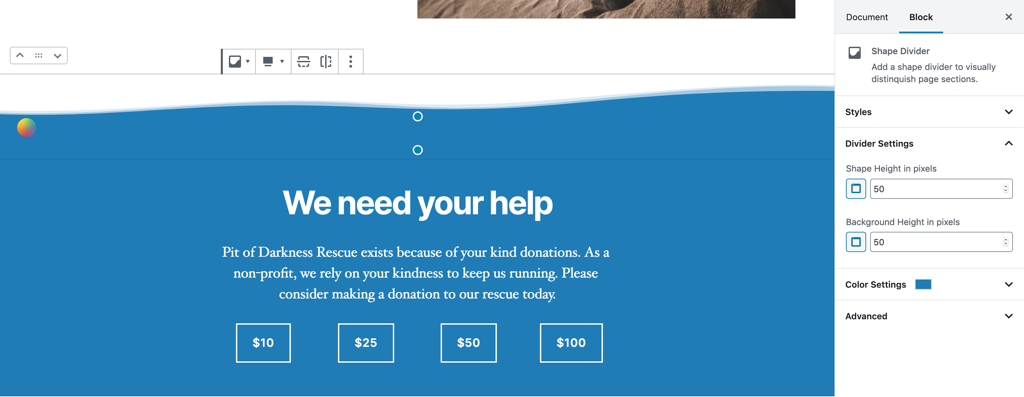
With that final block, my homepage is almost done. I just want to touch on two more blocks that can be used to improve the design: the Separator block, and the Spacer block.
Separator
Separator inserts an <hr /> into the page, with some minimal styles to make it look nice. Themes can then add new styles, or restyle the default to get some fancy alternatives, like this:

The Separator block is a great way to break up sections in a page.
Spacer
The Spacer block is an abomination, but I love it. It’s just an empty space. Think spacer gif, but spacer div. It’s terrible, but oh, oh so useful. I can increase space between elements without having to write any custom CSS. It empowers folks that are visual, but not technical. Combine it with Columns and you can almost pretend that you’re using a grid!
(It is, at the very least, hidden from screen readers.)
Okay but what does it look like?
With those in place, let’s check out my homepage.
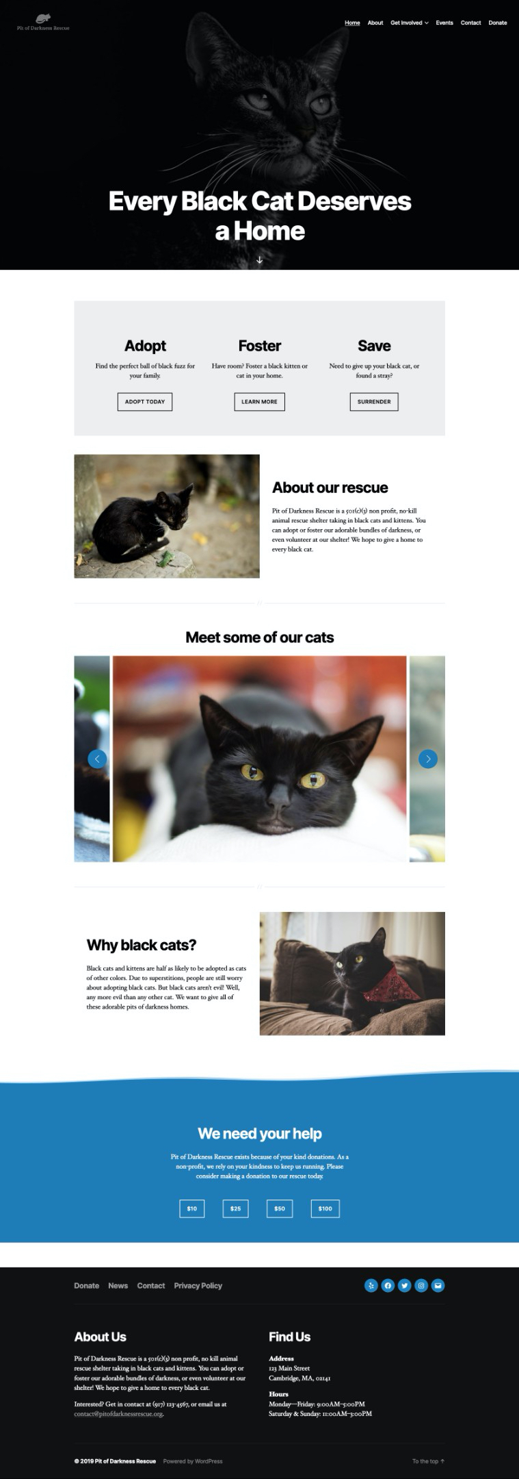
Almost perfect. It’s bold, streamlined, and features plenty of cute cats. The only issue that caught my eye is the gap of white between the page content and the footer, which I can fix with some CSS added into WordPress’s Customizer tool:
.home .footer-nav-widgets-wrapper {
    margin-top: 0;
}
Not too bad, considering this is the first bit of CSS I’ve had to write for my homepage layout.
How about the old editor?
Out of curiosity, I tried to recreate my homepage using the Classic Editor plugin, which restores the old WordPress editing interface. Since I used some of my favorite plugins on my block editor site, I decided it was only fair to leverage plugins on my classic site. I installed
Shortcodes Ultimate, a plugin offering over 60 shortcodes to improve the WordPress editor. It has a good shortcode picking interface, great documentation, and in my opinion, is one of the best shortcode plugins the WordPress community has to offer.
This wasn’t fun. No shortcode interface will make the experience worth it to me, when I could use Gutenberg. One misplaced bracket, and I’ve borked my site. It takes a whole lot of time. And, I almost always need to write a bunch of custom styles to get it to work with my theme.
With our homepage complete, let’s move on to some interior pages. There are a couple other blocks, and combinations of blocks, that can help me build out the rest of my site.
Cover Block
One of the earliest complex blocks offered in the new WordPress editor was the “Cover” block, which can be used for banners and hero images:

Originally, it only allowed you to add an image or video, headings, and paragraphs, but the requirements have recently been loosened so you can add whatever blocks you like. This can lead to some unique layout possibilities.
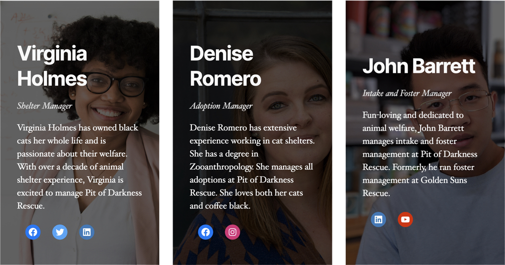
Take, for example, a “Teams” section on our About page. We could use columns to make a simple layout, like this:
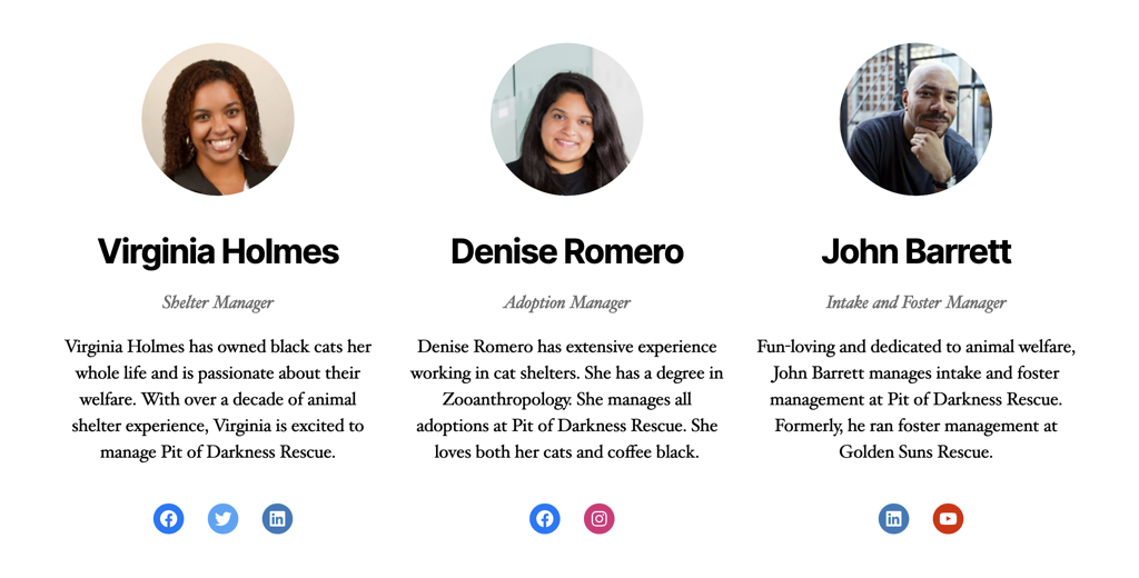
But if we have better images, we could explore using Cover to create more visual impact:
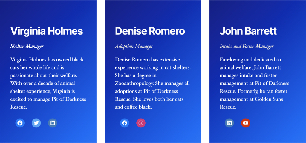
Let’s say we didn’t have any staff images, or they’re all poor quality and weirdly cropped, which is… not an usual occurrence! We can forego images altogether and instead, use the new gradient picker in Cover and use that to create visual impact:
Explore third-party blocks
Like CoBlocks’s gallery blocks, many third-party WordPress plugins can enhance your site and allow you to create a better experience for your visitors.
Accordions
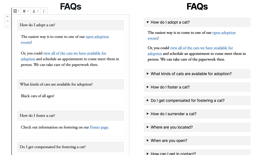
Let’s say this rescue organization has some FAQs. Rather than creating a wall-of-text, we could use an accordion block to organize the content for easier browsing:
Grids
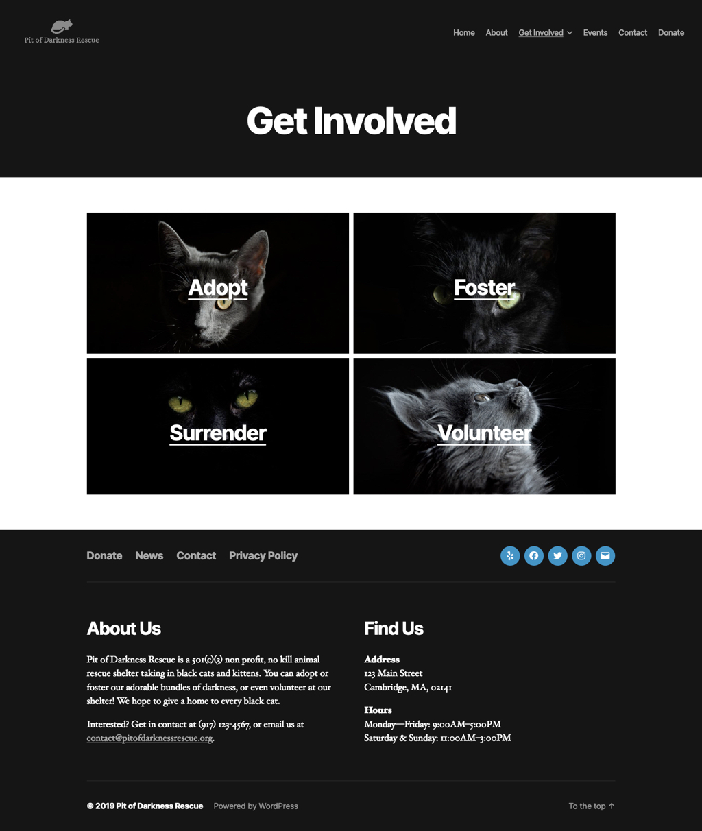
If columns aren’t adequate for achieving the layout you’re looking to build, you could try the Grids plugin by Evolve, which comes with a “build your own grid” feature:
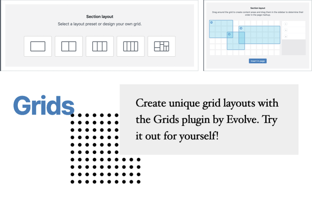
I can use this block to make a more visually interesting landing page for the “Get Involved” section, which only exists to link out to its child pages:
Typography
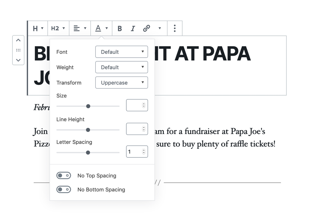
You can also use plugins like CoBlocks and Kioken Blocks to customize your site’s typography, opening up the possibilities for a truly from-scratch site design. And I have to admit, as someone who makes web software, the idea of giving full typographic control to users terrifies me… but as a designer, I absolutely love this feature! 😅
With these tools, it won’t take long to finish my website.
Tons of new possibilities
Mix and match to create beautiful, art-directed experiences using blocks. You can look for plugins that support and build on the new editor, or specifically download individual blocks in the new WordPress block directory (just beta launched!).
Unsure of how to combine blocks to make an impact? A couple of plugins like Atomic Blocks, Kioken Blocks, and Ultimate Addons for Gutenberg include pre-curated layouts you can quickly add to your own sites. These layouts are already art directed, so you can choose the one that creates the biggest impact on your own audience.
Explore, and share your results!
About the author
Mel Choyce is a wicked awesome product designer based in Boston, Massachusetts. Not only is Mel a WordPress Core Committer and former Release Lead, she is a regular core contributor and speaks frequently at WordCamps on design, typography, and user experience.
When Mel isn’t designing products at Automattic, she enjoys cold brew coffee, craft beer, and rocking out in her band. Say hi to her on Twitter at @melchoyce, and visit her site at choycedesign.com.
