Five Ways to Animate Responsibly

It’s been two years since I wrote about “Flashless Animation” on this very site. Since then, animation has steadily begun popping up on websites, from sleek app-like user interfaces to interactive magazine-like spreads. It’s an exciting time for web animation wonks, interaction developers, UXers, UI designers and a host of other acronyms!
But in our rush to experiment with animation it seems that we’re having fewer conversations about whether or not we should use it, and more discussions about what we can do with it. We spend more time fretting over how to animate all the things at 60fps than we do devising ways to avoid incapacitating users with vestibular disorders.
I love web animation. I live it. And I make adorably silly things with it that have no place on a self-respecting production website. I know it can be abused. We’ve all made fun of Flash-turbation. But how quickly we forget the lessons we learned from that period of web design. Parallax scrolling effects may be the skip intro of this generation. Surely we have learned better in the sobering up period between Flash and the web animation API.
So here are five bits of advice we can use to pull back from the edge of animation abuse. With these thoughts in mind, we can make 2015 the year web animation came into its own.
Animate deliberately
Sadly, animation is considered decorative by the bulk of the web development community. UI designers and interaction developers know better, of course. But when I’m teaching a workshop on animation for interaction, I know that my students face an uphill battle against decision makers who consider it nice to have, and tack it on at the end of a project, if at all.
This stigma is hard to shake. But it starts with us using animation deliberately or not at all. Poorly considered, tacked-on animation will often cause more harm than good. Users may complain that it’s too slow or too fast, or that they have no idea what just happened.
When I was at Chrome Dev Summit this year, I had the privilege to speak with Roma Sha, the UX lead behind Polymer’s material design (with the wonderful animation documentation). I asked her what advice she’d give to people using animation and transitions in their own designs. She responded simply: animate deliberately. If you cannot afford to slow down to think about animation and make well-informed and well-articulated decisions on behalf of the user, it is better that you not attempt it at all. Animation takes energy to perform, and a bad animation is worse than none at all.
It takes more than twelve principles
We always try to draw correlations between disparate things that spark our interest. Recently it feels like more and more people are putting the The Illusion of Life on their reading shelf next to Understanding Comics. These books give us so many useful insights from other industries. However, we should never mistake a website for a comic book or an animated feature film. Some of these concepts, while they help us see our work in a new light, can be more or less relevant to producing said work.
The illusion of life from cento lodigiani on Vimeo.
I am specifically thinking of the twelve principles of animation put forth by Disney studio veterans in that great tome The Illusion of Life. These principles are very useful for making engaging, lifelike animation, like a ball bouncing or a squirrel scampering, or the physics behind how a lightbox should feel transitioning off a page. But they provide no direction at all for when or how something should be animated as part of a greater interactive experience, like how long a drop-down should take to fully extend or if a group of manipulable objects should be animated sequentially or as a whole.
The twelve principles are a great place to start, but we have so much more to learn. I’ve documented at least six more functions of interactive animation that apply to web and app design. When thinking about animation, we should consider why and how, not just what, the physics. Beautiful physics mean nothing if the animation is superfluous or confusing.
Useful and necessary, then beautiful
There is a Shaker saying: “Don’t make something unless it is both necessary and useful; but if it is both necessary and useful, don’t hesitate to make it beautiful.” When it comes to animation and the web, currently there is very little documentation about what makes it useful or necessary. We tend to focus more on the beautiful, the delightful, the aesthetic. And while aesthetics are important, they take a back seat to the user’s overall experience.
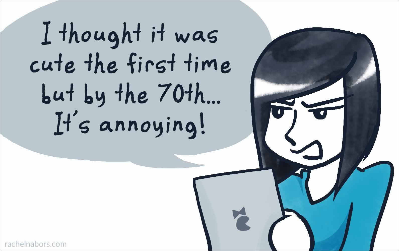
The first time I saw the load screen for Pokemon Yellow on my Game Boy, I was enthralled. By the sixth time, I was mashing the start button as soon as Game Freak’s logo hit the screen. What’s delightful and meaningful to us while working on a project is not always so for our users. And even when a purely delightful animation is favorably received, as with Pokemon Yellow’s adorable opening screen, too many repetitions of the cutest but ultimately useless animation, and users start to resent it as a hindrance.
If an animation doesn’t help the user in some way, by showing them where they are or how two elements on a page relate to each other, then it’s using up battery juice and processing cycles solely for the purpose of delight. Hardly the best use of resources.
Rather than animating solely for the sake of delight, we should first be able to articulate two things the animation does for the user. As an example, take this menu icon from Finethought.com (found via Use Your Interface). The menu icon does two things when clicked:
- It gives the user feedback by animating, letting the user know its been clicked.
- It demonstrates its changed relationship to the page’s content by morphing into a close button.

Assuming we have two good reasons to animate something, there is no reason our third cannot be to delight the user.
Go four times faster
There is a rule of thumb in the world of traditional animation which is applicable to web animation: however long you think your animation should last, take that time and halve it. Then halve it again! When we work on an animation for hours, our sense of time dilates. What seems fast to us is actually unbearably slow for most users. In fact, the most recent criticism from users of animated interfaces on websites seems to be, “It’s so slow!” A good animation is unobtrusive, and that often means running fast.
When getting your animations ready for prime time, reduce those durations to 25% of their original speed: a four-second fade out should be over in one.
Install a kill switch
No matter how thoughtful and necessary an animation, there will be people who become physically sick from seeing it. For these people, we must add a way to turn off animations on the website.
Fortunately, web designers are already thinking of ways to empower users to make their own decisions about how they experience the web. As an example, this site for the animated film Little from the Fish Shop allows users to turn off most of the parallax effects. While it doesn’t remove the animation entirely, this website does reduce the most nauseating of the animations.
Animation is a powerful tool in our web design arsenal. But we must take care: if we abuse animation it might get a bad reputation; if we underestimate it, it won’t be prioritized. But if we wield it thoughtfully, use it where it is both necessary and useful, and empower users to turn it off, animation is a tool that will help us build things that are easier to use and more delightful for years to come.
Let’s make 2015 the year web animation went to work for users.
About the author
Rachel Nabors is an interaction developer and award-winning cartoonist. She travels the world, speaking and training people in the art of web animation. When not biking around her home city of Portland, she makes interactive comics at her company Tin Magpie. You can catch her as @rachelnabors on Twitter and at rachelnabors.com.
Brought to you by
Related articles
-
Be Fluid with Your Design Skills: Build Your Own Sites
Ros Horner rings out a Christmas message for designers far and near of peace and goodwill to all, especially if they’re developers. With a rallying cry to take back control to see your own designs realised, young or old, merry or sober, the story is clear; as you design, so should you build.
-
Designing Your Future
Christopher Murphy channels the Ghost of Christmas Yet-to-Come by not just look into the future, but shaping the form it takes. By taking action now you can affect the outcome down the road, making all the difference when it comes to a big life change such as leaving full time employment.
-
It All Starts with a Humble <textarea>
Andy Bell rings out a fresh call in support of the timeless concept of progressive enhancement. What does it mean to build a modern JavaScript-focussed web experience that still works well if part of the stack isn’t supported or fails? Andy shows us how that might be done.
-
Jobs-to-Be-Done in Your UX Toolbox
Steph Troeth rallies the workshop elves around an idea for revolutionising their worksheets and giving them a new way to think about approaching each job. One thing’s for certain, as Christmas approaches there’s always plenty of jobs to be done.
-
Levelling Up for Junior Developers
Dean Hume places another log on the fire, sets the poker back on its stand, pulls up and chair and gathers the junior developers around the hearth to impart some wisdom. Whether you’re just starting out or have been in the game some time, we can all benefit from a little levelling up.
-
Solve the Hard Problems
Drew McLellan brings our 2015 calendar to a motivational close with some encouragement for the year ahead. Year’s end is a time for reflection and finding new purpose and enthusiasm for what we do. By tackling the thorniest design and development problems, we can make the greatest impact – and have the most fun. Merry Christmas and a happy New Year!