Science!
Sometimes we want to capture people’s attention at a glance to communicate something fast. At other times we want to have the interface fade away into the background, letting people paint pictures in their minds with our words (if you’ll forgive a little flowery festive flourish).
I tend to distinguish between these two broad objectives as designing for impact on the one hand, and designing for immersion on the other. What defines them is interruption. Impact needs an attention-grabbing interruption. Immersion requires us to remove interruption from the interface. Careful design deliberately interrupts but doesn’t accidentally disrupt. If that seems to make sense to you, then you’ll find the following snippets of science as useful as I did.
Saccades and fixations
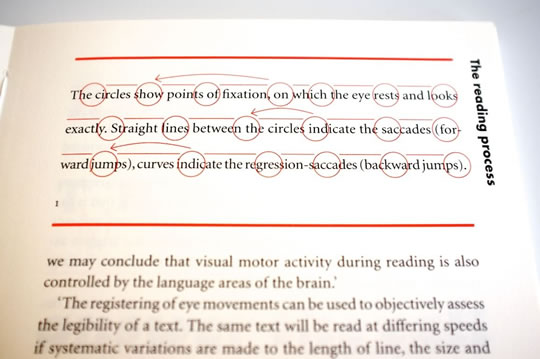
As you’re reading this your eyes are skipping along the lines in tiny jumps. During each jump everything is blurred. Each jump ends in a small pause so your brain can take a snapshot of the letters. It arranges them into words, and then parses out the meaning — fast — in around a quarter of a second.
The jumps are called saccades. The pauses are called fixations. Sometimes we take regressive saccades, skipping back to reread. There’s a simple example in the excellent little book, Detail in Typography, by Jost Hochuli.
If you want to explore the science of reading in much more depth, I recommend the excellent paper, “The Science of Word Recognition”, by Dr Kevin Larson of Microsoft.
To design for legibility and readability is to design for saccades and fixations. It’s the craft of making it easy for people’s brains to extract meaning, using techniques like good contrast, font size, spacing and structure, and only interrupting the reading experience deliberately.
Scan paths
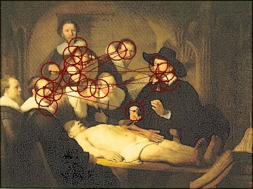
At some point when visiting 24 ways you probably scanned the screen to get orientated. The journey your eyes took is known as a scan path. Scan paths are made up of saccades and fixations. Right now you’re following a scan path as you read, along one line, and down to the next. This is a map of the scan paths found by Olivier Le Meur from observing people looking at Rembrandt’s Leçon d’anatomie:
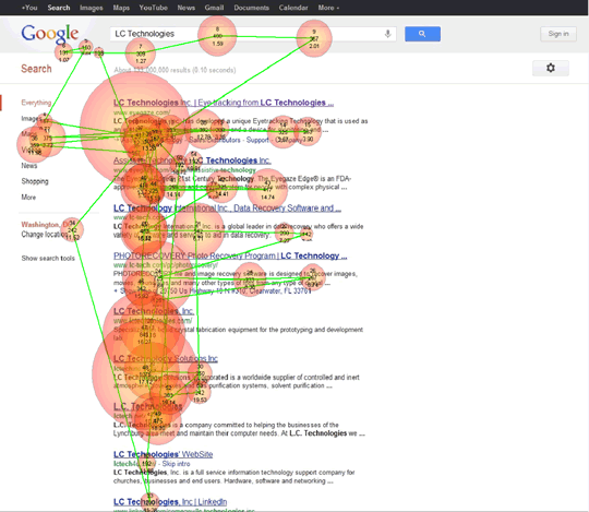
For websites, the scan path is a little different. This is an aggregate scan path of Google from LC Technologies:
The average shape of a website scan path becomes clearer in this average scan path taken by forty-six people during research by the Poynter Institute, the Estlow Center for Journalism & New Media, and Eyetools:
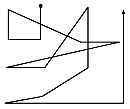
Just like when we read text arranged left to right in a vertical column, scan paths follow a roughly Z-shaped pattern from the top left to bottom right. Sometimes we skip back to reread a word or sentence, or glance again at a specific element, but the Z-shaped scan path persists.
Designing for scan paths is to organise content to help people move through an interface to get orientated, and to read.
The elements that are important enough to need impact must interrupt the scan path and clearly call attention to themselves. However, they don’t always need to clip people round the ear from multiple directions at once to get attention. It helps to list elements by importance. That gives us an interruption hierarchy to work with. Elements can then interrupt the design with degrees of contrast to the rest of the content using either positioning, treatment, or both. Ta-da! Impact achieved, but gently. No clips round the ear required.
Swinging mood
Human beings are resilient. Among the immersion and occasional interruptions, we even like a little disruption, especially if it’s absurd and funny. The Ling’s Cars website proves it. In fact, we’re so resilient that we can work around all kinds of mayhem to get a seemingly simple task done.
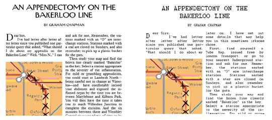
In one study, “The Aesthetics of Reading” (PDF, 480Kb), Dr Kevin Larson of Microsoft and Dr Rosalind Picard of MIT explored the effect of good typography on mood. Two versions of the New Yorker ePeriodical were created. One was typeset well and the other poorly.
They engaged twenty volunteers — half male, half female — and showed the good version to half of the participants. The other half saw the poor version.
The good doctors found that, “there are important differences between good and poor typography that appear to have little effect on common performance measures such as reading speed and comprehension.” In short, good typography didn’t help people read faster or comprehend better.
Oh. On the face of it that seems to invalidate what we designers do. Hold your horses, though! They also found that “the participants who received the good typography performed better on relative subjective duration and on certain cognitive tasks”, and that “good typography induces a good mood.”
This means that even though there were no actual differences in reading speed and comprehension, the people who read the version with good typography thought that it took less time to read, and were induced into a good mood by doing so. Not only that, but by being in a good mood, people were more capable of completing creative tasks faster.
That was a revelation to me. It means that the study showed there is a positive, measurable, emotional and perceptual benefit to good typography and design. To paraphrase: time and tasks fly when you’re having fun!
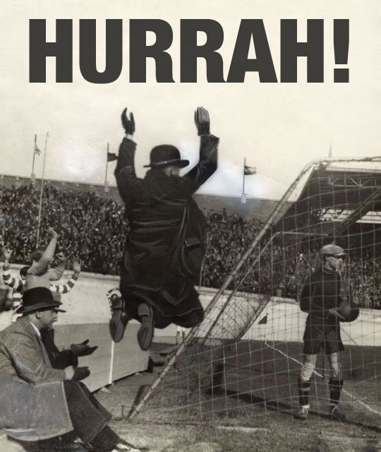
Source: Nationaal Archief of the Netherlands: Cheering man after the first goal, Netherlands vs. Belgium, Amsterdam, 1931.
So, among all my talk of saccades, fixations, scan paths and typesetting, there is science, and the science helps us qualify our design decisions when we need to, and do our jobs better. The science helps us understand how people will interact with our work, and what the actual benefits are for them, and the products or organisations we serve. Good design equals a subjectively quicker experience, a good mood, objectively faster completion of tasks, and happiness for everyone. Thank you, science!
About the author
Jon Tan is a designer and typographer who co-founded the web fonts service, Fontdeck. He’s a partner in Fictive Kin, where he works with friends making things like Brooklyn Beta and Mapalong.
His addiction to web typography has led him to share snippets of type news via @t8y. He also writes for publications like Typographica and 8 Faces, speaks at international events like An Event Apart, and works with such organisations as the BBC.
Jon is based in Mild Bunch HQ, the co-working studio he started in Bristol, UK. He can often be found wrestling with his two sons, losing, then celebrating the fact as @jontangerine on Twitter.

