Colour Accessibility

Here’s a quote from Josef Albers:
In visual perception a colour is almost never seen as it really is[…] This fact makes colour the most relative medium in art.Josef Albers, Interaction of Color, 1963
Albers was a German abstract painter and teacher, and published a very famous course on colour theory in 1963. Colour is very relative — not just in the way that it appears differently across different devices due to screen quality and colour management, but it can also be seen differently by different people — something we really need to be more mindful of when designing.
What is colour blindness?
Colour blindness very rarely means that you can’t see any colour at all, or that people see things in greyscale. It’s actually a decreased ability to see colour, or a decreased ability to tell colours apart from one another.
How does it happen?
Inside the typical human retina, there are two types of receptor cells — rods and cones. Rods are the cells that allow us to see dark and light, and shape and movement. Cones are the cells that allow us to perceive colour. There are three types of cones, each responsible for absorbing blue, red, and green wavelengths in the spectrum.
Problems with colour vision occur when one or more of these types of cones are defective or absent entirely, and these problems can either be inherited through genetics, or acquired through trauma, exposure to ultraviolet light, degeneration with age, an effect of diabetes, or other factors.
Colour blindness is a sex-linked trait and it’s much more common in men than in women. The most common type of colour blindness is called deuteranomaly which occurs in 7% of males, but only 0.5% of females. That’s a pretty significant portion of the population if you really stop and think about it — we can’t ignore this demographic.
What does it look like?
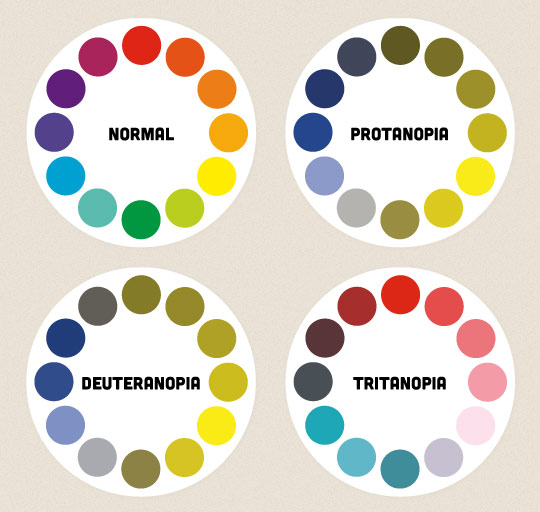
People with the most common types of colour blindness, like protanopia and deuteranopia, have difficulty discriminating between red and green hues. There are also forms of colour blindness like tritanopia, which affects perception of blue and yellow hues. Below, you can see what a colour wheel might look like to these different people.
What can we do?
Here are some things you can do to make your websites and apps more accessible to people with all types of colour blindness.
Include colour names and show examples
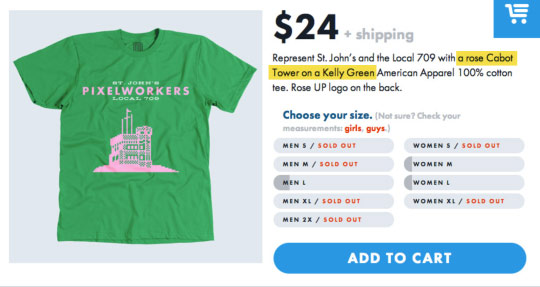
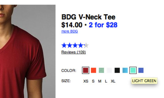
One of the most common annoyances I’ve heard from people who are colour-blind is that they often have difficulty purchasing clothing and they will sometimes need to ask another person for a second opinion on what the colour of the clothing might actually be. While it’s easier to shop online than in a physical store, there are still accessibility issues to consider on shopping websites.
Let’s say you’ve got a website that sells T-shirts. If you only show a photo of the shirt, it may be impossible for a person to tell what colour the shirt really is. For clarification, be sure to reference the name of the colour in the description of the product.
United Pixelworkers does a great job of following this rule. The St. John’s T-shirt has a quirky palette inspired by the unofficial pink, white and green Newfoundland flag, and I can imagine many people not liking it.
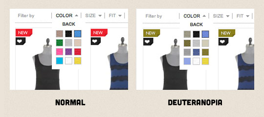
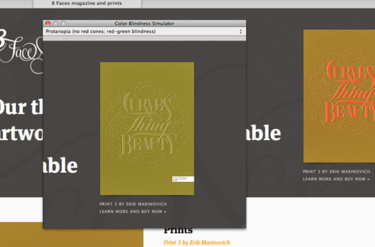
Another common problem occurs when a colour filter has been added to a product search. Here’s an example from a clothing website with unlabelled colour swatches, and how that might look to someone with deuteranopia-type colour blindness.
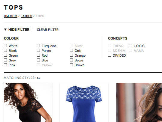
The colour search filter below, from the H&M website, is much better since it uses names instead.
At first glance, Urban Outfitters also uses unlabelled colour swatches on product pages (below), but on closer inspection, the colour name is displayed on hover. This isn’t an ideal solution, because although it’ll work on a desktop browser, it won’t work on a touchscreen device where hovering isn’t an option.
Using overly fancy colour names, like the ones you might find labelling high-end interior paint can be just as confusing as not using a colour name at all. Names like grape instead of purple don’t really give the viewer any useful information about what the colour actually is on a colour wheel. Is grape supposed to be purple, or could it refer to red grapes or even green? Stick with hue names as much as possible.
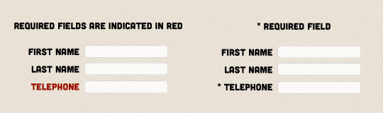
Avoid colour-specific instructions
When designing forms, avoid labelling required fields only with coloured text. It’s safer to use a symbol cue like the asterisk which is colour-independent.
A similar example would be directing a user to click a green button to purchase a product. Label your buttons clearly and reference them in the site copy by function, not colour, to avoid confusion.
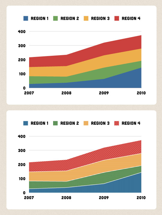
Don’t rely on colour coding
Designing accessible maps and infographics can be much more challenging.
Don’t rely on colour coding alone — try to use a combination of colour and texture or pattern, along with precise labels, and reflect this in the key or legend. Combine a blue background with a crosshatched pattern, or a pink background with a stippled dot — your users will always have two pieces of information to work with.
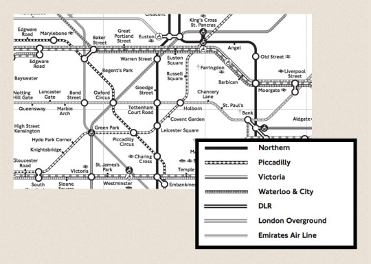
The map of the London subway system is an iconic image not just in London, but around the world. Unfortunately, it contains some colours that are indistinguishable from each other to a person with a vision problem. This is true not only for the London underground, but also for any other wayfinding system that relies on colour coding as the only key in a legend.
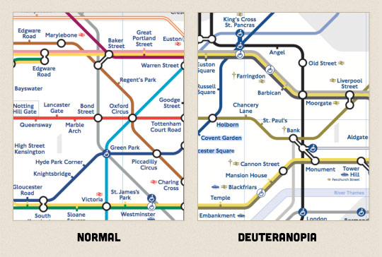
There are printable versions of the map available online in black and white, using patterns and shades of black and grey that are distinguishable, but the point is that there would be no need for such a map if it were designed with accessibility in mind from the beginning. And, if you’re a person who has a physical disability as well as a vision problem, the “Step-Free” guide map which shows stations is based on the original coloured map.
Provide alternatives and customization
While it’s best to consider these issues and design your app to be accessible by default, sometimes this might not be possible. Providing alternative styles or allowing users to edit their own colours is a feature to keep in mind.
The developers of the game Faster Than Light created an alternate colour-blind mode and asked for public feedback to make sure that it passed the test. Not much needed to be done, but you can see they added stripes to the red zones and changed some outlines to blue.

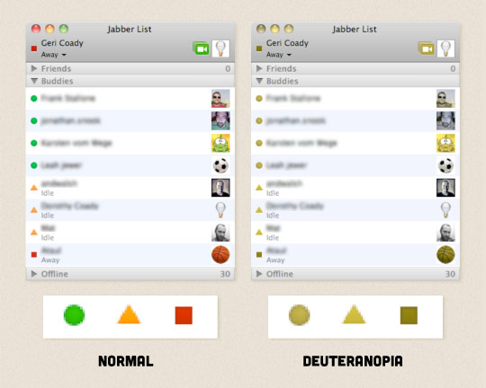
iChat is also a good example. Although by default it uses coloured bubbles to indicate a user’s status (available for chat, away or idle, or busy), included in the preferences is a “User Shapes to Indicate Status” option, which changes the shape of the standard circles to green circles, yellow triangles and red squares.
Pay attention to contrast
Colours that are similar in value but different in hue may be easy to distinguish between for a user with good vision, but a person who suffers from colour blindness may not be able to tell them apart at all. Proofing your work in greyscale is a quick way to tell if there’s enough contrast between the most important information in your design.
Check with a simulator
There are many tools out there for simulating different types of colour blindness, and it’s worth checking your design to catch any potential problems up front.
One is called Sim Daltonism and it’s available for Mac OS X. It’ll show a pop-up preview next to your cursor and you can choose which type of colour blindness you want to test from a drop-down menu.
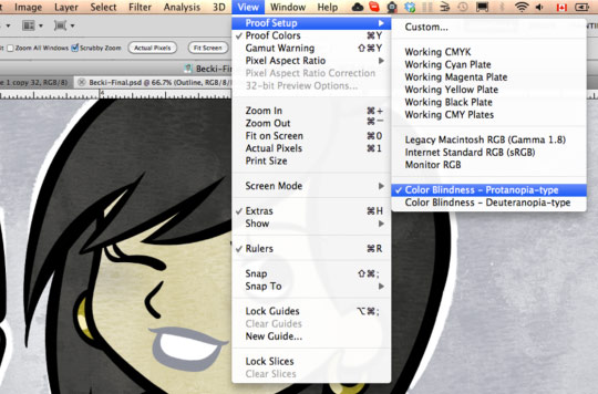
You can also proof for the two most common types of colour blindness right in Photoshop or Illustrator (CS4 and later) while you’re designing.
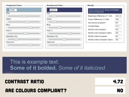
The colour contrast check tool from designer and developer Jonathan Snook gives you the option to enter a colour code for a background, and a colour code for text, and it’ll tell you if the colour contrast ratio meets the Web Content Accessibility Guidelines 2.0. You can use the built-in sliders to adjust your colours until they meet the compliant contrast ratios. This is a great tool to test your palette before going live.
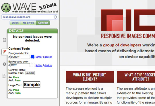
For live websites, you can use the accessibility tool called WAVE, which also has a contrast checker. It’s important to keep in mind, though, that while WAVE can identify contrast errors in text, other things can slip through, so a site that passes the test does not automatically mean it’s accessible in reality.
For example, the contrast checker here doesn’t notice that our red link in the introduction isn’t underlined, and therefore could blend into the surrounding paragraph text.
I know that once I started getting into the habit of checking my work in a simulator, I became more mindful of any potential problem areas and it was easier to avoid them up front. It’s also made me question everything I see around me and it sends red flags off in my head if I think it’s a serious colour blindness fail. Understanding that colour is relative in the planning stages and following these tips will help us make more accessible design for all.
About the author
Geri Coady is a colour-obsessed illustrator and designer from Newfoundland, Canada. She is a former Art Director at a Canadian advertising agency and is now pursuing her own clients through her website at hellogeri.com. Geri loves chatting about nerdy things on Twitter and has shared her thoughts in publications such as net magazine, The Pastry Box Project, and Digital Arts. She’s the author of the Pocket Guide to Colour Accessibility from Five Simple Steps, a sometimes-illustrator for A List Apart, and was voted Net Magazine’s Designer of the Year in 2014.
Brought to you by
Related articles
-
Accessibility Through Semantic HTML
Laura Kalbag takes us back to basics to make sure we consider accessibility when structuring our HTML. The Christmas tree needs to be standing firm before we drape it in lights and tinsel, and until you lot start doing it, we’re not going to stop preaching it.
-
Automating Your Accessibility Tests
Seren Davies reminds us that unlike Christmas, accessibility testing should not come but once a year with a look at how to apply automated testing. By configuring tests to run against each commit, you can ensure that your site’s accessibility compliance need not be left to chance.
-
Designing with Contrast
Mark Mitchell casts coarse salt upon the pale icy sheen of recent web design aesthetics to sound a warning that we may be on thin ice. The tension between low contrast tastes and high contrast needs is a story as old as the
<font>tag, and yet it bears frequent retelling. For snow has fallen snow on snow. -
Don’t Push Through the Pain
Carolyn Wood reminds us of what in recent years we’ve come to overlook, hunched as we are over laptop and tablet: our physical wellbeing. Sometimes, that tingle down your arm from shoulder to fingers isn’t Christmas magic.
-
Future Accessibility Guidelines—for People Who Can’t Wait to Read Them
Alan Dalton uses this, the International Day of Persons with Disabilities, to look back at where we’ve come from, to evaluate where we are, and to look forward to what’s coming next in the future of accessibility guidelines.
-
Inclusive Considerations When Restyling Form Controls
Scott O’Hara hogs the remote while he looks into the ever-present issue of custom form controls. We might brute-force an element to take on the styling we’re looking for, but will that interaction still make sense for all users? Let’s give the batteries a rub and find out.