Sketching to Communicate
As a web designer I’ve always felt that I’d somehow cheated the system, having been absent on the day God handed out the ability to draw. I didn’t study fine art, I don’t have a natural talent to effortlessly knock out a realistic bowl of fruit beside a water jug, and yet somehow I’ve still managed to blag my way this far. I’m sure many of you may feel the same.
I had no intention of becoming an artist, but to have enough skill to convey an idea in a drawing would be useful. Instead, my inadequate instrument would doodle drunkenly across the page leaving a web of unintelligible paths instead of the refined illustration I’d seen in my mind’s eye. This – and the natural scrawl of my handwriting – is fine (if somewhat frustrating) when it’s for my eyes only but, when sketching to communicate a concept to a client, such amateur art would be offered with a sense of embarrassment. So when I had the opportunity to take part in some sketching classes whilst at Clearleft I jumped at the chance.
Why sketch?
In UX workshops early on in a project’s life, sketching is a useful and efficient way to convey and record ideas. It’s disposable and inexpensive, but needn’t look amateur. A picture may be worth a thousand words, but a well executed sketch of how you’ll combine funny YouTube videos with elephants to make Lolephants.com could be worth millions in venture capital. Actually, that’s not bad… ;-)
Although (as you will see) the basics of sketching are easy to master, the kudos you will receive from clients for being a ‘proper designer’ makes it worthwhile!
Where to begin?
Start by not buying yourself a sketch pad. If you were the type of child who ripped the first page out of a school exercise book and started again if you made even a tiny mistake (you’re not alone!), Wreck This Journal may offer a helping hand. Practicing on plain A4 paper instead of any ‘special’ notepad will make the process a whole lot easier, no matter how deliciously edible those Moleskines look.
Do buy yourself a black fine-liner pen and a set of grey Pro Markers for shading. These pens are unlike any you will have used before, and look like blended watercolours once the ink is dry. Although multiple strokes won’t create unsightly blotches of heavy ink on the page, they will go right through your top sheet so always remember to keep a rough sheet in the second position as an ink blotter.
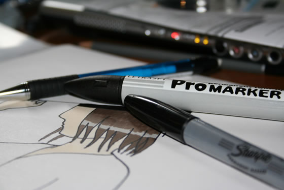 photo by Tom Harrison
Don’t buy pencils to sketch with, as they lack the confidence afforded by the heavy black ink strokes of marker pens and fine-liners.
If you’re going to be sketching with clients then invest in some black markers and larger sheets of paper. At the risk of sounding like a stationery brand whore, Sharpies are ideal, and these comedy-sized Post-Its do the job far better than cheaper, less sticky alternatives. Although they’re thicker than most standard paper, be sure to double-layer them if you’re writing on them on a wall, unless you fancy a weekend redecorating your client’s swanky boardroom.
The best way to build confidence and improve your sketching technique is, obviously, to practise. Reading this article will be of no help unless you repeat the following examples several times each. Go grab a pen and some paper now, and notice how you improve within even a short period of time.
Sketching web UI
Most elements of any website can be drawn as a combination of geometric shapes.
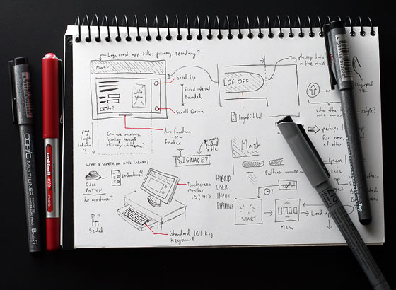 photo by Nathanael Boehm
Circles
To draw a circle, get in position and start by resting your hand on the page and making the circular motion a few times without putting pen to paper. As you lower your pen whilst continuing the motion, you should notice the resulting shape is more regular than it otherwise would have been.
Squares and rectangles
Draw one pair of parallel lines first, followed by the others to complete the shapes. Slightly overlap the ends of the lines to make corners feel more solid than if you were to leave gaps. If you’re drawing a container, always draw the contents first, that way it won’t be a squash to fit them in. If you’re drawing a grid (of thumbnails, for instance), draw all parallel lines first as a series of long dashes to help keep line lengths and angles consistent.

Shadows
To lift elements from the page for emphasis, add a subtle shadow with a grey marker. For the most convincing look, assume the light source to be at the top left of the page – the shadow should simply be a thick grey line along the bottom and up the right edge of your shape. If the shape is irregular, the shadow should follow its outline. This is a good way to emphasise featured items, speech bubbles, form buttons, and so on.
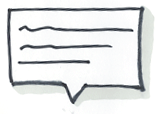
Sketching ideas
Arrows
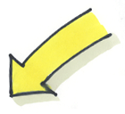
Use arrows to show steps in a process or direction of movement. Giving shadows a 3-D feel, or adding a single colour, will help separate them from the rest of the sketch.
Faces
Start by drawing the circle. The direction of the nose (merely a point) indicates the direction of the person’s gaze. The eyes and mouth show emotion: more open and curvy for happy thoughts; more closed and jagged for angry thoughts. Try out a few shapes and see what emotions they convey.

People
Remember, we’re aiming for communication rather than realism here. A stick man would be fine. Give him a solid body, as shown in this example, and it becomes easier to pose him.
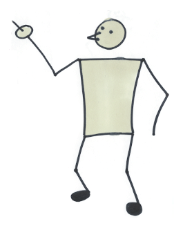
I know you think hands are hard, but they’re quite important to convey some ideas, and for our purposes we don’t need to draw hands with any detail. An oval with a stick does the job of a pointing hand. Close-ups might need more fingers showing, but still don’t require any degree of realism.
Signage
Don’t be afraid to use words. We’re sketching to communicate, so if the easiest way to show an office block is a building with a big ‘office’ sign on the roof, that’s fine!

Labels
Likewise, feel free to label interactions. Use upper-case letters for legibility and slightly angle the horizontal bars upwards to create a more positive feel.
Clichés
Clichés are your friend! Someone’s having an idea? Light bulb above the head. Computer’s crashed? Cloud of smoke with “$£%*!”


It’s good to practise regularly. Try applying these principles to still life, too. Look around you now and draw the cup on the table, or the books on the shelf. Think of it as a combination of shapes and aim for symbolism rather than realism, and it’s not as hard as you’d think.
I hope this has given you the confidence to give it a shot, and the ability to at least not be mortified with the results!
Tip: If you’re involving clients in design games like Leisa Reichelt’s ‘Design Consequences’ it may be wise to tone down the quality of your drawings at that point so they don’t feel intimidated. Remember, it’s important for them to feel at ease with the idea of wireframing in front of you and their colleagues, no matter how bad their line work.
For more information see davegrayinfo.com – Dave Gray taught me everything I know :-)
About the author
Paul Annett has over 10 years’ interaction design experience, with the last five spent as a Senior Designer at award-winning UX agency, Clearleft. In June 2010 he left and has established his own little design studio, Supernice Studio Ltd. He and his wife, Relly Annett-Baker, live in the home counties with their two little boys and two cats.


