A Christmas hCard From Me To You
So apparently Christmas is coming. And what is Christmas all about? Well, cleaning out your address book, of course! What better time to go through your contacts, making sure everyone’s details are up date and that you’ve deleted all those nasty clients who never paid on time?
It’s also a good time to make sure your current clients and colleagues have your most up-to-date details, so instead of filling up their inboxes with e-cards, why not send them something useful? Something like a… vCard! (See what I did there?)
Just in case you’ve been working in a magical toy factory in the upper reaches of Scandinavia for the last few years, I’m going to tell you that now would also be the perfect time to get into microformats. Using the hCard format, we’ll build a very simple web page and markup our contact details in such a way that they’ll be understood by microformats plugins, like Operator or Tails for Firefox, or the cross-browser Microformats Bookmarklet.
Oh, and because Christmas is all about dressing up and being silly, we’ll make the whole thing look nice and have a bit of fun with some CSS3 progressive enhancement.
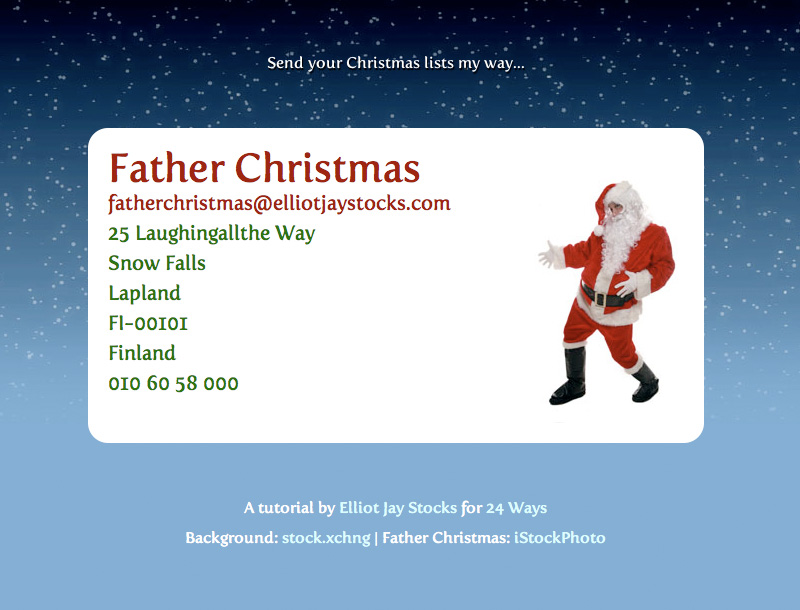
If you can’t wait to see what we end up with, you can preview it here.

Step 1: Contact Details
First, let’s decide what details we want to put on the page. I’d put my full name, my email address, my phone number, and my postal address, but I’d rather not get surprise visits from strangers when I’m fannying about with my baubles, so I’m going to use Father Christmas instead (that’s Santa to you Yanks).
Father Christmas
fatherchristmas@elliotjaystocks.com
25 Laughingallthe Way
Snow Falls
Lapland
Finland
010 60 58 000
Step 2: hCard Creator
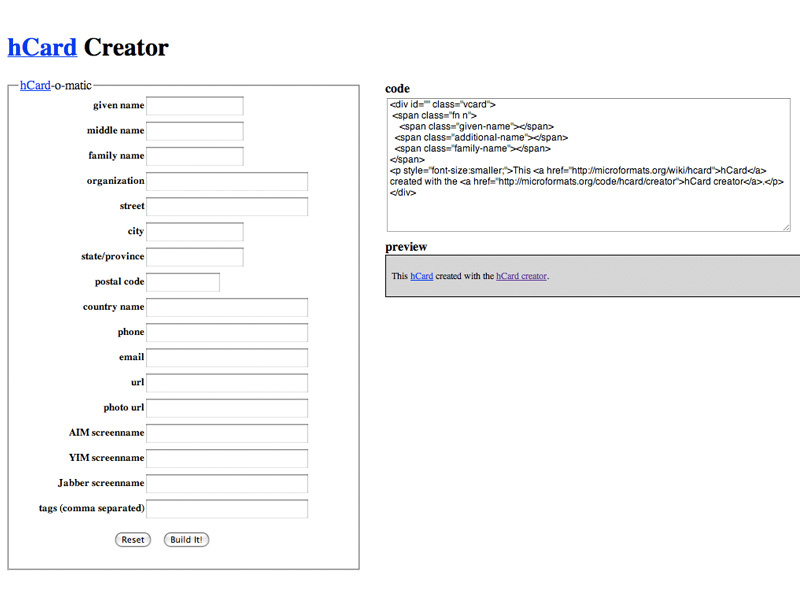
Now I’m not sure about you, but I rather like getting the magical robot pixies to do the work for me, so head on over to the hCard Creator and put those pixies to work! Pop in your details and they’ll give you some nice microformatted HTML in turn.

<div id="hcard-Father-Christmas" class="vcard">
	<a class="url fn" href="http://elliotjaystocks.com/fatherchristmas">Father Christmas</a>
	<a class="email" href="mailto:fatherchristmas@elliotjaystocks.com"> fatherchristmas@elliotjaystocks.com</a>
	<div class="adr">
	<div class="street-address">25 Laughingallthe Way</div>
	<span class="locality">Snow Falls</span>
	,
	<span class="region">Lapland</span>
	,
	<span class="postal-code">FI-00101</span>
	<span class="country-name">Finland</span>
</div>
<div class="tel">010 60 58 000</div>
	<p style="font-size:smaller;">This <a href="http://microformats.org/wiki/hcard">hCard</a> created with the <a href="http://microformats.org/code/hcard/creator">hCard creator</a>.</p>
</div>
Step 3: Editing The Code
One of the great things about microformats is that you can use pretty much whichever HTML tags you want, so just because the hCard Creator Fairies say something should be wrapped in a <span> doesn’t mean you can’t change it to a <blink>. Actually, no, don’t do that. That’s not even excusable at Christmas.
I personally have a penchant for marking up each line of an address inside a <li> tag, where the parent url retains the class of adr. As long as you keep the class names the same, you’ll be fine.
<div id="hcard-Father-Christmas" class="vcard">
	<h1><a class="url fn" href="http://elliotjaystocks.com/fatherchristmas">Father Christmas </a></h1>
	<a class="email" href="mailto:fatherchristmas@elliotjaystocks.com?subject=Here, have some Christmas cheer!">fatherchristmas@elliotjaystocks.com</a>
	<ul class="adr">
		<li class="street-address">25 Laughingallthe Way</li>
		<li class="locality">Snow Falls</li>
		<li class="region">Lapland</li>
		<li class="postal-code">FI-00101</li>
		<li class="country-name">Finland</li>
	</ul>
	<span class="tel">010 60 58 000</span>
</div>
Step 4: Testing The Microformats
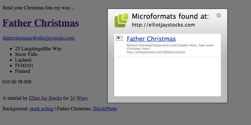
With our microformats in place, now would be a good time to test that they’re working before we start making things look pretty. If you’re on Firefox, you can install the Operator or Tails extensions, but if you’re on another browser, just add the Microformats Bookmarklet. Regardless of your choice, the results is the same: if you’ve code microformatted content on a web page, one of these bad boys should pick it up for you and allow you to export the contact info. Give it a try and you should see father Christmas appearing in your address book of choice. Now you’ll never forget where to send those Christmas lists!

Step 5: Some Extra Markup
One of the first things we’re going to do is put a photo of Father Christmas on the hCard. We’ll be using CSS to apply a background image to a div, so we’ll be needing an extra div with a class name of “photo”. In turn, we’ll wrap the text-based elements of our hCard inside a div cunningly called “text”. Unfortunately, because of the float technique we’ll be using, we’ll have to use one of those nasty float-clearing techniques. I shall call this “christmas-cheer”, since that is what its presence will inevitably bring, of course.
Oh, and let’s add a bit of text to give the page context, too:
<p>Send your Christmas lists my way...</p>
<div id="hcard-Father-Christmas" class="vcard">
	<div class="text">
		<h1><a class="url fn" href="http://elliotjaystocks.com/fatherchristmas">Father Christmas </a></h1>
		<a class="email" href="mailto:fatherchristmas@elliotjaystocks.com?subject=Here, have some Christmas cheer!">fatherchristmas@elliotjaystocks.com</a>
		<ul class="adr">
			<li class="street-address">25 Laughingallthe Way</li>
			<li class="locality">Snow Falls</li>
			<li class="region">Lapland</li>
			<li class="postal-code">FI-00101</li>
			<li class="country-name">Finland</li>
		</ul>
		<span class="tel">010 60 58 000</span>
	</div>
	<div class="photo"></div>
	<br class="christmas-cheer" />
</div>
<div class="credits">
	<p>A tutorial by <a href="http://elliotjaystocks.com">Elliot Jay Stocks</a> for <a href="http://24ways.org/">24 Ways</a></p>
	<p>Background: <a href="http://sxc.hu/photo/1108741">stock.xchng</a> | Father Christmas: <a href="http://istockphoto.com/file_closeup/people/4575943-active-santa.php?id=4575943">iStockPhoto</a></p>
</div>
Step 6: Some Christmas Sparkle
So far, our hCard-housing web page is slightly less than inspiring, isn’t it? It’s time to add a bit of CSS. There’s nothing particularly radical going on here; just a simple layout, some basic typographic treatment, and the placement of the Father Christmas photo. I’d usually use a more thorough CSS reset like the one found in the YUI or Eric Meyer’s, but for this basic page, the simple * solution will do.
Check out the step 6 demo to see our basic styles in place.
From this…

… to this:

Step 7: Fun With imagery
Now it’s time to introduce a repeating background image to the <body> element. This will seamlessly repeat for as wide as the browser window becomes.
But that’s fairly straightforward. How about having some fun with the Father Christmas image? If you look at the image file itself, you’ll see that it’s twice as wide as the area we can see and contains a ‘hidden’ photo of our rather camp St. Nick.

As a light-hearted visual… er… ‘treat’ for users who move their mouse over the image, we move the position of the background image on the “photo” div. Check out the step 7 demo to see it working.
Step 8: Progressive Enhancement
Finally, this fun little project is a great opportunity for us to mess around with some advanced CSS features (some from the CSS3 spec) that we rarely get to use on client projects. (Don’t forget: no Christmas pressies for clients who want you to support IE6!)
Here are the rules we’re using to give some browsers a superior viewing experience:
@font-faceallows us to use Jos Buivenga’s free font ‘Fertigo Pro’ on all text;text-shadowadds a little emphasis on the opening paragraph;body > p:first-childcauses only the first paragraph to receive this treatment;border-radiuscreated rounded corners on our maindivand the links within it;- and
webkit-transitionallows us to gently fade in between the default and hover states of those links.
And with that, we’re done! You can see the results here. It’s time to customise the page to your liking, upload it to your site, and send out the URL. And do it quickly, because I’m sure you’ve got some last-minute Christmas shopping to finish off!

About the author
Elliot Jay Stocks is a designer, speaker, and author. He is also the founder of typography magazine 8 Faces and, more recently, the co-founder of Viewport Industries. He lives and works in the countryside between Bristol and Bath, England.
Photo: Samantha Cliffe


