Styling hCards with CSS

There are plenty of places online where you can learn about using the hCard microformat to mark up contact details at your site (there are some resources at the end of the article). But there’s not yet been a lot of focus on using microformats with CSS. So in this installment of 24 ways, we’re going to look at just that – how microformats help make CSS based styling simpler and more logical.
Being rich, quite complex structures, hCards provide designers with a sophisticated scaffolding for styling them. A recent example of styling hCards I saw, playing on the business card metaphor, was by Andy Hume, at http://thedredge.org/2005/06/using-hcards-in-your-blog/. While his approach uses fixed width cards, let’s take a look at how we might style a variable width business card style for our hCards.
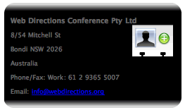
Let’s take a common hCard, which includes address, telephone and email details
<div class="vcard">
	<p class="fn org">Web Directions North
		<a href="http://suda.co.uk/projects/X2V/get-vcard.php?uri=http://north.webdirections.org/contact/">
			<img src="images/vcard-add.png" alt="download vcard icon"></a>
	</p>
1485 Laperrière Avenue
Ottawa ON K1Z 7S8
Canada
Phone/Fax: Work: 61 2 9365 5007
Email: info@webdirections.org
We’ll be using a variation on the now well established “sliding doors” technique (if you create a CSS technique, remember it’s very important to give it a memorable name or acronym, and bonus points if you get your name in there!) by Douglas Bowman, enhanced by Scott Schiller (see http://www.schillmania.com/projects/dialog/,) which will give us a design which looks like this
The technique, in a nutshell, uses background images on four elements, two at the top, and two at the bottom, to add each rounded corner.
We are going to make this design “fluid” in the sense that it grows and shrinks in proportion with the size of the font that the text of the element is displayed with. This is sometimes referred to as an “em driven design” (we’ll see why in a moment).
To see how this works in practice, here’s the same design with the text “zoomed” up in size
and the same design again, when we zoom the text size down
By the way, the hCard image comes from Chris Messina, and you can download it and other microformat icons from the microformats wiki.
Now, with CSS3, this whole task would be considerably easier, because we can add multiple background images to an element, and border images for each edge of an element. Safari, version 1.3 up, actually supports multiple background images, but sadly, it’s not supported in Firefox 1.5, or even Firefox 2.0 (let’s not mention IE7 eh?). So it’s probably too little supported to use now. So instead we’ll use a technique that only involves CSS2, and works in pretty much any browser.
Very often, developers add div or span elements as containers for these background images, and in fact, if you visit Scott Shiller’s site, that’s what he has done there. But if at all possible we shouldn’t be adding any HTML simply for presentational purposes, even if the presentation is done via CSS. What we can do is to use the HTML we have already, as much as is possible, to add the style we want. This can take some creative thinking, but once you get the hang of this approach it becomes a more natural way of using HTML compared with simply adding divs and spans at will as hooks for style. Of course, this technique isn’t always simple, and in fact sometimes simply not possible, requiring us to add just a little HTML to provide the “hooks” for CSS.
Let’s go to work
The first step is to add a background image to the whole vCard element.

We make this wide enough (for example 1000 or more pixels) and tall enough that no matter how large the content of the vCard grows, it will never overflow this area. We can’t simply repeat the image, because the top left corner will show when the image repeats.
We add this as the background image of the vCard element using CSS.
While we are at it, let’s give the text a sans-serif font, some color so that it will be visible, and stop the image repeating.
.vcard {
background-image: url(images/vcardfill.png);
background-repeat: no-repeat;
color: #666;
font-family: "Lucida Grande", Verdana, Helvetica, Arial, sans-serif;
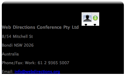
}Which in a browser, will look something like this.
Next step we need to add the top right hand corner of the hCard. In keeping with our aim of not adding HTML simply for styling purposes, we want to use the existing structure of the page where possible. Here, we’ll use the paragraph of class fn and org, which is the first child element of the vcard element.
<p class="fn org">Web Directions Conference Pty Ltd <img src="images/vcard-add.png" alt="download vcard icon"></p>Here’s our CSS for this element
.fn {
background-image: url(images/topright.png);
background-repeat: no-repeat;
background-position: top right;
padding-top: 2em;
font-weight: bold;
font-size: 1.1em;
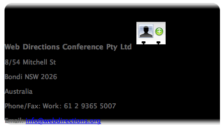
}Again, we don’t want it to repeat, but this time, we’ve specified a background position for the image. This will make the background image start from the top, but its right edge will be located at the right edge of the element. I also made the font size a little bigger, and the weight bold, to differentiate it from the rest of the text in the hCard.
Here’s the image we are adding as the background to this element.

So, putting these two CSS statements together we get
We specified a padding-top of 2em to give some space between the content of the fn element and the edge of the fn element. Otherwise the top of the hCard image would be hard against the border. To see this in action, just remove the padding-top: 2em; declaration and preview in a browser.
So, with just two statements, we are well under way. We’ve not even had to add any HTML so far. Let’s turn to the bottom of the element, and add the bottom border (well, the background image which will serve as that border).
Now, which element are we going to use to add this background image to?
OK, here I have to admit to a little, teensie bit of cheating. If you look at the HTML of the hCard, I’ve grouped the email and telephone properties into a div, with a class of telecommunications. This grouping is not strictly requred for our hCard.
<div class="telecommunications">
	<p class="tel">Phone/Fax: <span class="tel"><span class="type">Work</span>:
		<span class="value">61 2 9365 5007</span></p>
	<p class="email">Email: <a class="value" href="mailto:info@webdirections.org">info@webdirections.org</a></p>
</div>
Now, I chose that class name because that is what the vCard specification calls this group of properties. And typically, I do tend to group together related elements using divs when I mark up content. I find it makes the page structure more logical and readable. But strictly speaking, this isn’t necessary, so you may consider it cheating. But my lesson in this would be, if you are going to add markup, try to make it as meaningful as possible.
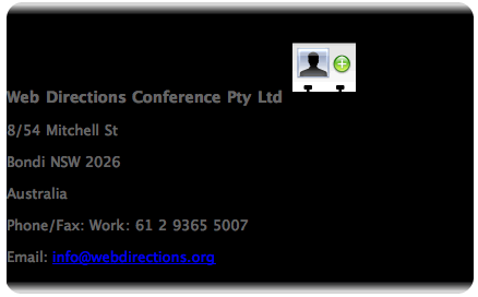
As you have probably guessed by now, we are going to add one part of the bottom border image to this element. We’re going to add this image as the background-image.

Again, it will be a very wide image, like the top left one, so that no matter how wide the element might get, the background image will still be wide enough. Now, we’ll need to make this image sit in the bottom left of the element we attach it to, so we use a backgound position of left bottom (we put the horizontal position before the vertical). Here’s our CSS statement for this
.telecommunications {
	background-image: url(images/bottom-left.png);
	background-repeat: no-repeat;
	background-position: left bottom;
	margin-bottom: 2em;
}
And that will look like this
Not quite there, but well on the way. Time for the final piece in the puzzle.
OK, I admit, I might have cheated just a little bit more in this step. But like the previous step, all valid, and (hopefully) quite justifiable markup. If we look at the HTML again, you’ll find that our email address is marked up like this
<p class="email">Email: <a class="value" href="mailto:info@webdirections.org">info@webdirections.org</a></p>Typically, in hCard, the value part of this property isn’t required, and we could get away with
<a class="email" href="mailto:info@webdirections.org">info@webdirections.org</a>The form I’ve used, with the span of class value is however, perfectly valid hCard markup (hard allows for multiple email addresses of different types, which is where this typically comes in handy). Why have I gone to all this trouble? Well, when it came to styling the hCard, I realized I needed a block element to attach the background image for the bottom right hand corner to. Typically the last block element in the containing element is the ideal choice (and sometimes it’s possible to take an inline element, for example the link here, and use CSS to make it a block element, and attach it to that, but that really doesn’t work with this design).
So, if we are going to use the paragraph which contains the email link, we need a way to select it exclusively, which means that with CSS2 at least, we need a class or id as a hook for our CSS selector (in CSS3 we could use the last-child selector, which selects the last child element of a specified element, but again, as last child is not widely supported, we won’t rely on it here.)
So, the least worst thing we could do is take an existing element, and add some reasonably meaningful markup to it. That’s why we gave the paragraph a class of email, and the email address a class of value. Which reminds me a little of a moment in Hamlet
The lady doth protest too much, methinks
OK, let’s get back to the CSS.
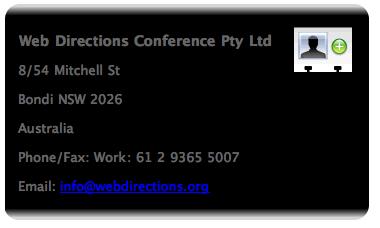
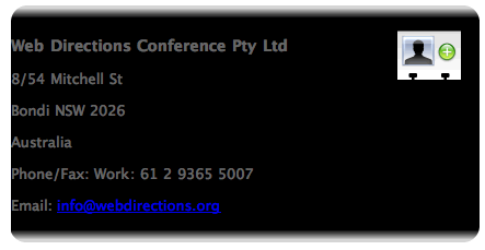
We add the bottom right corner image, positioning it in the bottom right of the element, and making sure it doesn’t repeat. We also add some padding to the bottom, to balance out the padding we added to the top of the hCard.
p.email {
	background-image: url(images/bottom-right.png);
	background-position: right bottom;
	background-repeat: no-repeat;
	padding-bottom: 2em;
}
Which all goes to make our hCard look like this
It just remains for us to clean up a little.
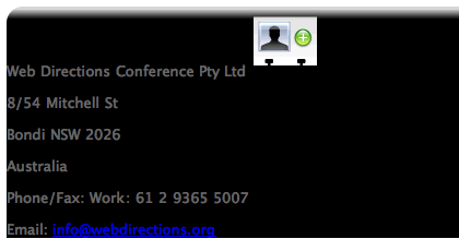
Let’s start from the top. We’ll float the download image to the right like this
.vcard img {
	float: right;
	padding-right: 1em;
	margin-top: -1em
}
See how we didn’t have to add a class to style the image, we used the fact that the image is a descendent of the vcard element, and a descendent selector. In my experience, the very widely supported, powerful descendent selector is one of the most underused aspects of CSS. So if you don’t use it frequently, look into it in more detail.
We added some space to the right of the image, and pulled it up a bit closer to the top of the hCard, like this
We also want to add some whitespace between the edge of the hCard and the text. We would typically add padding to the left of the containing element, (in this case the vcard element) but this would break our bottom left hand corner, like this
That’s because the div element we added this bottom left background image to would be moved in by the padding on its containing element.
So instead, we add left margin to all the paragraphs in the hCard
.vcard p {
	margin-left: 1em;
}
(there is the descendent selector again – it is the swiss army knife of CSS)
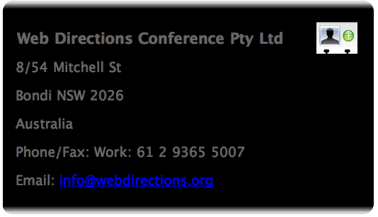
Now, we’ve not yet made the width of the hCard a function of the size of the text inside it (or “em driven” as we described it earlier). We do this by giving the hCard a width that is specified in em units. Here we’ll set a width of say 28em, which makes the hCard always roughly as wide as 28 characters (strictly speaking 28 times the width of the letter capital M).
So the statement for our containing vcard element becomes
.vcard {
	background-image: url(images/vcardfill.png);
	background-repeat: no-repeat;
	color: #666;
	font-family: "Lucida Grande", Verdana, Helvetica, Arial, sans-serif;
	width: 28em;
}
and now our element will look like this
We’ve used almost entirely the existing HTML from our original hCard (adding just a little, and trying as much as possible to keep that additional markup meaningful), and just 6 CSS statements.
Holiday Bonus – a downloadable vCard
Did you notice this part of the HTML
<a href="http://suda.co.uk/projects/X2V/get-vcard.php?uri=http://north.webdirections.org/contact/">
        <img src="images/vcard-add.png" alt="download vcard icon"></a>
What’s with the odd looking url
<a href="http://suda.co.uk/projects/X2V/get-vcard.php?uri=http://north.webdirections.org/contact/"If you click the link, X2V, a nifty web service from Brian Suda, grabs the page at the URL, and if it finds a hCard, converts it to a vCard, and depending on how your system is setup, automatically downloads it and adds it to your address book (Mac OS X) or prompts you whether you’d like to save the vCard and add it to whatever application is the default vCard handler on your system.
What X2V does is take the actual HTML of your hCard, and with the magic of XSLT, converts it to a vCard. So, by simply marking up contact details using hCard, and adding a link like this, you automatically get downloadable vCard – and if you change your contact details, and update the hCard, there’s no vCard file to update as well.
Technorati also have a similar service at http://technorati.com/contact so you might want to use that if you expect any kind of load, as they can probably afford the bandwidth more than Brian!
If you want to play with the HTML and CSS for this design, the code and images can be downloaded.
Hope you enjoyed this, and found it useful. If so, you might like to check out my microformats focussed blog, or get along to Web Directions North, where I’ll be speaking along with Dan Cederholmn and Tantek Çelik in a 2 hour session focussed solely on microformats. And keep an eye out for my microformats book, from which this article has been adapted, coming in the spring of 2007.
A happy festive season, and all the best for 2007
John
Some hCard links
- The hCard entry at microformats.org
- The hCard Creator
- The hCard cheatsheet
- The hCard FAQ
- Ideas for authoring hCards
- Microfomatique – a blog about microformats
- Web Directions North – featuring a full 2 hour focussed microformats session
About the author
John Allsopp is a founder of Westciv, an Australian web software development and training company, which provides some of the best CSS resources and tutorials on the web. Westciv’s software and training are used in dozens of countries around the World. The head developer of the leading cross platform CSS editor, Style Master, John has written on web development issues for numerous web and print publications and was one of the earliest members of the Web Standards Project.
Brought to you by
Related articles
-
A Christmas hCard From Me To You
Elliot Jay Stocks steps us through publishing a set of contact details using the hCard microformat. Once the basics are in place follow along as we add some sparkle with the aid of CSS3 web fonts, text-shadow, border-radius and first-child selectors.
-
Unobtrusively Mapping Microformats with jQuery
Simon Willison gets practical with microformats and the jQuery JavaScript library to demonstrate how data can be unobtrusively extracted from a page and plotted on a slippy map (like the ones we built the other day). See – it all links up. We think about this stuff.
-
Boost Your Hyperlink Power
Jeremy Keith appraises the humble hyperlink and highlights some of the more interesting, and perhaps lesser-known attributes that can be used to enrich the semantic value of your links. Consider it something to mull over whilst you polish off that gingerbread.
-
Practical Microformats with hCard
Drew McLellan takes a practical look at the hCard microformat and how easily it can be added to existing markup. He then stops talking about himself in the third person to convince the crowd that it’s not just all hype. Baby.