A Gift Idea For Your Users: Respect, Yo

If, indeed, it is the thought that counts, maybe we should pledge to make more thoughtful design decisions. In addition to wowing people who use the Web sites we build with novel features, nuanced aesthetics and the new new thing, maybe we should also thread some subtle things throughout our work that let folks know: hey, I’m feeling ya. We’re simpatico. I hear you loud and clear.
It’s not just holiday spirit that moves me to talk this way. As good as people are, we need more than the horizon of karma to overcome that invisible demon, inertia. Makers of the Web, respectful design practices aren’t just the right thing, they are good for business. Even if your site is the one and only place to get experience x, y or zed, you don’t rub someone’s face in it. You keep it free flowing, you honor the possible back and forth of a healthy transaction, you are Johnny Appleseed with the humane design cues. You make it clear that you are in it for the long haul.
A peek back:
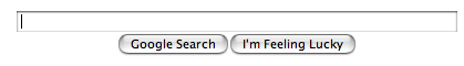
Think back to what search (and strategy) was like before Google launched a super clean page with “I’m Feeling Lucky” button. Aggregation was the order of the day (just go back and review all the ‘strategic alliances’ that were announced daily.) Yet the GOOG comes along with this zen layout (nope, we’re not going to try to make you look at one of our media properties) and a bold, brash, teleport-me-straight-to-the-first-search-result button. It could have been titled “We’re Feeling Cocky”. These were radical design decisions that reset how people thought about search services. Oh, you mean I can just find what I want and get on with it?
It’s maybe even more impressive today, after the GOOG has figured out how to monetize attention better than anyone. “I’m Feeling Lucky” is still there. No doubt, it costs the company millions. But by leaving a little money on the table, they keep the basic bargain they started to strike in 1997. We’re going to get you where you want to go as quickly as possible.
Where are the places we might make the same kind of impact in our work? Here are a few ideas:
Respect People’s Time
As more services become more integrated with our lives, this will only become more important. How can you make it clear that you respect the time a user has granted you?
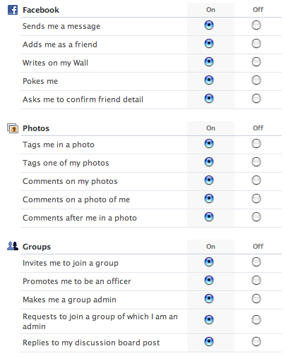
User-Oriented Defaults
Default design may be the psionic tool in your belt. Unseen, yet pow-er-ful. Look at your defaults. Who are they set up to benefit? Are you depending on users not checking off boxes so you can feel ok about sending them email they really don’t want? Are you depending on users not checking off boxes so you tilt privacy values in ways most beneficial for your SERPs? Are you making it a little too easy for 3rd party applications to run buckwild through your system?
There’s being right and then there’s being awesome. Design to the spirit of the agreement and not the letter.
See this?
Make sure that’s really the experience you think people want. Whenever I see a service that defaults to not opting me in their newsletter just because I bought a t shirt from them, you can be sure that I trust them that much more. And they are likely to see me again.
Reduce, Reuse
It’s likely that people using your service will have data and profile credentials elsewhere. You should really think hard about how you can let them repurpose some of that work within your system. Can you let them reduce the number of logins/passwords they have to manage by supporting OpenID? Can you let them reuse profile information from another service by slurping in (or even subscribing) to hCards? Can you give them a leg up by reusing a friends list they make available to you? (Note: please avoid the anti-pattern of inviting your user to upload all her credential data from 3rd party sites into your system.)
This is a much larger issue, and if you’d like to get involved, have a look at the wiki, and dive in.
Make it simple to leave
Oh, this drives me bonkers. Again, the more simple you make it to increase or decrease involvement in your site, or to just opt-out altogether, the better. This example from Basecamp is instructive:
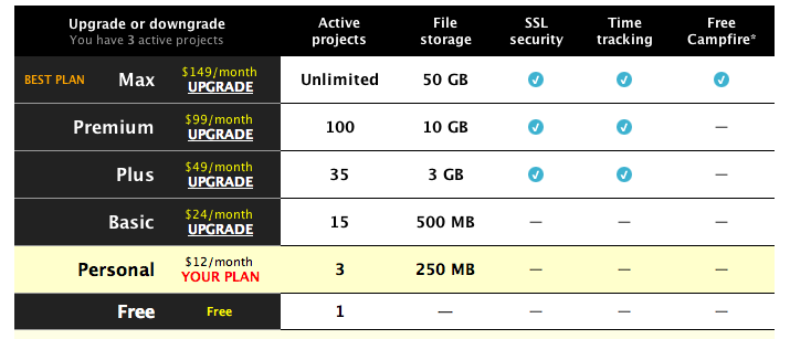
At a glance, I can see what the implications are of choosing a different type of account. I can also move between account levels with one click. Finally, I can cancel the service easily. No hoop jumping. Also, it should be simple for users to take data with them or delete it.
Let Them Have Fun
Don’t overlook opportunities for pleasure. Even the most mundane tasks can be made more enjoyable. Check out one of my favorite pieces of interaction design from this past year:
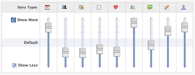
Holy knob fiddling, Batman! What a great way to get people to play with preference settings: an equalizer metaphor. Those of a certain age will recall how fun it was to make patterns with your uncle’s stereo EQ. I think this is a delightful way to encourage people to optimize their own experience of the news feed feature. Given the killer nature of this feature, it was important for Facebook to make it easy to fine tune.
I’d also point you to Flickr’s Talk Like A Pirate Day Easter egg as another example of design that delights. What a huge amount of work for a one-off, totally optional way to experience the site. And what fun. And how true to its brand persona. Brill.
Anti-hype
Don’t talk so much. Rather, ship and sample. Release code, tell the right users. See what happens. Make changes. Extend the circle a bit by showing some other folks. Repeat.
The more you hype coming features, the more you talk about what isn’t yet, the more you build unrealistic expectations. Your genius can’t possibly match our collective dreaming. Disappointment is inevitable. Yet, if you craft the right melody and make it simple for people to hum your tune, it will spread. Give it time. Listen.
Speak the Language of the Tribe
It’s respectful to speak in a human way. Not that you have to get all zOMGWTFBBQ!!1 in your messaging. People respond when you speak to them in a way that sounds natural. Natural will, of course, vary according to context. Again, listen in and people will signal the speech that works in that group for those tasks. Reveal those cues in your interface work and you’ll have powerful proof that actual people are working on your Web site.
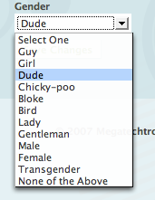
This example of Pownce‘s gender selector is the kind of thing I’m talking about:
Now, this doesn’t mean you should mimic the lingo on some cool kidz site. Your service doesn’t need to have a massage when it’s down. Think about what works for you and your tribe. Excellent advice here from Feedburner’s Dick Costolo on finding a voice for your service. Also, Mule Design’s Erika Hall has an excellent talk on improving your word fu.
Pass the mic, yo
Here is a crazy idea: you could ask your users what they want. Maybe you could even use this input to figure out what they really want. Tools abound. Comments, wikis, forums, surveys. Embed the sexy new Get Satisfaction widget and have a dynamic FAQ running.
The point is that you make it clear to people that they have a means of shaping the service with you. And you must showcase in some way that you are listening, evaluating and taking action against some of that user input.
You get my drift. There are any number of ways we can show respect to those who gift us with their time, data, feedback, attention, evangelism, money. Big things are in the offing. I can feel the love already.
About the author
Brian Oberkirch yammers a lot. He used to teach literature. And do radio news. And write newspaper articles. Now he helps people make Web stuff and talks up things like microformats and other open design approaches that should make life better for everyone. He carries on at brianoberkirch.com.
Brought to you by
Related articles
-
Art Direction and the New WordPress Editor
Mel Choyce explores how the new WordPress editor (also know as Gutenberg) can be used to create more carefully art directed posts. Like gifts carefully arranged beneath the Christmas tree, it’s the contents that matters but the presentation that sells.
-
Be the Villain
Eric Bailey asks us to take on the role of King Herod in our projects to consider how the products, services and processes we design could be abused to cause harm rather than to do good. No matter how good our intentions, we must remember that not every user has pure motivations and that every tool is a weapon if you hold it right.
-
Creating a Weekly Research Cadence
Wren Lanier sets aside time to explore the benefits of a regular schedule for user research. Santa’s elves quickly discovered the benefits of working to a fixed schedule, which is of course why we don’t get presents at Easter.
-
How to Do a UX Review
Joe Leech offers a rundown on his UX review process, sharing tips about analysing data and creating personas, and setting out findings in a form that benefits clients. From quick wins to workshops, there are gifts here everyone will be grateful for.
-
How to Use Audio on the Web
Ruth John lets the bells ring out for Christmas with a look at a selection of inspiring sites with creative and effective use of audio. The days of jangly MIDI tunes to distract and annoy are thankfully long behind us, with browser APIs offering new and exciting ways to generate sound. Ahead is a beautiful sonic landscape. Ding dong!
-
What I Learned about Product Design This Year
Meagan Fisher casts a thoughtful glance back over her work this year and considers what it means to design a product rather than a marketing experience. Pour yourself a cup of eggnog, grab a mince pie or two and gather around the fireside. Are you sitting comfortably? Good, then we shall begin.