Responsive Images: What We Thought We Needed

If you were to read a web designer’s Christmas wish list, it would likely include a solution for displaying images responsively. For those concerned about users downloading unnecessary image data, or serving images that look blurry on high resolution displays, finding a solution has become a frustrating quest.
Having experimented with complex and sometimes devilish hacks, consensus is forming around defining new standards that could solve this problem. Two approaches have emerged.
The <picture> element markup pattern was proposed by Mat Marquis and is now being developed by the Responsive Images Community Group. By providing a means of declaring multiple sources, authors could use media queries to control which version of an image is displayed and under what conditions:
<picture width="500" height="500">
  <source media="(min-width: 45em)" src="large.jpg">
  <source media="(min-width: 18em)" src="med.jpg">
  <source src="small.jpg">
  <img src="small.jpg" alt="">
  <p>Accessible text</p>
</picture>
A second proposal put forward by Apple, the srcset attribute, uses a more concise syntax intended for use with the <img> element, although it could be compatible with the <picture> element too. This would allow authors to provide a set of images, but with the decision on which to use left to the browser:
<img src="fallback.jpg" alt="" srcset="small.jpg 640w 1x, small-hd.jpg 640w 2x, med.jpg 1x, med-hd.jpg 2x ">Enter Scrooge
Men’s courses will foreshadow certain ends, to which, if persevered in, they must lead.
Ebenezer Scrooge
Given the complexity of this issue, there’s a heated debate about which is the best option. Yet code belies a certain truth. That both feature verbose and opaque syntax, I’m not sure either should find its way into the browser – especially as alternative approaches have yet to be fully explored.
So, as if to dampen the festive cheer, here are five reasons why I believe both proposals are largely redundant.
1. We need better formats, not more markup
As we move away from designs defined with fixed pixel values, bitmap images look increasingly unsuitable. While simple images and iconography can use scalable vector formats like SVG, for detailed photographic imagery, raster formats like GIF, PNG and JPEG remain the only suitable option.
There is scope within current formats to account for varying bandwidth but this requires cooperation from browser vendors. Newer formats like JPEG2000 and WebP generate higher quality images with smaller file sizes, but aren’t widely supported.
While it’s tempting to try to solve this issue by inventing new markup, the crux of it remains at the file level.
Daan Jobsis’s experimentation with image compression strengthens this argument. He discovered that by increasing the dimensions of a JPEG image while simultaneously reducing its quality, a smaller files could be produced, with the resulting image looking just as good on both standard and high-resolution displays.
This may be a hack in lieu of a more permanent solution, but it’s applied in the right place. Easy to accomplish with existing tools and without compatibility issues, it has few downsides. Further experimentation in this area should be encouraged, with standardisation efforts more helpful if focused on developing new image formats or, preferably, extending existing ones.
2. Art direction doesn’t belong in markup
A desired benefit of the <picture> markup pattern is to allow for greater art direction. For example, rather than scaling down images on smaller displays to the point that their content is hard to discern, we could present closer crops instead:
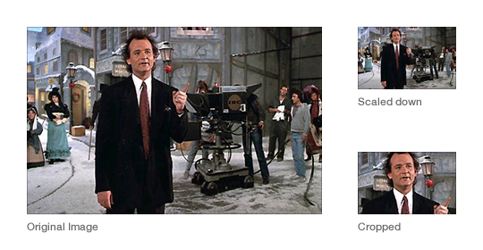
This can be achieved with CSS of course, although with a download penalty for those parts of an image not shown. This point may be negligible, however, since in the context of adaptable layouts, these hidden areas may end up being revealed anyway.
Art direction concerns design, not content. If we wish to maintain a separation of concerns, including presentation within our markup seems misguided.
3. The size of a display has little relation to the size of an image
By using media queries, the <picture> element allows authors to choose which characteristics of the screen or viewport to query for different images to be displayed.
In developing sites at Clearleft, we have noticed that the viewport is essentially arbitrary, with the size of an image’s containing element more important. For example, look at how this grid of images may adapt at different viewport widths:
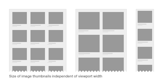
As we build more modular systems, components need to be adaptable in and of themselves. There is a case to be made for developing more contextual methods of querying, rather than those based on attributes of the display.
4. We haven’t lived with the problem long enough
A key strength of the web is that the underlying platform can be continually iterated. This can also be problematic if snap judgements are made about what constitutes an improvement.
The early history of the web is littered with such examples, be it the perceived need for blinking text or inline typographic styling. To build a platform for the future, additions to it should be carefully considered. And if we want more consistent support across browsers, burdening vendors with an ever increasing list of features seems counterproductive.
Only once the need for a new feature is sufficiently proven, should we look to standardise it. Before we could declare hover effects, rounded corners and typographic styling in CSS, we used JavaScript as a polyfill. Sure, doing so was painful, but use cases were fully explored, and the CSS specification better reflected the needs of authors.
5. Images and the web aesthetic
The srcset proposal has emerged from a company that markets its phones as being able to browse the real – yet squashed down, tapped and zoomable – web. Perhaps Apple should make its own website responsive before suggesting how the rest of us should do so.
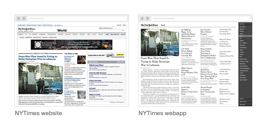
Converserly, while the <picture> proposal has the backing of a few respected developers and designers, it was born out of the work Mat Marquis and Filament Group did for the Boston Globe. As the first large-scale responsive design, this was a landmark project that ignited the responsive web design movement and proved its worth. But it was the first.
Its design shares a vernacular to that of contemporary newspaper websites, with a columnar, image-laden and densely packed layout. Compared to more recent examples – Quartz, The Next Web and the New York Times Skimmer – it feels out of step with the future direction of news sites. In seeking out a truer aesthetic for the web in which software interfaces have greater influence, we might discover that the need for responsive images isn’t as great as originally thought.
Building for the future
With responsive design, we’ve accepted the idea that a fully fluid layout, rather than a set of fixed layouts, is best suited to the web’s unpredictable nature. Current responsive image proposals are antithetical to this approach.
We need solutions that lack complexity, are device-agnostic and work within existing workflows. Any proposal that requires different versions of the same image to be created, is likely to have to acquiesce under the pressure of reality.
While it’s easy to get distracted about the size and quality of an image, and how we might choose to serve it, often the simplest solution is not to include it at all. After years of gluttonous design practice, in which fast connections and expansive display sizes were an accepted norm, we have got use to filling pages with needless images and countless items of page furniture.
To design more adaptable experiences, the presence of every element needs to be questioned, for its existence requires additional data to be downloaded or futher complexity within a design system. Conditional loading techniques mean that the inclusion of images is no longer a binary choice, but can instead appear in a progressively enhanced manner.
So here is my proposal. Instead of spending the next year worrying about responsive images, let’s embrace the constraints of the medium, and seek out new solutions that can work within them.
About the author
Brought to you by
Related articles
-
Being Responsive to the Small Things
Jonathan Snook considers the problem of container (or element) queries in the context of responsive web design and looks at the approach taken by current open source JavaScript solutions. Remember, no matter what size of box your Christmas gift comes in, it’s the thought that counts.
-
Making Sites More Responsive, Responsibly
Sally Jenkinson asserts that responsive design isn’t just about displaying content on multiple devices – we can also respond to users’ contextual needs to enhance experiences. When the snow lies deep and crisp and even, you’re gonna need a bigger boot.
-
Putting My Patterns through Their Paces
Ethan Marcotte dashes through the wintry landscape, his sled of flexboxed content drawn faithfully by a team of well-ordered hierarchical HTML huskies. For when it comes to structure and presentation, we must take care not to put the sleigh before the hounds.
-
Responsive Enhancement
Jeremy Keith leads us gently back to the basics of progressive enhancement with a simple navigation example. Ask yourself: does Christmas need to look exactly the same in every browser? Nope. Well, as long as you’re reading 24 ways…
-
The Responsive Hover Paradigm
Jenn Lukas twinkles like a guiding star in the deep Christmas night, casting her light on the interactivity issues raised by combined hover- and touch-enabled devices. With a little thought about designing for our content, we can add some seasonal sparkle.
-
Animating Vectors with SVG
Brian Suda dashes out a quick technique for animating SVG line drawings using JavaScript. Way better than falling snowflakes and a Santa hat on your logo.


