Jump to content

Year

Day

24 ways to impress your friends

When I was asked to write an article for 24 ways I jumped at the chance, as I’d been wanting to write about some fun hacks for responsive images and related parsing behaviours. My heart sank a little when Matt Wilcox beat me to the subject, but it floated back up when I realized I disagreed with his method and still had something to write about.

So, Matt Wilcox, if that is your real name (and I’m pretty sure it is), I disagree. I see your dirty server-based hack and raise you an even dirtier client-side hack. Evil laugh, etc., etc.

You guys can stomach yet another article about responsive design, right? Right?

Half the room gets up to leave

Whoa, whoa… OK, I’ll cut to the chase…

TL;DR

In a previous episode, we were introduced to Debbie and her responsive cat poetry page. Well, now she’s added some reviews of cat videos and some images of cats. Check out her new page and have a play around with the browser window. At smaller widths, the images change and the design responds. The benefits of this method are:

  • it’s entirely client-side
  • images are still shown to users without JavaScript
  • your media queries stay in your CSS file
  • no repetition of image URLs
  • no extra downloads per image
  • it’s fast enough to work on resize
  • it’s pure filth

What’s wrong with the server-side solution?

Responsive design is a client-side issue; involving the server creates a boatload of problems.

  • It sets a cookie at the top of the page which is read in subsequent requests. However, the cookie is not guaranteed to be set in time for requests on the same page, so the server may see an old value or no value at all.
  • Serving images via server scripts is much slower than plain old static hosting.
  • The URL can only cache with vary: cookie, so the cache breaks when the cookie changes, even if the change is unrelated. Also, far-future caching is out for devices that can change width.
  • It depends on detecting screen width, which is rather messy on mobile devices.
  • Responding to things other than screen width (such as DPI) means packing more information into the cookie, and a more complicated script at the top of each page.

So, why isn’t this straightforward on the client?

Client-side solutions to the problem involve JavaScript testing user agent properties (such as screen width), looping through some images and setting their URLs accordingly. However, by the time JavaScript has sprung into action, the original image source has already started downloading. If you change the source of an image via JavaScript, you’re setting off yet another request.

Images are downloaded as soon as their DOM node is created. They don’t need to be visible, they don’t need to be in the document.

new Image().src = url

The above will start an HTTP request for url. This is a handy trick for quick requests and preloading, but also shows the browser’s eagerness to download images.

Here’s an example of that in action. Check out the network tab in Web Inspector (other non-WebKit development aids are available) to see the image requests.

Because of this, some client-side solutions look like this:

<img src="t.gif" data-src="real-image.jpg" data-bigger-src="real-bigger-image.jpg">

where t.gif is a 1×1px tiny transparent GIF.

This results in no images if JavaScript isn’t available. Dealing with the absence of JavaScript is still important, even on mobile. I was recently asked to make a website work on an old Blackberry 9000. I was able to get most of the way there by preventing that OS parsing any JavaScript, and that was only possible because the site didn’t depend on it.

We need to delay loading images for JavaScript users, but ensure they load for users without JavaScript. How can we conditionally parse markup depending on JavaScript support?

Oh yeah! <noscript>!

<noscript>
    <img src="image.jpg">
</noscript>

Whoa! First spacer GIFs and now <noscript>? This really is the future! The image above will only load for users without JavaScript support. Now all we need to do is send JavaScript in there to get the textContent of the <noscript> element, then we can alter the image source before handing it to the DOM for parsing.

Here’s an example of that working … unless you’re using Internet Explorer.

Internet Explorer doesn’t retain the content of <noscript> elements. As soon as it’s parsed, it considers it an empty element. FANKS INTERNET EXPLORER. This is why some solutions do this:

<noscript data-src="image.jpg">
    <img src="image.jpg">
</noscript>

so JavaScript can still get at the URL via the data-src attribute. However, repeating stuff isn’t great. Surely we can do better than that.

A dirty, dirty hack

Thankfully, I managed to come up with a solution, and by me, I mean someone cleverer than me. Pornel’s solution uses <noscript>, but surely we don’t need that.

Now, before we look at this, I can’t stress how dirty it is. It’s so dirty that if you’ve seen it, schools will refuse to employ you.

<script>document.write('<' + '!--')</script>
<img src="image.jpg">
<!---->

Phwoar! Dirty, isn’t it? I’ll stop for a moment, so you can go have a wash.

Done? Excellent.

With this, the image is wrapped in a comment only for users with JavaScript. Without JavaScript, we get the image. Unlike the <noscript> example above, we can get the text content of the comment pretty easily.

Hurrah! But wait… Some browsers are sometimes downloading the image, even with JavaScript enabled. Notably Firefox. Huh?

Images are downloaded in comments now? What?

No. What we’re seeing here is the effect of speculative parsing. Here’s what’s happening:

Speculative parsing flow

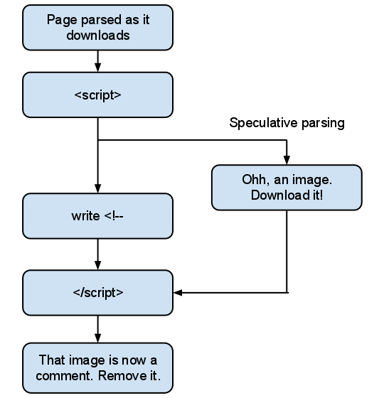
While the browser is parsing the script, it parses the rest of the document. This is usually a good thing, as it can download subsequent images and scripts without waiting for the script to complete. The problem here is we create an unbalanced tree.

An unbalanced tree, yesterday An unbalanced tree, yesterday.

In this case, the browser must throw away its speculative parsing and reparse from the end of the <script> element, taking our document.write into consideration. Unfortunately, by this stage it may have already discovered the image and sent an HTTP request for it.

A dirty, dirty hack… that works

Pornel was right: we still need the <noscript> element to cater for browsers with speculative parsing.

<script>document.write('<' + '!--')</script><noscript>
    <img src="image.jpg">
</noscript -->

And there we have it. We can now prevent images loading for users with JavaScript, but we can still get at the markup.

We’re still creating an unbalanced tree and there’s a performance impact in that. However, the parser won’t have got far by the time our script executes, so the impact is small. Unbalanced trees are more of a concern for external scripts; a lot of parsing can happen by the time the script has downloaded and parsed.

Using dirtiness to create responsive images

Now all we need to do is give each of our dirty scripts a class name, then JavaScript can pick them up, grab the markup from the comment and decide what to do with the images.

This technique isn’t exclusively useful for responsive images. It could also be used to delay images loading until they’ve scrolled into view. But to do that you’ll need a bulletproof way of detecting when elements are in view. This involves getting the height of the viewport, which is extremely unreliable on mobile devices.

Here’s a hastily thrown together example showing how it can be used for responsive images.

I adjust the end of the image URLs conditionally depending on the result of media queries. This is done on page load, and on resize.

I’m using regular expressions to alter the URLs. Using regex to deal with HTML is usually a sign of insanity, but parsing it with the browser’s DOM parser would trigger the download of images before we change the URLs. My implementation currently requires double-quoted image URLs, because I’m lazy. Wanna fight about it?

Media querying via JavaScript

Jeremy Keith used document.documentElement.clientWidth in his example, which is great as a proof of concept, but unfortunately is rather unreliable across mobile devices.

Thankfully, standards are coming to the rescue with window.matchMedia, which lets us provide a media query string and get a boolean result. There’s even a great polyfill for browsers that don’t support it (as long as they support media queries in CSS).

I didn’t go with that for three reasons:

  1. I’d like to keep media queries in the CSS file, if possible.
  2. I wanted something a little lighter to keep things speedy while resizing.
  3. It’s just not dirty enough yet.

To make things ultra-dirty, I add a test element to the page with a specific class, let’s say media-test. Then, I control the width of it using media queries in my CSS file:

@media all and (min-width: 640px) {
    .media-test {
        width: 1px;
    }
}
@media all and (min-width: 926px) {
    .media-test {
        width: 2px;
    }
}

The JavaScript part changes the URL suffix depending on the width of media-test. I’m using a min-width media query, but you can use others such as pixel-ratio to detect high DPI displays. Basically, it’s a hacky way for CSS to set a value that can be picked up by JavaScript. It means the bit that signals changes to the images sits with the rest of the responsive code, without duplication.

Also, phwoar, dirty!

The API

I threw a script together to demonstrate the technique. I’m not particularly attached to it, I’m not even sure I like it, but here’s the API:

responsiveGallery({
    // Class name of dirty script element(s) to target
    scriptClass: 'dirty-gallery-script',
    // Class name for our test element
    testClass: 'dirty-gallery-test',
    // The initial suffix of URLs, the bit that changes.
    initialSuffix: '-mobile.jpg',
    // A map of suffixes, for each width of 'dirty-gallery-test'
    suffixes: {
        '1': '-desktop.jpg',
        '2': '-large-desktop.jpg',
        '3': '-mobile-retina.jpg'
    }
});

The API can cover individual images or multiple galleries at once. In the example I gave at the start of the article I make two calls to the API, one for both galleries, and one for the single image above the video reviews. They’re separate calls because they respond slightly differently.

The future

Hopefully, we’ll get a proper solution to this soon. My favourite suggestion is the <picture> element that Bruce Lawson covers.

<picture alt="Angry pirate">
    <source src="hires.png" media="min-width:800px">
    <source src="midres.png" media="min-width:480px">
    <source src="lores.png">
    <!-- fallback for browsers without support -->
    <img src="midres.png" alt="Angry pirate">
</picture>

Unfortunately, we’re nowhere near that yet, and I’d still rather have my media queries stay in CSS. Perhaps the source elements could be skipped if they’re display:none; then they could have class names and be controlled via CSS. Sigh.

Well, I’m tired of writing now and I’m sure you’re tired of reading. I realize what I’ve presented is a yet another dirty hack to the responsive image problem (perhaps the dirtiest?) and may be completely unfeasible in professional situations. But isn’t that the true spirit of Christmas?

No.

Like what you read?

Comments

Comments are ordered by helpfulness, as indicated by you. Help us pick out the gems and discourage asshattery by voting on notable comments.

Got something to add? You can leave a comment below.

  • Barnaby http://WaterPigs.co.uk

    The more I read about responsive images, the more I think three things. Firstly:

    Some desktop users are still on dial up or low end broadband (like me). I in fact get better transfer speeds using the 3G on my iPad than I do using my home wifi. Why should image file size be proportional to browser screen size, after all.

    Second, surely if you have high resolution images, you should present a lower quality version and offer a larger version if requested regardless of platform.

    Ad thirdly: I can’t help but think that this is one of those things that for some reason is trendy to talk about, and everyone’s trying to come up with more and more crazy solutions, none of which will be used in commercial projects and all of which will be thrown away when the browser makers offer us real, client and server side device feature detection.

    (don’t get me wrong, I think they’re important thought experiments and fun to look at. But I don’t think we should be putting quite this much energy into it/taking it this seriously…)

    I think there should be more focus on image optimisation and compression — non dirty things that actually work great and can be used right now. Using vectors is also an interesting topic.
    I found out some interesting stuff in a recent project (e.g. Watercolours compress wonderfully, let’s start a trend away from gradients and towards paint!), so I’ll start writing about that.

    Vote Helpful or Unhelpful

  • Matt Wilcox http://mattwilcox.net

    Lol! Love your attitude Jake! Great article too :)

    For what it’s worth, I have been saying for some time that there isn’t one good solution to the adaptive images problem, and we need a client-side as well as a server-side fix. I think this is pretty crafty, but I must point out a couple of fallacies in your article with regard to Adaptive Images in particular:

    It sets a cookie at the top of the page which is read in subsequent requests. However, the cookie is not guaranteed to be set in time for requests on the same page, so the server may see an old value or no value at all.

    In the case of AI it doesn’t matter, the cookie value will never change because the cookie value is the width of the screen, not the width of the browser. And AI has a reasonable mechanism to fall back if there isn’t a cookie at all (as documented in the older article)

    The URL can only cache with vary: cookie, so the cache breaks when the cookie changes, even if the change is unrelated. Also, far-future caching is out for devices that can change width.

    This i must admit I’m guessing at because I don’t understand CDNs as well as I’d like, but… the cookie won’t ever change for a given user. And, by “change width” I assume you mean “rotate to landscape” (unless you have some elastic monitors I have never seen?). Again, AI won’t break with this. AI’s cookie takes the longest screen edge and uses that as it’s width.

    It depends on detecting screen width, which is rather messy on mobile devices.

    I wasn’t aware of this, but looking at the evidence it’s only Android which may be getting screwy with AI in particular. At least it’s weird default of 800 isn’t too far off the 480 we’d likely want. But yeah, what a bummer – fair point :(

    Responding to things other than screen width (such as DPI) means packing more information into the cookie, and a more complicated script at the top of each page.

    Wrong. AI has JS available for people who have higher DPI screens, the cookie still uses a pixel value. At worst it is one extra number long. Or as I believe it’s called, a singular byte.

    Other than that though, and the sheer dirtiness of your solution, I like the practicality of your approach as a current technology fix for adaptive images. I’d hate to have to use it due to how filthy it is, but it works well which is a damned impressive thing.

    Another note on why I developed the server-side approach and why that is a useful thing to have as well as a client side approach: one of the design goals for AI was to not have to alter any mark-up. It was important to me that I could get a large existing body of images and code still be responsive. And I also felt that greatly simplified the CMS problem, because it no longer needed the CMS to do anything at all – which makes it easy to apply and very easy to use for people who have no code knowledge.

    Also, high five for Bruce Lawsons proposed solution. That’s the kind of thing we’re needing front-end wise. You’re right again though, it does raise the issue of us potentially having three places where we have to declare width shenanigans. I can imagine that getting very tiresome.

    Vote Helpful or Unhelpful

  • Nicolas Chevallier http://www.nicolas-chevallier.fr

    I knew there was a simpler solution than the server-side approach. In my opinion many developers will now examine the problem and will find new hacks to further improve the solution. Anyway well done!

    Vote Helpful or Unhelpful

  • Nicolas Gallagher http://nicolasgallagher.com

    Anyone interested in the ideas presented in the article might also want to check out a bit of further reading on the same topics.

    A different approach to using a `noscript` element for responsive images was suggested and developed in some form by Head London in this article.

    The idea of a new `picture` element to avoid the history of `img`, `image`, and `object` was initially discussed at least as far back as 2007 on the public-html mailing list: handling fallback content for still images and unifying alternate content across embedded content element types

    Vote Helpful or Unhelpful

  • Ryan Munger http://happygeni.us

    Hooray for client side responsive images!

    Vote Helpful or Unhelpful

  • Stuart Robson http://www.alwaystwisted.com

    A fantastic foray into the filth we could all have whilst waiting (in hope) for <picture>.

    I’ve been thinking of a similar idea since Jeremy and Matt’s posts this year that would be a client-side lazy load of an image (dependent on viewport) that would have a <noscript> back up.

    I summed this all up in some tweets here –

    http://bit.ly/t6bDNZ

    I have yet to anything with this idea as yet though.

    My first decent into using Javascript (or jQuery) was when images were being discussed on the jQuery Mobile forum at a very early beta stage. I came up with the “everything loads regardless” Janeway Test (google it :) ) which resized dependant on viewport width AND height.

    I look forward to trying to pull apart your code to see if I can get a ‘nice and dirty’ version of my idea up and running :)

    Thanks, and again another great article for this year!! :D

    Vote Helpful or Unhelpful

  • Matt Wilcox

    And once again to reiterate something I’ve said: it’s fascinating how insanely hard it is to come up with a really good current-technology solution to this seemingly simple problem. And even more fascinating that it’s just as hard to come up with one for “the future” where we don’t have these limitations.

    Again, great article :)

    Vote Helpful or Unhelpful

  • Mark http://blog.stroep.nl/

    Anyone who uses this kind of dirty hacks know HTML is one piece of crap, at a point of no return. Hack until your browser FINALLY does what it should do.

    Great article & Clever workaround, thanks! :)

    Vote Helpful or Unhelpful

  • Yoav Weiss http://blog.yoav.ws

    @Matt Wilcox – Regarding the cookie issue, the AI cookie will not change, but in real life scenarios, the user might have other cookies as well (session ID, etc). “Vary: Cookie” means that the resource is invalid every time any cookie value is changed for this resource. If you have user specific cookies (again, session ID is the first one that come to mind), the resource is effectively non cacheable.
    You could solve this by storing images on a cookie-less domain, different from your main domain. This is also a good practice in general, since it results in smaller requests for images. But, you can’t set a cookie on the images domain with javascript that runs in the context of the HTML, which is on the main domain.
    All in all, it is complicated to get the images cacheable under the “URL must remain unchanged” assumption.

    Vote Helpful or Unhelpful

  • Pete Jones http://www.petersencreative.com

    Right, as this is the 100th responsive image article I’ve read, I thought it might be worth asking what 24ways thinks is the future of doing this? Surely we need something in the browser/on the server/in the ether, that just resizes all of these images as required and none of this cruft is ever needed? It’s like we’re hacking our way though IE6 bugs again. How long before we get RIE (Resposiveness Is Everything?) cropping up?

    Vote Helpful or Unhelpful

  • Gunnar Bittersmann http://bittersmann.de

    It’s as much fun to read your articles as it was to hear you talk at beyond tellerrand. :-)

    IIRC the ‘<’ in <script>document.write(’<’ + ‘!—’)</script> is problematic in XHTML. Either the script element content needs to be marked as CDATA, or the ‘<’ (U+003C) should be escaped. There’s no need for string concatenation then: <script>document.write(’\u003C!—’)</script>

    <noscript —> is a typo, right? it should be </noscript —>. However, </noscript><script>document.write(’—>’)</script> might be less dirty.

    Vote Helpful or Unhelpful

  • Mark Stickley

    Great article Jake! I love that your written articles have the same panache and huge personality as your talks and indeed as you do yourself.

    I’m not sure I could bring myself to use this technique, however, as it’s just so dirty that O2 would probably block it with it’s adult filter. I reserve the right to change my mind when I actually need to use adaptive images on a production site though!

    Vote Helpful or Unhelpful

  • Yoav Weiss http://blog.yoav.ws

    Regarding the technique itself, it is a nice hack, but it has its price. While disabling the speculative parser is essential to avoid downloading the same resource twice, it also means that the images will start to be downloaded only after the script ran.
    That will have a performance cost, that in some extreme conditions (depending on the page and the user’s network) may exceed the cost of simply downloading the larger images…
    It is unavoidable that the “same URL for different image dimensions” methods will mess up caching, while the “dynamically change the URL after the page loaded” methods will mess up the speculative parser.
    Both these approaches have their performance costs. We should keep that in mind while waiting for a real solution from browser vendors and the W3C.

    Vote Helpful or Unhelpful

  • Theo http://rolling-webdesign.com

    This is a great read for me, I really enjoyed it and the solution is “dirty” enough to try it out, thank you!

    Vote Helpful or Unhelpful

  • Stephen Band

    RE: Media querying the JavaScript….

    C’mon, we can get dirtier than that! Hide the #media-test element by putting it in the <head> (maybe it could be a script tag with type=“text/unknown”?), then use its CSS ‘content’ property to pass arbitrary JSON into the JavaScript:

    @media all and (min-width: 640px) {
    #media-test { content: ‘{“size”: “small”}’; }
    }
    @media all and (min-width: 926px) {
    #media-test { content: ‘{“size”: “big”}’; }
    }

    This way, in the CSS, you could define lists of scripts to load for different media queries…

    :)

    Vote Helpful or Unhelpful

  • Tom

    Waaah! I so don’t(!) wanna use this…

    If you don’t care for search engines (login needed or sth.), you could maybe do it like load the image via CSS-Background and generate a style block with noscript around it.

    <noscript>
    <style>
    .noJS .image1{background:…}
    .noJS .image2{background:…}
    </style>
    </noscript>
    <img src=“spacer.gif” class=“image1” alt=”“/>

    Looks much cleaner to me than your solution, at least a bit… ;)

    Vote Helpful or Unhelpful

  • Jake Archibald

    @Matt:

    Good point about the screen width vs browser width thing. Although that’s another drawback, responding to browser viewport size is much preferable.

    Detecting screen width is flakey in many devices. Eg, ask an iphone for its screen width when it’s in landscape vs portrait mode, you’ll get the same result.

    Completely agree that my solution is probably too dirty to use. Tempting though, isn’t it?

    @Pete Jones:

    Bruce Lawson covers some possible ideas

    @Gunnar:

    document.write is a no-go in XHTML isn’t it? Or did they fix that? Well spotted on the typo, is fixed now.

    @Yoav:

    Agree. I hope I flagged that enough in the article. What “extreme conditions” are you thinking of? I thought the effect would be minimal because the scripts are inline and parse & execution time should be minimal.

    Vote Helpful or Unhelpful

  • Jake Archibald

    @Stephen:

    Hah! I toyed with the idea of passing the image suffixes across using ‘content’, but browser support for content isn’t good enough. On the look out for another dirty way to pass strings from css to js though.

    @Tom:

    Nice. Although, as you say there are problems with having the incorrect src. Not just search engines but also dragging to desktop / save as / copy image. Also adds an extra http request for the spacer. Much cleaner solution though.

    Vote Helpful or Unhelpful

  • Phil Ricketts http://www.replete.nu

    I did something similar with Remember the War.

    Very very simple with a fallback for Javscript-less users.

    It was hobbled together in 4 days, and certainly isn’t finished, will be updated soon with less bugs and you know, will actually be finished!

    I nearly went with Matt Wilcox’s solution but opted for a totally static server-side solution due to amount of visits. Probably would have been fine, though.

    Vote Helpful or Unhelpful

  • Denys Mishunov

    Nice article even though really dirty, Jake ;) Yesterday, I wrote about the extension of the Head’s <noscript> technique — http://mishunov.tumblr.com/post/13915276060/adaptive-images-with-responsibility that I am using in my day-to-day work. I agree about using document.documentElement.clientWidth instead of screen.width — better support and more predictable result.

    Also it’s, probably, worth mentioning that IE is not the only one that doesn’t get textContent within <noscript>. From what I have tested, WebKit browser on Android doesn’t understand neither it nor innerHTML inside of <noscript>.

    Vote Helpful or Unhelpful

  • Yoav Weiss http://blog.yoav.ws

    @Jake – Styles in the <head>, as well as scripts that precede the images (and are not defered) must be downloaded, parsed and be applied/run before the img’s <script> can run and initiate the image’s download. Of course, it’s best to avoid using them, but it’s not always possible.
    If the above resources are either relatively big, numerous, or delayed by network conditions (i.e packet loss, high latency combined with multiple resources, etc), this can stall the download of the images, possibly offsetting the time we “gained” by downloading the small resolution images.
    I’m not sure what the performance impact of the “inline script per image” approach, but it may also add some delays to this process.

    Vote Helpful or Unhelpful

  • Brian LePore http://www.brandbuildercompany.com

    I am honestly very torn on this concept because of concerns for SEO/simplicity for caching dynamic content. I know that search engines prefer faster websites and these techniques speed up a page, but are search engines actually ranking the images/alt text associated with the images? Making the client do the work would help the caching issue, but I am still concerned about the SEO impact.

    Vote Helpful or Unhelpful

  • Rudie http://games.webblocks.nl

    It seems to me you’re completely ignoring IE < 9, (which is fine by me,) but then why would you define @hasClass()@ and @addListener()@ like you do? You could just use @elm.classList.contains(className)@ and @elm.addEventListener@, right?

    The @<picture>@ syntax is a bit too verbose for me. I’m more of a CSS @attr@ fan. I can’t find the original article, but it would allow CSS to set an IMG attr, like:

    bc. @media (max-width: 600px) { .body img { attr(‘src’, attr(‘data-src-small’)) }
    }

    or something like that. It would have the dimensions ‘logic’ in CSS and the filenames in HTML, like we do with our background images already.

    (Why don’t @ render as code? Stupid Textile.)

    Vote Helpful or Unhelpful

  • rudie

    Found the article. http://drublic.de/blog/responsive-media/ Big fan of the CSS attr function features.

    Vote Helpful or Unhelpful

  • Jake Archibald

    @Rudie

    Well spotted. I’m not ignoring IE, it will pull the images out of the comment, but it doesn’t get the responsiveness. However, it might work if you add respond.js into the mix. I haven’t tested this, so don’t know.

    I kept IE6 compatibility because I had ambitions to incorporate download-only-when-in-view as part of the same thing, but I’m not confident about detecting the viewport height on mobile devices yet.

    Vote Helpful or Unhelpful

  • Stephen Band

    @Jake Oh, isn’t it? Shit, I’m actually USING it. I am fully expecting it to bite me in the arse, though.

    I tested the ‘content’ property across FF/Opera/Safari/Chrome (but admittedly only the latest versions) and got it to work. I’ve yet to test IE9 (because my VirtualBox has flaked out for the moment). Not bothered about IE<9 seeing as they won’t see the media queries anyway.

    One thing I found was that if you want to pass JSON across, you have to lop off leading and trailing quotes, which I found odd. It seems that if you define this:

    content: ‘hello’

    then querying the CSS gives you “hello”, but if you define this:

    content: ‘{“message”: “hello”}’

    then querying the CSS gives you “’{“message”: “hello”}’” – ie. the single quote marks become part of the string. Weird.

    Vote Helpful or Unhelpful

  • Robin Winslow http://robinwinslow.co.uk

    Awesome hacks Jake. Filthy, but awesome. I think we’re genuinely honing in on a method that actually works.

    If you have a server-side media controller that allows you to specify your image size then the JavaScript could just detect the size of the image placement and modify the image URL accordingly – then there’s no duplication of media-width flags, and no need for a hack to pass variables from CSS to JavaScript. The sites I work on have such a media controller, so that is the option I would go for.

    With a view to the future, try this on for size: – There could be a new HTTP header, something like “ideal-width” or “placement-width” for requesting images. Servers could indicate their support for this header by sending an initial response header like ‘accepts-ideal-width’. And good browsers would then request images with this header included, specifying the size of the placement the image is to be loaded into. – There could then, hopefully, be plugins for the major servers that will automatically resize images when they get served based on the “ideal-width” header, only if that width is smaller than the actual width of the image. – For pages that support ‘ideal-width’ browsers could then maybe re-download the image when a new Media query kicks in changing the size of the placement. – This could work similar to how the gzip plugins currently work for servers.

    I like this idea because it means performance of pages could improve significantly without changing the web pages at all – all you have to do is install a new server plugin.

    One problem I see with this is – how would browsers handle Fluid Images that change whenever anyone resizes the page? I suppose there could be a built in JavaScript API to control the reloading of images?

    Thoughts?

    Vote Helpful or Unhelpful

  • Jim http://www.fckweloveit.com/

    A little late to the party, but: I think the noscript technique might not work on semi-recent iOS versions. On iOS 4.3.2 (at least on the simulator), querying the DOM for noscript elements always returns an empty collection.

    Can someone confirm this, with a real device? iOS 5 works, both on the device and on the simulator.

    Vote Helpful or Unhelpful

  • ryanve http://twitter.com/ryanve

    Lots of cool ideas (dirty as they may be ;)
    I’ve been working on this problem too at <a href=“http://responsejs.com”>responsejs.com</a>. IMO the data attribute techniques are the most sane. If you put the image in a link then Googlebot can still index it. I hope in the future the W3 will add something to the HTML spec so that images can have multiple sources based on meda attributes, but that’d be years before it was supported.

    Vote Helpful or Unhelpful

  • Kriss Watt

    Absolute filth, Archibald. Nice one.

    Vote Helpful or Unhelpful

  • Darren Miller http://dmlogic.com

    Sweet zombie Jesus, that’s nasty!

    Vote Helpful or Unhelpful

Impress us

Be friendly / use Textile

About the author

Jake Archibald

Jake Archibald is a developer at Lanyrd specialising in client-side stuff, although dabbles in a bit of Django. He developed Sprite Cow to help ease the pain of sprite sheets, and started a blog way after blogs stopped being cool.

Outside of the web, he’s a Formula One fan and likes taking photos of things. He tweets as @jaffathecake.

More information

Brought to you by:

Perch - a really little cms

The easiest way to publish fast, flexible HTML5 websites your clients will love.