Checking Out: Progress Meters

It’s the holiday season, so you know what that means: online shopping! When I started developing Web sites back in the 90s, many of my first clients were small local shops wanting to sell their goods online, so I developed many a checkout system. And because of slow dial-up speeds back then, informing the user about where they were in the checkout process was pretty important.
Even though we’re (mostly) beyond the dial-up days, informing users about where they are in a flow is still important. In usability tests at the companies I’ve worked at, I’ve seen time and time again how not adequately informing the user about their state can cause real frustration. This is especially true for two sets of users: mobile users and users of assistive devices, in particular, screen readers.
The progress meter is a very common design solution used to indicate to the user’s state within a flow. On the design side, much effort may go in to crafting a solution that is as visually informative as possible. On the development side, however, solutions range widely. I’ve checked out the checkouts at a number of sites and here’s what I’ve found when it comes to progress meters: they’re sometimes inaccessible and often confusing or unhelpful — all because of the way in which they’re coded. For those who use assistive devices or text-only browsers, there must be a better way to code the progress meter — and there is.
(Note: All code samples are from live sites but have been tweaked to hide the culprits’ identities.)
How not to make progress
A number of sites assemble their progress meters using non- or semi-semantic markup and images with no alternate text. On text-only browsers (like my mobile phone) and to screen readers, this looks and reads like chunks of content with no context given.
<div id="progress">
	<img src="icon_progress_1a.gif" alt="">
	<em>Shipping information</em>
	<img src="icon_progress_arrow.gif" alt="">
	<img src="icon_progress_2a.gif" alt="">
	<em>Payment information</em>
	<img src="icon_progress_arrow.gif" alt="" class="progarrow">
	<img src="icon_progress_3b.gif" alt="">
	<strong>Place your order</strong>
</div>
In the above example, the third state, “Place your order”, is the current state. But a screen reader may not know that, and my cell phone only displays "Shipping informationPayment informationPlace your order". Not good.
Is this progress?
Other sites present the entire progress meter as a graphic, like the following:

Now, I have no problem with using a graphic to render a very stylish progress meter (my sample above is probably not the most stylish example, of course, but you understand my point). What becomes important in this case is the use of appropriate alternate text to describe the image. Disappointingly, sites today have a wide range of solutions, including using no alternate text. Check out these code samples which call progress meter images.
<img src="checkout_step2.gif" alt="">I think we can all agree that the above is bad, unless you really don’t care whether or not users know where they are in a flow.
<img src="checkout_step2.gif" alt="Shipping information - Payment information - Place your order">The alt text in the example above just copies all of the text found in the graphic, but it doesn’t represent the status at all. So for every page in the checkout, the user sees or hears the same text. Sure, by the second or third page in the flow, the user has figured out what’s going on, but she or he had to think about it. I don’t think that’s good.
<img src="checkout_step2.gif" alt="Checkout: Payment information">The above probably has the best alternate text out of these examples, because the user at least understands that they’re in the Checkout process, on the Place your order page. But going through the flow with alt text like this, the user doesn’t know how many steps are in the flow.
Semantic progress
Of course, there are some sites that use an ordered list when marking up the progress meter. Hooray! Unfortunately, no text-only browser or screen reader would be able to describe the user’s current state given this markup.
<ol class="progressmeter">
	<li class="one current">shipping information</li>
	<li class="two">payment information</li>
	<li class="three">place your order</li>
</ol>
Without CSS enabled, the above is rendered as follows:
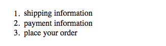
Progress at last
We all know that semantic markup makes for the best foundation, so we’ll start with the markup found above. In order to make the state information accessible, let’s add some additional text in paragraph and span elements.
<div class="progressmeter">
	<p>There are three steps in this checkout process.</p>
	<ol>
		<li class="one"><span>Enter your</span> shipping information</li>
		<li class="two"><span>Enter your</span> payment information</li>
		<li class="three"><span>Review details and</span> place your order</li>
	</ol>
</div>
Add on some simple CSS to hide the paragraph and spans, and arrange the list items on a single line with a background image to represent the large number, and this is what you’ll get:
There are three steps in this checkout process.
- Enter your shipping information
- Enter your payment information
- Review details and place your order
To display and describe a state as active, add the class “current” to one of the list items. Then change the hidden content such that it better describes the state to the user.
<div class="progressmeter">
	<p>There are three steps in this checkout process.</p>
	<ol>
		<li class="one current"><span>You are currently entering your</span> shipping information</li>
		<li class="two"><span>In the next step, you will enter your</span> payment information</li>
		<li class="three"><span>In the last step, you will review the details and</span> place your order</li>
	</ol>
</div>
The end result is an attractive progress meter that gives much greater semantic and contextual information.
There are three steps in this checkout process.
- You are currently entering your shipping information
- In the next step, you will enter your payment information
- In the last step, you will review the details and place your order
For example, the above example renders in a text-only browser as follows:
There are three steps in this checkout process.
- You are currently entering your shipping information
- In the next step, you will enter your payment information
- In the last step, you will review the details and place your order
And the screen reader I use for testing announces the following:
There are three steps in this checkout process. List of three items. You are currently entering your shipping information. In the next step, you will enter your payment information. In the last step, you will review the details and place your order. List end.
Here’s a sample code page that summarises this approach.
Happy frustration-free online shopping with this improved progress meter!
About the author
Kimberly Blessing has been developing Web sites since 1994 and has been a professional standards evangelist since 2000. She has worked for large companies like AOL and PayPal, leading their transitions to Web standards. She has also consulted for institutions large and small, helping them migrate to Web standards. She is a member and former Group Lead of the Web Standards Project and is active in other local, grass-roots Web standards efforts. (Geez, can we say “Web standards” any more in this bio?) An instructor in and a graduate of Bryn Mawr College‘s Computer Science program, Kimberly is also passionate about increasing the number of women in technology.
Brought to you by
Related articles
-
Accessibility Through Semantic HTML
Laura Kalbag takes us back to basics to make sure we consider accessibility when structuring our HTML. The Christmas tree needs to be standing firm before we drape it in lights and tinsel, and until you lot start doing it, we’re not going to stop preaching it.
-
Automating Your Accessibility Tests
Seren Davies reminds us that unlike Christmas, accessibility testing should not come but once a year with a look at how to apply automated testing. By configuring tests to run against each commit, you can ensure that your site’s accessibility compliance need not be left to chance.
-
Designing with Contrast
Mark Mitchell casts coarse salt upon the pale icy sheen of recent web design aesthetics to sound a warning that we may be on thin ice. The tension between low contrast tastes and high contrast needs is a story as old as the
<font>tag, and yet it bears frequent retelling. For snow has fallen snow on snow. -
Don’t Push Through the Pain
Carolyn Wood reminds us of what in recent years we’ve come to overlook, hunched as we are over laptop and tablet: our physical wellbeing. Sometimes, that tingle down your arm from shoulder to fingers isn’t Christmas magic.
-
Future Accessibility Guidelines—for People Who Can’t Wait to Read Them
Alan Dalton uses this, the International Day of Persons with Disabilities, to look back at where we’ve come from, to evaluate where we are, and to look forward to what’s coming next in the future of accessibility guidelines.
-
Inclusive Considerations When Restyling Form Controls
Scott O’Hara hogs the remote while he looks into the ever-present issue of custom form controls. We might brute-force an element to take on the styling we’re looking for, but will that interaction still make sense for all users? Let’s give the batteries a rub and find out.