Designing for Mobile Performance

Last year, some colleagues at Google ran a research study titled “The Need for Mobile Speed” to find out what the impact of performance and perception of speed had on the way people use the web on their mobile devices.
That’s not a trivial distinction; when considering performance, how fast something feels is often more important than how fast it actually is. When dealing with sometimes underpowered mobile devices and slow mobile networks, designing experiences that feel fast is exceptionally important.
One of the most startling numbers we found in the study was that 53% of mobile site visits are abandoned if pages take longer than 3 seconds to load.
We wanted to find out more, so following on from this study, we conducted research to define what the crucial elements of speed are. We took into consideration the user experience (UX), overall perception of speed, and how differing contexts the user finds themselves in can alter how fast a user thinks something loaded.
To understand speed and load times first we must understand that user mobile web behaviour is broken down into three buckets;
- Intention
- Location
- State of mind
Let’s look at each of those in turn.
Intention
Users browse sites on a mobile device for many different reasons. To be able to effectively design a performant user experience for them, it’s important to understand what those reasons might be. When asked to describe their reason for visiting a site, approximately 30% of people asked by the study claimed that they were simply browsing without a particular purpose in mind. Looking deeper, we found that this number increased slightly (34%) for retail sites. 30% said they were just there to find out some information for a future task or action, such as booking a flight.
Interestingly, the research shows that users are actually window shopping using their mobile browser. Only 29% actually said they had a specific goal or intent in mind, and this number increases significantly for financial services like banking sites (57%). This goes against a traditionally held view of users wanting to perform simple actions efficiently on their mobile device. Sure, some users are absolutely doing that, but many are just browsing around without a goal in mind, just like they would on a desktop browser.
This gives great insight into the user’s intentions. It tells us that users are actively using sites on their mobile, but a large majority do not intend to do anything instantly. There’s no goal they’re under pressure to achieve. If a site’s performance is lousy or janky, this will only reaffirm to the user to that they can hold off on completing a task, so they might just give up.
However, if a site is quick to load, sophisticated in expressing its value proposition quickly, and enables the user to perform their actions seamlessly, then turning that “browsing user” into a “buying user” becomes all that much easier. When the user has no goal, there’s more opportunity to convert, and you stand a greater chance of doing that if the performance is good enough so they stick around.
Location
Obviously, mobile devices by their nature can be used in many different locations. This is an interesting consideration, because it’s not something we traditionally need to take into account designing experiences for static platforms like desktop computers.
The in the study, we found that 82% of users browse the web on their mobile phone while in their home. In contrast, only 7% do the same while at work. This might come across as a bit of a shock, but when you look at mobile usage – in particular app usage – most of the apps being used are either a social network or some sort of entertainment or media app. Due to the unreliability of network connections, users will often alternate between these two types of apps.
The consequence being that if a site doesn’t work offline, or otherwise compensate for bad network connectivity in some way by providing opportunities to allow users to browse their site, then it becomes a self-fulfilling prophecy as to why users mostly view the mobile web from the comfort of their homes where there is a strong WiFi connection. They’re using mobile devices, but they’re not actually mobile themselves.
Another thing to bear in mind is how users alternate between devices, a study by comScore found that 80% of transactions take place on desktop while 69% of the browsing takes place on mobile. Any given user might access from more than one location - they might visit one day from a bus queue on their phone, and then next day from a laptop at home.
State of mind
One more thing we need to take into consideration is the user’s state of mind. Whilst browsing at home, users tend to be more relaxed, and in the research 76% stated they were generally calmer at home. The user’s state of mind can have quite a big impact on how they perceive things. The calmer they are, the quicker a site might appear to load. If the user is anxious and impatiently drumming their fingers on the table, things seem to take longer, and even a small wait can feel like an eternity.
This is quite key. Over 40% of sites take longer than 4 seconds to load for users who are are out and about and using a mobile data connection. Coupled with our perception, and amplified by a potentially less-than-calm state of mind, this can seem like an age.
What does this all mean?
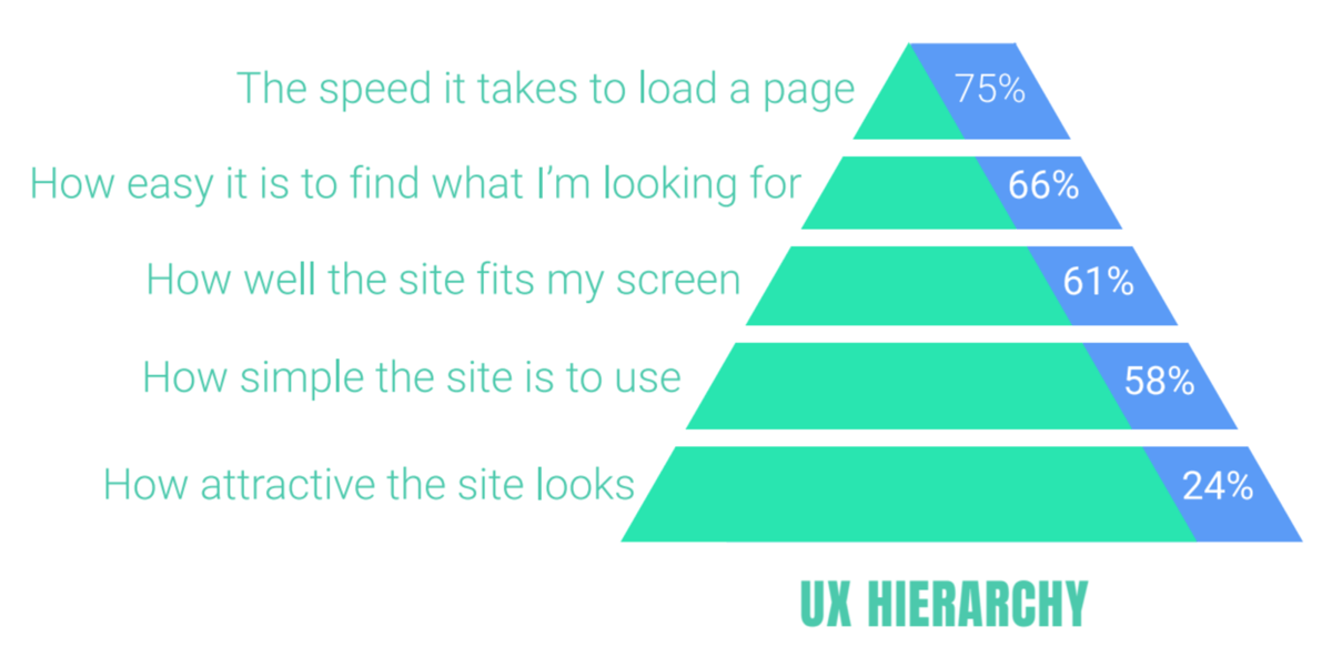
I think we can all agree that users prefer strong, steady connections and comfort when completing transactions. It seems like common sense when we say it out loud. Recreating these feelings and sensations of comfort and predictability under all circumstances therefore becomes paramount. Equally, when asked in the study, users all claimed that speed was the most important factor impacting their mobile web usage. Over 40%, in fact, said it was the most important UX feature of a site, and nobody asked considered it to be of no importance at all.
The meaning of speed
When it comes to performance, speed is measured in two ways – real speed; as measured on a clock, and perceived speed; how responsive an interaction feels. We can, of course, improve how quickly a site loads by simply making files smaller. Even then, the study showed that 32% of users felt a site can feel slow even when it loads in less than 4 seconds. This gets even worse when you look at it by age group, with 50% if young people (18-24 year olds) thinking a site was slower than it actually was. When you add to the mix that users think a site loaded faster when they are sitting compared to when they are standing up, then you are in a world of trouble if your site doesn’t have any clear indicators to let the user know the loading state of you website or app.
So what can we do about this to improve our designs?
How to fix / hack user perception
There are some golden rules of speed, the first thing is hacking response time. If a page takes more than 3 seconds to load, you will certainly start to lose your users. However, if that slowness is part of a UX flow such as processing information, the user understands it might take a little time. Under those circumstances, a load time of under 5 seconds is acceptable, but even then, you should take caution. Anything above 8 seconds and you are in very real danger of losing your audience completely.
| Load time | User impression |
|---|---|
| 200 ms | Feels instant |
| 1 s | Feels it is performing smoothly |
| 5 s | Part of user flow |
| 8 s | Lose attention |
Remove the tap delay
Mobile browsers often use a 300-350ms delay between the triggering of the touchend and click events. This delay was added so the browser could determine if there was going to be a double-tap triggered or not, since double-tap is a common gesture used to zoom into text. This delay can have the side effect of making interactions feel laggy, and therefore giving the user the impression that the site is slow, even if it’s their own browser causing the problem.
Fortunately there’s a way to remove the delay. Add following in the <head> of your page, and the delay no longer takes effect:
<meta name="viewport" content="width=device-width">You can also use touch-action: manipulation in newer browsers to eliminate click delay. For old browsers, FastClick by FT Labs uses touch events to trigger clicks faster and remove the double-tap gesture.
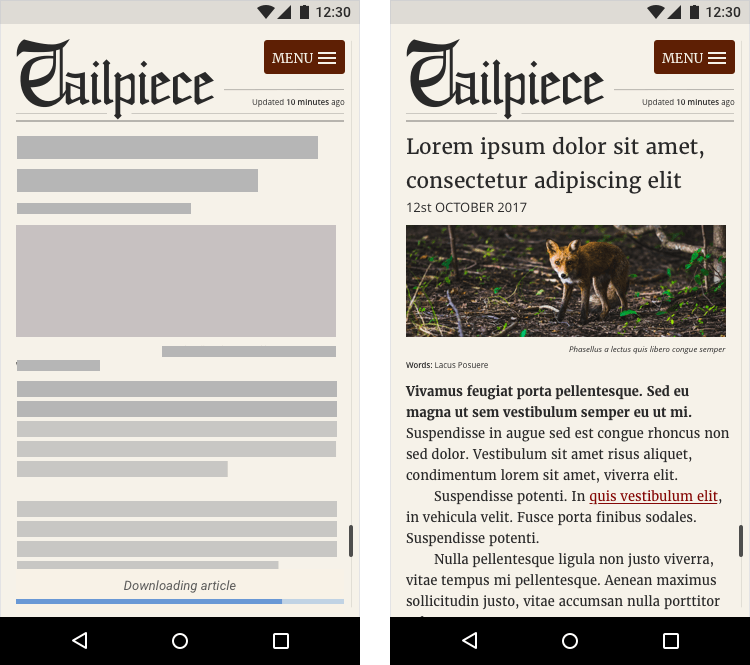
Make use of Skeleton Screens
A skeleton layout is a wireframe version of your app that displays while content is being loaded. This demonstrates to the user that content is about to be loaded, giving the impression that something is happening more quickly than it really is. Consider also using a preloader UI as well, with a text label informing the user that the app is loading. One example would be to pulsate the wireframe content giving the app the feeling that it is alive and loading. This reassures the user that something is happening and helps prevent resubmissions or refreshes of your app. Razvan Caliman created a Codepen example of how to create this effect in purely CSS.
One thing to consider though, if data doesn’t load then you might need to create a fallback 404 or error page to let the user know what happened.
Responsive Touch Feedback
Carefully designing the process by which items load is one aspect of increasing the perceived speed of your page, but reassuring the user that an action they have taken is in process is another. At Google we use something called a Ripple, which is is animating dot that expands or ripples in order to confirm to the user that their input has been triggered. This happens immediately, expanding outward from the point of touch. This reaffirms to the user that their input has been received and is being acted on, even before the site has had a chance to process or respond to the action. From the user’s point of view, they’ve tapped and the page has responded immediately, so it feels really quick and satisfying.
You can mimic this same behavior using our Material Design Components Web GitHub repo.

Progress bars
These UI elements have existed for a very long time, but research conducted by Chris Harrison and published in New Scientist found that the style of a progress bar can alter the perception of speed drastically. As a matter of fact, progress bars with ripples that animate towards the left appear like they are loading faster by at least 11% percent. So when including them in your site, take into consideration that ripples and progress bars that pulsate faster as they get to the end will make your sites seem quicker.
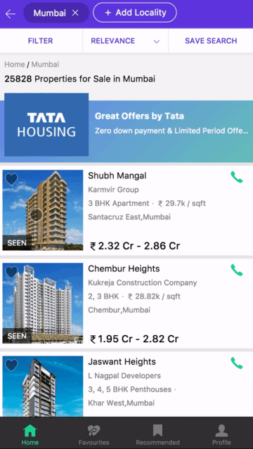
Navigation
The speed with which a user can locate navigational items or call to actions adds to their perceived performance of a site. If the user’s next action is quick to spot on the screen, they don’t spend time hunting around the interface with their eyes and fingers. So no matter how quickly your code runs, hiding items behind a nav bar will make a site feel slower than it actually is.
Facebook found that switching to using bottom navigation saw an increase in engagement, satisfaction, revenue, speed, and importantly, perception of speed. If the user sees the navigation items they’re looking for quickly, the interaction feels fast. What’s more, end-to-end task completion is quicker too, as the interface not only feels quicker, but actually measures quicker as well. Similar reactions were found with Spotify and Redbooth.
Luke Wroblewski gave a talk last year in Ireland titled “Obvious Always Wins” which he demonstrated through the work he did with Google+. Luke’s message is that by making the core features of your app obvious to your user, you will see engagement go up. This again seems obvious, right? However, it is important to note that adding bottom navigation doesn’t just mean a black bar at the bottom of your screen like some kind of performance magic bullet. The goal is to make the items clear to the user so they know what they need to be doing, and how you achieve that could be different from one interface to the next. Google keeps experimenting with different navigation styles, but finally settled with the below when they conducted user research and testing.

Conclusion
By utilizing a collection of UI patterns and speed optimisation techniques, you can improve not only the actual speed of a site, but the perception of how quickly a user thinks your site is loading. It is critical to remember that users will not always be using your site in a calm and relaxed manner and that even their age can impact how they will use or not use your site. By improving your site’s stability, you increase the likelihood of positive user engagement and task completion.
You can learn more about techniques to hack user perception and improve user speed by taking a look at an E-Book we published with Awwwards.com called Speed Matters: Design for Mobile Performance.
About the author
Mustafa is a Design Advocate at Google, which involves supporting designers worldwide create wonderful user experiences with Material Design, Progressive Web Apps and Google Design Sprints.
He has over seventeen years experience working as a UX Designer across multiple sectors including publishing, charities, central Government, education and finance, with a variety of organisations including News International, Middlesex University, The Metro Newspaper, Times London, BBC/Arts Council of England & Macmillan Publishing.
Brought to you by

Related articles
-
Websites of Christmas Past, Present and Future
Josh Emerson extols the virtues of progressive enhancement by acknowledging the need for speed, in both website rendering and interaction. With a new year imminent, there never was a better time to look backwards and forwards.
-
Helping VIPs Care About Performance
Lara Hogan ignites a little cognac over your web performance pudding by considering ways you can keep stakeholders invested in a site’s metrics and KPIs. More than just the budget, it’s the thought you put in that counts.
-
Microbrowsers are Everywhere
Colin Bendell gets into the minutia of microbrowsers - the small previews of your site that are pervasive all around the web and through social media apps and search engines whenever an item of content on your site is referenced.
-
HTTP/2 Server Push and Service Workers: The Perfect Partnership
Dean Hume pops on his gown and slippers and opens up his Christmas stocking to discover the high performance gifts of Server Push and Service Workers. It’s the gift that keeps on giving.
-
Your jQuery: Now With 67% Less Suck
Scott Kosman administers an optimizing shot in the arm to your seasonally sluggish jQuery with some simple ways to improve performance. Get your jQuery running so fast that Dasher, Dancer, Prancer, Vixen, Comet, Cupid, Donner and Blitzen will struggle to keep up.
-
Using Google App Engine as Your Own Content Delivery Network
Matt Riggott demonstrates how to use Google App Engine as a CDN for serving your site’s images, CSS and JavaScript files from a location close to your users. Find out how using this free service from Google could be just the performance kick your site needs.