Cascading Web Design with Feature Queries
Feature queries, also known as the @supports rule, were introduced as an extension to the CSS2 as part of the CSS Conditional Rules Module Level 3, which was first published as a working draft in 2011. It is a conditional group rule that tests if the browser’s user agent supports CSS property:value pairs, and arbitrary conjunctions (and), disjunctions (or), and negations (not) of them.
The motivation behind this feature was to allow authors to write styles using new features when they were supported but degrade gracefully in browsers where they are not. Even though the nature of CSS already allows for graceful degradation, for example, by ignoring unsupported properties or values without disrupting other styles in the stylesheet, sometimes we need a bit more than that.
CSS is ultimately a holistic technology, in that, even though you can use properties in isolation, the full power of CSS shines through when used in combination. This is especially evident when it comes to building web layouts. Having native feature detection in CSS makes it much more convenient to build with cutting-edge CSS for the latest browsers while supporting older browsers at the same time.
Browser support
Opera first implemented feature queries in November 2012, both Chrome and Firefox had it since May 2013. There have been several articles about feature queries written over the years, however, it seems that awareness of its broad support isn’t that well-known. Much of the earlier coverage on feature queries was not written in English, and perhaps that was a limiting factor.
@supports― CSSのFeature Queries by Masataka Yakura, August 8 2012- Native CSS Feature Detection via the
@supportsRule by Chris Mills, December 21 2012 - CSS
@supportsby David Walsh, April 3 2013 - Responsive typography with CSS Feature Queries by Aral Balkan, April 9 2013
- How to use the
@supportsrule in your CSS by Lea Verou, January 31 2014 - CSS Feature Queries by Amit Tal, June 2 2014
- Coming Soon: CSS Feature Queries by Adobe Web Platform Team, August 21 2014
- CSS feature queries mittels
@supportsby Daniel Erlinger, November 27 2014
As of December 2017, all current major browsers and their previous 2 versions support feature queries. Feature queries are also supported on Opera Mini, UC Browser and Samsung Internet. The only browsers that do not support feature queries are Internet Explorer and Blackberry Mobile, but that may be less of an issue than you might think.
Granted, there is still a significant number of organisations that require support of Internet Explorer. Microsoft still continues to support IE11 for the life-cycle of Windows 7, 8 and 10. They have, however, stopped supporting older versions since January 12, 2016. It is inevitable that there will be organisations that, for some reason or another, make it mandatory to support IE, but as time goes on, this number will continue to shrink.
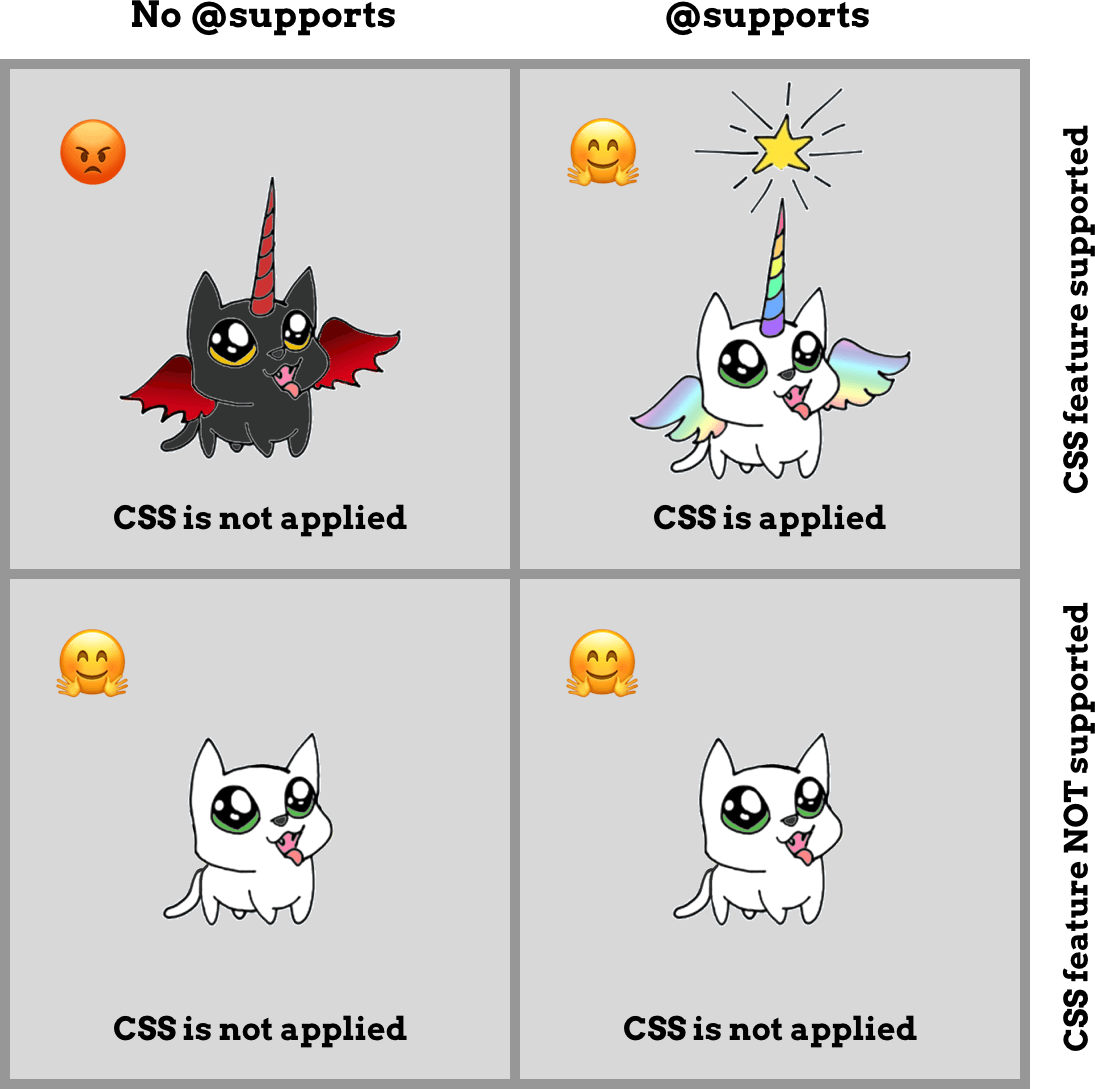
Jen Simmons wrote an extensive article called Using Feature Queries in CSS which discussed a matrix of potential situations when it comes to the usage of feature queries. The following image is a summary of the aforementioned matrix.

The most tricky situation we have to deal with is the box in the top-left corner, which are “browsers that don’t support feature queries, yet do support the feature in question”. For cases like those, it really depends on the specific CSS feature you want to use and a subsequent evaluation of the pros and cons of not including that feature in spite of the fact the browser (most likely Internet Explorer) supports it.
The basics of feature queries
As with any conditional, feature queries operate on boolean logic, in other words, if the query resolves to true, apply the CSS properties within the block, or else just ignore the entire block altogether. The syntax of a simple feature query is as follows:
.selector {
  /* Styles that are supported in old browsers */
}

@supports (property:value) {
  .selector {
    /* Styles for browsers that support the specified property */
  }
}
Note that the parentheses around the property:value pair are mandatory and the rule is invalid without them. Styles that apply to older browsers, i.e. fallback styles, should come first, followed by the newer properties, which are contained within the @supports conditional. Because of the cascade, fallback styles will be overridden by the newer properties in the modern browsers that support them.
main {
  background-color: red;
}

@supports (display:grid) {
  main {
    background-color: green;
  }
}
In this example, browsers that support CSS grid will have a main element with a green background colour because the conditional resolves to true, while browsers that do not support grid will have a main element with a red background colour.
The implication of such behaviour means that we can layer on enhanced styles based on the features we want to use and these styles will show up in browsers that support them. But for those that do not, they will get a more basic look that still works anyway. And that will be our approach moving forward.
Boolean operators for feature queries
The and operator allows us to test for support of multiple properties within a single conditional. This would be useful for cases where the desired output requires multiple cutting-edge features to be supported at the same time to work. All the property:value pairs listed in the conditional must resolve to true for the styles within the rule to be applied.
@supports (transform: rotate(45deg)) and
          (writing-mode: vertical-rl) {
  /* Some CSS styles */
}
The or operator allows us to list multiple property:value pairs in the conditional and as long as one of them resolves to true, the styles within the block will be applied. A relevant use-case would be for properties with vendor-prefixes.
@supports (background: -webkit-gradient(linear, left top, left bottom, from(white), to(black))) or
          (background: -o-linear-gradient(top, white, black)) or
          (background: linear-gradient(to bottom, white, black)) {
  /* Some CSS styles */
}
The not operator negates the resolution of the property:value pair in the conditional, resolving to false when the property is supported and vice versa. This is useful when there are two distinct sets of styles to be applied depending on the support of a specific feature. However, we do need to keep in mind the case where a browser does not support feature queries, and handle the styles for those browsers accordingly.
@supports not (shape-outside: polygon(100% 80%,20% 0,100% 0)) {
  /* Some CSS styles */
}
To avoid confusion between and and or, these operators must be explicitly declared as opposed to using commas or spaces. To prevent confusion caused by precedence rules, and, or and not operators cannot be mixed without a layer of parentheses.
This rule is not valid and the styles within the block will be ignored.
@supports (transition-property: background-color) or
          (animation-name: fade) and
          (transform: scale(1.5)) {
  /* Some CSS styles */
}
To make it work, parentheses must be added either around the two properties adjacent to the or or the and operator like so:
@supports ((transition-property: background-color) or
          (animation-name: fade)) and
          (transform: scale(1.5)) {
  /* Some CSS styles */
}
@supports (transition-property: background-color) or
((animation-name: fade) and
(transform: scale(1.5))) {
/* Some CSS styles */
}The current specification states that whitespace is required after a not and on both sides of an and or or, but this may change in a future version of the specification. It is acceptable to add extra parentheses even when they are not needed, but omission of parentheses is considered invalid.
Cascading web design
I’d like to introduce the concept of cascading web design, an approach made possible with feature queries. Browser update cycles are much shorter these days, so new features and bug fixes are being pushed out a lot more frequently as compared to the early days of the web.
With the maturation of web standards, browser behaviour is less unpredictable than before, but each browser will still have their respective quirks. Chances are, the latest features will not ship across all browsers at the same time. But you know what? That’s perfectly fine. If we accept this as a feature of the web, instead of a bug, we’ve just opened up a lot more web design possibilities.
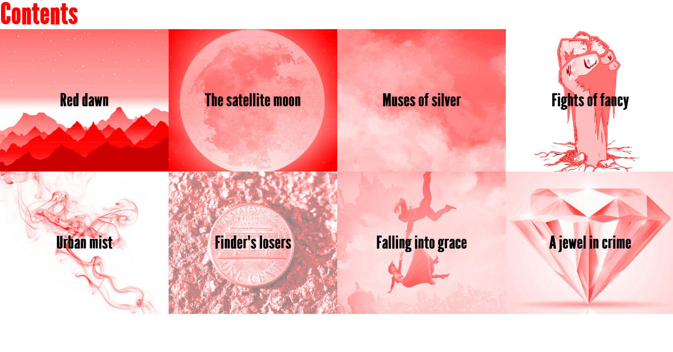
The following example is a basic, responsive grid layout of items laid out with flexbox, as viewed on IE11.

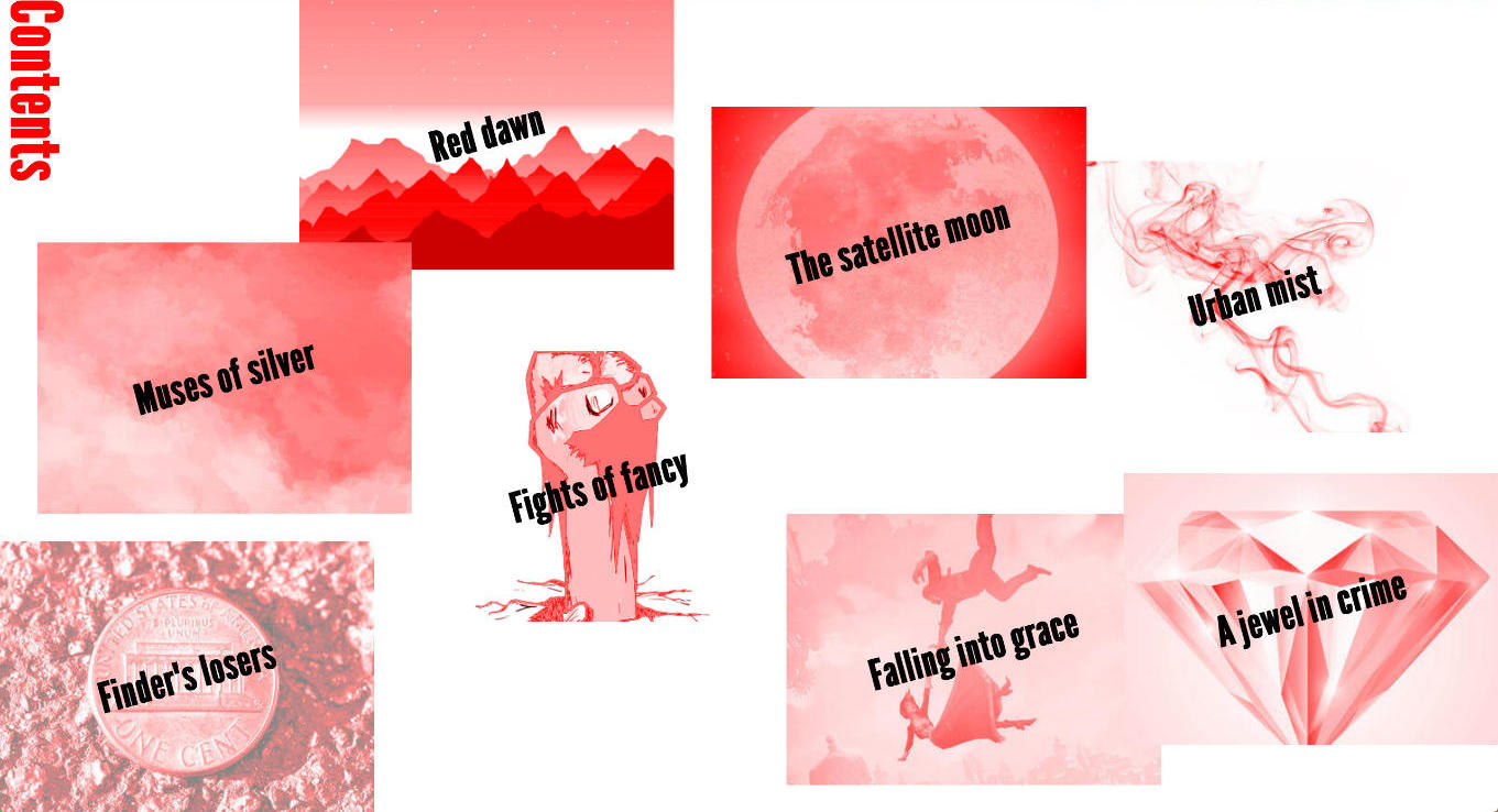
We can add a block of styles within an @supports rule to apply CSS grid properties for browsers that support them to enhance this layout, like so:

The web is not a static medium. It is dynamic and interactive and we manipulate this medium by writing code to tell the browser what we want it to do. Rather than micromanaging the pixels in our designs, maybe it’s time we cede control of our designs to the browsers that render them. This means being okay with your designs looking different across browsers and devices.
As mentioned earlier, CSS works best when various properties are combined. It’s one of those things whose whole is greater than the sum of its parts. So feature queries, when combined with media queries, allow us to design layouts that are most effective in the environment they have to perform in.
Such an approach requires interpolative thinking, on multiple levels. As web designers and developers, we don’t just think in one fixed dimension, we get to think about how our design will morph on a narrow screen, or on an older browser, in addition to how it will appear on a browser with the latest features.
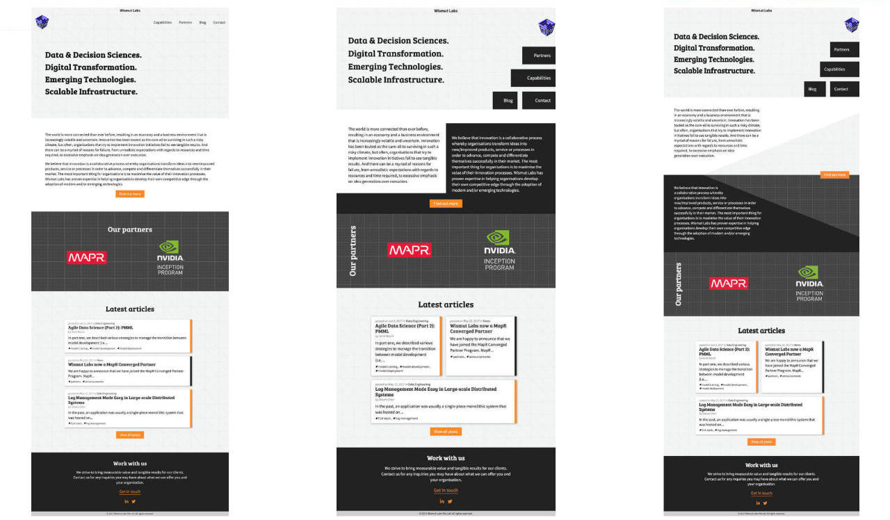
In the following example, the layout on the left is what IE11 users will see, the one in the middle is what Firefox users will see, because Firefox doesn’t support CSS shapes yet, but once it does, it will then look like the layout on the right, which is what Chrome users see now.

With the release of CSS Grid this year, we’ve hit another milestone in the evolution of the web as a medium. The beauty of the web is its backwards compatibility and generous fault tolerance. Browser features are largely additive, holding onto the good parts and building on top of them, while deprecating the bits that didn’t work well.
Feature queries allow us to progressively enhance our CSS, establishing a basic level of user experience across the widest range of browsers, while building in more advanced functionality for browsers who can use them. And hopefully, this will allow more of us to create designs that truly embrace the nature of the web.
About the author
Chen Hui Jing is a self-taught designer and developer with an inordinate love for CSS, as evidenced by her blog that is mostly about CSS, and her tweets, which are largely about typography and the web. She used to play basketball full-time and launched her web career during downtime between training sessions.


