Information Literacy Is a Design Problem

Information literacy, wrote Dr. Carol Kulthau in her 1987 paper “Information Skills for an Information Society,” is “the ability to read and to use information essential for everyday life”—that is, to effectively navigate a world built on “complex masses of information generated by computers and mass media.”
Nearly thirty years later, those “complex masses of information” have only grown wilder, thornier, and more constant. We call the internet a firehose, yet we’re loathe to turn it off (or even down). The amount of information we consume daily is staggering—and yet our ability to fully understand it all remains frustratingly insufficient.
This should hit a very particular chord for those of us working on the web. We may be developers, designers, or strategists—we may not always be responsible for the words themselves—but we all know that communication is much more than just words. From fonts to form fields, every design decision that we make changes the way information is perceived—for better or for worse.
What’s more, the design decisions that we make feed into larger patterns. They don’t just affect the perception of a single piece of information on a single site; they start to shape reader expectations of information anywhere. Users develop cumulative mental models of how websites should be: where to find a search bar, where to look at contact information, how to filter a product list.
And yet: our models fail us. Fundamentally, we’re not good at parsing information, and that’s troubling. Our experience of an “information society” may have evolved, but the skills Dr. Kuhlthau spoke of are even more critical now: our lives depend on information literacy.
Patterns from words
Let’s start at the beginning: with the words. Our choice of words can drastically alter a message, from its emotional resonance to its context to its literal meaning. Sometimes we can use word choice for good, to reinvigorate old, forgotten, or unfairly besmirched ideas.
One time at a wedding bbq we labeled the coleslaw BRASSICA MIXTA so people wouldn’t skip it based on false hatred.
— Eileen Webb (@webmeadow) November 27, 2016
We can also use clever word choice to build euphemisms, to name sensitive or intimate concepts without conjuring their full details. This trick gifts us with language like “the beast with two backs” (thanks, Shakespeare!) and “surfing the crimson wave” (thanks, Cher Horowitz!).
But when we grapple with more serious concepts—war, death, human rights—this habit of declawing our language gets dangerous. Using more discrete wording serves to nullify the concepts themselves, euphemizing them out of sight and out of mind.
The result? Politicians never lie, they just “misspeak.” Nobody’s racist, but plenty of people are “economically anxious.” Nazis have rebranded as “alt-right.”
I’m not an asshole, I’m just alt-nice.
— Andi Zeisler (@andizeisler) November 22, 2016
The problem with euphemisms like these is that they quickly infect everyday language. We use the words we hear around us. The more often we see “alt-right” instead of “Nazi,” the more likely we are to use that phrase ourselves—normalizing the term as well as the terrible ideas behind it.
Patterns from sentences
That process of normalization gets a boost from the media, our main vector of information about the world outside ourselves. Headlines control how we interpret the news that follows—even if the story contradicts it in the end. We hear the framing more clearly than the content itself, coloring our interpretation of the news over time.
Even worse, headlines are often written to encourage clicks, not to convey critical information. When headline-writing is driven by sensationalism, it’s much, much easier to build a pattern of misinformation. Take this CBS News headline: “Donald Trump: ‘Millions’ voted illegally for Hillary Clinton.” The headline makes no indication that this an objectively false statement; instead, this word choice subtly suggestions that millions did, in fact, illegally vote for Hillary Clinton.
Headlines like this are what make lying a worthwhile political strategy. https://t.co/DRjGeYVKmW
— Binyamin Appelbaum (@BCAppelbaum) November 27, 2016
This is a deeply dangerous choice of words when headlines are the primary way that news is conveyed—especially on social media, where it’s much faster to share than to actually read the article. In fact, according to a study from the Media Insight Project, “roughly six in 10 people acknowledge that they have done nothing more than read news headlines in the past week.”
If a powerful person asserts X there are 2 responsible ways to cover:
— Helen Rosner (@hels) November 27, 2016
1. “X is true”
2. “Person incorrectly thinks X”
Never “Person says X”
Even if we do, in fact, read the whole article, there’s no guarantee that we’re thinking critically about it. A study conducted by Stanford found that “82 percent of students could not distinguish between a sponsored post and an actual news article on the same website. Nearly 70 percent of middle schoolers thought they had no reason to distrust a sponsored finance article written by the CEO of a bank, and many students evaluate the trustworthiness of tweets based on their level of detail and the size of attached photos.”
Friends: our information literacy is not very good. Luckily, we—workers of the web—are in a position to improve it.
Sentences into design
Consider the presentation of those all-important headlines in social media cards, as on Facebook. The display is a combination of both the card’s design and the article’s source code, and looks something like this:
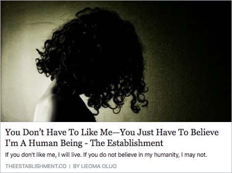
A large image, a large headline; perhaps a brief description; and, at the bottom, in pale gray, a source and an author’s name.
Those choices convey certain values: specifically, they suggest that the headline and the picture are the entire point. The source is so deemphasized that it’s easy to see how fake news gains a foothold: daily exposure to this kind of hierarchy has taught us that sources aren’t important.
And that’s the message from the best-case scenario. Not every article shows every piece of data. Take this headline from the BBC: “Wisconsin receives request for vote recount.”
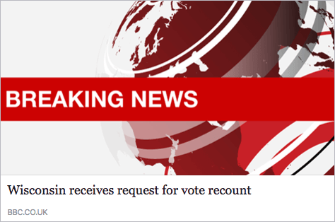
With no image, no description, and no author, there’s little opportunity to signal trust or provide nuance. There’s also no date—ever—which presents potentially misleading complications, especially in the context of “breaking news.”
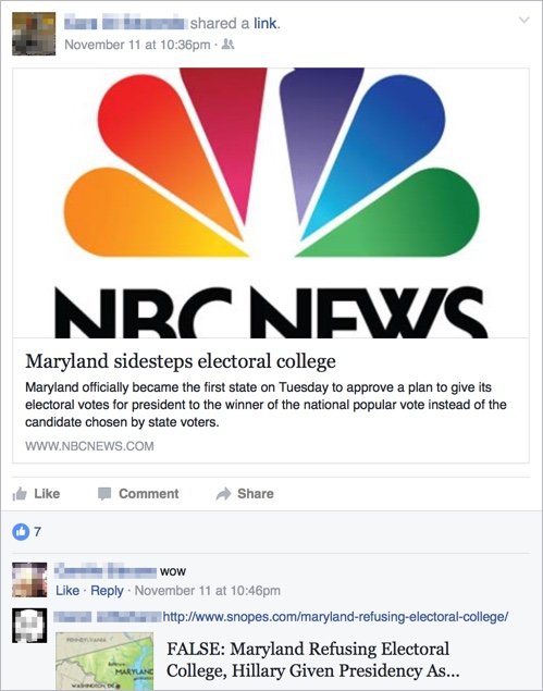
And lest you think dates don’t matter in the light-speed era of social media, take the headline, “Maryland sidesteps electoral college.” Shared into my feed two days after the US presidential election, that’s some serious news with major historical implications. But since there’s no date on this card, there’s no way for readers to know that the “Tuesday” it refers to was in 2007. Again, a design choice has made misinformation far too contagious.
More recently, I posted my personal reaction to the death of Fidel Castro via a series of twenty tweets. Wanting to share my thoughts with friends and family who don’t use Twitter, I then posted the first tweet to Facebook. The card it generated was less than ideal:
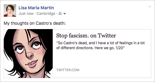
The information hierarchy created by this approach prioritizes the name of the Twitter user (not even the handle), along with the avatar. Not only does that create an awkward “headline” (at least when you include a full stop in your name), but it also minimizes the content of the tweet itself—which was the whole point.
The arbitrary elevation of some pieces of content over others—like huge headlines juxtaposed with minimized sources—teaches readers that these values are inherent to the content itself: that the headline is the news, that the source is irrelevant. We train readers to stop looking for the information we don’t put in front of them.
These aren’t life-or-death scenarios; they are just cases where design decisions noticeably dictate the perception of information. Not every design decision makes so obvious an impact, but the impact is there. Every single action adds to the pattern.
Design with intention
We can’t necessarily teach people to read critically or vet their sources or stop believing conspiracy theories (or start believing facts). Our reach is limited to our roles: we make websites and products for companies and colleges and startups.
But we have more reach there than we might realize. Every decision we make influences how information is presented in the world. Every presentation adds to the pattern. No matter how innocuous our organization, how lowly our title, how small our user base—every single one of us contributes, a little bit, to the way information is perceived.
Are we changing it for the better?
While it’s always been crucial to act ethically in the building of the web, our cultural climate now requires dedicated, individual conscientiousness. It’s not enough to think ourselves neutral, to dismiss our work as meaningless or apolitical. Everything is political. Every action, and every inaction, has an impact.
As Chappell Ellison put it much more eloquently than I can:
Every single action and decision a designer commits is a political act. The question is, are you a conscious actor?
— Chappell Ellison🤔 (@ChappellTracker) November 28, 2016
As shapers of information, we have a responsibility: to create clarity, to further understanding, to advance truth. Every single one of us must choose to treat information—and the society it builds—with integrity.
About the author
Lisa Maria Martin is an independent consultant based in Boston. She practices content-driven information architecture, helping organizations to understand, organize, and structure their web content for empowering user experiences. She has worked with clients and agencies such as Carnegie Mellon University, Vectorworks, the Posse Foundation, Gettysburg University, Brain Traffic, and Happy Cog. Lisa Maria is a speaker, writer, and workshop facilitator, as well as managing editor at A Book Apart. Follow her on Twitter @redsesame, or learn more about her work at thefutureislikepie.com.
Brought to you by
Related articles
-
Content Production Planning
Sophie Dennis understands the necessity of planning carefully how and when website content will be produced – and who’s responsible. Content’s like Christmas: best not left to chance.
-
Cooking Up Effective Technical Writing
Sally Jenkinson sets out her recipe for helpful documentation, suggesting you serve up structured, easily digestible and nutritious information for your readers. With a dusting of screencasts and GIFs, it’s a recipe for success at Christmas and beyond.
-
Dynamic Social Sharing Images
Drew McLellan draws this, our fourteenth season to a gentle close by getting a little Inside Snowball and gives an account of how we put the robots to work in generating custom dynamic social media sharing images for each of the articles here on the site. Christmas is a time to share what you have, even if it’s just a grid of pixels.
-
Is Your Website Accidentally Sexist?
Suw Charman-Anderson offers up a handy guide to help us not get stuck up the chimney of gender bias by failing to properly consider our design and language choices. Take the time to examine your work and find any biases, because the girls and boys won’t get any toys if you don’t pull them out.
-
Turn Jekyll up to Eleventy
Paul Lloyd assembles a heavenly host of cherubs to sing the virtues of the Eleventy static site generator. By looking at how it compares to the familiar Ruby-based Jekyll (which we have espoused the virtues of here before), he may have you humming its tune for this season’s holiday projects. But will it put you on cloud eleven?
-
How to Write a Book
Jonathan Snook knows that writing and publishing are different things, and relates his experience of creating an ebook, exploring the formats and the tools to set you on your merry way. Will 2014 be the year of your book?