CSS Writing Modes

Since you may not have a lot of time, I’m going to start at the end, with the dessert.
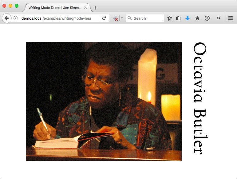
You can use a little-known, yet important and powerful CSS property to make text run vertically. Like this.
Or instead of running text vertically, you can layout a set of icons or interface buttons in this way. Or, of course, with anything on your page.
The CSS I’ve applied makes the browser rethink the orientation of the world, and flow the layout of this element at a 90° angle to “normal”. Check out the live demo, highlight the headline, and see how the cursor is now sideways.
See the Pen Writing Mode Demo — Headline by Jen Simmons (@jensimmons) on CodePen.
The code for accomplishing this is pretty simple.
h1 {
  writing-mode: vertical-rl;
}
That’s all it takes to switch the writing mode from the web’s default horizontal top-to-bottom mode to a vertical right-to-left mode. If you apply such code to the html element, the entire page is switched, affecting the scroll direction, too.
In my example above, I’m telling the browser that only the h1 will be in this vertical-rl mode, while the rest of my page stays in the default of horizontal-tb.
So now the dessert course is over. Let me serve up this whole meal, and explain the the CSS Writing Mode Specification.
Why learn about writing modes?
There are three reasons I’m teaching writing modes to everyone—including western audiences—and explaining the whole system, instead of quickly showing you a simple trick.
-
We live in a big, diverse world, and learning about other languages is fascinating. Many of you lay out pages in languages like Chinese, Japanese and Korean. Or you might be inspired to in the future.
-
Using
writing-modeto turn bits sideways is cool. This CSS can be used in all kinds of creative ways, even if you are working only in English. - Most importantly, I’ve found understanding Writing Modes incredibly helpful when understanding Flexbox and CSS Grid. Before I learned Writing Mode, I felt like there was still a big hole in my knowledge, something I just didn’t get about why Grid and Flexbox work the way they do. Once I wrapped my head around Writing Modes, Grid and Flexbox got a lot easier. Suddenly the Alignment properties,
align-*andjustify-*, made sense.
Whether you know about it or not, the writing mode is the first building block of every layout we create. You can do what we’ve been doing for 25 years – and leave your page set to the default left-to-right direction, horizontal top-to-bottom writing mode. Or you can enter a world of new possibilities where content flows in other directions.
CSS properties
I’m going to focus on the CSS writing-mode property in this article. It has five possible options:
  writing-mode: horizontal-tb;
  writing-mode: vertical-rl;
  writing-mode: vertical-lr;
  writing-mode: sideways-rl;
  writing-mode: sideways-lr;
The CSS Writing Modes Specification is designed to support a wide range of written languages in all our human and linguistic complexity. Which—spoiler alert—is pretty insanely complex. The global evolution of written languages has been anything but simple.
So I’ve got to start with explaining some basic concepts of web page layout and writing systems. Then I can show you what these CSS properties do.
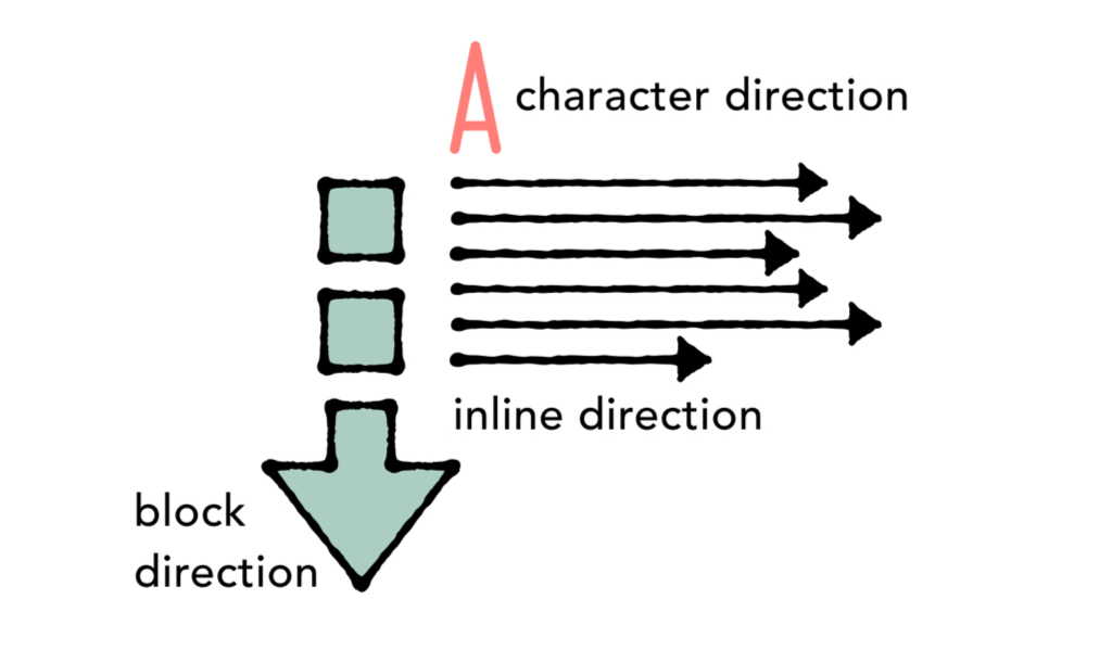
Inline Direction, Block Direction, and Character Direction
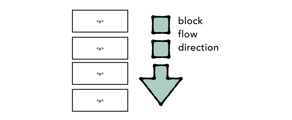
In the world of the web, there’s a concept of ‘block’ and ‘inline’ layout. If you’ve ever written display: block or display: inline, you’ve leaned on these concepts.
In the default writing mode, blocks stack vertically starting at the top of the page and working their way down. Think of how a bunch of block-levels elements stack—like a bunch of a paragraphs—that’s the block direction.
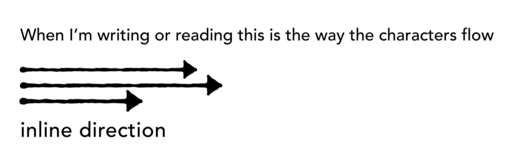
Inline is how each line of text flows. The default on the web is from left to right, in horizontal lines. Imagine this text that you are reading right now, being typed out one character at a time on a typewriter. That’s the inline direction.
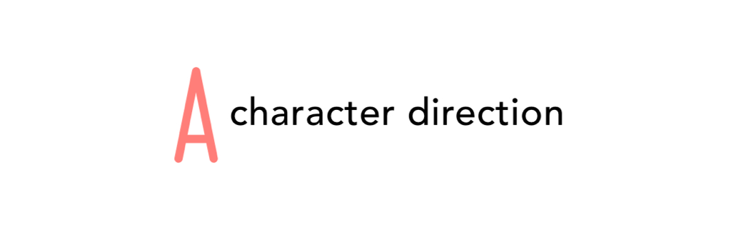
The character direction is which way the characters point. If you type a capital “A” for instance, on which side is the top of the letter? Different languages can point in different directions. Most languages have their characters pointing towards the top of the page, but not all.
Put all three together, and you start to see how they work as a system.
Now that we know what block, inline, and character directions mean, let’s see how they are used in different writing systems from around the world.
The four writing systems of CSS Writing Modes
The CSS Writing Modes Specification handles all the use cases for four major writing systems; Latin, Arabic, Han and Mongolian.
Latin-based systems
One writing system dominates the world more than any other, reportedly covering about 70% of the world’s population.
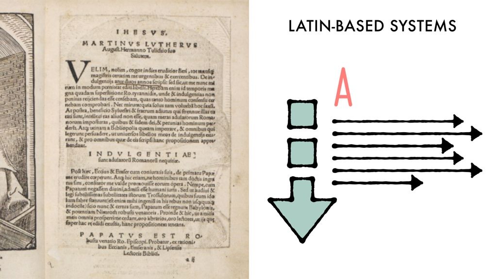
The text is horizontal, running from left to right, or LTR. The block direction runs from top to bottom.
It’s called the Latin-based system because it includes all languages that use the Latin alphabet, including English, Spanish, German, French, and many others. But there are many non-Latin-alphabet languages that also use this system, including Greek, Cyrillic (Russian, Ukrainian, Bulgarian, Serbian, etc.), and Brahmic scripts (Devanagari, Thai, Tibetan), and many more.
You don’t need to do anything in your CSS to trigger this mode. This is the default.
Best practices, however, dictate that you declare in your opening <html> element which language and which direction (LTR or RTL) you are using. This website, for instance, uses <html lang='en-gb' dir='ltr'> to let the browser know this content is published in Great Britian’s version of English, in a left to right direction.
Arabic-based systems
Arabic, Hebrew and a few other languages run the inline direction from right to left. This is commonly known as RTL.
Note that the inline direction still runs horizontally. The block direction runs from top to bottom. And the characters are upright.
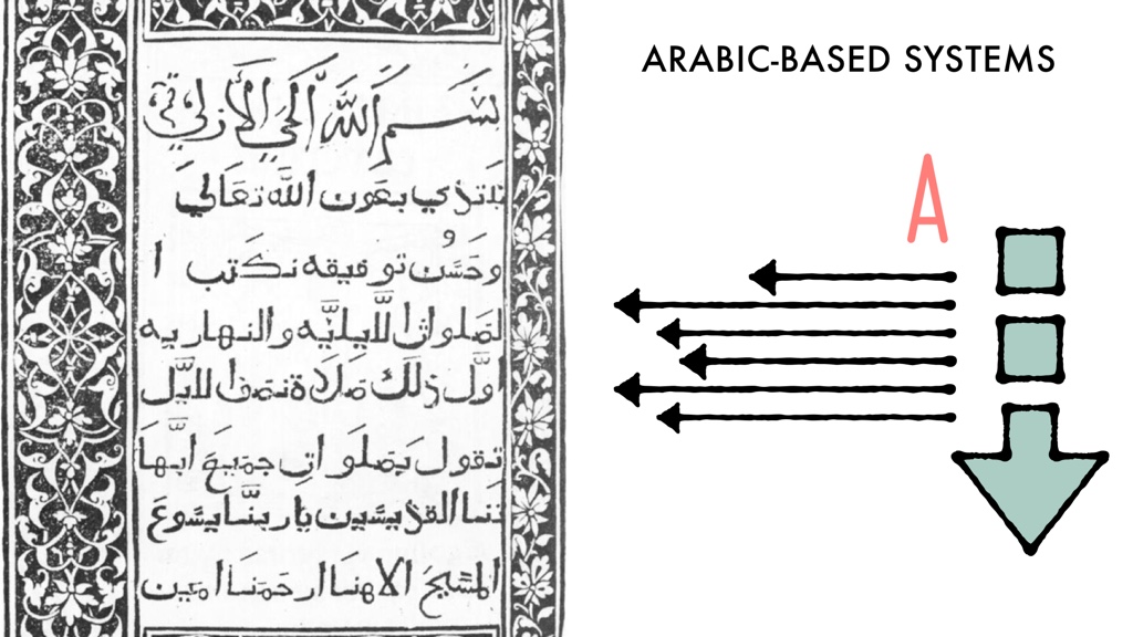
It’s not just the flow of text that runs from right to left, but everything about the layout of the website. The upper right-hand corner is the starting position. Important things are on the right. The eyes travel from right to left. So, typically RTL websites use layouts that are just like LTR websites, only flipped.
For many web developers, our experiences with internationalization have focused solely on supporting Arabic and Hebrew script.
CSS layout hacks for internationalization & RTL
To prepare an LTR project to support RTL, developers have had to create all sorts of hacks. For example, the Drupal community started a convention of marking every margin-left and -right, every padding-left and -right, every float: left and float: right with the comment /* LTR */. Then later developers could search for each instance of that exact comment, and create stylesheets to override each left with right, and vice versa. It’s a tedious and error prone way to work. CSS itself needed a better way to let web developers write their layout code once, and easily switch language directions with a single command.
Our new CSS layout system does exactly that. Flexbox, Grid and Alignment use start and end instead of left and right. This lets us define everything in relationship to the writing system, and switch directions easily. By writing justify-content: flex-start, justify-items: end, and eventually margin-inline-start: 1rem we have code that doesn’t need to be changed.
This is a much better way to work. I know it can be confusing to think through start and end as replacements for left and right. But it’s better for any multiligual project, and it’s better for the web as a whole.
Sadly, I’ve seen CSS preprocessor tools that claim to “fix” the new CSS layout system by getting rid of start and end and bringing back left and right. They want you to use their tool, write justify-content: left, and feel self-righteous. It seems some folks think the new way of working is broken and should be discarded. It was created, however, to fulfill real needs. And to reflect a global internet. As Bruce Lawson says, WWW stands for the World Wide Web, not the Wealthy Western Web. Please don’t try to convince the industry that there’s something wrong with no longer being biased towards western culture. Instead, spread the word about why this new system is here.
Spend a bit of time drilling the concept of inline and block into your head, and getting used to start and end. It will be second nature soon enough.
I’ve also seen CSS preprocessors that let us use this new way of thinking today, even as all the parts aren’t fully supported by browsers yet. Some tools let you write text-align: start instead of text-align: left, and let the preprocessor handle things for you. That is terrific, in my opinion. A great use of the power of a preprocessor to help us switch over now.
But let’s get back to RTL.
How to declare your direction
You don’t want to use CSS to tell the browser to switch from an LTR language to RTL. You want to do this in your HTML. That way the browser has the information it needs to display the document even if the CSS doesn’t load.
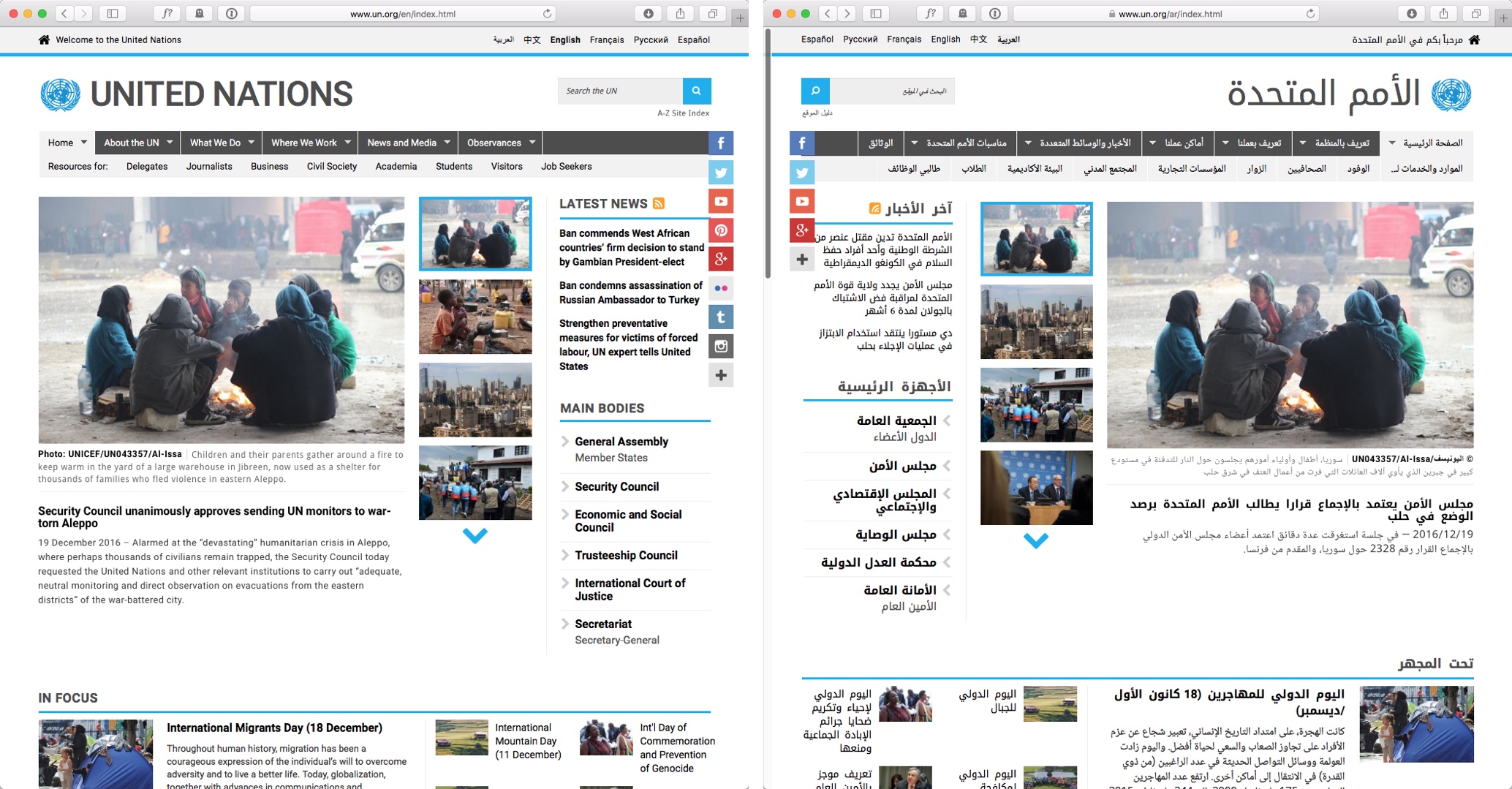
This is accomplished mainly on the html element. You should also declare your main language. As I mentioned above, the 24 ways website is using <html lang='en-gb' dir='ltr'> to declare the LTR direction and the use of British English. The UN Arabic website uses <html lang='ar' dir='rtl'>to declare the site as an Arabic site, using a RTL layout.
Things get more complicated when you’ve got a page with a mix of languages. But I’m not going to get into all of that, since this article is focused on CSS and layouts, not explaining everything about internationalization.
Let me just leave direction here by noting that much of the heavy work of laying out the characters which make up each word is handled by Unicode. If you are interested in learning more about LTR, RTL and bidirectional text, watch this video: Introduction to Bidirectional Text, a presentation by Elika Etemad.
Meanwhile, let’s get back to CSS.
The writing mode CSS for Latin-based and Arabic-based systems
For both of these systems—Latin-based and Arabic-based, whether LTR or RTL—the same CSS property applies for specifying the writing mode: writing-mode: horizontal-tb. That’s because in both systems, the inline text flow is horizontal, while the block direction is top-to-bottom. This is expressed as horizontal-tb.
horizontal-tb is the default writing mode for the web, so you don’t need to specify it unless you are overriding something else higher up in the cascade. You can just imagine that every site you’ve ever built came with:
html {
  writing-mode: horizontal-tb;
}
Now let’s turn our attention to the vertical writing systems.
Han-based systems
This is where things start to get interesting.
Han-based writing systems include CJK languages, Chinese, Japanese, Korean and others. There are two options for laying out a page, and sometimes both are used at the same time.
Much of CJK text is laid out like Latin-based languages, with a horizontal top-to-bottom block direction, and a left-to-right inline direction. This is the more modern way to doing things, started in the 20th century in many places, and further pushed into domination by the computer and later the web.
The CSS to do this bit of the layouts is the same as above:
section {
  writing-mode: horizontal-tb;
}
Or, you know, do nothing, and get that result as a default.
Alternatively Han-based languages can be laid out in a vertical writing mode, where the inline direction runs vertically, and the block direction goes from right to left.
See both options in this diagram:
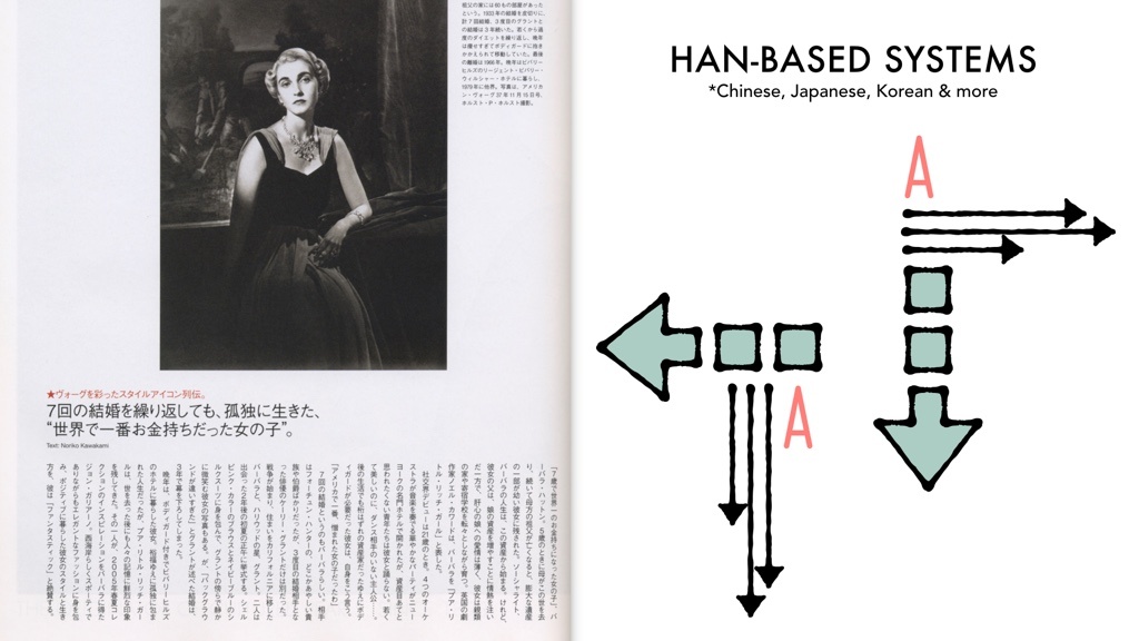
Note that the horizontal text flows from left to right, while the vertical text flows from right to left. Wild, eh?
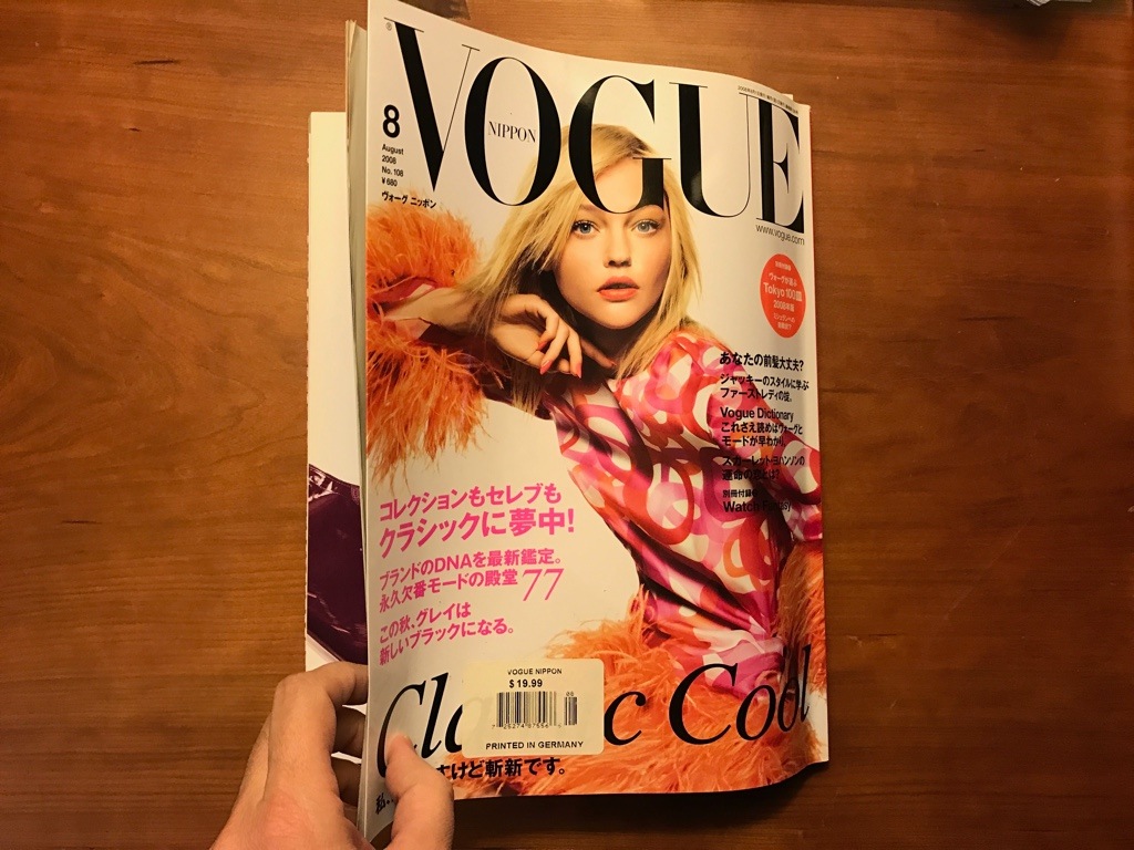
This Japanese issue of Vogue magazine is using a mix of writing modes. The cover opens on the left spine, opposite of what an English magazine does.
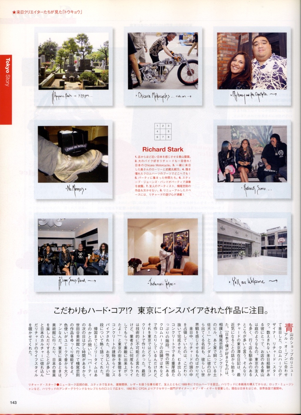
This page mixes English and Japanese, and typesets the Japanese text in both horizontal and vertical modes. Under the title “Richard Stark” in red, you can see a passage that’s horizontal-tb and LTR, while the longer passage of text at the bottom of the page is typeset vertical-rl. The red enlarged cap marks the beginning of that passage. The long headline above the vertical text is typeset LTR, horizontal-tb.
The details of how to set the default of the whole page will depend on your use case. But each element, each headline, each section, each article can be marked to flow the opposite of the default however you’d like.
For example, perhaps you leave the default as horizontal-tb, and specify your vertical elements like this:
div.articletext {
  writing-mode: vertical-rl;
}
Or alternatively you could change the default for the page to a vertical orientation, and then set specific elements to horizontal-tb, like this:
html {
writing-mode: vertical-rl;
}
h2, .photocaptions, section {
writing-mode: horizontal-tb;
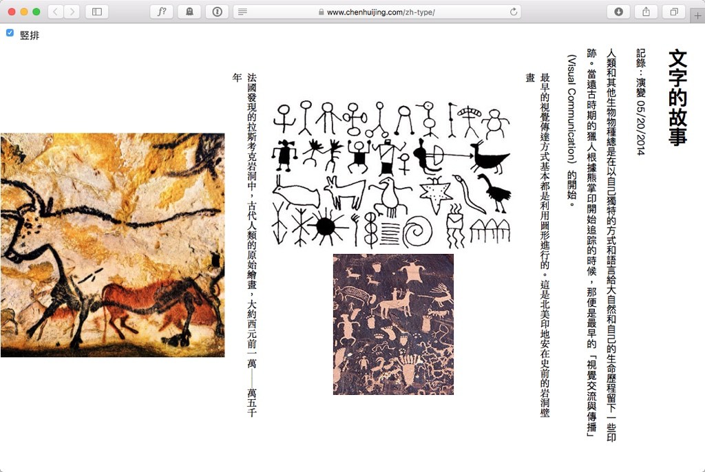
}If your page has a sideways scroll, then the writing mode will determine whether the page loads with upper left corner as the starting point, and scroll to the right (horizontal-tb as we are used to), or if the page loads with the upper right corner as the starting point, scrolling to the left to display overflow. Here’s an example of that change in scrolling direction, in a CSS Writing Mode demo by Chen Hui Jing. Check out her demo — you can switch from horizontal to vertical writing modes with a checkbox and see the difference.
Mongolian-based systems
Now, hopefully so far all of this kind of makes sense. It might be a bit more complicated than expected, but it’s not so hard. Well, enter the Mongolian-based systems.
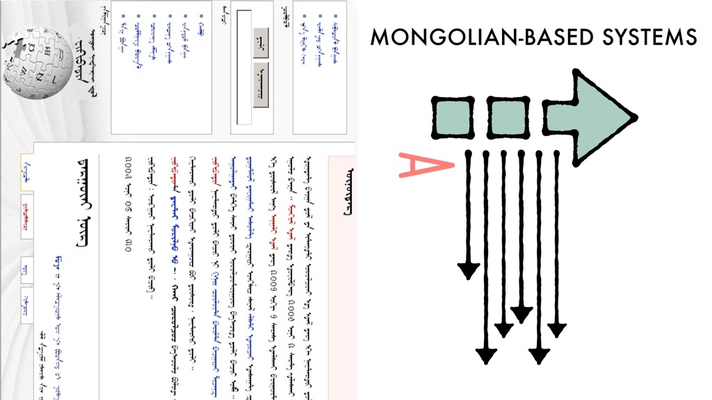
Mongolian is also a vertical script language. Text runs vertically down the page. Just like Han-based systems. There are two major differences. First, the block direction runs the other way. In Mongolian, block-level elements stack from left to right.
Here’s a drawing of how Wikipedia would look in Mongolian if it were laid out correctly.
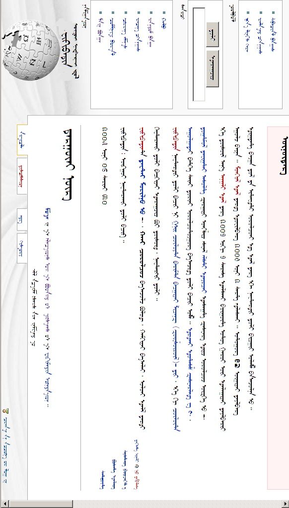
Now you might think, that doesn’t look so weird. Tilt your head to the left, and it’s very familiar. The block direction starts on the left side of the screen and goes to the right. The inline direction starts on the top of the page and moves to the bottom (similar to RTL text, just turned 90° counter-clockwise). But here comes the other huge difference. The character direction is “upside down”. The top of the Mongolian characters are not pointing to the left, towards the start edge of the block direction. They point to the right. Like this:
Now you might be tempted to ignore all this. Perhaps you don’t expect to be typesetting Mongolian content anytime soon. But here’s why this is important for everyone — the way Mongolian works defines the results writing-mode: vertical-lr. And it means we cannot use vertical-lr for typesetting content in other languages in the way we might otherwise expect.
If we took what we know about vertical-rl and guessed how vertical-lr works, we might imagine this:
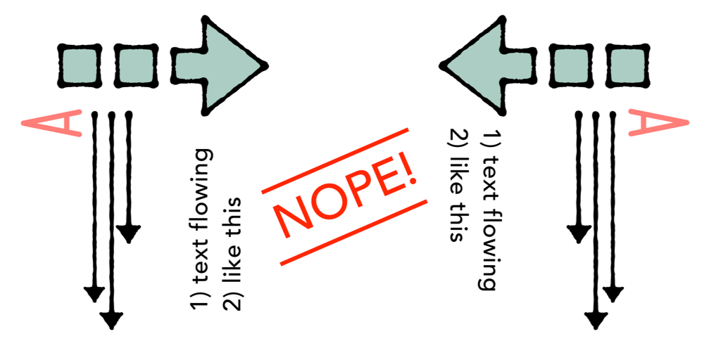
But that’s wrong. Here’s how they actually compare:
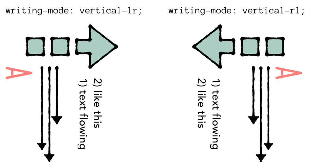
See the unexpected situation? In both writing-mode: vertical-rl and writing-mode: vertical-lr latin text is rotated clockwise. Neither writing mode let’s us rotate text counter-clockwise.
If you are typesetting Mongolian content, apply this CSS in the same way you would apply writing-mode to Han-based writing systems. To the whole page on the html element, or to specific pages of the page like this:
section {
  writing-mode: vertical-lr;
}
Now, if you are using writing-mode for a graphic design effect on a language that is otherwise typesets horizontally, I don’t think writing-mode: vertical-lr is useful. If the text wraps onto two lines, it stacks in a very unexpected way. So I’ve sort of obliterated it from my toolkit. I find myself using writing-mode: vertical-rl a lot. And never using -lr. Hm.
Writing modes for graphic design
So how do we use writing-mode to turn English headlines sideways? We could rely on transform: rotate()
Here are two examples, one for each direction. (By the way, each of these demos use CSS Grid for their overall layout, so be sure to test them in a browser that supports CSS Grid, like Firefox Nightly.)

In this demo 4A, the text is rotated clockwise using this code:
h1 {
  writing-mode: vertical-rl;
}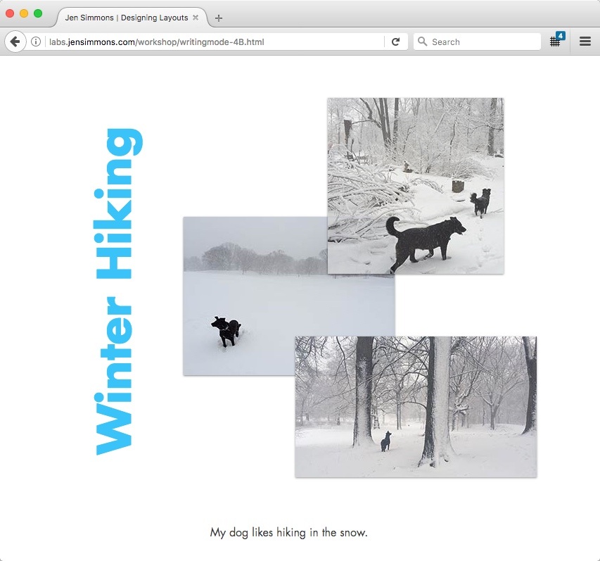
In this demo 4B, the text is rotated counter-clockwise using this code:
h1 {
  writing-mode: vertical-rl;
  transform: rotate(180deg);
  text-align: right;
}
I use vertical-rl to rotate the text so that it takes up the proper amount of space in the overall flow of the layout. Then I rotate it 180° to spin it around to the other direction. And then I use text-align: right to get it to rise up to the top of it’s container. This feels like a hack, but it’s a hack that works.
Now what I would like to do instead is use another CSS value that was designed for this use case — one of the two other options for writing mode.
If I could, I would lay out example 4A with:
h1 {
  writing-mode: sideways-rl;
}
And layout example 4B with:
h1 {
  writing-mode: sideways-lr;
}
The problem is that these two values are only supported in Firefox. None of the other browsers recognize sideways-*. Which means we can’t really use it yet.
In general, the writing-mode property is very well supported across browsers. So I’ll use writing-mode: vertical-rl for now, with the transform: rotate(180deg); hack to fake the other direction.
There’s much more to what we can do with the CSS designed to support multiple languages, but I’m going to stop with this intermediate introduction.
If you do want a bit more of a taste, look at this example that adds text-orientation: upright; to the mix — turning the individual letters of the latin font to be upright instead of sideways.
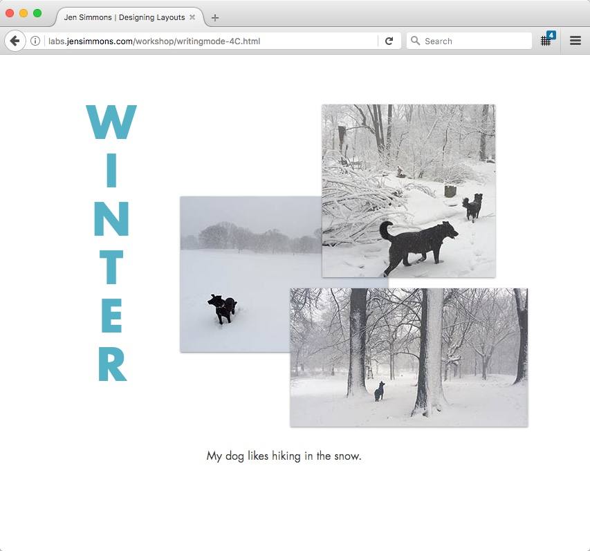
It’s this demo 4C, with this CSS applied:
h1 {
writing-mode: vertical-rl;
text-orientation: upright;
text-transform: uppercase;
letter-spacing: -25px;
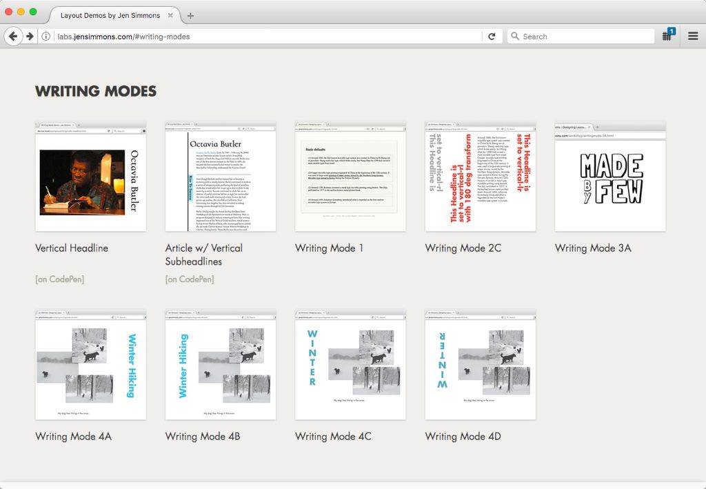
}You can check out all my Writing Modes demos at labs.jensimmons.com/#writing-modes.
I’ll leave you with this last demo. One that applies a vertical writing mode to the sub headlines of a long article. I like how small details like this can really bring a fresh feeling to the content.
See the Pen Writing Mode Demo — Article Subheadlines by Jen Simmons (@jensimmons) on CodePen.
About the author
Dubbed “the Terry Gross of the tech industry,” Jen Simmons is the host and executive producer of The Web Ahead. Her in-depth interviews explain emerging technology and predict the future of the web — and won the 2015 Net Award for Podcast of the Year.
Jen is a Designer and Developer Advocate at Mozilla, where she advocates for web standards and researches the coming revolution in graphic design on the web. She’s spoken at events including SXSW, An Event Apart, Fluent, Generate, Future of Web Design, and Respond. Her talk, Modern Layouts: Getting Out of Our Ruts, was awarded Best Conference Presentation at CSS Dev Conf 2014.
Jen launched her first client website in 1998 and spent years making sites for small businesses, arts organizations, and creative individuals. Her more well-known clients include CERN, the W3C, Google, Drupal, Temple University, and the Annenberg Foundation. Jen earned a MFA in Film and Media Arts from Temple University. She lives in New York City.
Brought to you by
Related articles
-
A History of CSS Through Fifteen Years of 24 ways
Rachel Andrew guides us through a tour of the last fifteen years in CSS layout, as manifested in articles here on 24 ways. From the days when Internet Explorer 6 was de rigueur, right up to the modern age of evergreen browsers, the only thing you can be sure of is that the web never stands still for long.
-
A Modern Typographic Scale
Rob Weychert reaches for the top notes to sing us a song of typographic scale. A little attention to scale and to the mathematics will help you to hit a high note with your designs this Christmas and beyond.
-
Beautiful Scrolling Experiences – Without Libraries
Michelle Barker appears as one of a heavenly host, coming forth with scroll in hand to pronounce an end to janky scrolljacking! Unto us a new specification is born, in the city of TimBL, and its name shall be called Scroll Snap.
-
Cascading Web Design with Feature Queries
Chen Hui Jing pulls off the dust covers, swings open the storm shutters and lets the winter light fall on the subject of CSS feature queries. The chestnuts may not yet be roasting, and the halls may be still be undecked, but pull up a chair and settle down. It’s Christmas.
-
Clip Paths Know No Bounds
Dan Wilson throws some Christmas shapes and gives us a run down of different ways to use CSS polygon clip paths to create interesting a flexible shapes with less code that you might have thought. It may be the time of year to follow a star, but was the star plotted with five or ten points?
-
Flexible Captioned Slanted Images
Eric Meyer gift wraps the most awkwardly shaped of boxes using nothing but CSS, HTML and a little curl of ribbon. No matter how well you plan and how much paper you have at your disposal, sometimes you just need to slant the gift to the side.


