Get Expressive with Your Typography

In 1955 Beatrice Warde, an American communicator on typography, published a series of essays entitled The Crystal Goblet in which she wrote, “People who love ideas must have a love of words. They will take a vivid interest in the clothes that words wear.” And with that proposition Warde introduced the idea that just as we judge someone based on the clothes they are wearing, so we make judgements about text based on the typefaces in which it is set.
Choosing the same typeface as everyone else, especially if you’re trying to make a statement, is like turning up to a party in the same dress; to a meeting in the same suit, shirt and tie; or to a craft ale dispensary in the same plaid shirt and turned-up skinny jeans.
But there’s more to your choice of typeface than simply making an impression. In 2012 Jon Tan wrote on 24 ways about a scientific study called “The Aesthetics of Reading” which concluded that “good quality typography is responsible for greater engagement during reading and thus induces a good mood.”
Furthermore, at this year’s Ampersand conference Sarah Hyndman, an expert in multisensory typography, discussed how typefaces can communicate with our subconscious. Sarah showed that different fonts could have an effect on how food tasted. A rounded font placed near a bowl of jellybeans would make them taste sweeter, and a jagged angular font would make them taste more sour.
The quality of your typography can therefore affect the mood of your reader, and your font choice directly affect the senses. This means you can manipulate the way people feel. You can change their emotional state through type alone. Now that’s a real superpower!
The effects of your body text design choices are measurable but subtle. If you really want to have an impact you need to think big. Literally. Display text and headings are your attention grabbers. They are your chance to interrupt, introduce and seduce.
Display text and headings set the scene and draw people in. Text set large creates an image that visitors see before they read, and that’s your chance to choose a typeface that immediately expresses what the text, and indeed the entire website, stands for. What expectations of the text do you want to set up? Youthful enthusiasm? Businesslike? Cutting-edge? Hipster? Sensible and secure? Fun and informal? Authoritarian?
Typography conveys much more than just information. It imparts feeling, emotion and sentiment, and arouses preconceived ideas of trust, tone and content. Think about taking advantage of this by introducing impactful, expressive typography to your designs on the web. You can alter the way your reader feels, so what emotion do you want to provoke?
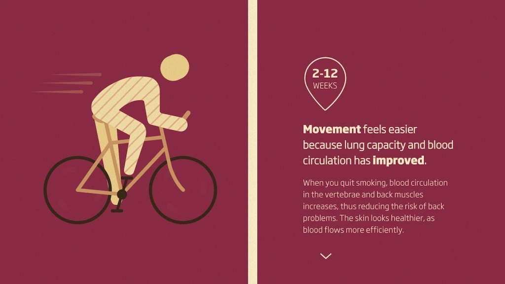
Maybe you want them to feel inspired like this stop smoking campaign:
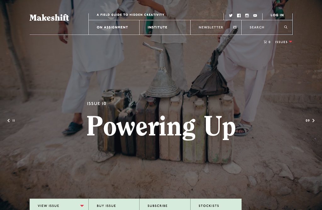
Perhaps they should be moved and intrigued, as with Makeshift magazine:
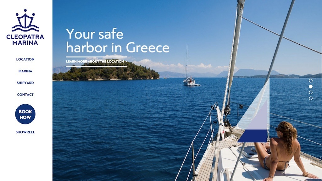
Or calmly reassured:
Fonts also tap into the complex library of associations that we’ve been accumulating in our brains all of our lives. You build up these associations every time you see a font from the context that you see it in. All of us associate certain letterforms with topics, times and places.
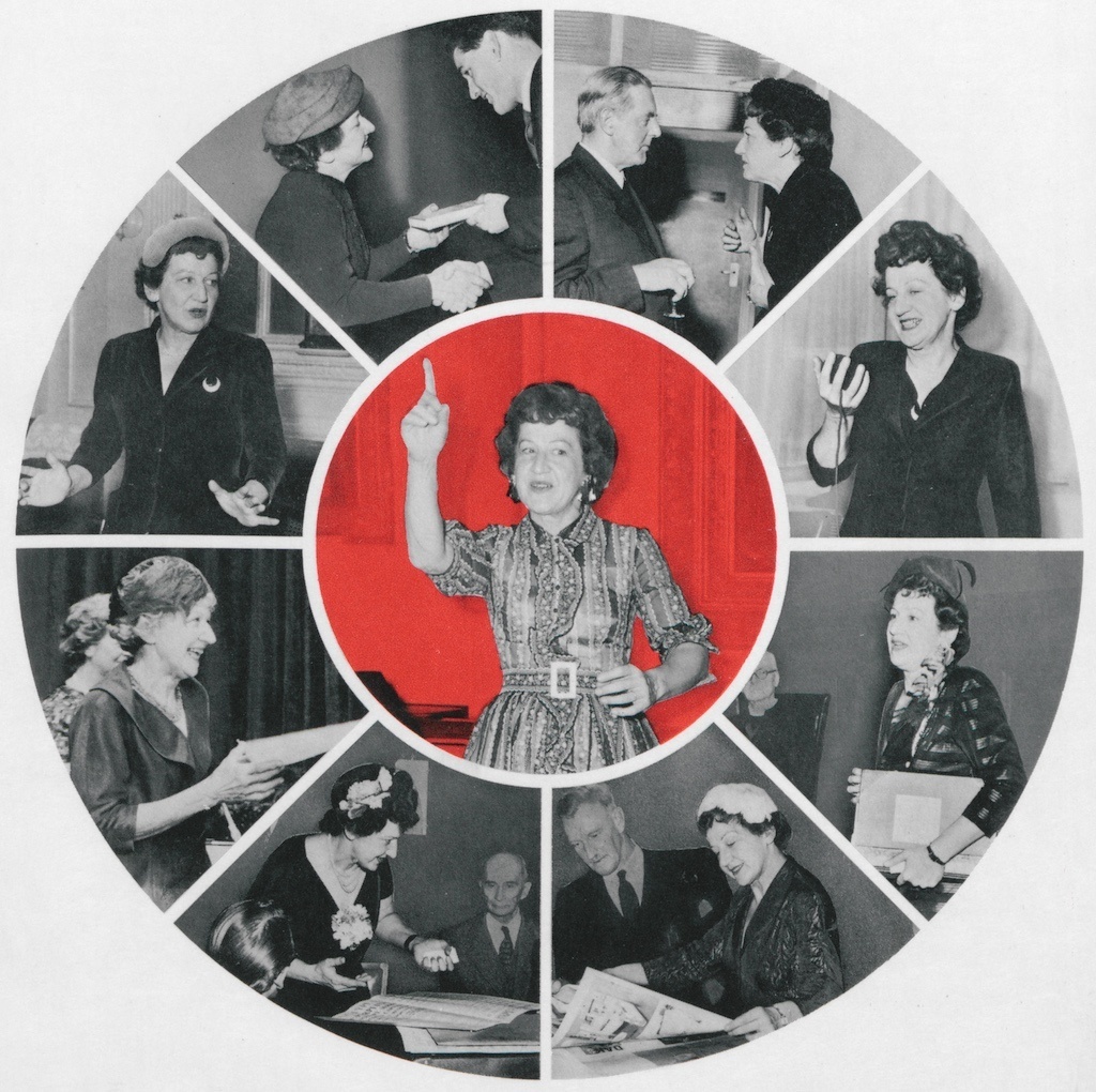
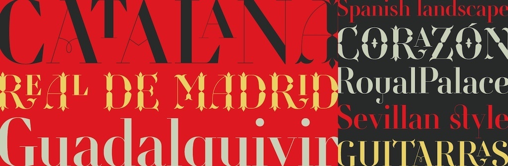
Retiro is obviously Spanish:
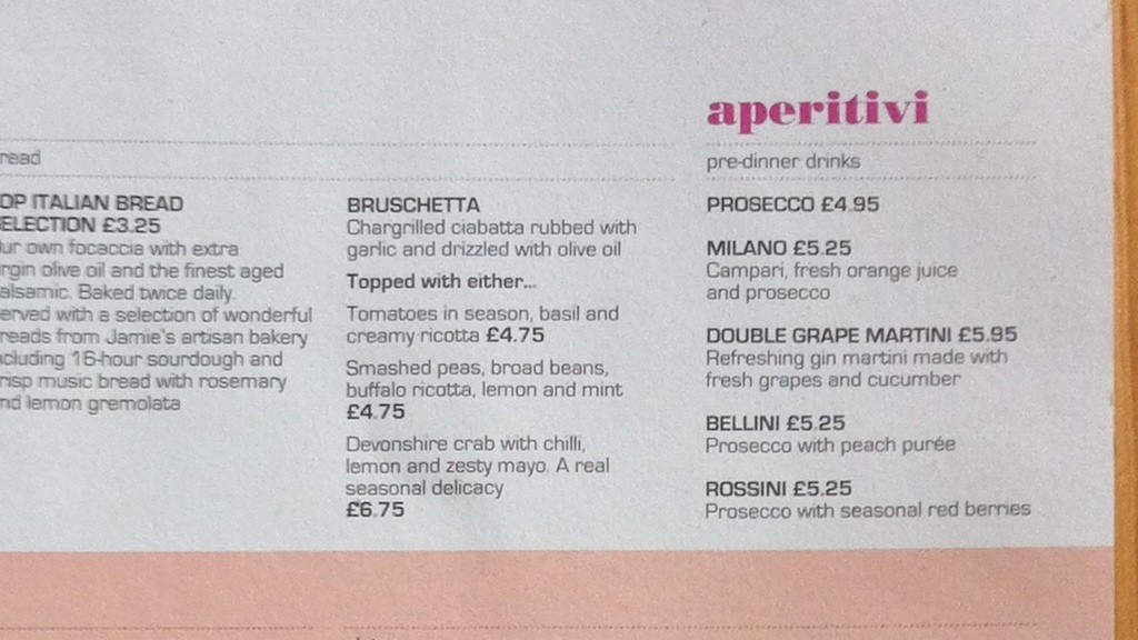
Bodoni and Eurostile used in this menu couldn’t be much more Italian:
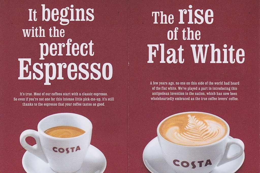
To me, Clarendon gives a sense of the 1960s and 1970s. I’m not sure if that’s what Costa was going for, but that’s what it means to me:
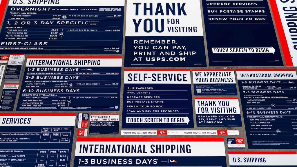
And Knockout and Gotham really couldn’t be much more American:
When it comes to choosing your display typeface, the type designer Christian Schwartz says there are two kinds. First are the workhorse typefaces that will do whatever you want them to do. Helvetica, Proxima Nova and Futura are good examples. These fonts can be shaped in many different ways, but this also means they are found everywhere and take great skill and practice to work with in a unique and striking manner.
The second kind of typeface is one that does most of the work for you. Like finely tailored clothing, it’s the detail in the design that adds interest.
Such typefaces carry much more inherent character, but are also less malleable and harder to adapt to different contexts. Good examples are Marr Sans, FS Clerkenwell, Strangelove and Bree.
Push the boat out
Remember, all type can have an effect on the reader. Take advantage of that and allow your type to have its own vernacular and impact. Be expressive with your type. Don’t be too reverential, dogmatic – or ordinary. Be brave and push a few boundaries.
Adapted from Web Typography a book in progress by Richard Rutter.
About the author
Richard Rutter is a user experience consultant and director of Clearleft. In 2009 he cofounded the webfont service, Fontdeck. He runs an ongoing project called The Elements of Typographic Style Applied to the Web, where he extols the virtues of good web typography. Richard occasionally blogs at Clagnut, where he writes about design, accessibility and web standards issues, as well as his passion for music and mountain biking.
Brought to you by
Related articles
-
An Introduction to Variable Fonts
Jason Pamental forges a path through the freshly laid snowy landscape of variable fonts. Like a brave explorer in a strange new typography topology let Jason show you the route to some fantastic font feats. Everything you thought you knew has changed.
-
Interactivity and Animation with Variable Fonts
Mandy Michael turns the corner on our variable font adventure and stumbles into a grotto of wonder and amazement. Not forgetting the need for a proper performance budget, Mandy shows how variable fonts can free your creativity from bygone technical constraints.
-
Managing Flow and Rhythm with CSS Custom Properties
Andy Bell rings out a call for a more flexible method of achieving consistent vertical rhythm across components within a page. Using a technique of CSS custom properties to establish spacing inherited through the cascade, you can make sure your choir are all singing from the same song sheet.
-
Get the Balance Right: Responsive Display Text
Richard Rutter shepherds a tea towel onto our collective heads and describes a technique for responsively scaling display text to maintain a consistent feel in both landscape and portrait screen orientations. That should put things back into proportion.
-
Run Ragged
Mark Boulton completes our calendar with some typographic techniques to improve the reading experience. Typography, like Christmas and advent calendars, relies on the accumulation of small gains for its best effects.
-
Untangling Web Typography
Nicole Sullivan understands how the accumulated weight of small typographic decisions can mount up into a tangle of CSS declarations. With a new tool at your disposal you can take stock and clear up the mess like it’s Boxing Day.