Flashless Animation

Animation in a Flashless world
When I splashed down in web design four years ago, the first thing I wanted to do was animate a cartoon in the browser. I’d been drawing comics for years, and I’ve wanted to see them come to life for nearly as long. Flash animation was still riding high, but I didn’t want to learn Flash. I wanted to learn JavaScript!
Sadly, animating with JavaScript was limiting and resource-intensive. My initial foray into an infinitely looping background did more to burn a hole in my CPU than amaze my friends (although it still looks pretty cool). And there was still no simple way to incorporate audio. The browser technology just wasn’t there.
Things are different now. CSS3 transitions and animations can do most of the heavy lifting and HTML5 audio can serve up the music and audio clips. You can do a lot without leaning on JavaScript at all, and when you lean on JavaScript, you can do so much more!
In this project, I’m going to show you how to animate a simple walk cycle with looping audio. I hope this will inspire you to do something really cool and impress your friends. I’d love to see what you come up with, so please send your creations my way at rachelnabors.com!
Note: Because every browser wants to use its own prefixes with CSS3 animations, and I have neither the time nor the space to write all of them out, I will use the W3C standard syntaxes; that is, going prefix-less. You can implement them out of the box with something like Prefixfree, or you can add prefixes on your own. If you take the latter route, I recommend using Sass and Compass so you can focus on your animations, not copying and pasting.
The walk cycle
Walk cycles are the “Hello world” of animation. One of the first projects of animation students is to spend hours drawing dozens of frames to complete a simple loopable animation of a character walking.
Most animators don’t have to draw every frame themselves, though. They draw a few key frames and send those on to production animators to work on the between frames (or tween frames). This is meticulous, grueling work requiring an eye for detail and natural movement. This is also why so much production animation gets shipped overseas where labor is cheaper.
Luckily, we don’t have to worry about our frame count because we can set our own frames-per-second rate on the fly in CSS3. Since we’re trying to impress friends, not animation directors, the inconsistency shouldn’t be a problem. (Unless your friend is an animation director.)
This is a simple walk cycle I made of my comic character Tuna for my CSS animation talk at CSS Dev Conference this year:
The magic lies here:
animation: walk-cycle 1s steps(12) infinite;Breaking those properties down:
animation: <name> <duration> <timing-function> <iteration-count>;walk-cycle is a simple @keyframes block that moves the background sprite on .tuna around:
@keyframes walk-cycle {
    0% {background-position: 0 0; }
    100% {background-position: 0 -2391px;}
}
The background sprite has exactly twelve images of Tuna that complete a full walk cycle. We’re setting it to cycle through the entire sprite every second, infinitely. So why isn’t the background image scrolling down the .tuna container? It’s all down to the timing function steps(). Using steps() let us tell the CSS to make jumps instead of the smooth transitions you’d get from something like linear. Chris Mills at dev.opera wrote in his excellent intro to CSS3 animation :
Instead of giving a smooth animation throughout, [
steps()] causes the animation to jump between a set number of steps placed equally along the duration. For example,steps(10)would make the animation jump along in ten equal steps. There’s also an optional second parameter that takes a value ofstartorend.steps(10, start)would specify that the change in property value should happen at the start of each step, whilesteps(10, end)means the change would come at the end.
(Seriously, go read his full article. I’m not going to touch on half the stuff he does because I cannot improve on the basics any more than he already has.)
The background
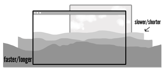
A cat walking in a void is hardly an impressive animation and certainly your buddy one cube over could do it if he chopped up some of those cat GIFs he keeps using in group chat. So let’s add a parallax background! Yes, yes, all web designers signed a peace treaty to not abuse parallax anymore, but this is its true calling—treaty be damned.
And to think we used to need JavaScript to do this! It’s still pretty CPU intensive but much less complicated. We start by splitting up the page into different layers, .foreground, .midground, and .background. We put .tuna in the .midground.
.background has multiple background images, all set to repeat horizontally:
background-image:
    url(background_mountain5.png),
    url(background_mountain4.png),
    url(background_mountain3.png),
    url(background_mountain2.png),
    url(background_mountain1.png);
background-repeat: repeat-x;
With parallax, things in the foreground move faster than those in the background. Next time you’re driving, notice how the things closer to you move out of your field of vision faster than something in the distance, like a mountain or a large building. We can imitate that here by making the background images on top (in the foreground, closer to us) wider than those on the bottom of the stack (in the distance).
The different lengths let us use one animation to move all the background images at different rates in the same interval of time:
animation: parallax_bg linear 40s infinite;The shorter images have less distance to cover in the same amount of time as the longer images, so they move slower.
Let’s have a look at the background’s animation:
@keyframes parallax_bg {
  0% {
    background-position: -2400px 100%, -2000px 100%, -1800px 100%, -1600px 100%, -1200px 100%;
  }
  100% {
    background-position: 0 100%, 0 100%, 0 100%, 0 100%, 0 100%;
  }
}
At 0%, all the background images are positioned at the negative value of their own widths. Then they start moving toward background-position: 0 100%. If we wanted to move them in the reverse direction, we’d remove the negative values at 0% (so they would start at 2400px 100%, 2000px 100%, etc.). Try changing the values in the codepen above or changing background-repeat to none to see how the images play together.
.foreground and .midground operate on the same principles, only they use single background images.
The music
After finishing the first draft of my original walk cycle, I made a GIF with it and posted it on YTMND with some music from the movie Paprika, specifically the track “The Girl in Byakkoya.” After showing it to some colleagues in my community, it became clear that this was a winning combination sure to drive away dresscode blues. So let’s use HTML5 to get a clip of that music looping in there!
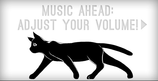
Warning, there is sound. Please adjust your volume or apply headphones as needed.
We’re using HTML5 audio’s loop and autoplay abilities to automatically play and loop a sound file on page load:
<audio loop autoplay>
  <source src="http://music.com/clip.mp3" />
</audio>
Unfortunately, you may notice there is a small pause between loops. HTML5 audio, thou art half-baked still. Let’s hope one day the Web Audio API will be able to help us out, but until things improve, we’ll have to hack our way around these shortcomings.
Turns out there’s a handy little script called seamlessLoop.js which we can use to patch this. Mind you, if we were really getting crazy with the Cheese Whiz, we’d want to get out big guns like sound.js. But that’d be overkill for a mere loop (and explaining the Web Audio API might bore, rather than impress your friends)!
Installing seamlessLoop.js will get rid of the pause, and now our walk cycle is complete.
(I’ve done some very rough sniffing to see if the browser can play MP3 files. If not, we fall back to using .ogg formatted clips (Opera and Firefox users, you’re welcome).)
Really impress your friends by adding a run cycle
So we have music, we have a walk cycle, we have parallax. It will be a snap to bring them all together and have a simple, endless animation. But let’s go one step further and knock the socks off our viewers by adding a run cycle.
The run cycle
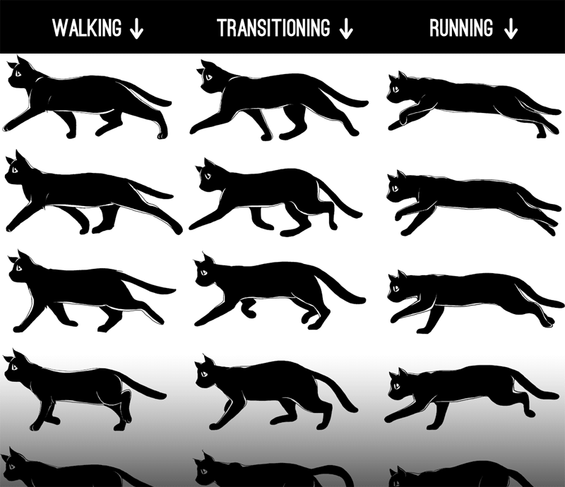
Tacking a run cycle on to our walk cycle will require a third animation sequence: a transitional animation of Tuna switching from walking to running. I have added all these to the sprite:
Let’s work on getting that transition down. We’re going to use multiple animations on the same .tuna div, but we’re going to kick them off at different intervals using animation-delay—no JavaScript required! Isn’t that magical?
It requires a wee bit of math (not much, it doesn’t hurt) to line them up. We want to:
- Loop the walk animation twice
- Play the transitional cycle once (it has a finite beginning and end perfectly drawn to pick up between the last frame of the walk cycle and the first frame of the run cycle—no looping this baby)
- RUN FOREVER.
Using the pattern animation: <name> <duration> <timing-function> <delay> <iteration-count>, here’s what that looks like:
animation:
    walk-cycle 1s steps(12) 2,
    walk-to-run .75s steps(12) 2s 1,
    run-cycle .75s steps(13) 2.75s infinite;
I played with the times to get make the movement more realistic. You may notice that the running animation looks smoother than the walking animation. That’s because it has 13 keyframes running over .75 second instead of 12 running in one second. Remember, professional animation studios use super-high frame counts. This little animation isn’t even up to PBS’s standards!
The music: extended play with HTML5 audio sprites
My favorite part in the The Girl in Byakkoya is when the calm opening builds and transitions into a bouncy motif. I want to start with Tuna walking during the opening, and then loop the running and bounciness together for infinity.
- The intro lasts for 24 seconds, so we set our 1 second walk cycle to run for 24 repetitions:
walk-cycle 1s steps(12) 24 - We delay
walk-to-runby 24 seconds so it runs for .75 seconds before… - We play
run-cycleat 24.75 seconds and loop it infinitely
For the music, we need to think of it as two parts: the intro and the bouncy loop. We can do this quite nicely with audio sprites: using one HTML5 audio element and using JavaScript to change the play head location, like skipping tracks with a CD player. Although this technique will result in a small gap in music shifts, I think it’s worth using here to give you some ideas.
// Get the audio element
var byakkoya = document.querySelector('audio');
// create function to play and loop audio
function song(a){
    //start playing at 0
    a.currentTime = 0;
    a.play();
    //when we hit 64 seconds...
    setTimeout(function(){
        // skip back to 24.5 seconds and keep playing...
        a.currentTime = 24.55;
        // then loop back when we hit 64 again, or every 59.5 seconds.
        setInterval(function(){
            a.currentTime = 24.55;
        },39450);
    },64000);
}
The load screen
I’ve put it off as long as I can, but now that the music and the CSS are both running on their own separate clocks, it’s imperative that both images and music be fully downloaded and ready to run when we kick this thing off. So we need a load screen (also, it’s nice to give people a heads-up that you’re about to blast them with music, no matter how wonderful that music may be).
Since the two timers are so closely linked, we’d best not run the animations until we run the music:
* { animation-play-state: paused; }animation-play-state can be set to paused or running, and it’s the most useful thing you will learn today.
First we use an event listener to see when the browser thinks we can play through from the beginning to end of the music without pause for buffering:
byakkoya.addEventListener("canplaythrough", function () { });
(More on HTML5 audio’s media events at HTML5doctor.com)
Inside our event listener, I use a bit of jQuery to add class of .playable to the body when we’re ready to enable the play button:
$("body").addClass("playable");
    $("#play-me").html("Play me.").click(function(){
      song(byakkoya);
      $("body").addClass("playing");
    });
That .playing class is special because it turns on the animations at the same time we start playing the song:
.playing * { animation-play-state: running; }The background
We’re almost done here! When we add the background, it needs to speed up at the same time that Tuna starts running. The music picks up speed around 24.75 seconds in, and so we’re going to use animation-delay on those backgrounds, too.
This will require some math. If you try to simply shorten the animation’s duration at the 24.75s mark, the backgrounds will, mid-scroll, jump back to their initial background positions to start the new animation! Argh! So let’s make a new @keyframe and calculate where the background position would be just before we speed up the animation.
Here’s the formula:
new 0% value = delay ÷ old duration × length of image
new 100% value = new 0% value + length of image
Here’s the formula put to work on a smaller scale:
Voilà! The finished animation!
I’ve always wanted to bring my illustrations to life. Then I woke up one morning and realized that I had all the tools to do so in my browser and in my head. Now I have fallen in love with Flashless animation.
I’m sure there will be detractors who say HTML wasn’t meant for this and it’s a gross abuse of the DOM! But I say that these explorations help us expand what we expect from devices and software and challenge us in good ways as artists and programmers. The browser might not be the most appropriate place for animation, but is certainly a fun place to start.
There is so much you can do with the spec implemented today, and so much of the territory is still unexplored. I have not yet begun to show you everything. In eight months I expect this demo will represent the norm, not the bleeding edge. I look forward to seeing the wonderful things you create.
(Also, someone, please, do something about that gappy HTML5 audio looping. It’s a crying shame!)
About the author
Rachel Nabors is an interaction developer and award-winning cartoonist. She travels the world, speaking and training people in the art of web animation. When not biking around her home city of Portland, she makes interactive comics at her company Tin Magpie. You can catch her as @rachelnabors on Twitter and at rachelnabors.com.
Brought to you by
Related articles
-
A History of CSS Through Fifteen Years of 24 ways
Rachel Andrew guides us through a tour of the last fifteen years in CSS layout, as manifested in articles here on 24 ways. From the days when Internet Explorer 6 was de rigueur, right up to the modern age of evergreen browsers, the only thing you can be sure of is that the web never stands still for long.
-
A Modern Typographic Scale
Rob Weychert reaches for the top notes to sing us a song of typographic scale. A little attention to scale and to the mathematics will help you to hit a high note with your designs this Christmas and beyond.
-
Beautiful Scrolling Experiences – Without Libraries
Michelle Barker appears as one of a heavenly host, coming forth with scroll in hand to pronounce an end to janky scrolljacking! Unto us a new specification is born, in the city of TimBL, and its name shall be called Scroll Snap.
-
Cascading Web Design with Feature Queries
Chen Hui Jing pulls off the dust covers, swings open the storm shutters and lets the winter light fall on the subject of CSS feature queries. The chestnuts may not yet be roasting, and the halls may be still be undecked, but pull up a chair and settle down. It’s Christmas.
-
Clip Paths Know No Bounds
Dan Wilson throws some Christmas shapes and gives us a run down of different ways to use CSS polygon clip paths to create interesting a flexible shapes with less code that you might have thought. It may be the time of year to follow a star, but was the star plotted with five or ten points?
-
Flexible Captioned Slanted Images
Eric Meyer gift wraps the most awkwardly shaped of boxes using nothing but CSS, HTML and a little curl of ribbon. No matter how well you plan and how much paper you have at your disposal, sometimes you just need to slant the gift to the side.


