Displaying Icons with Fonts and Data- Attributes

Traditionally, bitmap formats such as PNG have been the standard way of delivering iconography on websites. They’re quick and easy, and it also ensures they’re as pixel crisp as possible. Bitmaps have two drawbacks, however: multiple HTTP requests, affecting the page’s loading performance; and a lack of scalability, noticeable when the page is zoomed or viewed on a screen with a high pixel density, such as the iPhone 4 and 4S.
The requests problem is normally solved by using CSS sprites, combining the icon set into one (physically) large image file and showing the relevant portion via background-position. While this works well, it can get a bit fiddly to specify all the positions. In particular, scalability is still an issue. A vector-based format such as SVG sounds ideal to solve this, but browser support is still patchy.
The rise and adoption of web fonts have given us another alternative. By their very nature, they’re not only scalable, but resolution-independent too. No need to specify higher resolution graphics for high resolution screens!
That’s not all though:
- Browser support: Unlike a lot of new shiny techniques, they have been supported by Internet Explorer since version 4, and, of course, by all modern browsers. We do need several different formats, however!
- Design on the fly: The font contains the basic graphic, which can then be coloured easily with CSS – changing colours for themes or
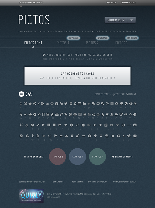
:hoverand:focusstyles is done with one line of CSS, rather than requiring a new graphic. You can also use CSS3 properties such astext-shadowto add further effects. Using-webkit-background-clip: text;, it’s possible to use gradient and inset shadow effects, although this creates a bitmap mask which spoils the scalability. - Small file size: specially designed icon fonts, such as Drew Wilson’s Pictos font, can be as little as 12Kb for the .woff font. This is because they contain fewer characters than a fully fledged font. You can see Pictos being used in the wild on sites like Garrett Murray’s Maniacal Rage.
As with all formats though, it’s not without its disadvantages:
- Icons can only be rendered in monochrome or with a gradient fill in browsers that are capable of rendering CSS3 gradients. Specific parts of the icon can’t be a different colour.
- It’s only appropriate when there is an accompanying text to provide meaning. This can be alleviated by wrapping the text label in a tag (I like to use
<b>rather than<span>, due to the fact that it’s smaller and isn’ t being used elsewhere) and then hiding it from view withtext-indent:-999em. - Creating an icon font can be a complex and time-consuming process. While font editors can carry out hinting automatically, the best results are achieved manually.
- Unless you’re adept at creating your own fonts, you’re restricted to what is available in the font. However, fonts like Pictos will cover the most common needs, and icons are most effective when they’re using familiar conventions.
The main complaint about using fonts for icons is that it can mean adding a meaningless character to our markup. The good news is that we can overcome this by using one of two methods – CSS generated content or the data-icon attribute – in combination with the :before and :after pseudo-selectors, to keep our markup minimal and meaningful.
Our simple markup looks like this:
<a href="/basket" class="icon basket">View Basket</a>Note the multiple class attributes. Next, we’ll import the Pictos font using the @font-face web fonts property in CSS:
@font-face {
    font-family: 'Pictos';
    src: url('pictos-web.eot');
    src: local('☺'),
    url('pictos-web.woff') format('woff'),
    url('pictos-web.ttf') format('truetype'),
    url('pictos-web.svg#webfontIyfZbseF') format('svg');
}
This rather complicated looking set of rules is (at the time of writing) the most bulletproof way of ensuring as many browsers as possible load the font we want. We’ll now use the content property applied to the :before pseudo-class selector to generate our icon. Once again, we’ll use those multiple class attribute values to set common icon styles, then specific styles for .basket. This helps us avoid repeating styles:
.icon {
    font-family: 'Pictos';
    font-size: 22px:
}

.basket:before {
    content: "$";
}
What does the :before pseudo-class do? It generates the dollar character in a browser, even when it’s not present in the markup. Using the generated content approach means our markup stays simple, but we’ll need a new line of CSS, defining what letter to apply to each class attribute for every icon we add.
data-icon is a new alternative approach that uses the HTML5 data- attribute in combination with CSS attribute selectors. This new attribute lets us add our own metadata to elements, as long as its prefixed by data- and doesn’t contain any uppercase letters. In this case, we want to use it to provide the letter value for the icon. Look closely at this markup and you’ll see the data-icon attribute.
<a href="/basket" class="icon" data-icon="$">View Basket</a>
We could add others, in fact as many as we like.
<a href="/" class="icon" data-icon="k">Favourites</a>
<a href="/" class="icon" data-icon="t">History</a>
<a href="/" class="icon" data-icon="@">Location</a>
Then, we need just one CSS attribute selector to style all our icons in one go:
.icon:before {
    content: attr(data-icon);
    /* Insert your fancy colours here */
    }
By placing our custom attribute data-icon in the selector in this way, we can enable CSS to read the value of that attribute and display it before the element (in this case, the anchor tag). It saves writing a lot of CSS rules. I can imagine that some may not like the extra attribute, but it does keep it out of the actual content – generated or not.

![]()
This could be used for all manner of tasks, including a media player and large simple illustrations. See the demo for live examples. Go ahead and zoom the page, and the icons will be crisp, with the exception of the examples that use -webkit-background-clip: text as mentioned earlier.
Finally, it’s worth pointing out that with both generated content and the data-icon method, the letter will be announced to people using screen readers. For example, with the shopping basket icon above, the reader will say “dollar sign view basket”. As accessibility issues go, it’s not exactly the worst, but could be confusing. You would need to decide whether this method is appropriate for the audience. Despite the disadvantages, icon fonts have huge potential.
About the author
Jon Hicks is one half of the creative partnership Hicksdesign, designing for a variety of mediums, but with a particular fondness for icon and logo design. In fact he’s written a book, about it called The Icon Handbook, released in January 2012. His recent clients include Skype, Mailchimp, Shopify and Opera Software, but is best known for his uncanny impression of Lucius Malfoy singing “I only want to be with you”.
He blogs about design and personal interests (mainly Dr Who and Cycling) at hicksdesign.co.uk/journal
Brought to you by
Related articles
-
A History of CSS Through Fifteen Years of 24 ways
Rachel Andrew guides us through a tour of the last fifteen years in CSS layout, as manifested in articles here on 24 ways. From the days when Internet Explorer 6 was de rigueur, right up to the modern age of evergreen browsers, the only thing you can be sure of is that the web never stands still for long.
-
A Modern Typographic Scale
Rob Weychert reaches for the top notes to sing us a song of typographic scale. A little attention to scale and to the mathematics will help you to hit a high note with your designs this Christmas and beyond.
-
Beautiful Scrolling Experiences – Without Libraries
Michelle Barker appears as one of a heavenly host, coming forth with scroll in hand to pronounce an end to janky scrolljacking! Unto us a new specification is born, in the city of TimBL, and its name shall be called Scroll Snap.
-
Cascading Web Design with Feature Queries
Chen Hui Jing pulls off the dust covers, swings open the storm shutters and lets the winter light fall on the subject of CSS feature queries. The chestnuts may not yet be roasting, and the halls may be still be undecked, but pull up a chair and settle down. It’s Christmas.
-
Clip Paths Know No Bounds
Dan Wilson throws some Christmas shapes and gives us a run down of different ways to use CSS polygon clip paths to create interesting a flexible shapes with less code that you might have thought. It may be the time of year to follow a star, but was the star plotted with five or ten points?
-
Flexible Captioned Slanted Images
Eric Meyer gift wraps the most awkwardly shaped of boxes using nothing but CSS, HTML and a little curl of ribbon. No matter how well you plan and how much paper you have at your disposal, sometimes you just need to slant the gift to the side.