The First Tool You Reach For

Microsoft recently announced that Internet Explorer 8 will be released in the first half of 2009. Compared to the standards support of other major browsers, IE8 will not be especially great, but it will finally catch up with the state of the art in one specific area: support for CSS tables. This milestone has the potential to trigger an important change in the way you approach web design.
To show you just how big a difference CSS tables can make, think about how you might code a fluid, three-column layout from scratch. Just to make your life more difficult, give it one fixed-width column, with a background colour that differs from the rest of the page. Ready? Go!
Okay, since you’re the sort of discerning web designer who reads 24ways, I’m going to assume you at least considered doing this without using HTML tables for the layout. If you’re especially hardcore, I imagine you began thinking of CSS floats, negative margins, and faux columns. If you did, colour me impressed!
Now admit it: you probably also gave an inward sigh about the time it would take to figure out the math on the negative margin overlaps, check for dropped floats in Internet Explorer and generally wrestle each of the major browsers into giving you what you want. If after all that you simply gave up and used HTML tables, I can’t say I blame you.
There are plenty of professional web designers out there who still choose to use HTML tables as their main layout tool. Sure, they may know that users with screen readers get confused by inappropriate use of tables, but they have a job to do, and they want tools that will make that job easy, not difficult.
Now let me show you how to do it with CSS tables. First, we have a div element for each of our columns, and we wrap them all in another two divs:
<div class="container">
	<div>
		<div id="menu">
		⋮
		</div>
		<div id="content">
		⋮
		</div>
		<div id="sidebar">
		⋮
		</div>
	</div>
</div>
Don’t sweat the “div clutter” in this code. Unlike tables, divs have no semantic meaning, and can therefore be used liberally (within reason) to provide hooks for the styles you want to apply to your page.
Using CSS, we can set the outer div to display as a table with collapsed borders (i.e. adjacent cells share a border) and a fixed layout (i.e. cell widths unaffected by their contents):
.container {
	display: table;
	border-collapse: collapse;
	table-layout: fixed;
}
With another two rules, we set the middle div to display as a table row, and each of the inner divs to display as table cells:
.container > div {
	display: table-row;
}
.container > div > div {
	display: table-cell;
}
Finally, we can set the widths of the cells (and of the table itself) directly:
.container {
	width: 100%;
}
#menu {
	width: 200px;
}
#content {
	width: auto;
}
#sidebar {
	width: 25%;
}
And, just like that, we have a rock solid three-column layout, ready to be styled to your own taste, like in this example:
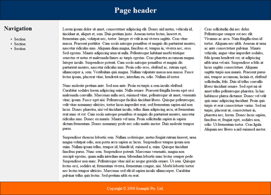
This example will render perfectly in reasonably up-to-date versions of Firefox, Safari and Opera, as well as the current beta release of Internet Explorer 8.
CSS tables aren’t only useful for multi-column page layout; they can come in handy in most any situation that calls for elements to be displayed side-by-side on the page. Consider this simple login form layout:
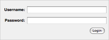
The incantation required to achieve this layout using CSS floats may be old hat to you by now, but try to teach it to a beginner, and watch his eyes widen in horror at the hoops you have to jump through (not to mention the assumptions you have to build into your design about the length of the form labels).
Here’s how to do it with CSS tables:
<form action="/login" method="post">
	<div>
		<div>
			<label for="username">Username:</label>
			<span class="input"><input type="text" name="username" id="username"/></span>
		</div>
		<div>
			<label for="userpass">Password:</label>
			<span class="input"><input type="password" name="userpass" id="userpass"/></span>
		</div>
		<div class="submit">
			<label for="login"></label>
			<span class="input"><input type="submit" name="login" id="login" value="Login"/></span>
		</div>
	</div>
</form>
This time, we’re using a mixture of divs and spans as semantically transparent styling hooks. Let’s look at the CSS code.
First, we set up the outer div to display as a table, the inner divs to display as table rows, and the labels and spans as table cells (with right-aligned text):
form > div {
	display: table;
}
form > div > div {
	display: table-row;
}
form label,
form span {
	display: table-cell;
	text-align: right;
}
We want the first column of the table to be wide enough to accommodate our labels, but no wider. With CSS float techniques, we had to guess at what that width was likely to be, and adjust it whenever we changed our form labels. With CSS tables, we can simply set the width of the first column to something very small (1em), and then use the white-space property to force the column to the required width:
form label {
	white-space: nowrap;
	width: 1em;
}
To polish off the layout, we’ll make our text and password fields occupy the full width of the table cells that contain them:
input[type=text],
input[type=password] {
	width: 100%;
}
The rest is margins, padding and borders to get the desired look. Check out the finished example.
As the first tool you reach for when approaching any layout task, CSS tables make a lot more sense to your average designer than the cryptic incantations called for by CSS floats. When IE8 is released and all major browsers support CSS tables, we can begin to gradually deploy CSS table-based layouts on sites that are more and more mainstream.
In our new book, Everything You Know About CSS Is Wrong!, Rachel Andrew and I explore in much greater detail how CSS tables work as a page layout tool in the real world. CSS tables have their quirks just like floats do, but they don’t tend to affect common layout tasks, and the workarounds tend to be less fiddly too. Check it out, and get ready for the next big step forward in web design with CSS.
About the author
Kevin Yank is the Technical Director of SitePoint, a respected publisher for web professionals. An accomplished speaker and writer, he has written books about PHP, JavaScript, and CSS, and a weekly newsletter with nearly 400,000 subscribers. He lives in Melbourne.
Brought to you by
Related articles
-
A History of CSS Through Fifteen Years of 24 ways
Rachel Andrew guides us through a tour of the last fifteen years in CSS layout, as manifested in articles here on 24 ways. From the days when Internet Explorer 6 was de rigueur, right up to the modern age of evergreen browsers, the only thing you can be sure of is that the web never stands still for long.
-
A Modern Typographic Scale
Rob Weychert reaches for the top notes to sing us a song of typographic scale. A little attention to scale and to the mathematics will help you to hit a high note with your designs this Christmas and beyond.
-
Beautiful Scrolling Experiences – Without Libraries
Michelle Barker appears as one of a heavenly host, coming forth with scroll in hand to pronounce an end to janky scrolljacking! Unto us a new specification is born, in the city of TimBL, and its name shall be called Scroll Snap.
-
Cascading Web Design with Feature Queries
Chen Hui Jing pulls off the dust covers, swings open the storm shutters and lets the winter light fall on the subject of CSS feature queries. The chestnuts may not yet be roasting, and the halls may be still be undecked, but pull up a chair and settle down. It’s Christmas.
-
Clip Paths Know No Bounds
Dan Wilson throws some Christmas shapes and gives us a run down of different ways to use CSS polygon clip paths to create interesting a flexible shapes with less code that you might have thought. It may be the time of year to follow a star, but was the star plotted with five or ten points?
-
Flexible Captioned Slanted Images
Eric Meyer gift wraps the most awkwardly shaped of boxes using nothing but CSS, HTML and a little curl of ribbon. No matter how well you plan and how much paper you have at your disposal, sometimes you just need to slant the gift to the side.


