Diagnostic Styling
We’re all used to using CSS to make our designs live and breathe, but there’s another way to use CSS: to find out where our markup might be choking on missing accessibility features, targetless links, and just plain missing content.
Note: the techniques discussed here mostly work in Firefox, Safari, and Opera, but not Internet Explorer. I’ll explain why that’s not really a problem near the end of the article — and no, the reason is not “everyone should just ignore IE anyway”.
Basic Diagnostics
To pick a simple example, suppose you want to call out all holdover font and center elements in a site. Simple: you just add the following to your styles.
font, center {outline: 5px solid red;}You could take it further and add in a nice lime background or some such, but big thick red outlines should suffice. Now you’ll be able to see the offenders wherever as you move through the site. (Of course, if you do this on your public server, everyone else will see the outlines too. So this is probably best done on a development server or local copy of the site.)
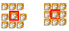
Not everyone may be familiar with outlines, which were introduced in CSS2, so a word on those before we move on. Outlines are much like borders, except outlines don’t affect layout. Eh? Here’s a comparison.

On the left, you have a border. On the right, an outline. The border takes up layout space, pushing other content around and generally being a nuisance. The outline, on the other hand, just draws into quietly into place. In most current browsers, it will overdraw any content already onscreen, and will be overdrawn by any content placed later — which is why it overlaps the images above it, and is overlapped by those below it.
Okay, so we can outline deprecated elements like font and center. Is that all? Oh no.
Attribution
Let’s suppose you also want to find any instances of inline style — that is, use of the style attribute on elements in the markup. This is generally discouraged (outside of HTML e-mails, which I’m not going to get anywhere near), as it’s just another side of the same coin of using font: baking the presentation into the document structure instead of putting it somewhere more manageable. So:
*[style], font, center {outline: 5px solid red;}Adding that attribute selector to the rule’s grouped selector means that we’ll now be outlining any element with a style attribute.
There’s a lot more that attribute selectors will let use diagnose. For example, we can highlight any images that have empty alt or title text.
img[alt=""] {border: 3px dotted red;}
img[title=""] {outline: 3px dotted fuchsia;}
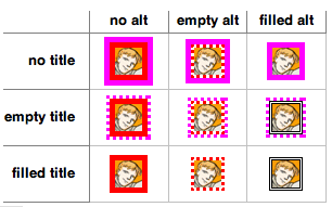
Now, you may wonder why one of these rules calls for a border, and the other for an outline. That’s because I want them to “add together” — that is, if I have an image which possesses both alt and title, and the values of both are empty, then I want it to be doubly marked.

See how the middle image there has both red and fuchsia dots running around it? (And am I the only one who sorely misses the actual circular dots drawn by IE5/Mac?) That’s due to its markup, which we can see here in a fragment showing the whole table row.
<tr>
<th scope="row">empty title</th>
<td><img src="comic.gif" title="" /></td>
<td><img src="comic.gif" title="" alt="" /></td>
<td><img src="comic.gif" title="" alt="comical" /></td>
</tr>
Right, that’s all well and good, but it misses a rather more serious situation: the selector img[alt=""] won’t match an img element that doesn’t even have an alt attribute. How to tackle this problem?
Not a Problem
Well, if you want to select something based on a negative, you need a negative selector.
img:not([alt]) {border: 5px solid red;}This is really quite a break from the rest of CSS selection, which is all positive: “select anything that has these characteristics”. With :not(), we have the ability to say (in supporting browsers) “select anything that hasn’t these characteristics”. In the above example, only img elements that do not have an alt attribute will be selected. So we expand our list of image-related rules to read:
img[alt=""] {border: 3px dotted red;}
img[title=""] {outline: 3px dotted fuchsia;}
img:not([alt]) {border: 5px solid red;}
img:not([title]) {outline: 5px solid fuchsia;}
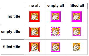
With the following results:

We could expand this general idea to pick up tables who lack a summary, or have an empty summary attribute.
table[summary=""] {outline: 3px dotted red;}
table:not([summary]) {outline: 5px solid red;}
When it comes to selecting header cells that lack the proper scope, however, we have a trickier situation. Finding headers with no scope attribute is easy enough, but what about those that have a scope attribute with an incorrect value?
In this case, we actually need to pull an on-off maneuver. This has us setting all th elements to have a highlight style, and then turn it off for the elements that meet our criteria.
th {border: 2px solid red;}
th[scope="col"], th[scope="row"] {border: none;}
This was necessary because of the way CSS selectors work. For example, consider this:
th:not([scope="col"]), th:not([scope="row"]) {border: 2px solid red;}That would select…all th elements, regardless of their attrributes. That’s because every th element doesn’t have a scope of col, doesn’t have a scope of row, or doesn’t have either. There’s no escaping this selector o’ doom!
This limitation arises because :not() is limited to containing a single “thing” within its parentheses. You can’t, for example, say “select all elements except those that are images which descend from list items”. Reportedly, this limitation was imposed to make browser implementation of :not() easier.
Still, we can make good use of :not() in the service of further diagnosing. Calling out links in trouble is a breeze:
a[href]:not([title]) {border: 5px solid red;}
a[title=""] {outline: 3px dotted red;}
a[href="#"] {background: lime;}
a[href=""] {background: fuchsia;}
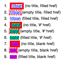
Here we have a set that will call our attention to links missing title information, as well as links that have no valid target, whether through a missing URL or a JavaScript-driven page where there are no link fallbacks in the case of missing or disabled JavaScript (href="#").
And What About IE?
As I said at the beginning, much of what I covered here doesn’t work in Internet Explorer, most particularly :not() and outline. (Oh, so basically everything? -Ed.)
I can’t do much about the latter. For the former, however, it’s possible to hack your way around the problem by doing some layered on-off stuff. For example, for images, you replace the previously-shown rules with the following:
img {border: 5px solid red;}
img[alt][title] {border-width: 0;}
img[alt] {border-color: fuchsia;}
img[alt], img[title] {border-style: double;}
img[alt=""][title],
img[alt][title=""] {border-width: 3px;}
img[alt=""][title=""] {border-style: dotted;}
It won’t have exactly the same set of effects, given the inability to use both borders and outlines, but will still highlight troublesome images.

It’s also the case that IE6 and earlier lack support for even attribute selectors, whereas IE7 added pretty much all the attribute selector types there are, so the previous code block won’t have any effect previous to IE7.
In a broader sense, though, these kinds of styles probably aren’t going to be used in the wild, as it were. Diagnostic styles are something only you see as you work on a site, so you can make sure to use a browser that supports outlines and :not() when you’re diagnosing. The fact that IE users won’t see these styles is irrelevant since users of any browser probably won’t be seeing these styles.
Personally, I always develop in Firefox anyway, thanks to its ability to become a full-featured IDE through the addition of extensions like Firebug and the Web Developer Toolbar.
Yeah, About That…
It’s true that much of what I describe in this article is available in the WDT. I feel there are two advantages to writing your own set of diagnostic styles.
- When you write your own styles, you can define exactly what the visual results will be, and how they will interact. The WDT doesn’t let you make its outlines thicker or change their colors.
- You can combine a bunch of diagnostics into a single set of rules and add it to your site’s style sheet during the diagnostic portion, thus ensuring they persist as you surf around. This can be done in the WDT, but it isn’t as easy (and, at least for me, not as reliable).
It’s also true that a markup validator will catch many of the errors I mentioned, such as missing alt and summary attributes. For some, that’s sufficient. But it won’t catch everything diagnostic styles can, like empty alt values or untargeted links, which are perfectly valid, syntactically speaking.
Diagnosis Complete?
I hope this has been a fun look at the concept of diagnostic styling as well as a quick introduction into possibly new concepts like :not() and outlines. This isn’t all there is to say, of course: there is plenty more that could be added to a diagnostic style sheet. And everyone’s diagnostics will be different, tuned to meet each person’s unique situation.
Mostly, though, I hope this small exploration triggers some creative thinking about the use of CSS to do more than just lay out pages and colorize text. Given the familiarity we acquire with CSS, it only makes sense to use it wherever it might be useful, and setting up visible diagnostic flags is just one more place for it to help us.
About the author
Eric A. Meyer (@meyerweb) has been a burger flipper, a college webmaster, an early blogger, one of the original CSS Samurai, a member of the CSS Working Group, a consultant and trainer, and a Standards Evangelist for Netscape. Among other things, Eric co-wrote Design For Real Life with Sara Wachter-Boettcher for A Book Apart and CSS: The Definitive Guide with Estelle Weyl for O’Reilly, created the first official W3C test suite, assisted in the creation of microformats, and co-founded An Event Apart with Jeffrey Zeldman. Eric lives with his family in Cleveland, Ohio, which is a much nicer city than you’ve probably heard. He enjoys a good meal whenever he can and considers almost every form of music to be worthwhile.


