Knockout Type - Thin Is Always In
OS X has gorgeous native anti-aliasing (although I will admit to missing 10px aliased Geneva — *sigh*). This is especially true for dark text on a light background. However, things can go awry when you start using light text on a dark background. Strokes thicken. Counters constrict. Letterforms fill out like seasonal snackers.


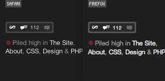
So how do we combat the fat? In Safari and other Webkit-based browsers we can use the CSS ‘text-shadow’ property. While trying to add a touch more contrast to the navigation on haveamint.com I noticed an interesting side-effect on the weight of the type.

The second line in the example image above has the following style applied to it:
This creates an invisible drop-shadow. (Why is it invisible? The shadow is positioned directly behind the type (the first two zeros) and has no spread (the third zero). So the color, black, is completely eclipsed by the type it is supposed to be shadowing.)


Why applying an invisible drop-shadow effectively lightens the weight of the type is unclear. What is clear is that our light-on-dark text is now of a comparable weight to its dark-on-light counterpart.


You can see this trick in effect all over ShaunInman.com and in the navigation on haveamint.com and Subtraction.com. The HTML and CSS source code used to create the example images used in this article can be found here.
About the author
Shaun Inman designed and developed Mint, the curiously successful web site analytic tool. He passes the time (literally) tinkering on ShaunInman.com while nervously eyeing the dust gathering on Designologue.


