Why Bother with Accessibility?

Web accessibility (known in other fields as inclusive design or universal design) is the degree to which a website is available to as many people as possible. Accessibility is most often used to describe how people with disabilities can access the web.
How we approach accessibility
In the web community, there’s a surprisingly inconsistent approach to accessibility. There are some who are endlessly dedicated to accessible web design, and there are some who believe it so intrinsic to the web that it shouldn’t be considered a separate topic. Still, of those who are familiar with accessibility, there’s an overwhelming number of designers, developers, clients and bosses who just aren’t that bothered.
Over the last few months I’ve spoken to a lot of people about accessibility, and I’ve heard the same reasons to ignore it over and over again. Let’s take a look at the most common excuses.
Excuse 1: “People with disabilities don’t really use the web”
Accessibility will make your site available to more people — the inclusion case
In the same way that the accessibility of a building isn’t just about access for wheelchair users, web accessibility isn’t just about blind users and screen readers. We can affect positively the lives of many people by making their access to the web easier.
There are four main types of disability that affect use of the web:
- Visual
- Blindness, low vision and colour-blindness
- Auditory
- Profoundly deaf and hard of hearing
- Motor
- The inability to use a mouse, slow response time, limited fine motor control
- Cognitive
- Learning difficulties, distractibility, the inability to focus on large amounts of information
None of these disabilities are completely black and white
Examining deafness, it’s clear from the medical scale that there are many grey areas between full hearing and total deafness:
- mild
- moderate
- moderately severe
- severe
- profound
- totally deaf
For eyesight, and brain conditions that affect what users see, there is a huge range of conditions and challenges:
- astigmatism
- colour blindness
- akinetopsia (motion blindness)
- scotopic visual sensitivity (visual stress related to light)
- visual agnosia (impaired recognition or identification of objects)
While we might have medical and government-recognised definitions that tell us what makes a disability, day-to-day life is not so straightforward. People experience varying degrees of different conditions, and often one or more conditions at a time, creating a false divide when you view disability in terms of us and them.
Impairments aren’t always permanent
As we age, we’re more likely to experience different levels of visual, auditory, motor and cognitive impairments. We might have an accident or illness that affects us temporarily. We might struggle more earlier or later in the day. There are so many little physiological factors that affect the way people interact with the web that we can’t afford to make any assumptions based on our own limited experiences.
Impairments might be somewhere between the user and the website
There are also impairments that aren’t directly related to the user. Environmental factors have a huge effect on the way people interact with the web. These could be:
- Low bandwidth, or intermittent internet connection
- Bright light, rain, or other weather-based conditions
- Noisy environments, or a location where the user doesn’t want to disturb their neighbours with sound
- Browsing with mobile devices, games consoles and other non-desktop devices
- Browsing with legacy browsers or operating systems
Such environmental factors show that it’s not just those with physical impairments who benefit from more accessible websites. We started designing responsive websites so we could be more future-friendly, and with a shared goal of better optimised experiences, accessibility should be at the core of responsive web design.
Excuse 2: “We don’t want to affect the experience for the majority of our users”
Accessibility will improve your site for all your users — the usability case
On a basic level, the different disability groups, as shown in the inclusion case, equate to simple usability goals:
- Visual – make it easy to read
- Auditory – make it easy to hear
- Motor – make it easy to interact
- Cognitive – make it easy to understand and focus
Taking care to ensure good usability in these areas will also have an impact on accessibility. Unless your site is catering specifically to a particular disability, where extreme optimisation is most beneficial, taking care to design with accessibility in mind will rarely negatively affect the experience of your wider audience.
Excuse 3: “We don’t have the budget for accessibility”
Accessibility will make you money — the business case
By reducing your audience through ignoring accessibility, you’re potentially excluding the income from those users. Designing with accessibility in mind from the beginning of a project makes it easier to make small inexpensive optimisations as part of the design and development process, rather than bolting on costly updates to increase your potential audience later on.
The following are excerpts from a white paper about companies that increased the accessibility of their websites to comply with government regulation.
Improvements in accessibility doubled Legal and General’s life insurance sales online.
Improvements in accessibility increased Tesco’s grocery home delivery sales by £13 million in 2005… To their surprise they found that many normal visitors preferred the ease of navigation and improved simplicity of the [parallel] accessible site and switched to use it. Tesco have replaced their ‘normal’ site with their accessible version and expect a further increase in revenues.
Improvements in accessibility increased Virgin.net sales by 68%.
Statistics all from WSI white paper: Improve your website’s usability and accessibility to increase sales (PDF).
Excuse 4: “Accessible websites are ugly”
Accessibility won’t stop your site from being beautiful — the beauty case
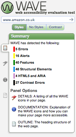
Many people use ugly accessible websites as proof that all accessible websites are ugly. This just isn’t the case. I’ve compiled some examples of beautiful and accessible websites with screenshots of how they look through the Color Oracle simulator and how they perform when run through Webaim’s Wave accessibility checker tool.
While automated tools are no substitute for real users, they can help you learn more about good practices, and give you guidance on where your site needs improvements to make it more accessible.
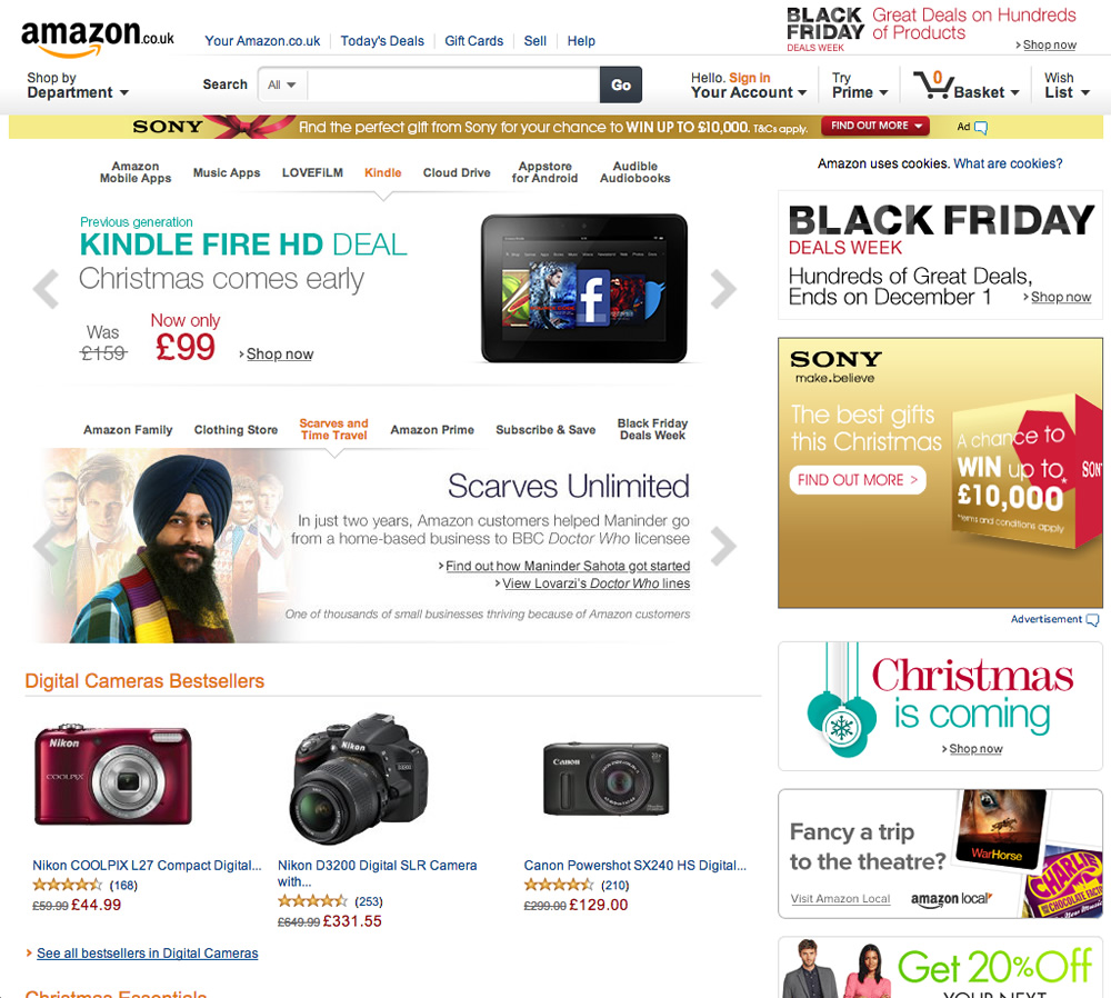
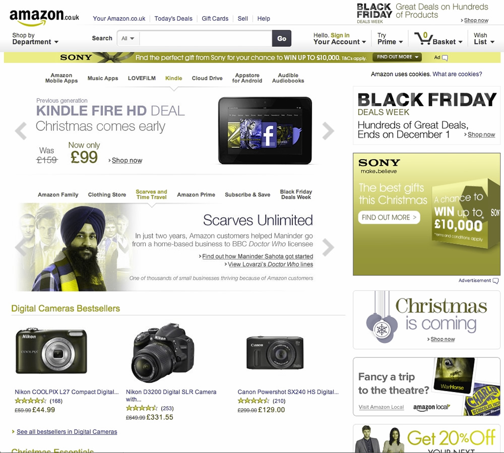
Amazon.co.uk
It may not be a decorated beauty, but Amazon is often first in functional design. It’s a huge website with a lot of interactive content, but it generates just five errors on the Wave test, and is easy to read under a Color Oracle filter.
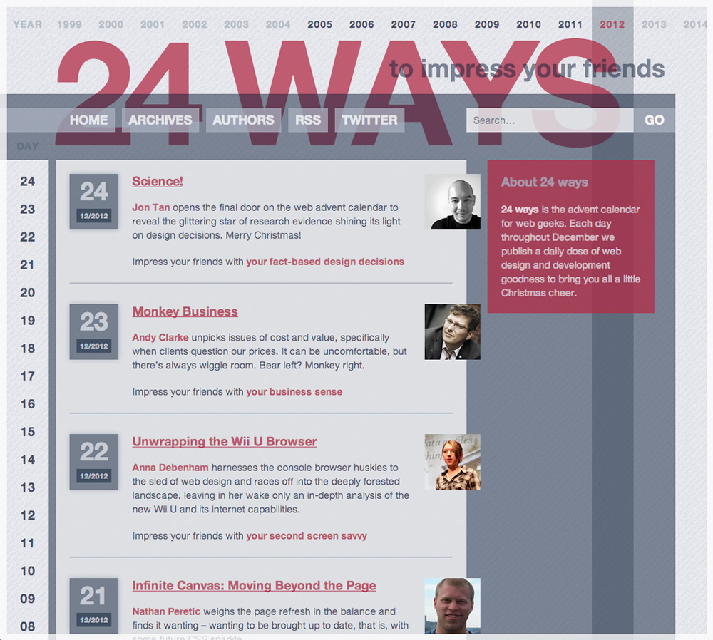
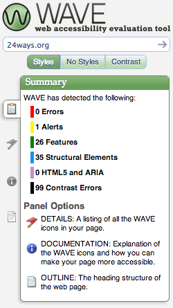
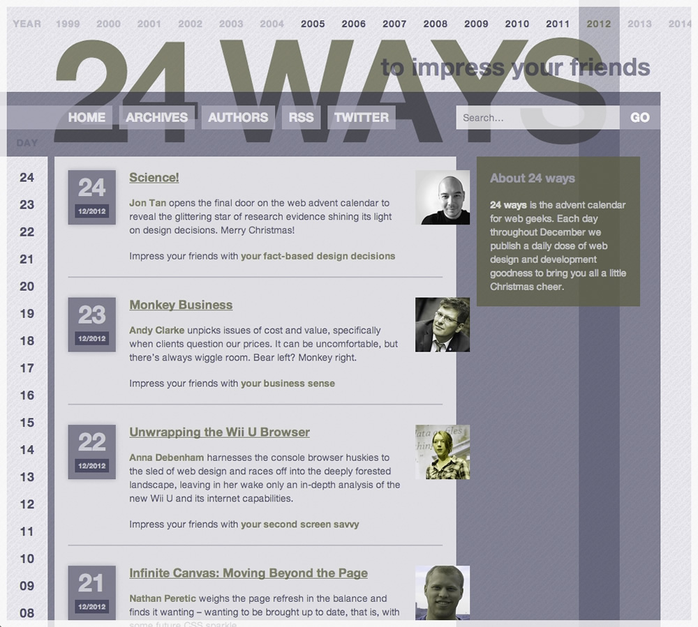
24 ways
When Tim Van Damme redesigned 24 ways back in 2007, it was a striking and unusual design that showed what could be achieved with CSS and some imagination. Despite the complexity of the design, it gets an outstanding zero errors on the Wave test, and is still readable under a Color Oracle filter.
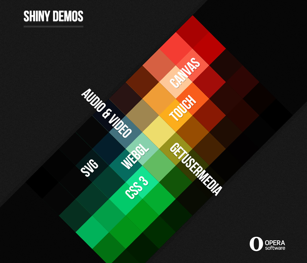
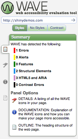
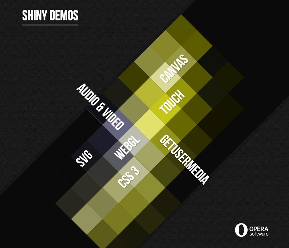
Opera’s Shiny Demos
Demos and prototypes are notorious for ignoring accessibility, but Opera’s Shiny Demos site shows how exploring new technologies doesn’t have to exclude anyone. It only gets one error on the Wave test, and looks fine under a Color Oracle filter.
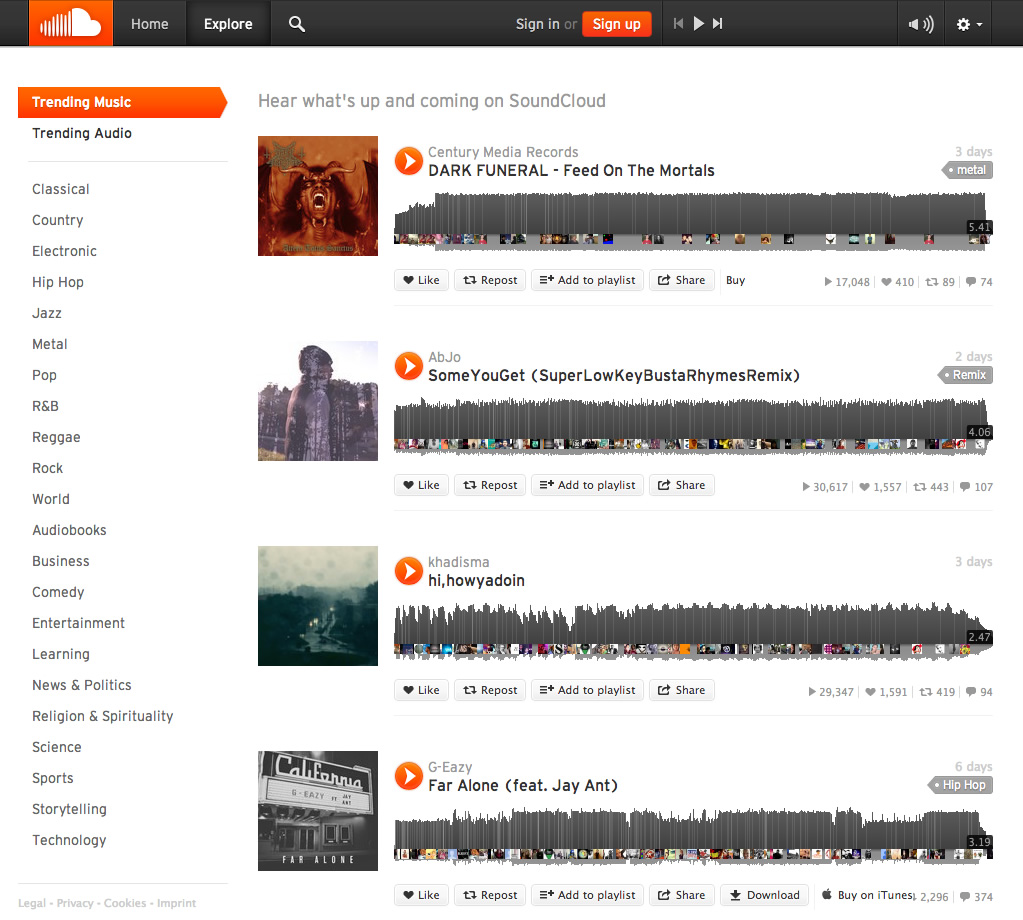
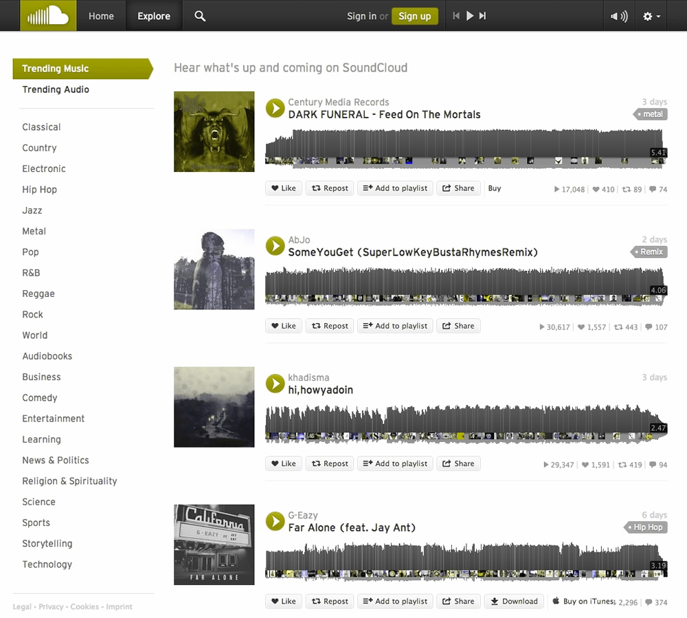
SoundCloud
When a site is more app-like, relying on more interaction from the user, accessibility can be more challenging. However, SoundCloud only gets one error on the Wave test, and the colour contrast holds up well under a Color Oracle filter.

Education and balance
As with most web design, doing accessibility well is about combining your knowledge of accessibility with your project’s context to create a balance that serves your users’ needs. Your types of content and interactions will dictate one set of constraints. Your users’ needs and goals will dictate another. In broad terms, web design as a practice is finding the equilibrium between these constraints.
And then there’s just caring. The web as a platform is open, affordable and available to many. Accessibility is our way to ensure that nobody gets shut out.
About the author
Laura Kalbag is a British designer living in Ireland, and author of Accessibility For Everyone from A Book Apart. She’s one third of Small Technology Foundation, a tiny two-person-and-one-husky not-for-profit organisation. At Small Technology Foundation, Laura works on a web privacy tool called Better Blocker, and initiatives to advocate for and build small technology to protect personhood and democracy in the digital network age.
Brought to you by

Related articles
-
Accessibility Through Semantic HTML
Laura Kalbag takes us back to basics to make sure we consider accessibility when structuring our HTML. The Christmas tree needs to be standing firm before we drape it in lights and tinsel, and until you lot start doing it, we’re not going to stop preaching it.
-
Automating Your Accessibility Tests
Seren Davies reminds us that unlike Christmas, accessibility testing should not come but once a year with a look at how to apply automated testing. By configuring tests to run against each commit, you can ensure that your site’s accessibility compliance need not be left to chance.
-
Designing with Contrast
Mark Mitchell casts coarse salt upon the pale icy sheen of recent web design aesthetics to sound a warning that we may be on thin ice. The tension between low contrast tastes and high contrast needs is a story as old as the
<font>tag, and yet it bears frequent retelling. For snow has fallen snow on snow. -
Don’t Push Through the Pain
Carolyn Wood reminds us of what in recent years we’ve come to overlook, hunched as we are over laptop and tablet: our physical wellbeing. Sometimes, that tingle down your arm from shoulder to fingers isn’t Christmas magic.
-
Future Accessibility Guidelines—for People Who Can’t Wait to Read Them
Alan Dalton uses this, the International Day of Persons with Disabilities, to look back at where we’ve come from, to evaluate where we are, and to look forward to what’s coming next in the future of accessibility guidelines.
-
Inclusive Considerations When Restyling Form Controls
Scott O’Hara hogs the remote while he looks into the ever-present issue of custom form controls. We might brute-force an element to take on the styling we’re looking for, but will that interaction still make sense for all users? Let’s give the batteries a rub and find out.