Programmers like me are often intimidated by design – but a little effort can give a huge return on investment. Here are one coder’s tips for making any site quickly look more professional.
I am a programmer. I am not a designer. I have a degree in computer science, and I don’t mind Comic Sans. (It looks cheerful. Move on.)
But although I am a programmer, I want to make my sites look attractive. This is partly out of vanity, and partly realism. Vanity because I want people to think my work is good, and realism because the research shows that people won’t think a site is credible unless it also looks attractive.
For a very long time after I became a programmer, I was scared of design. Design seemed to consist of complicated rules that weren’t written down anywhere, plus an unlearnable sense of taste, possessed only by a black-clad elite.
But a little while ago, I decided to do my best to hack what it took to make my own projects look vaguely attractive. And although this doesn’t come close to the effect a professional designer could achieve, gathering these resources for improving a site’s look and feel has been really helpful.
If I hadn’t figured out some basic design shortcuts, it’s unlikely that a weekend hack of mine would have ended up on page three of the Daily Mail. And too often now, I see excellent programming projects that don’t reach the audience they deserve, simply because their design doesn’t match their execution.
So, if you are a developer, my Christmas present to you is this: my own collection of hacks that, used rightly, can make your personal programming projects look professional, quickly. None are hard to learn, most are free, and they let you focus on writing code.
One thing to note about these tips, though. They are a personal, pragmatic compilation. They are suggestions, not a definitive guide. You will definitely get better results by working with a professional designer, and by studying design more deeply.
If you are a designer, I would love to hear your suggestions for the best tools that I’ve missed, and I’d love to know how we programmers can do things better.
With that, on to the tools…
1. Use Bootstrap
If you’re not already using Bootstrap, start now. I really think that Bootstrap is one of the most significant technical achievements of the last few years: it democratizes the whole process of web design.
Essentially, Bootstrap is a a grid system, with a bunch of common elements. So you can lay your site out how you want, drop in simple elements like forms and tables, and get a good-looking, consistent result, without spending hours fiddling with CSS. You just need HTML.
Another massive upside is that it makes it easy to make any site responsive, so you don’t have to worry about writing media queries. Go, get Bootstrap and check out the examples. To keep your site lightweight, you can customize your download to include only the elements you want.
If you have more time, then Mark Otto’s article on why and how Bootstrap was created at Twitter is well worth a read.
2. Pimp Bootstrap
Using Bootstrap is already a significant advance on not using Bootstrap, and massively reduces the tedium of front-end development. But you also run the risk of creating Yet Another Bootstrap Site, or Hack Day Design, as it’s known.
If you’re really pressed for time, you could buy a theme from Wrap Bootstrap. These are usually created by professional designers, and will give a polish that we can’t achieve ourselves. Your site won’t be unique, but it will look good quickly.
Luckily, it’s pretty easy to make Bootstrap not look too much like Bootstrap – using fonts, CSS effects, background images, colour schemes and so on. Most of the rest of this article covers different ways to achieve this.
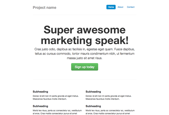
We are going to customize this Bootstrap example page.
This already has some custom CSS in the <head>. We’ll pull it all out, and create a new CSS file, custom.css. Then we add a reference to it in the header. Now we’re ready to start customizing things.
3. Fonts
Web fonts are one of the quickest ways to make your site look distinctive, modern, and less Bootstrappy, so we’ll start there.
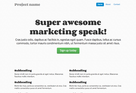
First, we can add some sweet fonts, from Google Web Fonts. The intimidating bit is choosing fonts that look nice together. Luckily, there are plenty of suggestions around the web: we’re going to use one of DesignShack’s suggested free Google Fonts pairings. Our fonts are Corben (for headings) and Nobile (for body copy).
Then we add these files to our <head>.
<link href="http://fonts.googleapis.com/css?family=Corben:bold" rel="stylesheet" type="text/css">
<link href="http://fonts.googleapis.com/css?family=Nobile" rel="stylesheet" type="text/css">
…and this to custom.css:
h1, h2, h3, h4, h5, h6 {
font-family: 'Corben', Georgia, Times, serif;
}
p, div {
font-family: 'Nobile', Helvetica, Arial, sans-serif;
}
Now our example looks like this. It’s not going to win any design awards, but it’s immediately better:
I also recommend the web font services Fontdeck, or Typekit – these have a wider selection of fonts, and are worth the investment if you regularly need to make sites look good. For more font combinations, Just My Type suggests appealing pairings from Typekit. Finally, you can experiment with type pairing ideas at Type Connection. For the design background on pairing fonts, Typekit’s post is worth a read.
4. Textures
An instant way to make a site look classy is to use textures. You know the grey, stripy, indefinably elegant background on 24ways.org? That.
If only there was a superb resource listing attractive, free, ready-to-use textures… Oh wait, there’s Atle Mo’s Subtle Patterns.
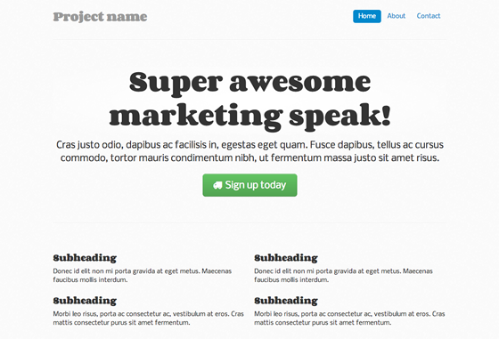
We’re going to use Cream Dust, for an effect that can only be described as subtle. We download the file to a new /img/ directory, then add this to the CSS file:
body {
background: url(/img/cream_dust.png) repeat 0 0;
}
Bang:
For some design background on patterns, I recommend reading through Smashing Magazine’s guidelines on textures. (TL;DR version: use textures to enhance beauty, and clarify the information architecture of your site; but don’t overdo it, or inadvertently obscure your text.)
Still more to do, though. Onwards.
5. Icons
Last year’s 24 ways taught us to use icon fonts for our site icons.
This is great for the time-pressed coder, because icon fonts don’t just cut down on HTTP requests – they’re a lot quicker to set up than image-based icons, too.
Bootstrap ships with an extensive, free for commercial use icon set in the shape of Font Awesome. Its icons are safe for screen readers, and can even be made to work in IE7 if needed (we’re not going to bother here).
To start using these icons, just download Font Awesome, and add the /fonts/ directory to your site and the font-awesome.css file into your /css/ directory. Then add a reference to the CSS file in your header:
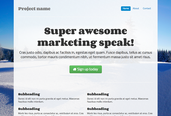
<link rel="stylesheet" href="/css/font-awesome.css">
Finally, we’ll add a truck icon to the main action button, as follows. Why a truck? Why not?
<a class="btn btn-large btn-success" href="#"><i class="icon-truck"></i> Sign up today</a>
We’ll also tweak our CSS file to stop the icon nudging up against the button text:
.jumbotron .btn i {
margin-right: 8px;
}
And this is how it looks:
Not the most exciting change ever, but it livens up the page a bit. The licence is CC-BY-3.0, so we also include a mention of Font Awesome and its URL in the source code.
If you’d like something a little more distinctive, Shifticons lets you pay a few cents for individual icons, with the bonus that you only have to serve the icons you actually use, which is more efficient. Its icons are also friendly to screen readers, but won’t work in IE7.
6. CSS3
The next thing you could do is add some CSS3 goodness. It can really help the key elements of the site stand out.
If you are pressed for time, just adding box-shadow and text-shadow to emphasize headings and standouts can be useful:
h1 {
text-shadow: 1px 1px 1px #ccc;
}
.div-that-you want-to-stand-out {
box-shadow: 0 0 1em 1em #ccc;
}
We have a little more time though, so we’re going to do something more subtle. We’ll add a radial gradient behind the main heading, using an online gradient editor.
The output is hefty, but you can see it in the CSS. Note that we also need to add the following to our HTML, for IE9 support:
<!--[if gte IE 9]>
<style type="text/css">
.gradient {
filter: none;
}
</style>
<![endif]-->
And the effect – I don’t know what a designer would think, but I like the way it makes the heading pop.
For a crash course in useful modern CSS effects, I highly recommend CodeSchool’s online course in Functional HTM5 and CSS3. It costs money ($25 a month to subscribe), but it’s worth it for the time you’ll save. As a bonus, you also get access to some excellent JavaScript, Ruby and GitHub courses.
(Incidentally, if you find yourself fighting with basic float and display attributes in CSS – and there’s no shame in it, CSS layout is not intuitive – I recommend the CSS Cross-Country course at CodeSchool.)
7. Add a twist
We could leave it there, but we’re going to add a background image, and give the site some personality.
This is the area of design that I think many programmers find most intimidating. How do we create the graphics and photographs that a designer would use? The answer is iStockPhoto and its competitors – online image libraries where you can find and pay for images. They won’t be unique, but for our purposes, that’s fine.
We’re going to use a Christmassy image. For a twist, we’re going to use Backstretch to make it responsive.
We must pay for the image, then download it to our /img/ directory. Then, we set it as our <body>’s background-image, by including a JavaScript file with just the following line:
$.backstretch("/img/winter.jpg");
We also reset the subtle pattern to become the background for our container image. It would look much better transparent, so we can use this technique in GIMP to make it see-through:
.container-narrow {
background: url(/img/cream_dust_transparent.png) repeat 0 0;
}
We also fiddle with the padding on body and .container-narrow a bit, and this is the result:
(Aside: If this were a real site, I’d want to buy images in multiple sizes and ensure that Backstretch chose the most appropriately sized image for our screen, perhaps using responsive images.)
How to find the effects that make a site interesting? I keep a set of bookmarks for interesting JavaScript and CSS effects I might want to use someday, from realistic shadows to animating grids. The JavaScript Weekly newsletter is a great source of ideas.
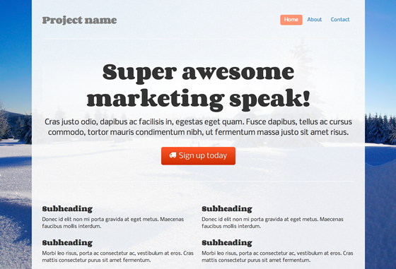
8. Colour schemes
We’re just about getting there – though we’re probably past half an hour now – but that button and that menu still both look awfully Bootstrappy.
Real sites, with real designers, have a colour palette, carefully chosen to harmonize and match the brand profile. For our purposes, we’re just going to borrow some colours from the image. We use Gimp’s colour picker tool to identify the hex values of the blue of the snow. Then we can use Color Scheme Designer to find contrasting, but complementary, colours.
Finally, we use those colours for our central button. There are lots of tools to help us do this, such as Bootstrap Buttons. The new HTML is quite long, so I won’t paste it all here, but you can find it in the CSS file.
We also reset the colour of the pills in the navigation menu, which is a bit easier:
.nav-pills > .active > a, .nav-pills > .active > a:hover {
background-color: #FF9473;
}
I’m not sure if the result is great to be honest, but at least we’ve lost those Bootstrap-blue buttons:
Another way to do it, if you didn’t have an image to match, would be to borrow an attractive colour scheme. Colourlovers is a community where people create and share ready-made colour palettes.
The key thing is to find a palette with an open licence, so you can legitimately use it. Unfortunately, you can’t search for palettes by licence type, but many do have open licences. Here’s a popular palette with a CC-BY-SA licence that allows reuse with attribution.
As above, you can use the hex values from the palette in your custom CSS, and bask in the newly colourful results.
9. Read on
With the above techniques, you can make a site that is starting to look slightly more professional, pretty quickly.
If you have the time to invest, it’s well worth learning some design principles, if only so that design seems less intimidating and more like fun. As part of my design learning, I read a few introductory design books aimed at coders. The best I found was David Kadavy’s Design for Hackers: Reverse-Engineering Beauty, which explains the basic principles behind choosing colours, fonts, typefaces and layout.
In the introduction to his book, David writes:
No group stands to gain more from design literacy than hackers do… The one subject that is exceedingly frustrating for hackers to try to learn is design. Hackers know that in order to compete against corporate behemoths with just a few lines of code, they need to have good, clear design, but the resources with which to learn design are simply hard to find.
Well said. If you have half a day to invest, rather than half an hour, I recommend getting hold of David’s book.
And the journey is over. Perhaps that took slightly more than half an hour, but with practice, using the above techniques can become second nature. What useful tools have I missed? Designers, how would you improve on the above? I would love to know, so please give me your views in the comments.


Comments
Comments are ordered by helpfulness, as indicated by you. Help us pick out the gems and discourage asshattery by voting on notable comments.
Got something to add? You can leave a comment below.
16/12/2012
One little optimization tip:
Including multiple fonts from Google Fonts, can be done in one single query, which will mean one less http request.
So instead of:
<link href=“http://fonts.googleapis.com/css?family=Corben:bold” rel=“stylesheet” type=“text/css”> <link href=“http://fonts.googleapis.com/css?family=Nobile” rel=“stylesheet” type=“text/css”>
You can do:
<link href=“http://fonts.googleapis.com/css?family=Corben:bold|Nobile” rel=“stylesheet” type=“text/css”>
Just my 2 cents…
Vote Helpful or Unhelpful
16/12/2012
Whilst I appreciate that many (most?) developers struggle with design, they would be much better off learning a few design fundamentals, which they can then build on for the rest of their careers. Frameworks come and go, and so do fashions and trends. Design fundamentals don’t change.
I don’t buy the idea that design is unlearnable or somehow innate to the right-brained elite.
The same applies vice-versa: I’ve met plenty of designers who deliberately distance themselves from doing any development work because to them it’s black magic. This is self-limiting laziness caused by pigeon-holing yourself into mythical left/right brain categories.
Get out of your comfort zone and learn what you don’t know properly. Your future self will thank you and World Domination is yours for the taking.
Vote Helpful or Unhelpful
16/12/2012
(I wrote the book you mention in #9 – thanks!)
Great article, Anna! I didn’t know about Wrap Bootstrap or Subtle Patterns. The latter will be good for a project I’m working on (I may even use Cream Dust), and the former – maybe I can make a Bootstrap theme soon.
Google Fonts, Typekit, and other services are awesome. In my conversations with budding designers, I’ve found it can be really intimidating to choose from the sea of choices on these sites, though. Even I have only come across a few typefaces there that I’m really crazy about.
I just wanted to let your readers know that if they’re experiencing “font anxiety,” I have a PDF available at my book’s site (URL next to my name) called “All of the fonts you’ll ever need,” which I’ll immediately email to them if they enter their address (they’ll then be subscribed for more emails about design, but they are welcome to immediately unsubscribe if they like).
This PDF doesn’t have the more “exciting” fonts that you find in Google Web Fonts or Typekit, but it does offer some simple recommendations, and describes some classifications for those fonts that are useful for knowing what fonts to pair them with, and what mediums they work best on (some fonts aren’t so good for screen).
Thanks again for the mention, and I hope your readers get some use out of my book should they choose to check it out. If anyone has any questions, I’m pretty active on twitter: @kadavy.
Vote Helpful or Unhelpful
17/12/2012
Reduce lock-in to one particular CSS framework by extending Bootstrap CSS with your own semantic style classes.
Some posts that cover techniques to do this …
Please stop embedding Bootstrap classes in your HTML!
A Tale of Two Bootstraps: Lessons Learned in Maintainable CSS
Vote Helpful or Unhelpful
17/12/2012
As it stands this is a great collection of tools and tips for decorating a page, but as a first step you should be asking yourself “who am I designing for” and “what do I want people to do” – this is what (as a starting point) should influence your choices in typography, colour, layout and content.
Vote Helpful or Unhelpful
17/12/2012
Nice article to get folks rolling quickly :)
As a designer who’s worked with coders for a long time, one of the big differences between the disciplines is what we see: I’m looking for design issues; they’re looking for code issues. So I think half the battle is learning to put your code-head to one side, & learn to look for other things.
A great way of helping you look through someone else’s eyes is user testing. Get some non-coding mates to look at your site:
* Ask them to narrate their thought processes.
* Their 1st utterances will tell you what their primary usability issues are.
* Look at the faces they pull too.
* Pay close attention to all the points they raise.
Testers will say confusing things that need dissecting: try not to dismiss feedback as irrelevant just cos “I just don’t like it†is hard to decipher. With a bit of prodding, they will start to tell you what’s making them feel uncomfortable.
A great reference on basic design principles is “The Non-Designer’s Design Book” by Robyn Williams. It’s now in its 3rd edition & is useful for design novices & experts alike. Apply its advice from the outset, & again after each round of testing, & you’ll be on to a winner.
Vote Helpful or Unhelpful
16/12/2012
I’m kind of a hybrid guy myself and I just recently got into using responsive Frameworks as a tool for rapid prototyping and also production sites.
When it came to choosing a Framework it was a bit of a tie between Bootstrap an Zurb’s Foundation 3. In the end I went with Foundation as I really like its SASS support.
But I think at the end both Frameworks would get you to the same level of simplification.
Vote Helpful or Unhelpful
17/12/2012
A couple of tips that I want to share from reading this post;
1) It’s as much about what “not” to add when designing. Adding more and more into your site might not be always right.
2) Get feedback. If you know a designer just ask them for some quick tips about the general look. Getting feedback is a dream in the design world and no design should live without it. If you don’t know someone who designs then you can seek feedback on communities like Dribble and Forrst. Do not be scared, its about the work not you.
I can’t stress point 1 enough here. Don’t just add CSS3, textures and whatever just because it brings something visual to your work. Ask yourself if it’s needed first and then apply it. I hope that helps :)
Vote Helpful or Unhelpful
16/12/2012
Your CSS3 example doesn’t appear to be working, but your particular use of text-shadow isn’t really great design. Adding a grey shadow to black text just makes it look blurry.
My rule: only ever add a light shadow to dark text, or a dark shadow to light text. By extension this implies only use text shadow on a coloured background, not pure white or pure black.
Vote Helpful or Unhelpful
17/12/2012
Thank you for this very handy post!
I’d like to give my two cents about the contents container.
I like to reduce the number of images as little as possible.
Instead of (or in addition to) using the ‘cream_dust_transparent.png’ image, you may want to consider this:
bc. .container-narrow { background-image: url(/img/cream_dust_transparent.png); background-image: rgba(255,255,255,0.8);
}
The use of “background-image” for a color is intentional, in order to provide an image fallback for browser that don’t support rgba().
Vote Helpful or Unhelpful
17/12/2012
I am sure a lot of developers scared of HTML/CSS will appreciate and learn from this article. However, I do think advising people to just take products off the shelf ‘without worrying about responsive design’ or how things are really done is a little lazy.
If you want to use bootstrap, really understand how it works, what its limitations are, how you can apply it. Maybe you just want to take some elements of it, not all.
I am a big proponent of not reinventing the wheel, but taking this copy and paste mechanism for doing things you don’t understand very well doesn’t make for a great quality product over time. It just ends up as a mash-up of different developers code. This can often cause pain further down the line when you get coding conflicts or something does only 80% of what you really needed.
All of us have time constraints in projects and we do and will continue to make short-cuts where needed, but try to improve on what someone has done or understand it enough to really customise it to your needs.
Vote Helpful or Unhelpful
17/12/2012
I have no problems at all with developers trying to make their sites attractive.
It’s not uncommon for agencies to use bootstrap and / or WordPress theme, change an image or colour and charge many thousands (even tens of thousands of pounds) as unique work. Hurtful and damaging!
Boostrap is great for prototyping or to put up a quick mates site but it forces a certain grid to be used and therefore stifling creativity from the very off, as the mindset of that grid / layout has been defined.
That said the tips take a terrible site into something respectable, and a developers site is good use, it’s just what else bootstrap is used for.
Vote Helpful or Unhelpful
16/12/2012
Hi Anna,
Really helpful article – thanks for sharing.
I recently heard someone describe Bootstrap as “normalising CSS in the same way jQuery normalises the DOM” and it’s been on my list of things to investigate ever since (if only to find out if that’s an accurate description).
Spurred on by your article I intend to pull my finger out and take a look!
Vote Helpful or Unhelpful
17/12/2012
Actually I didnt expect a Bootstrap-based post like that :D Bootstrap is my favourite framework of all time. After I discovered Roots (and Wordpress Bootstrap by 320press) I began building my own themes. At the beginning it is hard to understand (i was used to super easy-to-use wordpress themes with lots of graphic customizations possible), but when you understand the power of Bootstrap and HTML5, you’ll always use them.
Vote Helpful or Unhelpful
16/12/2012
“it [Bootstrap] democratizes the whole process of web design. â€
I think if throwing in some grids, consistency and fonts does democratise anything, it democratises reaching a certain degree of attractiveness on a page. Which is not much wrong with, but I’d like to make the distinction between ‘making some attractive’ and ‘design’ or even ‘beauty’ (as ‘design’ is something one would hire an expert for, as it needs to be done with intent, specific skills, knowledge of the context of the project and whatnot).
Interesting article though, good read!
Vote Helpful or Unhelpful
16/12/2012
From one developer to another, I just want to say that this is a godsend!
For years, I’ve puttered around with throwing CSS at it until something tolerable came out. I’ve been reading the bootstrap docs, and it suddenly feels like the sky’s the limit on what I can do. Drop downs scared me before, but now I can use them just as richly as their desktop counterparts.
Vote Helpful or Unhelpful
17/12/2012
@Andrey quoting the first paragraph:
“Programmers like me are often intimidated by design – but a little effort can give a huge return on investment. Here are one coder’s tips for making any site quickly look more professional.”
Perhaps you’re right – maybe no decent designer should “be EVER introduced Bootstrap”, but the author clearly states she’s not a designer.
People have different skill-sets. As an example, I specialise in back-end & JS development. At my day job I work with a team of developers, project managers and extremely competent designers. The designers on this team do custom hand-coded design work, from start to finish. On experimental or personal projects, I work alone. In these latter cases, where I must perform every task, including those that I do not specialise in, I do use methods described here.
It may amaze you, but not everybody who works in the web space aspires to be an excellent designer.
Vote Helpful or Unhelpful
16/12/2012
What’s the deal with the license issue for color patterns suggested in this article? Can a color pattern really be copyrighted? That makes no sense whatsoever.
Vote Helpful or Unhelpful
17/12/2012
I would not expect an article like this on here. Design is not just about CSS3 effects and fonts – in other words it’s not just visual candy. I thought this was common knowledge now? Obviously not.
I would spend the time mentioned in this article to ask questions about why your site is not working and then form a brief to work with a designer. To address the key issues with your site. Not just throw random things at your site. What is that actually achieving? Your just wasting time and delaying an inevitable redesign.
I’m a designer and have used Bootstrap – only when I think the web site / app would require it. I wouldn’t just use it for the sake of using it as it adds thousands of lines of CSS and JS. Plus it actually takes a lot of work to make it look NOT like a generic bootstrap build. For simple designs I have actually found it quicker to just write my own code than get bootstrap up and running, and then try and restyle it.
So please, spend time asking what your site needs, and why you think it’s not working, rather than just putting stuff on it for the sake of making it look better to your eyes.
Remember that in most cases you are not your user. What may look good to you may not look good to other people. Especially if your a self confessed programmer and not a designer.
Vote Helpful or Unhelpful
19/12/2012
I just would like to thank you for your article. I’m a small coder from Italy and here modern web technologies aren’t used a lot, except from some startups.
I found your article really helpful, I have to start building my personal website during Christmas and I think I’ll buy design book because, lucky, I still have some time to spare.
Thanks for your precious suggestions.
Vote Helpful or Unhelpful
17/12/2012
Bootstrap is one of the best web innovations out there. For me it takes gui development time down to at least a third, time that I can use to be creative in other, more important parts of the project.
Vote Helpful or Unhelpful
27/12/2012
NO. Bootstrap is horrible – it’s just designed for noobs who don’t care about their site looking the same as thousands of others. While I understand that you don’t need to use the stock styles, keep in mind that these sites are mostly made by noobs who just copy and paste code – they’re not going to bother making some custom CSS.
Vote Helpful or Unhelpful
29/12/2012
Up to Point 6, the website looks great. Vanilla, but visible by Real Human eyes.
But from there on, you fall into myspace-y-2001-like webdesign.
Plus, asking a pure dev to chose a background image and a color scheme is plain graphical suicide !
I would say the same about font choice on point 3, but in fact, going the Google Fonts way is kinda fireproof.
Vote Helpful or Unhelpful
17/12/2012
To tell you the truth, I like the end result of your second step, 2. Pimp Bootstrap, the most.
For me I would stop and 2 and skip to 8 to add unique color scheme and that’s it. :)
Vote Helpful or Unhelpful
17/12/2012
I shared this article with a colleague who is our accessibility lead. The moment I mentioned Bootstrap he cut me short, saying that the UI parts at least are not accessible. If that is indeed so, it’s an instant deal breaker.
Vote Helpful or Unhelpful
17/12/2012
This is great article. It helped me getting the site half decent !!
Vote Helpful or Unhelpful
17/12/2012
Might I just add, really decent looking site yourself. Love the top and left year/day counters.
Vote Helpful or Unhelpful
17/12/2012
Excellent content, Anna! I did not know about Cover Bootstrap or Simple Styles. The latter will be excellent for a venture I’m operating on (I may even use Lotion Dust), and the former – maybe I can create a Bootstrap concept soon.
But your post is realy informable for a person who wnat to leasrn something new in web designe.
thnks.
Vote Helpful or Unhelpful
16/12/2012
These are some great tips. Anything that helps developers get back to coding is a win in my opinion :)
In addition to Mr. Kadavy’s book, you might also want to check out my online guide: http://www.visualmess.com . It’s about a ten minute read, and while it’s not aimed specifically at programmers I myself am a programmer and tried to explain things in a programmer-friendly way.
Vote Helpful or Unhelpful
16/12/2012
Bootstrap can make all the sites looks decent – but people tend to ignore it and create their our “unique” style, instead. Sure, the result – its worse!
Vote Helpful or Unhelpful
06/01/2013
I’d read this article before, just read it again after a few months. I still feel the same. Bootstrap is fine for prototyping a site, but it’s not a cure-all that can just be slapped on a site to fix it.
It shouldn’t be taken as more or less than that. Unless having a site that looks and behaves exactly the same as twenty bajilion other sites out there is completely acceptable to you.
It’s like a designer that only knows Photoshop saying, “Just use jQuery, and now you’re a programmer”.
Vote Helpful or Unhelpful
21/12/2012
Howdy from Texas :)
I recently remade my site on a git-powered blogging engine that uses markdown (and customized some of the code). Always handy :)
I’ve made use of the Skeleton CSS framework, made some simple changes to typography styles and basic code-blocks, added in some colors for pop, animated in LARGE background images above the fold, added in some sexy styles for headers, lists, and block comments.
Would you recommend anything else for my site?
Vote Helpful or Unhelpful
17/12/2012
good to see someone getting behind bootstrap!! i think for developing a theme from scratch, its one of the easiest frameworks out there. the tips on pimping bootstrap are spot on .. i had’nt thought of those!!
Vote Helpful or Unhelpful
16/12/2012
Very good article. I can see myself making use of what you have outlined in the article. Thanks a lot.
Brett
Vote Helpful or Unhelpful
29/12/2012
“…the effect a professional designer could achieve”. So design is just an “effect”? As a supposed member of the “black clad elite” I find that to be an interesting point of view :) Cake decorating is all well and good but call it what it is, don’t call it Design.
Vote Helpful or Unhelpful
16/12/2012
I appreciate your talk about style. My sweetie doesn’t have any AT ALL (he wouldn’t mind my saying) and he would rather program and fiddle. I am kind of a font snob, so I wasn’t fond of the font chosen in the final design of your example, but I’m all for the nice clean button and the crisp image border. I will pass along your ideas to him.
Vote Helpful or Unhelpful
16/12/2012
u really made my xmas!!
i’m an individual startup trying to figure out how non-profits can have elegant websites – like u said, thats where the potential volunteer or donor’s journey of knowing the non-profit begins. n first impression is the only impression.
thanks so much for sharing your learnings! just the jumpstart i was looking for!
Vote Helpful or Unhelpful
17/12/2012
I wish these people making these comments had looked at your http://darkgreener.com/ site before they commented.
Vote Helpful or Unhelpful
16/12/2012
u really made my xmas!!
i’m an individual startup trying to figure out how non-profits can have elegant websites – like u said, thats where the potential volunteer or donor’s journey of knowing the non-profit begins. n first impression is the only impression.
thanks so much for sharing your learnings! just the jumpstart i was looking for!
Vote Helpful or Unhelpful
17/12/2012
Using conditional statements to target different browsers (IE in particular) is WRONG. It is one of the things holding back the web development industry. Stop pandering to different browser versions. The site doesn’t need to look identical in every browser. http://t.co/1LNuhWm7
Vote Helpful or Unhelpful
16/12/2012
Stopped reading after section 1. No decent designer should be EVER introduced Bootstrap. If you think the other way, please email me your best 20 websites and if 2 of them are any good, I will excuse myself.
Vote Helpful or Unhelpful
Impress us