Extreme Design
Recently, I set out with twelve other designers and developers for a 19th century fortress on the Channel Island of Alderney. We were going to /dev/fort, a sort of band camp for geeks. Our cohort’s mission: to think up, build and finish something – without readily available internet access.
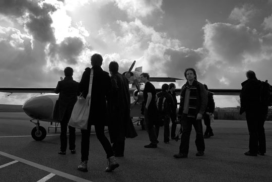 Alderney runway, photo by Chris Govias
Wait, no internet?
Well, pretty much. As the creators of /dev/fort James Aylett and Mark Norman Francis put it: “Imagine a place with no distractions – no IM, no Twitter”. But also no way to quickly look up a design pattern, code sample or source material. Like packing for camping, /dev/fort means bringing everything you’ll need on your back or your hard drive: from long johns to your favourite icon set.
We got to work the first night discussing ideas for what we wanted to build. By the time breakfast was cleared up the next morning, we’d settled on Russ’s idea to make the Apollo 13 (PDF) transcript accessible. Days two and three were spent collaboratively planning (KJ style) what features we wanted to build, and unravelling the larger UX challenges of the project. The next five days were spent building it. Within 36 hours of touchdown at Southampton Airport, we launched our creation: spacelog.org
The weather was cold, the coal fire less than ideal, food and supplies a hike away, and the process lightning-fast. A week of designing under extreme circumstances called for an extreme process. Some of this was driven by James’s and Norm’s experience running these things, but a lot of it materialised while we were there – especially for our three-strong design team (myself, Gavin O’ Carroll and Chris Govias) who, though we knew each other, had never worked together as a group in this kind of scenario before.
The outcome was a pretty spectacular process, with a some key takeaways useful for any small group trying to build something quickly.
What it’s like inside the fort
/dev/fort has the pressure and pace of a hack day without being a hack day – primarily, no workshops or interruptions‚ but also a different mentality. While hack days are typically developer-driven with a ‘hack first, design later (if at all)’ attitude, James was quick to tell the team to hold off from writing any code until we had a plan. This put a healthy pressure on the design and product folks to slash through the UX problems before we started building.
While the fort had definitely more of a hack day feel, all of us were familiar with Agile methods, so we borrowed a few useful techniques such as morning stand-ups and an emphasis on teamwork. We cut some really good features to make our launch date, and chunked the work based on user goals, iterating as we went.
What made this design process work?
A golden ratio of teams
My personal experience both professionally and in free-form situations like this, is a tendency to get/hire a designer. Leaders of businesses, founders of start-ups, organisers of events: one designer is not enough! Finding one ace-blooded designer who can ‘do everything’ will always result in bottleneck and burnout. Like the nuances between different development languages, design is a multifaceted discipline, and very few can claim to be equally strong in every aspect. Overlap in skill set will result in a stronger, more robust interface.
More importantly, however, having lots of designers to go around meant that we all had the opportunity to pair with developers, polishing the details that don’t usually get polished. As soon as we launched, the public reception of the design and UX was overwhelmingly positive (proof!). But also, a lot of people asked us who the designer was, attributing it to one person.
While it’s important to note that everyone in our team was multitalented (and could easily shift between roles, helping us all stay unblocked), the golden ratio James and Norm devised was two product/developer folks, three interaction designers and eight developers.
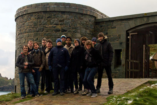 photo by Ben Firshman
Equality inside the fortress walls
Something magical about the fort is how everyone leaves the outside world on the drawbridge. Job titles, professional status, Twitter followers, and so on. Like scout camp, a mutual respect and trust is expected of all the participants. Like extreme programming, extreme design requires us all to be equal partners in a collaborative team. I think this is especially worth noting for designers; our past is filled with the clear hierarchy of the traditional studio system which, however important for taste and style, seems less compatible with modern web/software development methods.
Being equal doesn’t mean being the same, however. We established clear roles and teams for ourselves on the second day, deferring to that person when a decision needed to be made. As the interface coalesced, the designers and developers took ownership over certain parts to ensure the details got looked after, while staying open to ideas and revisions from the rest of the cohort.
Create a space where everyone who enters is equal, but be sure to establish clear roles. Even if it’s just for a short while, the environment will be beneficial.
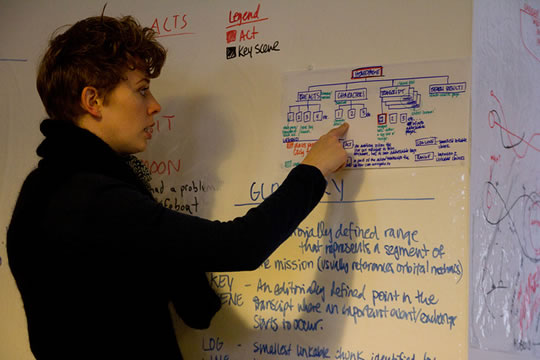 photo by Ben Firshman
Hang your heraldry from the rafters
Forts and castles are full of lore: coats of arms; paintings of battles; suits of armour. It’s impossible not to be surrounded by these stories, words and ways of thinking. Like the whiteboards on the walls, putting organisational lore in your physical surroundings makes it impossible not to see.
Ryan Alexander brought some of those static-cling whiteboard sheets which were quickly filled with use cases; IA; team roles; and, most importantly, a glossary. As soon as we started working on the project, we realised we needed to get clear on what certain words meant: what was a logline, a range, a phase, a key moment? Were the back-end people using these words in the same way design and product was? Quickly writing up a glossary of terms meant everyone was instantly speaking the same language. There was no “Ah, I misunderstood because in the data structure x means y” or, even worse, accidental seepage of technical language into the user interface copy.
Put a glossary of your internal terminology somewhere big and fat on the wall. Stand around it and argue until you agree on what it says. Leave it up; don’t underestimate the power of ambient communication and physical reference.
Plan more, download less
While internet is forbidden inside the fort, we did go on downloading expeditions: NASA photography; code documentation; and so on. The project wouldn’t have been possible without a few trips to the web. We had two lists on the wall: groceries and supplies; internets – “loo roll; Tom Stafford photo“.
This changed our usual design process, forcing us to plan carefully and think of what we needed ahead of time. Getting to the internet was a thirty-minute hike up a snow covered cliff to the town airport, so you really had to need it, too.
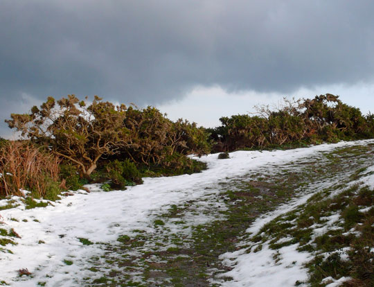 The path to the internet
For the visual design, especially, this resulted in more focus up front, and communication between the designers on what assets we required. It made us make decisions earlier and stick with them, creating less distraction and churn later in the process.
Try it at home: unplug once you’ve got the things you need. As an artist, it’s easier to let your inner voice shine through if you’re not looking at other people’s work while creating.
Social design
Finally, our design team experimented with a collaborative approach to wireframing. Once we had collectively nailed down use cases, IA, user journeys and other critical artefacts, we tried a pairing approach. One person drew in Illustrator in real time as the other two articulated what to draw. (This would work equally well with two people, but with three it meant that one of us could jump up and consult the lore on the walls or clarify a technical detail.) The result: we ended up considering more alternatives and quickly rallying around one solution, and resolved difficult problems more quickly.
At a certain stage we discovered it was more efficient for one person to take over – this happened around the time when the basic wireframes existed in Illustrator and we’d collectively run through the use cases, making sure that everything was accounted for in a broad sense. At this point, take a break, go have a beer, and give yourself a pat on the back.
Put the files somewhere accessible so everyone can use them as their base, and divide up the more detailed UI problems, screens or journeys. At this level of detail it’s better to have your personal headspace.
Gavin called this ‘social design’. Chatting and drawing in real time turned what was normally a rather solitary act into a very social process, with some really promising results. I’d tried something like this before with product or developer folks, and it can work – but there’s something really beautiful about switching places and everyone involved being equally quick at drawing. That’s not something you get with non-designers, and frequent swapping of the ‘driver’ and ‘observer’ roles is a key aspect to pairing.
Tackle the forest collectively and the trees individually – it will make your framework more robust and your details more polished. Win/win.
The return home
Grateful to see a 3G signal on our phones again, our flight off the island was delayed, allowing for a flurry of domain name look-ups, Twitter catch-up, and e-mails to loved ones. A week in an isolated fort really made me appreciate continuous connectivity, but also just how unique some of these processes might be.
You just never know what crazy place you might be designing from next.
About the author
Originally from Canada’s icy north, Hannah Donovan is creative director at Last.fm, where she’s worked for the last four years. Before moving to London to work at Last.HQ, she designed websites with Canada’s largest youth-focused agency working on brands such as Hershey, Heineken and Bic. Previous to that, Hannah designed for Street Print, a Canada Research Council funded, open source web app for sharing and archiving printed ephemera. Hannah also plays the cello with an orchestra and draws monsters.
