Ignorance Is Bliss
This is a true story.
Meet Mike
Mike’s a smart guy. He knows a great browser when he sees one. He uses Firefox on his Windows PC at work and Safari on his Mac at home. Mike asked us to design a Web site for his business. So we did.
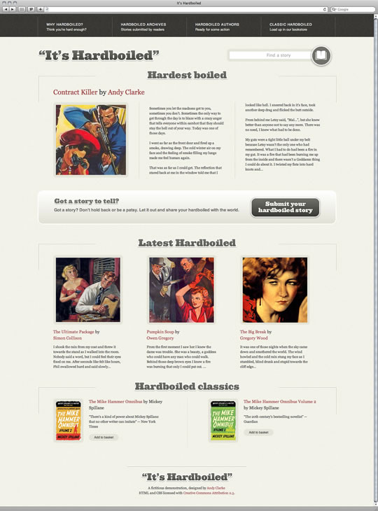
We wanted to make the best Web site for Mike that we could, so we used all of the CSS tools that are available today. That meant using RGBa colour to layer elements, border-radius to add subtle rounded corners and (possibly most experimental of all new CSS), generated gradients.
 The home page Mike sees in Safari on his Mac
Mike loves what he sees.
Meet Sam
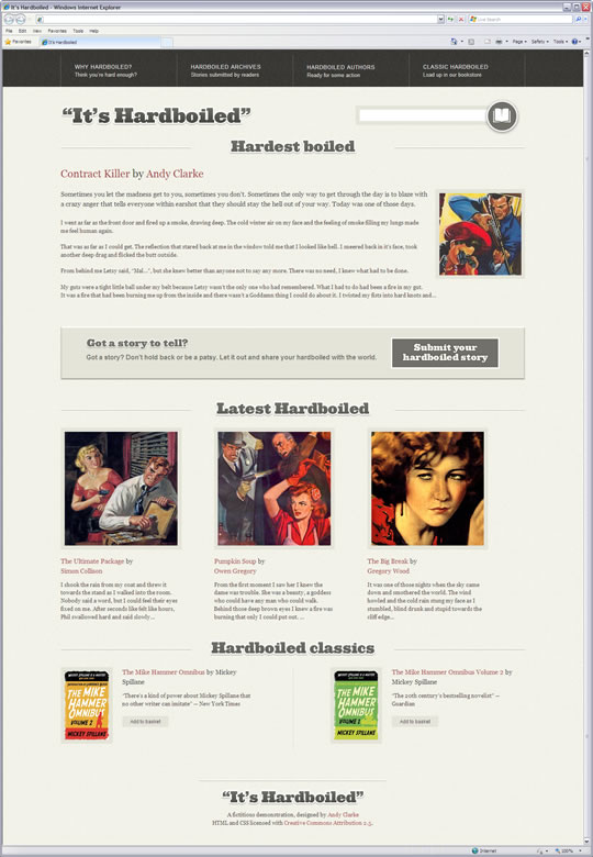
Sam works with Mike. She uses Internet Explorer 7 because it came on the Windows laptop that the company bought her when she joined.
 The home page Sam sees in Internet Explorer 7 on her PC
Sam loves the new Web site too.
How could both of them be happy when they experienced the Web site differently?
The new WYSIWYG
When I first presented my designs to Mike and Sam, I showed them a Web page made with HTML and CSS in their respective browsers and not a picture of a Web page. By showing neither a static image of my design, I set none of the false expectations that, by definition, a static Photoshop or Fireworks visual would have established.
Mike saw rounded corners and subtle shadows in Firefox and Safari. Sam saw something equally as nice, just a little different, in Internet Explorer. Both were very happy because they saw something that they liked.
Neither knew, or needed to know, about the subtle differences between browsers. Their users don’t need to know either.
That’s because in the real world, people using the Web don’t find a Web site that they like, then open up another browser to check that it looks they same. They simply buy what they came to buy, read what what they came to read, do what they came to do, then get on with their lives in blissful ignorance of what they might be seeing in another browser.
Often when I talk or write about using progressive CSS, people ask me, “How do you convince clients to let you work that way? What’s your secret?” Secret? I tell them what they need to know, on a need-to-know basis.
Epilogue
Sam has a new iPhone that Mike bought for her as a reward for achieving her sales targets. She loves her iPhone and was surprised at just how fast and good-looking the company Web site appears on that. So she asked,
“Andy, I didn’t know you optimised our site for mobile. I don’t remember seeing an invoice for that.”
I smiled.
“That one was on the house.”
About the author
Andy Clarke is one of the world’s best-known website designers, consultant, speaker, and writer on art direction and design for products and websites. Andy founded Stuff & Nonsense in 1998 and for 20 years has helped companies big and small to improve their website and product designs. Andy’s the author of four web design books including ‘Transcending CSS,’ ‘Hardboiled Web Design’ and ‘Art Direction for the Web’. He really, really loves gorillas.


