Don't Lose Your :focus

For many web designers, accessibility conjures up images of blind users with screenreaders, and the difficulties in making sites accessible to this particular audience. Of course, accessibility covers a wide range of situations that go beyond the extreme example of screenreader users. And while it’s true that making a complex site accessible can often be a daunting prospect, there are also many small things that don’t take anything more than a bit of judicious planning, are very easy to test (without having to buy expensive assistive technology), and can make all the difference to certain user groups.
In this short article we’ll focus on keyboard accessibility and how careless use of CSS can potentially make your sites completely unusable.
Keyboard Access
Users who for whatever reason can’t use a mouse will employ a keyboard (or keyboard-like custom interface) to navigate around web pages. By default, they will use TAB and SHIFT + TAB to move from one focusable element (links, form controls and area) of a page to the next.
Note: in OS X, you’ll first need to turn on full keyboard access under System Preferences > Keyboard and Mouse > Keyboard Shortcuts. Safari under Windows needs to have the option Press Tab to highlight each item on a webpage in Preferences > Advanced enabled. Opera is the odd one out, as it has a variety of keyboard navigation options – the most relevant here being spatial navigation via Shift+Down, Shift+Up, Shift+Left, and Shift+Right).
But I Don’t Like Your Dotted Lines…
To show users where they are within a page, browsers place an outline around the element that currently has focus. The “problem” with these default outlines is that some browsers (Internet Explorer and Firefox) also display them when a user clicks on a focusable element with the mouse. Particularly on sites that make extensive use of image replacement on links with “off left” techniques this can create very unsightly outlines that stretch from the replaced element all the way to the left edge of the browser.
 Outline bleeding off to the left (image-replacement example from carsonified.com)
There is a trivial workaround to prevent outlines from “spilling over” by adding a simple overflow:hidden, which keeps the outline in check around the clickable portion of the image-replaced element itself.
 Outline tamed with
 overflow:hidden
But for many designers, even this is not enough. As a final solution, many actively suppress outlines altogether in their stylesheets. Controversially, even Eric Meyer’s popular reset.css – an otherwise excellent set of styles that levels the playing field of varying browser defaults – suppresses outlines.
html, body, div, span, applet, object, iframe ... {
	...
	outline: 0;
	...
}
/* remember to define focus styles! */
:focus {
	outline: 0;
}
Yes, in his explanation (and in the CSS itself) Eric does remind designers to define relevant styles for :focus… but judging by the number of sites that seem to ignore this (and often remove the related comment from the stylesheet altogether), the message doesn’t seem to have sunk in.
Anyway… hurrah! No more unsightly dotted lines on our lovely design. But what about keyboard users? Although technically they can still TAB from one element to the next, they now get no default cue as to where they are within the page (one notable exception here is Opera, where the outline is displayed regardless of stylesheets)… and if they’re Safari users, they won’t even get an indication of a link’s target in the status bar, like they would if they hovered over it with the mouse.
Only Suppress outline For Mouse Users
Is there a way to allow users navigating with the keyboard to retain the standard outline behaviour they’ve come to expect from their browser, while also ensuring that it doesn’t show display for mouse users?
 Testing some convoluted style combinations
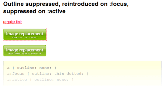
After playing with various approaches (see Better CSS outline suppression for more details), the most elegant solution also seemed to be the simplest: don’t remove the outline on :focus, do it on :active instead – after all, :active is the dynamic pseudo-class that deals explicitly with the styles that should be applied when a focusable element is clicked or otherwise activated.
a:active { outline: none; }The only minor issues with this method: if a user activates a link and then uses the browser’s back button, the outline becomes visible. Oh, and old versions of Internet Explorer notoriously get confused by the exact meaning of :focus, :hover and :active, so this method fails in IE6 and below. Personally, I can live with both of these.
Note: at the last minute before submitting this article, I discovered a fatal flaw in my test. It appears that outline still manages to appear in the time between activating a link and the link target loading (which in hindsight is logical – after activation, the link does indeed receive focus). As my test page only used in-page links, this issue never came up before. The slightly less elegant solution is to also suppress the outline on :hover.
a:hover, a:active { outline: none; }In Conclusion
Of course, many web designers may argue that they know what’s best, even for their keyboard-using audience. Maybe they’ve removed the default outline and are instead providing some carefully designed :focus styles. If they know for sure that these custom styles are indeed a reliable alternative for their users, more power to them… but, at the risk of sounding like Jakob “blue underlined links” Nielsen, I’d still argue that sometimes the default browser behaviours are best left alone. Complemented, yes (and if you’re already defining some fancy styles for :hover, by all means feel free to also make them display on :focus)… but not suppressed.

About the author
Patrick H. Lauke works as Web Evangelist in the Developer Relations team at Opera Software. He has been engaged in the discourse on standards and accessibility since early 2001 – regularly speaking at conferences and contributing to a variety of web development and accessibility related mailing lists and initiatives such as the Web Standards Project and the Webkrauts. For more of his ruminations and weird experiments you can visit Patrick’s personal site.
Brought to you by
Related articles
-
Accessibility Through Semantic HTML
Laura Kalbag takes us back to basics to make sure we consider accessibility when structuring our HTML. The Christmas tree needs to be standing firm before we drape it in lights and tinsel, and until you lot start doing it, we’re not going to stop preaching it.
-
Automating Your Accessibility Tests
Seren Davies reminds us that unlike Christmas, accessibility testing should not come but once a year with a look at how to apply automated testing. By configuring tests to run against each commit, you can ensure that your site’s accessibility compliance need not be left to chance.
-
Designing with Contrast
Mark Mitchell casts coarse salt upon the pale icy sheen of recent web design aesthetics to sound a warning that we may be on thin ice. The tension between low contrast tastes and high contrast needs is a story as old as the
<font>tag, and yet it bears frequent retelling. For snow has fallen snow on snow. -
Don’t Push Through the Pain
Carolyn Wood reminds us of what in recent years we’ve come to overlook, hunched as we are over laptop and tablet: our physical wellbeing. Sometimes, that tingle down your arm from shoulder to fingers isn’t Christmas magic.
-
Future Accessibility Guidelines—for People Who Can’t Wait to Read Them
Alan Dalton uses this, the International Day of Persons with Disabilities, to look back at where we’ve come from, to evaluate where we are, and to look forward to what’s coming next in the future of accessibility guidelines.
-
Inclusive Considerations When Restyling Form Controls
Scott O’Hara hogs the remote while he looks into the ever-present issue of custom form controls. We might brute-force an element to take on the styling we’re looking for, but will that interaction still make sense for all users? Let’s give the batteries a rub and find out.