Shiny Happy Buttons

Since Mac OS X burst onto our screens, glossy, glassy, shiny buttons have been almost de rigeur, and have essentially, along with reflections and rounded corners, become a cliché of Web 2.0 “design”. But if you can’t beat ‘em you’d better join ‘em. So, in this little contribution to our advent calendar, we’re going to take a plain old boring HTML button, and 2.0 it up the wazoo.
But, here’s the catch. We’ll use no images, either in our HTML or our CSS. No sliding doors, no image replacement techniques. Just straight up, CSS, CSS3 and a bit of experimental CSS. And, it will be compatible with pretty much any browser (though with some progressive enhancement for those who keep up with the latest browsers).
The HTML
We’ll start with our HTML.
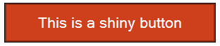
<button type="submit">This is a shiny button</button>OK, so it’s not shiny yet – but boy will it ever be.
Before styling, that’s going to look like this.
Ironically, depending on the operating system and browser you are using, it may well be a shiny button already, but that’s not the point. We want to make it shiny 2.0. Our mission is to make it look something like this

If you want to follow along at home keep in mind that depending on which browser you are using you may see fewer of the CSS effects we’ve added to create the button. As of writing, only in Safari are all the effects we’ll apply supported.
Taking a look at our finished product, here’s what we’ve done to it:
- We’ve given the button some padding and a width.
- We’ve changed the text color, and given the text a drop shadow.
- We’ve given the button a border.
- We’ve given the button some rounded corners.
- We’ve given the button a drop shadow.
- We’ve given the button a gradient background.
and remember, all without using any images.
Styling the button
So, let’s get to work.
First, we’ll add given the element some padding and a width:
button {
	padding: .5em;
	width: 15em;
}
Next, we’ll add the text color, and the drop shadow:
color: #ffffff;
text-shadow: 1px 1px 1px #000;
A note on text-shadow
If you’ve not seen text-shadows before well, here’s the quick back-story. Text shadow was introduced in CSS2, but only supported in Safari (version 1!) some years later. It was removed from CSS2.1, but returned in CSS3 (in the text module). It’s now supported in Safari, Opera and Firefox (3.1). Internet Explorer has a shadow filter, but the syntax is completely different.
So, how do text-shadows work? The three length values specify respectively a horizontal offset, a vertical offset and a blur (the greater the number the more blurred the shadow will be), and finally a color value for the shadow.
Rounding the corners
Now we’ll add a border, and round the corners of the element:
border: solid thin #882d13;
-webkit-border-radius: .7em;
-moz-border-radius: .7em;
border-radius: .7em;
Here, we’ve used the same property in three slightly different forms. We add the browser specific prefix for Webkit and Mozilla browsers, because right now, both of these browsers only support border radius as an experimental property. We also add the standard property name, for browsers that do support the property fully in the future.
The benefit of the browser specific prefix is that if a browser only partly supports a given property, we can easily avoid using the property with that browser simply by not adding the browser specific prefix. At present, as you might guess, border-radius is supported in Safari and Firefox, but in each the relevant prefix is required.
border-radius takes a length value, such as pixels. (It can also take two length values, but that’s for another Christmas.) In this case, as with padding, I’ve used ems, which means that as the user scales the size of text up and down, the radius will scale as well. You can test the difference by making the radius have a value of say 5px, and then zooming up and down the text size.
We’re well and truly on the way now. All we need to do is add a shadow to the button, and then a gradient background.
In CSS3 there’s the box-shadow property, currently only supported in Safari 3. It’s very similar to text-shadow – you specify a horizontal and vertical offset, a blur value and a color.
-webkit-box-shadow: 2px 2px 3px #999;
box-shadow: 2px 2px 2px #bbb;
Once more, we require the “experimental” -webkit- prefix, as Safari’s support for this property is still considered by its developers to be less than perfect.
Gradient Background
So, all we have left now is to add our shiny gradient effect. Now of course, people have been doing this kind of thing with images for a long time. But if we can avoid them all the better. Smaller pages, faster downloads, and more scalable designs that adapt better to the user’s font size preference. But how can we add a gradient background without an image?
Here we’ll look at the only property that is not as yet part of the CSS standard – Apple’s gradient function for use anywhere you can use images with CSS (in this case backgrounds). In essence, this takes SVG gradients, and makes them available via CSS syntax.
Here’s what the property and its value looks like:
background-image: -webkit-gradient(linear, left top, left bottom, from(#e9ede8), to(#ce401c),color-stop(0.4, #8c1b0b));Zooming in on the gradient function, it has this basic form:
-webkit-gradient(type, point, point, from(color), to(color),color-stop(where, color));Which might look complicated, but is less so than at first glance.
The name of the function is gradient (and in this case, because it is an experimental property, we use the -webkit- prefix).
You might not have seen CSS functions before, but there are others, including the attr() function, used with generated content. A function returns a value that can be used as a property value – here we are using it as a background image.
Next we specify the type of the gradient. Here we have a linear gradient, and there are also radial gradients.
After that, we specify the start and end points of the gradient – in our case the top and bottom of the element, in a vertical line.
We then specify the start and end colors – and finally one stop color, located at 40% of the way down the element. Together, this creates a gradient that smoothly transitions from the start color in the top, vertically to the stop color, then smoothly transitions to the end color.
There’s one last thing. What color will the background of our button be if the browser doesn’t support gradients? It will be white (or possibly some default color for buttons). Which may make the text difficult or impossible to read. So, we’ll add a background color as well (see why the validator is always warning you when a color but not a background color is specified for an element?).
If we put it all together, here’s what we have:
button {
	width: 15em;
	padding: .5em;
	color: #ffffff;
	text-shadow: 1px 1px 1px #000;
	border: solid thin #882d13;
	-webkit-border-radius: .7em;
	-moz-border-radius: .7em;
	border-radius: .7em;
	-webkit-box-shadow: 2px 2px 3px #999;
	box-shadow: 2px 2px 2px #bbb;
	background-color: #ce401c;
	background-image: -webkit-gradient(linear, left top, left bottom, from(#e9ede8), to(#ce401c),color-stop(0.4, #8c1b0b));
}
Which looks like this in various browsers:
In Safari (3)
In Firefox 3.1 (3.0 supports border-radius but not text-shadow)

In Opera 10

and of course in Internet Explorer (version 8 shown here)
But it looks different in different browsers
Yes, it does look different in different browsers, but we all know the answer to the question “do web sites need to look the same in every browser?“.
Even if you really think sites should look the same in every browser, hopefully this little tutorial has whet your appetite for what CSS3 and experimental CSS that’s already supported in widely used browsers (and we haven’t even touched on animations and similar effects!).
I hope you’ve enjoyed out little CSSMas present, and look forward to seeing your shiny buttons everywhere on the web.
Oh, and there’s just a bit of homework – your job is to use the :hover selector, and make a gradient in the hover state.
About the author
John Allsopp is a founder of Westciv, an Australian web software development and training company, which provides some of the best CSS resources and tutorials on the web. Westciv’s software and training are used in dozens of countries around the World. The head developer of the leading cross platform CSS editor, Style Master, John has written on web development issues for numerous web and print publications and was one of the earliest members of the Web Standards Project.
Brought to you by
Related articles
-
A History of CSS Through Fifteen Years of 24 ways
Rachel Andrew guides us through a tour of the last fifteen years in CSS layout, as manifested in articles here on 24 ways. From the days when Internet Explorer 6 was de rigueur, right up to the modern age of evergreen browsers, the only thing you can be sure of is that the web never stands still for long.
-
A Modern Typographic Scale
Rob Weychert reaches for the top notes to sing us a song of typographic scale. A little attention to scale and to the mathematics will help you to hit a high note with your designs this Christmas and beyond.
-
Beautiful Scrolling Experiences – Without Libraries
Michelle Barker appears as one of a heavenly host, coming forth with scroll in hand to pronounce an end to janky scrolljacking! Unto us a new specification is born, in the city of TimBL, and its name shall be called Scroll Snap.
-
Cascading Web Design with Feature Queries
Chen Hui Jing pulls off the dust covers, swings open the storm shutters and lets the winter light fall on the subject of CSS feature queries. The chestnuts may not yet be roasting, and the halls may be still be undecked, but pull up a chair and settle down. It’s Christmas.
-
Clip Paths Know No Bounds
Dan Wilson throws some Christmas shapes and gives us a run down of different ways to use CSS polygon clip paths to create interesting a flexible shapes with less code that you might have thought. It may be the time of year to follow a star, but was the star plotted with five or ten points?
-
Flexible Captioned Slanted Images
Eric Meyer gift wraps the most awkwardly shaped of boxes using nothing but CSS, HTML and a little curl of ribbon. No matter how well you plan and how much paper you have at your disposal, sometimes you just need to slant the gift to the side.


