A Festive Type Folly

‘Tis the season to be jolly, so the carol singers tell us. At 24 ways, we’re keeping alive another British tradition that includes the odd faux-Greco-Roman building dotted around the British countryside, Tower Bridge built in 1894, and your Dad’s Christmas jumper with the dancing reindeer motif. ‘Tis the season of the folly!
The example is not an image, just text. You may wish to see a screenshot in Safari to compare with your own operating system and browser rendering.
Like all follies this is an embellishment — a bit of web typography fun. It’s similar to the masthead text at my place, but it’s also a hyperlink. Unlike the architectural follies of the past, no child labour was used to fund or build it, just some HTML flavoured with CSS, and a heavy dose of Times New Roman. Why Times New Roman, you ask? Well, after a few wasted hours experimenting with heaps of typefaces, seeking an elusive consistency of positioning and rendering across platforms, it proved to be the most consistent. Who’d‘a thought? To make things more interesting, I wanted to use a traditional scale and make the whole thing elastic by using relative lengths that would react to a person’s font size. So, to the meat of this festive frippery:
There are three things we rely on to create this indulgence:
HTML & Descendant Selectors
The markup for the folly might seem complex at first glance. To semantics pedants and purists it may seem outrageous. If that’s you, read on at your peril! Here it is with lots of whitespace:
<div id="type">
<h1>
  <a href="/">
    <em>2
      <span>4
        <span>w
          <span>a
            <span>y
              <span>s</span>
            </span>
          </span>
        </span>
      </span>
    </em>
    <strong>to
      <span>i
        <span>m
          <span>pre
            <span>s
              <span>s
                <span>your
                  <span>friends</span>
                </span>
              </span>
            </span>
          </span>
        </span>
      </span>
    </strong>
  </a>
</h1>
</div>
Why so much markup? Well, we want to individually style many of the glyphs. By nesting the elements, we can pick out the bits we need as descendant selectors.
To retain a smidgen of semantics, the text is wrapped in <h1> and <a> elements. The two phrases, “24 ways” and “to impress your friends” are wrapped in <em> and <strong> tags, respectively. Within those loving arms, their descendant <span>s cascade invisibly, making a right mess of our source, but ready to be picked out in our CSS rules.
So, to select the “2” from the example we can simply write, #type h1 em{ }. Of course, that selects everything within the <em> tags, but as we drill down the document tree, selecting other glyphs, any property / value styles can be reset or changed as required.
Pixels Versus Ems
Before we get stuck into the CSS, I should say that the goal here is to have everything expressed in relative “em” lengths. However, when I’m starting out, I use pixels for all values, and only convert them to ems after I’ve finished. It saves re-calculating the em length for every change I make as the folly evolves, but still makes the final result elastic, without relying on browser zoom.
To skip ahead, see the complete CSS.
Absolutely Positioned Glyphs
If a parent element has position: relative, or position: absolute applied to it, all children of that parent can be positioned absolutely relative to it. (See Dave Shea’s excellent introduction to this.) That’s exactly how the folly is achieved. As the parent, #type also has a font-size of 16px set, a width and height, and some basic style with a background and border:
#type{
	font-size: 16px;
	text-align: left;
	background: #e8e9de;
	border: 0.375em solid #fff;
	width: 22.5em;
	height: 13.125em;
	position: relative;
}
The h1 is also given a default style with a font-size of 132px in ems relative to the parent font-size of 16px:
#type h1{
	font-family: "Times New Roman", serif;
	font-size: 8.25em; /* 132px */
	line-height: 1em;
	font-weight: 400;
	margin: 0;
	padding: 0;
}
To get the em value, we divide the required size in pixels by the actual parent font-size in pixels
132 ÷ 16 = 8.25
We also give the descendants of the h1 some default properties. The line height, style and weight are normalised, they are positioned absolutely relative to #type, and a border and padding is applied:
#type h1 em,
#type h1 strong,
#type h1 span{
	line-height: 1em;
	font-style: normal;
	font-weight: 400;
	position: absolute;
	padding: 0.1em;
	border: 1px solid transparent;
}
The padding ensures that some browsers don’t forget about parts of a glyph that are drawn outside of their invisible container. When this happens, IE will trim the glyph, cutting off parts of descenders, for example. The border is there to make sure the glyphs have layout. Without this, positioning can be problematic. IE6 will not respect the transparent border colour — it uses the actual text colour — but in all other respects renders the example. You can hack around it, but it seemed unnecessary for this example.
Once these defaults are established, the rest is trial and error. As a quick example, the numeral “2” is first to be positioned:
#type h1 a em{
	font-size: 0.727em; /* (2) 96px */
	left: 0.667em;
	top: 0;
}
Every element of the folly is positioned in exactly the same way as you can see in the complete CSS. When converting pixels to ems, the font-size is set first. Then, because we know what that is, we calculate the equivalent x- and y-position accordingly.
Inheritance
CSS inheritance gave me a headache a long time ago when I first encountered it. After the penny dropped I came to experience something disturbingly close to affection for this characteristic. What it basically means is that children inherit the characteristics of their parents. For example:
- We gave
#typeafont-sizeof 16px. - For
#type h1we changed it by settingfont-size: 8.25em;. Than means that#type h1now has a computedfont-sizeof 8.25 × 16px = 132px. - Now, all children of
#type h1in the document tree will inherit afont-sizeof 132px unless we explicitly change it as we did for#type h1 a em.
The “2” in the example — selected with #type h1 a em — is set at 96px with left and top positioning calculated relatively to that. So, the left position of 0.667em is 0.667 × 96 = 64px, approximately (three decimal points in em lengths don’t always give exact pixel equivalents).
One way to look at inheritance is as a cascade of dependancy: In our example, the computed font size of any given element depends on that of the parent, and the absolute x- and y-position depends on the computed font size of the element itself.
Link Colours
The same descendant selectors we use to set and position the type are also used to apply the colour by combining them with pseudo-selectors like :focus and :hover. Because the descendant selectors are available to us, we can pretty much pick out any glyph we like. First, we need to disable the underline:
#type h1 a:link,
#type h1 a:visited{
	text-decoration: none;
}
In our example, the “24” has a unique default state (colour):
#type h1 a:link em,
#type h1 a:visited em{
	color: #624;
}
The rest of the “Ways” text has a different colour, which it shares with the large “s” in “impress”:
#type h1 a:link em span span,
#type h1 a:visited em span span,
#type h1 a:link strong span span span span,
#type h1 a:visited strong span span span span{
	color: #b32720;
}
“24” changes on :focus, :hover and :active. Critically though, the whole of the “24 Ways” text, and the large “s” in “impress” all have the same style in this instance:
#type h1 a:focus em,
#type h1 a:hover em,
#type h1 a:active em,
#type h1 a:focus em span span,
#type h1 a:hover em span span,
#type h1 a:active em span span,
#type h1 a:focus strong span span span span,
#type h1 a:hover strong span span span span,
#type h1 a:active strong span span span span{
	color: #804;
}
If a descendant selector has a :link and :visited state set as a pseudo element, it needs to also have the corresponding :focus, :hover and :active states set.
A Final Note About Web Typography
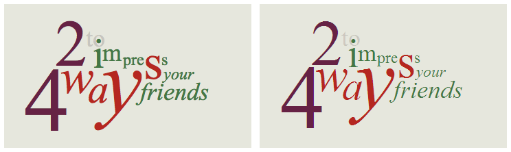
From grids to basic leading to web fonts, and even absolute positioning, there’s a wealth of things we can do to treat type on the Web with love and respect. However, experiments like this can highlight the vagaries of rasterisation and rendering that limit our ability to achieve truly subtle and refined results. At the operating system level, the differences in type rendering are extreme, and even between sequential iterations in Windows — from Standard to ClearType — they can be daunting. Add to that huge variations in screen quality, and even the paper we print our type onto has many potential variations. Compare our example in Safari 3.2.1 / OS X 10.5.5 (left) and IE7 / Win XP (right). Both rendered on a 23” Apple Cinema HD (LCD):
Browser developers continue to make great strides. However, those of us who set type on the Web need more consistency and quality if we want to avoid technologies like Flash and evolve web typography. Although web typography is inevitably — and mistakenly — compared unfavourably to print, it has the potential to achieve the same refinement in a different way. Perhaps one day, the glyphs of our favourite faces, so carefully crafted, kerned and hinted for the screen, will be rendered with the same precision with which they were drawn by type designers and styled by web designers. That would be my wish for the new year. Happy holidays!
About the author
Jon Tan is a designer and typographer who co-founded the web fonts service, Fontdeck. He’s a partner in Fictive Kin, where he works with friends making things like Brooklyn Beta and Mapalong.
His addiction to web typography has led him to share snippets of type news via @t8y. He also writes for publications like Typographica and 8 Faces, speaks at international events like An Event Apart, and works with such organisations as the BBC.
Jon is based in Mild Bunch HQ, the co-working studio he started in Bristol, UK. He can often be found wrestling with his two sons, losing, then celebrating the fact as @jontangerine on Twitter.
Brought to you by
Related articles
-
An Introduction to Variable Fonts
Jason Pamental forges a path through the freshly laid snowy landscape of variable fonts. Like a brave explorer in a strange new typography topology let Jason show you the route to some fantastic font feats. Everything you thought you knew has changed.
-
Interactivity and Animation with Variable Fonts
Mandy Michael turns the corner on our variable font adventure and stumbles into a grotto of wonder and amazement. Not forgetting the need for a proper performance budget, Mandy shows how variable fonts can free your creativity from bygone technical constraints.
-
Managing Flow and Rhythm with CSS Custom Properties
Andy Bell rings out a call for a more flexible method of achieving consistent vertical rhythm across components within a page. Using a technique of CSS custom properties to establish spacing inherited through the cascade, you can make sure your choir are all singing from the same song sheet.
-
Get the Balance Right: Responsive Display Text
Richard Rutter shepherds a tea towel onto our collective heads and describes a technique for responsively scaling display text to maintain a consistent feel in both landscape and portrait screen orientations. That should put things back into proportion.
-
Run Ragged
Mark Boulton completes our calendar with some typographic techniques to improve the reading experience. Typography, like Christmas and advent calendars, relies on the accumulation of small gains for its best effects.
-
Get Expressive with Your Typography
Richard Rutter adapts an extract from his forthcoming book on web typography and encourages us to be brave with type choices. By allowing type to express a website’s intentions from even before the moment a visitor starts to read, we can help set the tone and our users’ expectations.


