Underpants Over My Trousers

With Christmas approaching faster than a speeding bullet, this is the perfect time for you to think about that last minute present to buy for the web geek in your life. If you’re stuck for ideas for that special someone, forget about that svelte iPhone case carved from solid mahogany and head instead to your nearest comic-book shop and pick up a selection of comics or graphic novels. (I’ll be using some of my personal favourite comic books as examples throughout).
Trust me, whether your nearest and dearest has been reading comics for a while or has never peered inside this four-colour world, they’ll thank-you for it.
Aside from indulging their superhero fantasies, comic books can provide web designers with a rich vein of inspiring ideas and material to help them create shirt button popping, trouser bursting work for the web. I know from my own personal experience, that looking at aspects of comic book design, layout and conventions and thinking about the ways that they can inform web design has taken my design work in often-unexpected directions.
There are far too many fascinating facets of comic book design that provide web designers with inspiration to cover in the time that it takes to pull your underpants over your trousers. So I’m going to concentrate on one muscle bound aspect of comic design, one that will make you think differently about how you lay out the content of your pages in panels.
A suitcase full of Kryptonite
Now, to the uninitiated onlooker, the panels of a comic book may appear to perform a similar function to still frames from a movie. But inside the pages of a comic, panels must work harder to help the reader understand the timing of a story. It is this method for conveying narrative timing to a reader that I believe can be highly useful to designers who work on the web as timing, drama and suspense are as important in the web world as they are in worlds occupied by costumed crime fighters and superheroes.
I’d like you to start by closing your eyes and thinking about your own process for laying out panels of content on a page. OK, you’ll actually be better off with your eyes open if you’re going to carry on reading.
I’ll bet you a suitcase full of Kryptonite that you often, if not always, structure your page layouts, and decide on the dimensions of those panels according to either:
- The base grid that you are working to
- The Golden Ratio or another mathematical schema
More likely, I bet that you decide on the size and the number of your panels based on the amount of content that will be going into them. From today, I’d like you to think about taking a different approach. This approach not only addresses horizontal and vertical space, but also adds the dimension of time to your designs.
Slowing down the action
A comic book panel not only acts as a container for its content but also indicates to a reader how much time passes within the panel and as a result, how much time the reader should focus their attention on that one panel.
Smaller panels create swift eye movement and shorter bursts of attention. Larger panels give the perception of more time elapsing in the story and subconsciously demands that a reader devotes more time to focus on it.
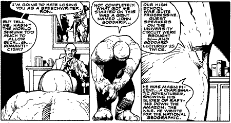
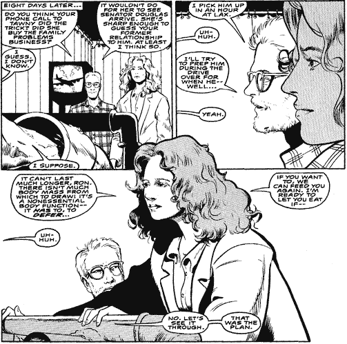
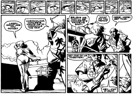 Concrete by Paul Chadwick (Dark Horse Comics)
This use of panel dimensions to control timing can also be useful for web designers in designing the reading/user experience. Imagine a page full of information about a product or service. You’ll naturally want the reader to focus for longer on the key benefits of your offering rather than perhaps its technical specifications.
Now take a look at this spread of pages from Watchmen by Alan Moore and Dave Gibbons.
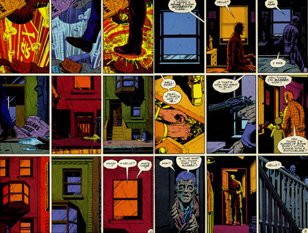 Watchmen by Alan Moore and Dave Gibbons (Diamond Comic Distributors 2004)
Throughout this series of (originally) twelve editions, artist Dave Gibbons stuck rigidly to his 3×3 panels per page design and deviated from it only for dramatic moments within the narrative.
In particular during the last few pages of chapter eleven, Gibbons adds weight to the impending doom by slowing down the action by using larger panels and forces the reader to think longer about what was coming next. The action then speeds up through twelve smaller panels until the final panel: nothing more than white space and yet one of the most iconic and thought provoking in the entire twelve book series.
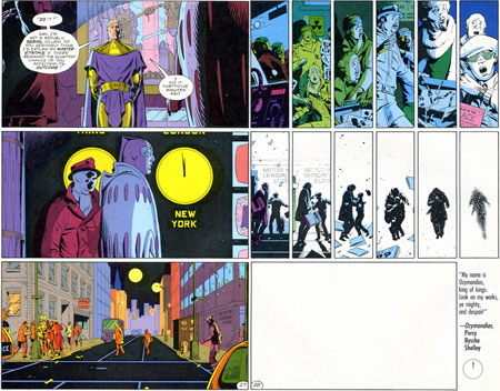 Watchmen by Alan Moore and Dave Gibbons (Diamond Comic Distributors 2004)
On the web it is common for clients to ask designers to fill every pixel of screen space with content, perhaps not understanding the drama that can be added by nothing more than white space.
In the final chapter, Gibbons emphasises the carnage that has taken place (unseen between chapters eleven and twelve) by presenting the reader with six full pages containing only single, large panels.
 Watchmen by Alan Moore and Dave Gibbons (Diamond Comic Distributors 2004)
This drama, created by the artist’s use of panel dimensions to control timing, is a technique that web designers can also usefully employ when emphasising important areas of content.
Think back for a moment to the home page of Apple Inc., during the launch of their iconic iPhone, where the page contained nothing more than a large image and the phrase “Say hello to iPhone”. Rather than fill the page with sales messages, Apple’s designers allowed the space itself to tell the story and created a real sense of suspense and expectation among their readers.
Borders
Whereas on the web, panel borders are commonly used to add emphasis to particular areas of content, in comic books they take on a different and sometimes opposite role.
In the examples so far, borders have contained all of the action. Removing a border can have the opposite effect to what you might at first think. Rather than taking emphasis away from their content, in comics, borderless panels allow the reader’s eyes to linger for longer on the content adding even stronger emphasis.
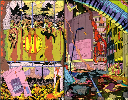
 Concrete by Paul Chadwick (Dark Horse Comics)
This effect is amplified when the borderless content is allowed to bleed to the edges of a page. Because the content is no longer confined, except by the edges of the page (both comic and web) the reader’s eye is left to wander out into open space.
 Concrete by Paul Chadwick (Dark Horse Comics)
This type of open, borderless content panel can be highly useful in placing emphasis on the most important content on a page in exactly the very opposite way that we commonly employ on the web today.
So why is time an important dimension to think about when designing your web pages? On one level, we are often already concerned with the short attention spans of visitors to our pages and should work hard to allow them to quickly and easily find and read the content that both they and we think is important. Learning lessons from comic book timing can only help us improve that experience.
On another: timing, suspense and drama are already everyday parts of the web browsing experience. Will a reader see what they expect when they click from one page to the next? Or are they in for a surprise?
Most importantly, I believe that the web, like comics, is about story telling: often the story of the experiences that a customer will have when they use our product or service or interact with our organisation. It is this element of story telling than can be greatly improved by learning from comics.
It is exactly this kind of learning and adapting from older, more established and at first glance unrelated media that you will find can make a real distinctive difference to the design work that you create.
Fill your stockings
If you’re a visual designer or developer and are not a regular reader of comics, from the moment that you pick up your first title, I know that you will find them inspiring.
I will be writing more, and speaking about comic design applied to the web at several (to be announced) events this coming year. I hope you’ll be slipping your underpants over your trousers and joining me then. In the meantime, here is some further reading to pick up on your next visit to a comic book or regular bookshop and slip into your stockings:
- Comics and Sequential Art by Will Eisner (Northern Light Books 2001)
- Understanding Comics: The Invisible Art by Scott McCloud (Harper Collins 1994)
Have a happy superhero season.
(I would like to thank all of the talented artists, writers and publishers whose work I have used as examples in this article and the hundreds more who inspire me every day with their tall tales and talent.)
About the author
Andy Clarke is one of the world’s best-known website designers, consultant, speaker, and writer on art direction and design for products and websites. Andy founded Stuff & Nonsense in 1998 and for 20 years has helped companies big and small to improve their website and product designs. Andy’s the author of four web design books including ‘Transcending CSS,’ ‘Hardboiled Web Design’ and ‘Art Direction for the Web’. He really, really loves gorillas.
Brought to you by
Related articles
-
Art Direction and the New WordPress Editor
Mel Choyce explores how the new WordPress editor (also know as Gutenberg) can be used to create more carefully art directed posts. Like gifts carefully arranged beneath the Christmas tree, it’s the contents that matters but the presentation that sells.
-
Be the Villain
Eric Bailey asks us to take on the role of King Herod in our projects to consider how the products, services and processes we design could be abused to cause harm rather than to do good. No matter how good our intentions, we must remember that not every user has pure motivations and that every tool is a weapon if you hold it right.
-
Creating a Weekly Research Cadence
Wren Lanier sets aside time to explore the benefits of a regular schedule for user research. Santa’s elves quickly discovered the benefits of working to a fixed schedule, which is of course why we don’t get presents at Easter.
-
How to Do a UX Review
Joe Leech offers a rundown on his UX review process, sharing tips about analysing data and creating personas, and setting out findings in a form that benefits clients. From quick wins to workshops, there are gifts here everyone will be grateful for.
-
How to Use Audio on the Web
Ruth John lets the bells ring out for Christmas with a look at a selection of inspiring sites with creative and effective use of audio. The days of jangly MIDI tunes to distract and annoy are thankfully long behind us, with browser APIs offering new and exciting ways to generate sound. Ahead is a beautiful sonic landscape. Ding dong!
-
What I Learned about Product Design This Year
Meagan Fisher casts a thoughtful glance back over her work this year and considers what it means to design a product rather than a marketing experience. Pour yourself a cup of eggnog, grab a mince pie or two and gather around the fireside. Are you sitting comfortably? Good, then we shall begin.