Earlier this year, I forget exactly when (it’s been a good year), I was building a client site that needed widgets which look like this (designed, incidentally, by my erstwhile writing partner, Cameron Adams):

Building this was a challenge not just in CSS, but in choosing the proper markup – how should such a widget be constructed?
Mmm … markup
It seemed to me there were two key issues to deal with:
- The function of the interface is to input information, so semantically this is a form, therefore we have to find a way of building it using form elements:
fieldset,legend,labelandinput - We can’t use a table for layout, even though that would clearly be the easiest solution!
Abusing tables for layout is never good – physical layout is not what table semantics mean. But even if this data can be described as a table, we shouldn’t mix forms markup with non-forms markup, because of the behavioral impact this can have on a screen reader:
To take a prominent example, the screen reader JAWS has a mode specifically for interacting with forms (cunningly known as “forms mode”). When running in this mode its output only includes relevant elements – legends, labels and form controls themselves. Any other kind of markup – like text in a previous table cell, a paragraph or list in between – is simply ignored. The user in this situation would have to switch continually in and out of forms mode to hear all the content. (For more about this issue and some test examples, there’s a thread at accessify forum which wanders in that direction.)
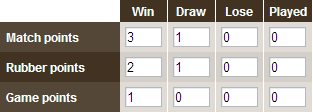
One further issue for screen reader users is implied by the design: the input fields are associated together in rows and columns, and a sighted user can visually scan across and down to make those associations; but a blind user can’t do that. For such a user the row and column header data will need to be there at every axis; in other words, the layout should be more like this:

And constructed with appropriate semantic markup to convey those relationships. By this point the selection of elements seems pretty clear: each row is a fieldset, the row header is a legend, and each column header is a label, associated with an input.
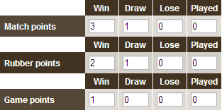
Here’s what that form looks like with no CSS:

And here’s some markup for the first row (with most of the attributes removed just to keep this example succinct):
<fieldset><legend><span>Match points</span></legend><label><span>Win</span><input value="3" /></label><label><span>Draw</span><input value="1" /></label><label><span>Lose</span><input value="0" /></label><label><span>Played</span><input value="0" /></label></fieldset>- Source: /code/showing-good-form/1.txt
The span inside each legend is because legend elements are highly resistant to styling! Indeed they’re one of the most stubborn elements in the browsers’ vocabulary. Oh man … how I wrestled with the buggers … until this obvious alternative occurred to me! So the legend element itself is just a container, while all the styling is on the inner span.
Oh yeah, there was some CSS too
I’m not gonna dwell too much on the CSS it took to make this work – this is a short article, and it’s all there in the demo [demo page, style sheet]
But I do want to touch on the most interesting bit – where we get from a layout with headers on every row, to one where only the top row has headers – or at least, so it appears to graphical browsers. For screen readers, as we noted, we need those headers on every row, so we should employ some cunning CSS to partly negate their visual presence, without removing them from the output.
The core styling for each label span is like this:
label span{display:block;padding:5px;line-height:1em;background:#423221;color:#fff;font-weight:bold;}- Source: /code/showing-good-form/2.txt
But in the rows below the header they have these additional rules:
fieldset.body label span{padding:0 5px;line-height:0;position:relative;top:-10000em;}- Source: /code/showing-good-form/3.txt
The rendered width of the element is preserved, ensuring that the surrounding label is still the same width as the one in the header row above, and hence a unified column width is preserved all the way down. But the element effectively has no height, and so it’s effectively invisible. The styling is done this way, rather than just setting the height to zero and using overflow:hidden, because to do that would expose an unrelated quirk with another popular screen reader! (It would hide the output from Window Eyes, as shown in this test example at access matters.)
The finished widget
It’s an intricate beast allright! But after all that we do indeed get the widget we want:
It’s not perfect, most notably because the legends have to have a fixed width; this can be in em to allow for text scaling, but it still doesn’t allow the content to break into multiple lines. It also doesn’t look quite right in Safari; and some CSS hacking was needed to make it look right in IE6 and IE7.
Still it worked well enough for the purpose, and satisfied the client completely. And most of all it re-assured me in my faith – that there’s never any need to abuse tables for layout. (Unless of course you think this content is a table anyway, but that’s another story!)


Comments
11/12/2006
A great article!
It’s an interface I’ve often come across and I too have been pondering about what markup to use in this situation. Thanks for providing this solution :)
One thing though, how do screen readers behave when input fields are nested within their labels? It looks weird to me to nest those elements..
11/12/2006
I’m impressed with the final outcome considering the form code you had to start with.
My interest is more in why a table layout isn’t appropriate here. It seems like it isn’t simply because the ‘forms mode’ of JAWS makes the form unusable. Whereas, semantically speaking, it would seem like a table is actually the most appropriate for the content. Anyways, I don’t intend to completely derail this conversation into a mere semantics debate…
11/12/2006
This is a classic CSS issue of creating forms. I like your implementation and am especially impressed by the way that you show the headings only once. However, I think that there is a semantic problem here. For accessibility, you solution is the best one and I would use it myself. However, I think that this form should be in a table. This is not using a table for layout, it is the intended use for a table. For instance, if you were to make this same form as a print document, you would put it in a table. I understand why you did it that way and if I had to make a form like this today I would do it pretty much the same way. However, in the future I would like to see screen readers understand table forms better – since they are sometime the semantically appropriate method.
11/12/2006
We tried this very solution two years ago, but it failed user testing with people with disabilities. Although it looks nice, we had the choice between making an alternative accessible version, or to simplify the form layout and remove the tabular-type layout. We chose not to use the tabular type layout, but broke each “row” into a separate fieldset with visible labels – and thankfully, that worked out really well.
The structure of this particular form is tabular, so using a table for laying it out is semantically and structurally correct. Yes, the tabular structure is ignored by JAWS in forms mode, but that’s no reason to remove structurally correct markup. The nested fieldsets are a useful alternative, but then you lose the two dimensional cellular structure for a two level hierarchical structure. Compounding that with hiding labels, and your nested fieldset emulation loses information that some groups of disabled people need.
The main audience this solution creates barriers for are disabled people using screen magnifiers – for them it is important that every field is properly visually labelled (the same rationale for people with cognitive difficulties). Take for instance the form element in the bottom right hand corner (as a worse case scenario) – in a screen magnifier focused on this field, they’d be very fortunate if the “column heading” of “Played” (three lines higher up) is visible in the magnification area, but the “row header” Game points most certainly won’t be visible. (Incidentally, that’s why having the form label immediately above textfields, text areas and selects is the more accessible approach – it is far more likely for both elements to be visible at the same time in a screen magnifier region).
Now if it were marked up as a table, there could have been a fallback way of giving people using screen magnifiers an online highlight/announcement of the row and column headings (like a browser extension like Gez Lemon’s excellent Table Inspector: http://juicystudio.com/article/firefox-table-inspector.php ). Or if the labels were visible adjacent to their respective form fields…
Although the resulting barrier isn’t an impossible one, it is still a barrier that’s difficult for certain groups of disabled people to cope with. The main suggestion is to remove the table-emulation styles (of hiding labels offscreen), and use the fieldset and label structure to visually emphasise the relationships in the form elements, and not to position them offscreen – so back to http://24ways.org/examples/showing-good-form/article-example3.gif – that is the most accessible of the form layouts on this page (when its styled with only one text field per line). The CSS that follows creates accessibility barriers – by hiding information that’s necessary for screen magnifier users and people with cognitive disabilities.
11/12/2006
This is clearly tabular data. Semantic html doesn’t not mean to avoid tables, it’s about using tables for what tables was meant to be used for.
11/12/2006
Seeing as Safari accounts for about 4-5% browser share I don’t think it’s acceptable to concede “It also doesn’t look quite right in Safari” for the sake of doing it the technically correct way. There are so many versions of the tableless form layout out there now, but none of them are robust enough for real world use.
11/12/2006
As a few people have mentioned above – clearly this is semantically tabular data.
If a particular user-agent (with an absolute minority market share at that) doesn’t provide adequate support for rendering the semantically correct implementation for this situation, does it mean you should hack your way around it?
11/12/2006
If a table would be used to show the data why not use it to construct the form which supplies the data? Well – ok – JAWS doesn’t support it and maybe other screen readers doesn’t but if there’s anything that Internet Explorer has tought us that would be to follow standars – not software.
If JAWS does not support tabular forms – it’s their problem, not ours. No disrespect of blind people – the opposite actually. They deserve a Firefox-like software also that can read what it should be able to read.
Labels, fieldsets etc should be used but tables is also the correct way of constructing this – by constructing a table you know that every row has a relation which is defined in some manner and you know by each columnhead what data that column holds. To use tables in a form such as this is the correct way of using tables.
11/12/2006
Agreed.
These days many coders seem to defer to accessibility tools as if they’re Gospel, and end up carving up their markup like a Christmas goose to adhere to them, making other, far more used rendering tools and users suffer because of it.
As many here have pointed out, although this is a form due to its need for user input, it is clearly a tabular dataset as well, so it seems to me that any incompatibility with screen readers is an issue that the screen reader developers need to deal with.
Browsers aren’t perfect, and neither are screen readers.
11/12/2006
“These days many coders seem to defer to accessibility tools as if they’re Gospel, and end up carving up their markup like a Christmas goose to adhere to them, making other, far more used rendering tools and users suffer because of it.”
I have to agree with this. If we keep giving screen readers a free pass, then this situation won’t get any better — what if we’d made excuses for Internet Explorer 5.0?
It is especially critical for non-visual user agents (screen readers, spiders, etc.) to respect semantics, since that’s the only way they can infer meaning. We need to hold their feet to the fire — JAWS, Window-Eyes, Home Page Reader — just like we did with IE. In the meantime, we can provide alternate interfaces where required for accessibility.
11/12/2006
What everyone else said: this is tabular data, so it belongs in a table. It’s a mistake to design your markup for specific user agents. It was a mistake when we were using tables for layout because it was otherwise difficult to get them to look pretty in IE, and it’s just as much a mistake when we’re not using tables for tabular data because it’s difficult to get them to sound pretty in JAWS.
11/12/2006
I really appreciate this discussion, as both sides have very valid points.
Semantically, I think a table describes the data best. However, as emphasized through initiatives like microformats, data should be designed for humans first. I haven’t done much testing with screen readers, so I’ll take James’ word for it that a screen reader would have difficulty with a form/table hybrid. I’m all in favor of semantic markup, but if it will cause difficulty in a user agent, whether it’s a browser, a screen reader or anything else, the markup should be compromised to make the information easier to digest. It’s unfortunate that certain user agents incorrectly interpret semantics, but to claim that “any incompatibility with screen readers is an issue that the screen reader developers need to deal with” is creating a scapegoat and avoids providing a solution.
12/12/2006
That is indeed very much a table, so no convoluted markup and CSS required. The tabular data may be editable, but it’s still tabular data, therefore it goes in a table, poor screenreader support or no. Insisting on throwing tables out in instances like this (when it absolutely is a table) just gives CSS a bad name.
12/12/2006
“I’m all in favor of semantic markup, but if it will cause difficulty in a user agent, whether it’s a browser, a screen reader or anything else, the markup should be compromised to make the information easier to digest.”
This is a little too absolute for my taste. As with everything else in web design, it’s a trade-off: is the time spent on the workaround worthwhile? All else being equal, I’d pick the solution that satisfies the WCAG and minimizes the time spent on the problem. In this case it’s an alternative interface.
“It’s unfortunate that certain user agents incorrectly interpret semantics, but to claim that ‘any incompatibility with screen readers is an issue that the screen reader developers need to deal with’ is creating a scapegoat and avoids providing a solution.”
I’m not making them a scapegoat; it’s their product. They need to be held accountable; that’s why we have standards in the first place. And there is an interim solution: provide an alternative interface until the semantics are correctly interpreted by screen readers. It’s in the long-term interest of accessibility if designers and developers demand proper standards support from all user agents. There’s no reason why we can’t fight on two fronts at once.
12/12/2006
Well it certainly could be a table, but that doesn’t mean it must be. If it is a table, then it’s an editable table, but that’s not something we can implement in practice – we can’t create editable tables that degrade without JS, or works for assistive technologies or lower-spec browsers.
So in that absence of that, it must be a form.
And if it is a form, then it can’t also be a table, because that would make it inaccessible as I’ve described.
This is how I found myself reasoning, and this is what I did when faced with that practical need. I don’t think I’ve abused markup or CSS at all here, I just found a solution that works, today, for a problem that’s real and out there.
13/12/2006
I have believed for years that screen readers, especially JAWS, are of absolutely unacceptable quality when it comes to their design and understanding of markup.
I’m in agreement with those above that think this data is tabular. It’s not just tabular data, it’s a tabular form.
Tabular forms exist in the UI world as standard widgets – any spreadsheet uses them, javax.swing, some colour pickers. Why can the designers of JAWS not comprehend these issues?
Why does JAWS not tell the user there is a table in this form, and give the user some indication of what’s in the table. Or perhaps it could look at tags… Instead of ignoring tables completely!
I an very much of the opinion that we should use tables and force the screen reader developers to push forward. Unfortunately, the recent onslaught of lawsuits against ‘inaccessible’ websites doesn’t do much to help the situation!
Nonetheless, if you’re going to cave in against the screen readers, this is about the best way I’ve seen. Clicking on some of the labels does some slightly strange things in Opera, though..
18/12/2006
I am going to use this technique on a form that shows dates with select boxes and the correct label on top.
For those into the discussion of whether or not this is a table or not, yes in the case of listing numbers it is a table but if you use like I am going to it’s not a table.
I have a demo here and it is not finished and it is in swedish. :P
30/12/2006
A lot of good arguments.
Very logical use of fieldsets and labels.
Nice to see someone taking accessibility seriously. Something too often forgotten.
12/01/2007
I’ve had problems with wrapping the ‘labels’ around ‘inputs’ before. It broke for me in IE Windows.
19/01/2007
@Keith Humm:
“Tabular forms exist in the UI world as standard widgets – any spreadsheet uses them, javax.swing, some colour pickers. Why can the designers of JAWS not comprehend these issues?”
Maybe because they have not yet been presented with tabular data in which header information and content have effectively been matched one to the other.
You mention spreadsheets (which would be the logical basis for understanding double-entry tables): in Excel for instance you still have headers displayed as bold, and there’s no more information than that available. It’s still strongly based on visual experience and I’m not sure anywhere in any of the UIs you mention the information is structured enough for any tool to infer that ‘this is a two-entry spreadsheet widget’.
Add to that the fact that up until recently tables were so abused for HTML layout and that should give us a hint as to why assistive technology developers haven’t looked any further into these issues. They already have so much to tackle, I’m afraid.
This article is very inspirational, I had never thought of formatting forms that way.
Impress us