Twelve Days of Front End Testing

Anyone who’s spoken to me at some point in November may get the impression that I’m a bit of a grinch. But don’t get me wrong, I love Christmas, I love decorating my tree, singing carols, and doing Christmas cooking - in December. So for me to willingly be humming the 12 days of Christmas in October, it’s probably for something that I think is even more important than banning premature Christmas decorations, like front end testing.
On the 12th day of Christmas, my front end dev, she gave to me, 12 testing tools, 11 optimised images, 10 linting rules, 9 semantic headings, 8 types of colour blindness, 7(.0) contrast ratio, 6 front end tests, 5 browser types, 4 types of tests, 3 shaken trees, 2 image types, and a source controlled deployment pipeline.
Twelve Testing Tools
-
axe does automated accessibility testing. Run as part of your development build, it outputs warnings to your console to let you know what changes you need to make (referencing accessibility guides). You can also specify particular accessibility standard levels that you’d like to test against, eg.
best-practice,wcag2aorwcag2aa, or you can pick and choose individual rules that you want to check for (full list of rules you can test with axe).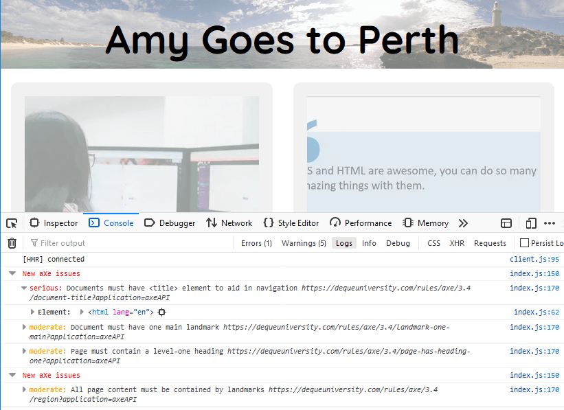
aXe Core can be used to automate accessibility testing, and has a range of extensions for different programming languages and frameworks. -
BackstopJS runs visual regression tests on your website. Run separately, or as part of your deployment/PR process, you can use it to make sure your code changes aren’t bleeding into other areas of the website. By default, BackstopJS will set you up with a bunch of configuration options by running
backstop initin your project to help get you started.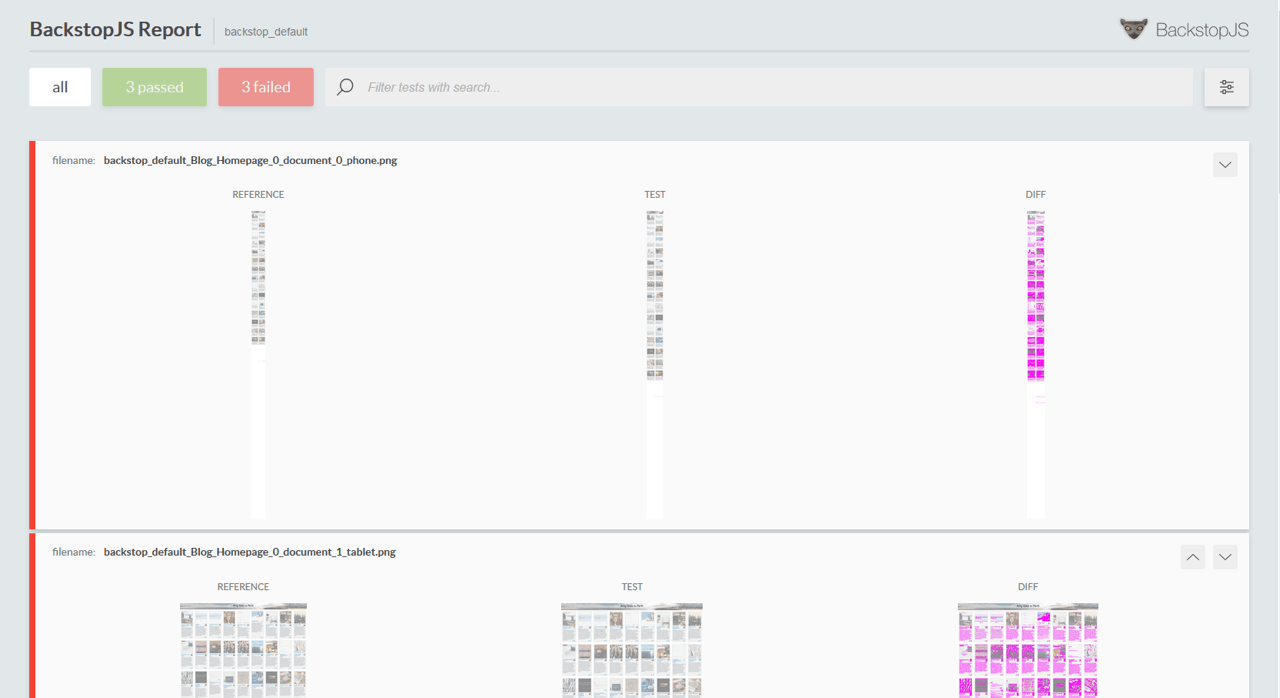
BackstopJS compares screenshots of your website to previous screenshots and compares the visual differences to see what’s changed. -
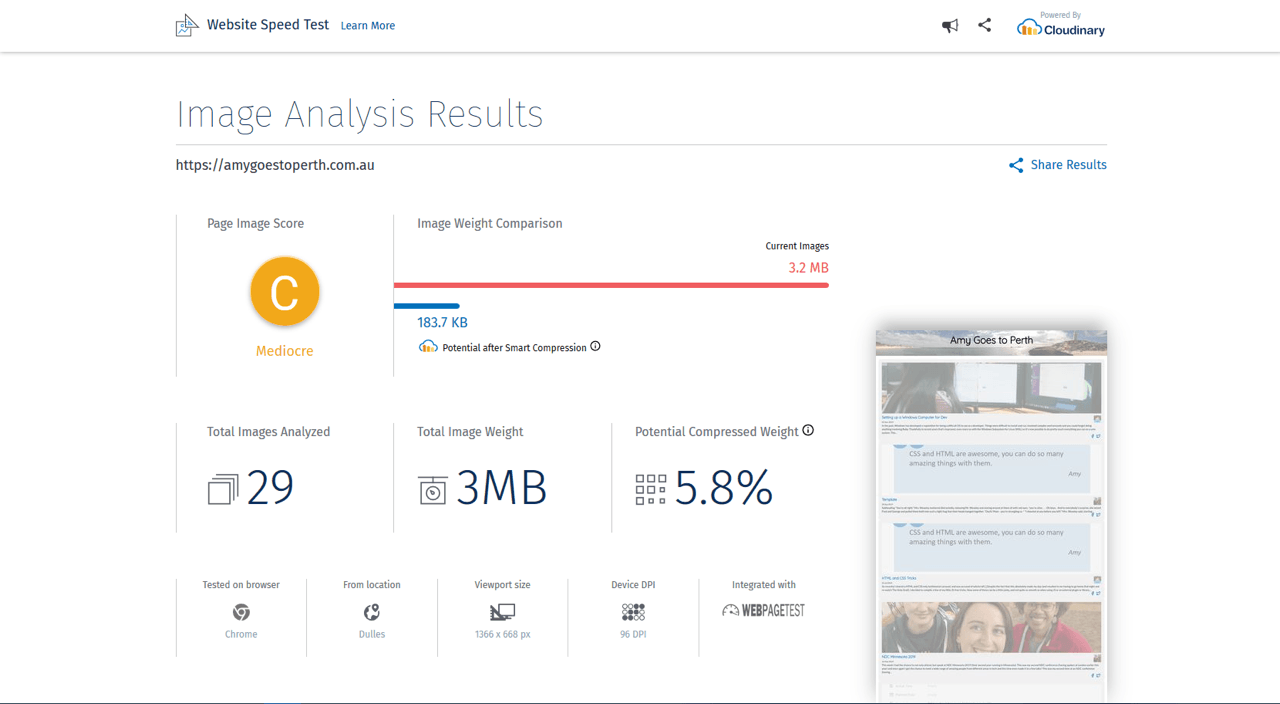
Website Speed Test analyses the performance of your website specifically with respect to images, and the potential size savings if they were optimised.
-
Calibre runs several different types of tests by leveraging Lighthouse. You can run it over your live website through their web app or through the command line, it then monitors your website for performance and accessibility over time, providing metrics and notifications of any changes.
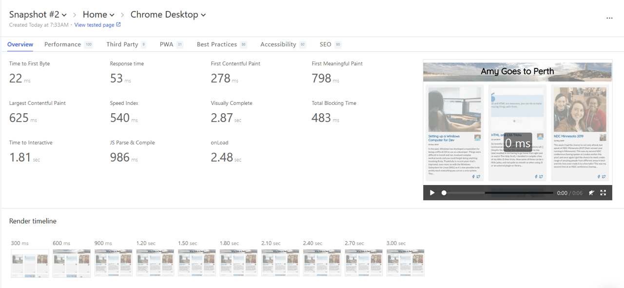
Calibre provides an easy to use interface and dashboard to test and monitor your website for performance, accessibility and several other areas. - Cypress is for end-to-end testing of your website. When visual regression testing may be a bit much for you, Cypress can help you test and make sure elements are still on the page and visible (even if they’re not pixel for pixel where they were last time).
- pa11y is for automated accessibility testing. Run as part of your build process or using their CLI or dashboard, it tests your website against various Web Content Accessibility Guidelines (WCAG) criteria (including visual tests like colour contrast). While axe is run as part of your dev build and gives you an output to the console, it can be combined with pa11y to automate any changes as part of your build process.
-
whocanuse was created by Corey Ginnivan, and it allows you to view colour combinations as those with colour blindness would (as well as testing other visual deficiencies, and situational vision events), and test the colour contrast ratio based on those colours.
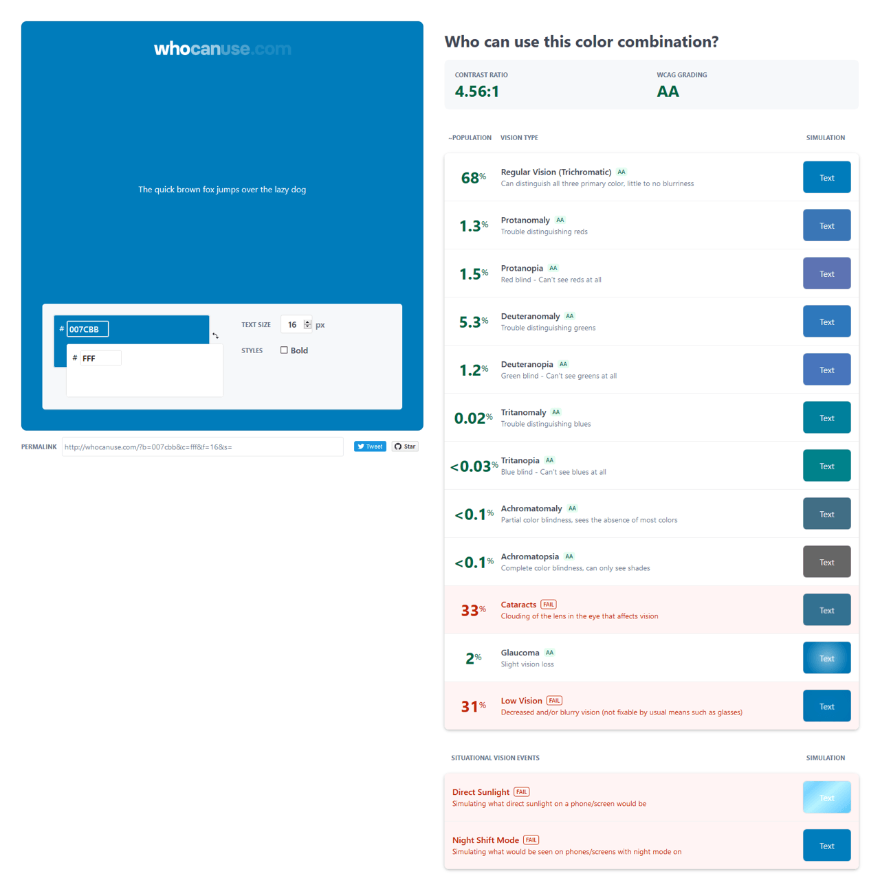
Colour contrast assessment of my brand colours, testing them for issues for people with various vision deficiencies, and situational vision events. -
Colour Blindness Emulation was created by Kyo Nagashima as an SVG filter to emulate the different types of colour blindness, or if you’re using Gatsby, you can use a plugin based off of
gatsby-plugin-colorblind-filters. -
Accessible Brand Colors tests all your branding colours against each other (this is great to show designers what combinations they can safely use).
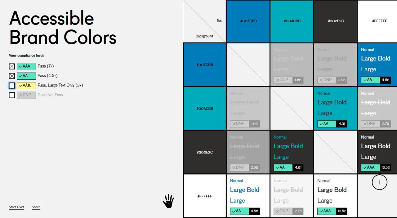
Accessible Brand Colors tests all colour combinations of background and text colours available from your branding colours, and checks them for compliance levels at various font sizes and weights. -
Browser dev tools - Most of the modern browsers have been working hard on the features available in their dev tools:
- Firefox: Accessibility Inspector, Contrast Ratio testing, Performance monitoring.
- Chromium: (Chrome, Edge Beta, Brave, Vivaldi, Opera, etc) - Accessibility Inspector, Contrast Ratio testing, Performance Monitoring, Lighthouse Audits (testing performance, best practices, accessibility and more).
- Edge: Accessibility Inspector, Performance monitoring.
- Safari: Accessibility Inspector, Performance monitoring.
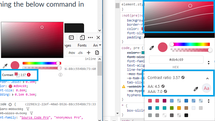
Firefox (left), Chrome, and Edge Beta (right) Dev Tools now analyse contrast ratios in the colour picker. The Chromium-based browsers also show curves on the colour picker to let you know which shades would meet the contrast requirements. - Linc is a continuous delivery platform that makes testing the front end easier by automatically deploying a version of your website for every commit on every branch. One of the biggest hurdles when testing the front end is needing a live version of the site to view and test against. Linc makes sure you always have one.
- ESLint and Stylelint check your code for programmatic and stylistic errors, as well as helping keep formatting standard on projects with multiple developers. Adding a linter to your project not only helps you write better code, it can reduce simple errors that might be found during testing time. If you’re not writing JavaScript, there are plenty of alternatives for whatever language you’re writing in.


If you’re trying to run eslint in VS Code, make sure you don’t have the Beautify extension installed, as that will break things.
Eleven Optimised Images
When it comes to performance, images are where we take the biggest hit, with images accounting for over 50% of total transfer size for websites. Many websites are serving excessively large images “just in case”, but there’s actually a native HTML element that allows us to serve different image sizes based on the screen size or serve better image formats when the browser supports it (or both).
<!-- Serving different images based on the width of the screen -->
<picture>
    <source
        srcset="/img/banner_desktop.jpg"
        media="(min-width: 1200px)"
    />
    <source
        srcset="/img/banner_tablet.jpg"
        media="(min-width: 700px)"
    />
    <source
        srcset="/img/banner_mobile.jpg"
        media="(min-width: 300px)"
    />
    <img src="/img/banner_fallback.jpg">
</picture>

<!-- Serving different image formats based on browser compatibility -->
<picture>
    <source
        srcset="/banner.webp"
        type="image/webp"
    />
    <img src="/img/banner_fallback.jpg">
</picture>
Ten Linting Rules
A year ago, I didn’t use linting. It was mostly just me working on projects, and I can code properly right? But these days it’s one of the first things I add to a project as it saves me so much time (and has taught me a few things about JavaScript). Linting is a very personal choice, but there are plenty of customisations to make sure it’s doing what you want, and it’s available in a wide variety of languages (including linting for styling).
// .eslintrc
module.exports = {
    rules: {
        'no-var': 'error',
        'no-unused-vars': 1,
        'arrow-spacing': ['error', { before: true, after: true }],
        indent: ['error', 'tab'],
        'comma-dangle': ['error', 'always'],
        // standard plugin - options
        'standard/object-curly-even-spacing': ['error', 'either'],
        'standard/array-bracket-even-spacing': ['error', 'either'], },
}

// .stylelintrc
{
    "rules": {
        "color-no-invalid-hex": true,
        "indentation": [
            "tab",
            {
                "except": [
                    "value"
                ]
            }
        ],
        "max-empty-lines": 2,
    }
}
Nine Semantic Headings
No, I’m not saying you should use 9 levels of headings, but your webpage should have an appropriate number of semantic headings. When your users are accessing your webpage with a screen reader, they rely on landmarks like headings to tell them about the page. Similarly to how we would scan a page visually, screen readers give users a list of all headings on a page to allow them to scan through the sections and access the information faster.
When there aren’t any headings on a page (or headings are being used for their formatting rather than their semantic meaning), it makes it more difficult for anyone using a screen reader to understand and navigate the page. Make sure that you don’t skip heading levels on your page, and remember, you can always change the formatting on a p tag if you need to have something that looks like a heading but isn’t one.
<h1>Heading 1 - Page Title</h2>
<p>Traditionally you'll only see one h1 per page as it's the main page title</p>
<h2>Heading 2</h2>
<p>h2 helps to define other sections within the page. h2 must follow h1, but you can also have h2 following another h2.</p>
<h3>Heading 3</h3>
<p>h3 is a sub-section of h2 and follows similar rules to h2. You can have a h3 after h3, but you can't go from h1 to h3.</p>
<h4>Heading 4</h4>
<p>h4 is a sub-section of h3. You get the pattern?</p>
Eight Types of Colour Blindness
Testing colour contrast may not always be enough, as everyone perceives colour differently. Take the below colour combination (ignoring the fact that it doesn’t actually look nice). It has decent colour contrast and would meet the WCAG colour contrast requirements for AA standards – but what if one of your users was red-green colour blind? Would they be able to tell the difference?

Red-green colour blindness is the most common form of colour blindness, but there are 8 different types affecting different parts of the colour spectrum, all the way up to complete colour blindness.
- Protanopia
- Inability to see red end of the colour spectrum.
- Protanomaly
- Difficulty seeing some shades of red.
- Deuteranopia
- Inability to see the green portion of the colour spectrum.
- Deuteranomaly
- Difficulty seeing some shades of green.
- Tritanopia
- Inability to see blue end of the colour spectrum.
- Tritanomaly
- Difficulty seeing some shades of blue.
- Achromatopsia
- Inability to see all parts of the colour spectrum, only able to perceive black, white and shades of grey.
- Achromatomaly
- Difficulty seeing all parts of the colour spectrum.
Seven (.0) Contrast Ratio
Sufficient colour contrast is perhaps one of the best steps to take for accessibility, as it benefits everyone. Having adequate contrast doesn’t just make the experience better for those with vision impairments, but it also helps those with situational impairments. Have you ever been in the sun and tried to read something on your screen? Whether you can view something when there’s glare could be as easy as making sure there’s enough contrast between the text and its background colour.
The WCAG have defined a contrast ratio of at least 4.5:1 for normal text (18.5px) and 3:1 for large text (24px) to meet AA accessibility standards, but this should be an absolute minimum and isn’t always readable. All four below examples have sufficient contrast to pass AA standards, but you might be hard pressed to read them when there’s glare or you have a dodgy monitor (even more so considering most websites use below 18.5px for their base font size).

To meet the AAA standard you need to have a ratio of 7:1 for normal text and 4.5:1 for large text, which should be sufficient for those with 20/80 vision to read.
Six Front End Tests
- Adding default axe-core testing to Gatsby:
//gatsby-config.js { resolve: 'gatsby-plugin-react-axe', options: {}, }, - Running pa11y tests on homepage at various screen sizes:
// tests/basic-a11y_home.js const pa11y = require('pa11y'), fs = require('file-system') runTest() async function runTest() { try { const results = await Promise.all([ pa11y('http://localhost:8000', { standard: 'WCAG2AA', actions: [], screenCapture: `${__dirname}/results/basic-a11y_home_mobile.png`, viewport: { width: 320, height: 480, deviceScaleFactor: 2, isMobile: true, }, }), pa11y('http://localhost:8000', { standard: 'WCAG2AA', actions: [], screenCapture: `${__dirname}/results/basic-a11y_home_desktop.png`, viewport: { width: 1280, height: 1024, deviceScaleFactor: 1, isMobile: false, }, }), ]) fs.writeFile('tests/results/basic-a11y_home.json', JSON.stringify(results), err => { console.log(err) }) } catch (err) { console.error(err.message) } } - Running pa11y tests on a blog post template at various screen sizes:
// tests/basic-a11y_post.js const pa11y = require('pa11y'), fs = require('file-system') runTest() async function runTest() { try { const results = await Promise.all([ pa11y('http://localhost:8000/template', { standard: 'WCAG2AA', actions: [], screenCapture: `${__dirname}/results/basic-a11y_post_mobile.png`, viewport: { width: 320, height: 480, deviceScaleFactor: 2, isMobile: true, }, }), pa11y('http://localhost:8000/template', { standard: 'WCAG2AA', actions: [], screenCapture: `${__dirname}/results/basic-a11y_post_desktop.png`, viewport: { width: 1280, height: 1024, deviceScaleFactor: 1, isMobile: false, }, }), ]) fs.writeFile('tests/results/basic-a11y_post.json', JSON.stringify(results), err => { console.log(err) }) } catch (err) { console.error(err.message) } } - Running BackstopJS on a homepage and blog post template at various screen sizes:
// backstop.json { "id": "backstop_default", "viewports": [ { "label": "phone", "width": 320, "height": 480 }, { "label": "tablet", "width": 1024, "height": 768 }, { "label": "desktop", "width": 1280, "height": 1024 } ], "onBeforeScript": "puppet/onBefore.js", "onReadyScript": "puppet/onReady.js", "scenarios": [ { "label": "Blog Homepage", "url": "http://localhost:8000", "delay": 2000, "postInteractionWait": 0, "expect": 0, "misMatchThreshold": 1, "requireSameDimensions": true }, { "label": "Blog Post", "url": "http://localhost:8000/template", "delay": 2000, "postInteractionWait": 0, "expect": 0, "misMatchThreshold": 1, "requireSameDimensions": true } ], "paths": { "bitmaps_reference": "backstop_data/bitmaps_reference", "bitmaps_test": "backstop_data/bitmaps_test", "engine_scripts": "backstop_data/engine_scripts", "html_report": "backstop_data/html_report", "ci_report": "backstop_data/ci_report" }, "report": [ "browser" ], "engine": "puppeteer", "engineOptions": { "args": [ "--no-sandbox" ] }, "asyncCaptureLimit": 5, "asyncCompareLimit": 50, "debug": false, "debugWindow": false } - Running Cypress tests on the homepage:
// cypress/integration/basic-test_home.js describe('Blog Homepage', () => { beforeEach(() => { cy.visit('http://localhost:8000') }) it('contains "Amy Goes to Perth" in the title', () => { cy.title().should('contain', 'Amy Goes to Perth') }) it('contains posts in feed', () => { cy.get('.article-feed').find('article') }) it('all posts contain title', () => { cy.get('.article-feed') .find('article') .get('h2') }) }) - Running Cypress tests on a blog post template at various screen sizes:
// cypress/integration/basic-test_post.js

describe('Blog Post Template', () => {
    beforeEach(() => {
        cy.visit('http://localhost:8000/template')
    })
    it('contains "Amy Goes to Perth" in the title', () => {
        cy.title().should('contain', 'Amy Goes to Perth')
    })
    it('has visible post title', () => {
        cy.get('h1').should('be.visible')
    })
    it('has share icons', () => {
        cy.get('.share-icons a').should('be.visible')
    })
    it('has working share icons', () => {
        cy.get('.share-icons a').click({ multiple: true })
    })
    it('has a visible author profile image', () => {
        cy.get('.author img').should('be.visible')
    })
})

describe('Mobile Blog Post Template', () => {
    beforeEach(() => {
        cy.viewport('samsung-s10')
        cy.visit('http://localhost:8000/template')
    })
    it('contains "Amy Goes to Perth" in the title', () => {
        cy.title().should('contain', 'Amy Goes to Perth')
    })
    it('has visible post title', () => {
        cy.get('h1').should('be.visible')
    })
    it('has share icons', () => {
        cy.get('.share-icons .share-link').should('be.visible')
    })
    it('has a visible author profile image', () => {
        cy.get('.author img').should('be.visible')
    })
})
Five Browser Types
Browser testing may be the bane of our existence, but it’s gotten easier, especially when you know the secret:
Not every browser needs to look the same.
Now, this may differ depending on your circumstances, but your website doesn’t have to match pixel for pixel across all browsers. As long as it’s on-brand and is useable across all browsers (this is where a good solid HTML foundation is useful), it’s ok for your site to look a little different between browsers.
While the browsers you test in will differ depending on your user base, the main ones you want to be covering are:
- Chrome/Chromium
- Firefox
- Safari
- Internet Explorer
- Edge
Make sure you’re testing these browsers on both desktop and mobile/tablet as well, sometimes their level of support or rendering engine will differ between devices – for example, iOS Chrome uses the Safari rendering engine, so something that works on Android Chrome may not work on iOS Chrome.
Four Types of Test
When it comes to testing the front end, there are a few different areas that we can cover:
- Accessibility Testing: doing accessibility testing properly usually involves getting an expert to run through your website, but there are several automated tests that you can run against various standard levels.
- Performance Testing: performance testing does technically bleed into the back end as well, but there are plenty of things that can be done from a front end perspective. Making sure the images are optimised, our code is clean and minified, and even optimising fonts using features like the
font-displayproperty. No amount of optimising the server and back end will matter if it takes forever for the front end to appear in a browser. - Visual Regression Testing: we’ve all been in the position where changing one line of CSS somewhere has affected another section of the website. Visual regression testing helps prevent that. By using a tool that compares before and after screenshots against one another to flag up what’s changed, you can be sure that style changes won’t bleed into unintended areas of the site.
- Browser/device testing: while we all want our users to be running the most recent version of Chrome or Firefox, they may still be using the inbuilt browser on their DVD player – so we need to test various browsers, platforms and devices to make sure that our website can be accessed on whatever device they use.
Three Shaken Trees
Including (and therefore requiring your users to download) things that you’re not using affects the performance of your application. Are you forcing them to download the entire lodash library when you’re only using 2 functions? While a couple of unused lines of code may not seem like a huge performance hit, it can greatly affect users with slower devices or internet connections, as well as cluttering up your code with unused functions and dependencies. This can be set up on your bundler – Webpack and Parcel both have guides for tree shaking, and Gatsby has a plugin to enable it.
Two Image Types
While there are several different types of images, most of the time they fall into one of two categories:
- Informative
- The image represents/conveys important information that isn’t conveyed by the content surrounding it.
- Decorative
- The image only adds visual decoration to a page.
From these two categories, we can then determine if we need to provide alternative text for an image. If an image is purely decorative, then we add alt="" to let screen readers know that it’s not important. But if an image is informative, then we need to be supplying a text alternative that describes the picture for anyone who’s using a screen reader or isn’t able to see the image (remember the days when a standard internet connection took a long time to load a page and you saw alt text before an image loaded).
<img src="./nice-picture.jpg" alt="" />
<img src="./important-graphic.png" alt="This is a picture of something important to help add meaning to the text around me" />
If you have a lot of images with missing alt text, look into services that can auto-generate alt text based on image recognition services.
One Source Controlled Deployment Pipeline
While front end tests are harder to automate, running them through a source control and deployment pipeline helps track changes and eliminates issues where “it works on my computer”. Whether you’re running tests as part of the PR process, or simply against every commit that comes through, running tests automatically as part of your process makes every developer’s life easier and helps keep code quality at a high standard.
We already knew that testing was important, and your project can’t be run unless all your unit and integration tests are written (and pass), but often we forget about testing the front end. There are so many different tests we need to be running on the front end, it’s hard to work out what your need to test for and where to start.
Hopefully this has given you a bit of insight to front end testing, and some Christmas cheer to take you into the holidays.
About the author
Amy wears many hats as a freelance developer, business owner and conference addict. She regularly shares her knowledge with her peers and the next generation of developers by mentoring, coaching, teaching and feeding into the tech community in many ways.
Amy can be found volunteering her time with Fenders, ACS, SheCodes (formerly Perth Web Girls) and MusesJS (formerly NodeGirls). She also works as an evangelist for YOW! Conferences, is a Twilio Champion and has been nominated for the WiTWA awards for the last 2 years.
In her spare time Amy shares her knowledge and experience on her blogs and speaking at conferences. She has previously given keynotes at multiple events as well as speaking at several international conferences in the US and Europe.
Brought to you by
Related articles
-
A Favor for Your Future Self
Alicia Sedlock embodies the Ghost of Code Reviews Yet-to-Come with a call to start testing. Do you know your unit from your integration, your acceptance from your visual regression? And will you pass the ultimate Christmas test; are you naughty or nice?
-
Christmas Gifts for Your Future Self: Testing the Web Platform
Rachel Andrew unwraps the unwanted gift of browser bugs with a look at getting started with the Web Platform Tests suite. Perhaps this Christmas you could contribute some tests and give your favourite browser bug a watch of wondering love.

