Designing Your Site Like It’s 1998
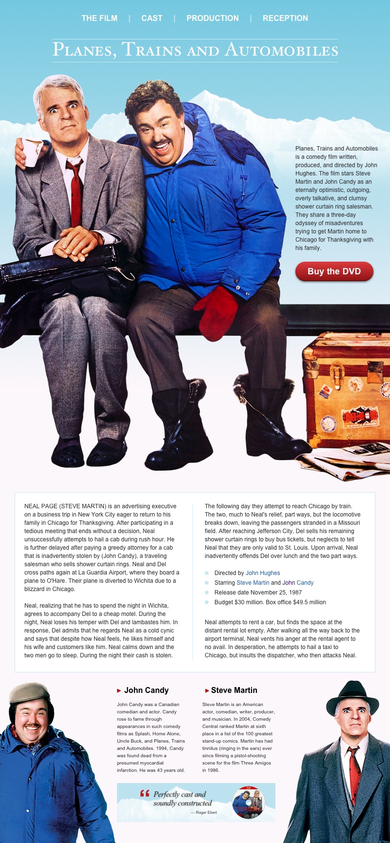
It’s 20 years to the day since my wife and I started Stuff & Nonsense, our little studio and my outlet for creative ideas on the web. To celebrate this anniversary—and my fourteenth contribution to 24 ways— I’d like to explain how I would’ve developed a design for Planes, Trains and Automobiles, one of my favourite Christmas films.

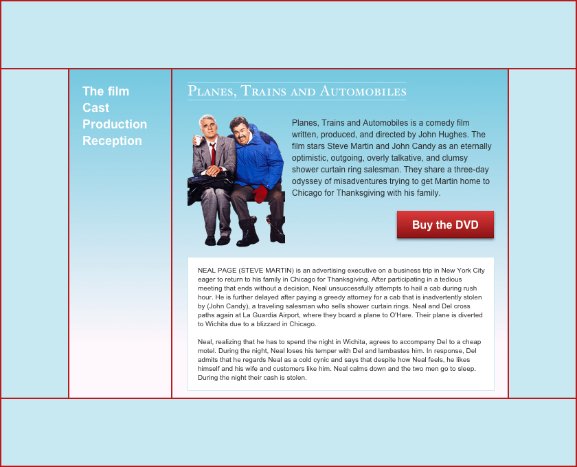
Developing a <frameset> framework
I’ll start by using frames to set up the framework for this new website. Frames are individual pages—one for navigation, the other for my content—pulled together to form a frameset. Space is limited on lower-resolution screens, so by using frames I can ensure my navigation always remains visible. I can include any number of frames inside a <frameset> element.
I add two rows to my <frameset>; the first is for my navigation and is 50px tall, the second is for my content and will resize to fill any available space. As I don’t want frame borders or any space between my frames, I set frameborder and framespacing attributes to 0:
<frameset frameborder="0" framespacing="0" rows="50,*">
[…]
</frameset>
Next I add the source of my two frame documents. I don’t want people to be able to resize or scroll my navigation, so I add the noresize attribute to that frame:
<frameset frameborder="0" framespacing="0" rows="50,*">
<frame noresize scrolling="no" src="nav.html">
<frame src="content.html">
</frameset>
I do want links from my navigation to open in the content frame, so I give each <frame> a name so I can specify where I want links to open:
<frameset frameborder="0" framespacing="0" rows="50,*">
<frame name="navigation" noresize scrolling="no" src="nav.html">
<frame name="content" src="content.html">
</frameset>
The framework for this website is simple as it contains only two horizontal rows. Should I need a more complex layout, I can nest as many framesets—and as many individual documents—as I need:
<frameset rows="50,*">
 <frame name="navigation">
 <frameset cols="25%,*">
  <frame name="sidebar">
  <frame name="content">
 </frameset>
</frameset>
Handling older browsers
Sadly not every browser supports frames, so I should send a helpful message to people who use older browsers asking them to upgrade. Happily, I can do that using noframes content:
<noframes>
<body>
<p>This page uses frames, but your browser doesn’t support them.
    Please upgrade your browser.</p>
</body>
</noframes>
Forcing someone back into a frame
Sometimes, someone may follow a link to a page from a portal or search engine, or they might attempt to open it in a new window or tab. If that page properly belongs inside a <frameset>, people could easily miss out on other parts of a design. This short script will prevent this happening and because it’s vanilla Javascript, it doesn’t require a library such as jQuery:
<script type="text/javascript">
if (top == self) {
  location = 'frameset.html';
}
</script>
Laying out my page
Before starting my layout, I add a few basic background and colour styles. I must include these attributes in every page on my website:
<body background="img/container.jpg" bgcolor="#fef7fb"
    link="#245eab" alink="#245eab" vlink="#3c146e" text="#000000">
I want absolute control over how people experience my design and don’t want to allow it to stretch, so I first need a <table> which limits the width of my layout to 800px. The align attribute will keep this <table> in the centre of someone’s screen:
<table width="800" align="center">
 <tr>
  <td>[…]</td>
 </tr>
</table>
Although they were developed for displaying tabular information, the cells and rows which make up the <table> element make it ideal for the precise implementation of a design. I need several tables—often nested inside each other—to implement my design. These include tables for a banner and three rows of content:
<table width="800" align="center">
 <table>[…]</table>
 <table>
  <table>
   <table>[…]</table>
  </table>
 </table>
 <table>[…]</table>
 <table>[…]</table>
</table>
The width of the first table—used for my banner—is fixed to match the logo it contains. As I don’t need borders, padding, or spacing between these cells, I use attributes to remove them:
<table border="0" cellpadding="0" cellspacing="0" width="587" align="center">
 <tr>
  <td><img src="logo.gif" border="0" width="587" alt="Logo"></td>
 </tr>
</table>
The next table—which contains the largest image, introduction, and a call-to-action—is one of the most complex parts of my design, so I need to ensure its layout is pixel perfect. To do that I add an extra row at the top of this table and fill each of its cells with tiny transparent images:
<tr>
 <td><img src="spacer.gif" width="593" height="1"></td>
 <td><img src="spacer.gif" width="207" height="1"></td>
</tr>
The height and width of these “shims” or “spacers” is only 1px but they will stretch to any size without increasing their weight on the page. This makes them perfect for performant website development.
For the hero of this design, I splice up the large image into three separate files and apply each slice as a background to the table cells. I also match the height of those cells to the background images:
<tr>
 <td background="slice-1.jpg" height="473"> </td>
 <td background="slice-2.jpg" height="473">[…]</td>
</tr>

<tr>
 <td background="slice-3.jpg" height="388"> </td>
</tr>
I use tables and spacer images throughout the rest of this design to lay out the various types of content with perfect precision. For example, to add a single-pixel border around my two columns of content, I first apply a blue background to an outer table along with 1px of cellspacing, then simply nest an inner table—this time with a white background—inside it:
<table border="0" cellpadding="1" cellspacing="0">
 <tr>
  <td>
   <table bgcolor="#ffffff" border="0" cellpadding="0" cellspacing="0">
[…]
   </table>
  </td>
 </tr>
</table>
Adding details
Tables are fabulous tools for laying out a page, but they’re also useful for implementing details on those pages. I can use a table to add a gradient background, rounded corners, and a shadow to the button which forms my “Buy the DVD” call-to-action. First, I splice my button graphic into three slices; two fixed-width rounded ends, plus a narrow gradient which stretches and makes this button responsive. Then, I add those images as backgrounds and use spacers to perfectly size my button:
<table border="0" cellpadding="0" cellspacing="0">
 <tr>
  <td background="btn-1.jpg" border="0" height="48" width="30"><img src="spacer.gif" width="30" height="1"></td>

  <td background="btn-2.jpg" border="0" height="48">
   <center>
    <a href="" target="_blank"><b>Buy the DVD</b></a>
   </center>
  </td>

  <td background="btn-3.jpg" border="0" height="48" width="30"><img src="spacer.gif" width="30" height="1"></td>
 </tr>
</table>
I use those same elements to add details to headlines and lists too. Adding a “bullet” to each item in a list needs only two additional table cells, a circular graphic, and a spacer:
<table border="0" cellpadding="0" cellspacing="0">
 <tr>
  <td width="10"><img src="li.gif" border="0" width="8" height="8"> </td>
  <td><img src="spacer.gif" width="10" height="1"> </td>
  <td>Directed by John Hughes</td>
 </tr>
</table>
Implementing a typographic hierarchy
So far I’ve explained how to use frames, tables, and spacers to develop a layout for my content, but what about styling that content? I use <font> elements to change the typeface from the browser’s default to any font installed on someone’s device:
<font face="Arial">Planes, Trains and Automobiles is a comedy film […]</font>To adjust the size of those fonts, I use the size attribute and a value between the smallest (1) and the largest (7) where 3 is the browser’s default. I use a size of 4 for this headline and 2 for the text which follows:
<font face="Arial" size="4"><b>Steve Martin</b></font>

<font face="Arial" size="2">An American actor, comedian, writer, producer, and musician.</font>
When I need to change the typeface, perhaps from a sans-serif like Arial to a serif like Times New Roman, I must change the value of the face attribute on every element on all pages on my website.
NB: I use as many <br> elements as needed to create space between headlines and paragraphs.
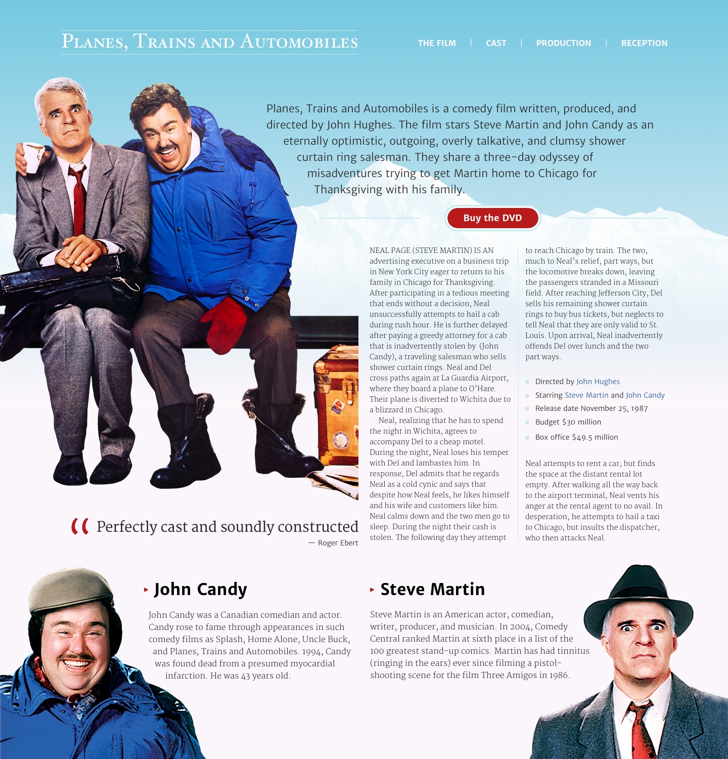
View the final result (and especially the source.)

I can imagine many people reading this and thinking “This is terrible advice because we don’t develop websites like this in 2018.” That’s true.
We have the ability to embed any number of web fonts into our products and websites and have far more control over type features, leading, ligatures, and sizes:
font-variant-caps: titling-caps;
font-variant-ligatures: common-ligatures;
font-variant-numeric: oldstyle-nums;
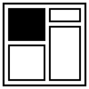
Grid has simplified the implementation of even the most complex compound grid down to just a few lines of CSS:
body {
  display: grid;
  grid-template-columns: 3fr 1fr 2fr 2fr 1fr 3fr;
  grid-template-rows: auto;
  grid-column-gap: 2vw;
  grid-row-gap: 1vh;
}
Flexbox has made it easy to develop flexible components such as navigation links:
nav ul { display: flex; }
nav li { flex: 1; }
Just one line of CSS can create multiple columns of fluid type:
main { column-width: 12em; }CSS Shapes enable text to flow around irregular shapes including polygons:
[src*="main-img"] {
  float: left;
  shape-outside: polygon(…);
}
Today, we wouldn’t dream of using images and a table to add a gradient, rounded corners, and a shadow to a button or link, preferring instead:
.btn {
  background: linear-gradient(#8B1212, #DD3A3C);
  border-radius: 1em;
  box-shadow: 0 2px 4px 0 rgba(0,0,0,0.50), inset 0 -1px 1px 0 rgba(0,0,0,0.50);
}
CSS Custom Properties, feature and media queries, filters, pseudo-elements, and SVG; the list of advances in HTML, CSS, and other technologies goes on. So does our understanding of how best to use them by separating content, structure, presentation, and behaviour. As 2018 draws to a close, we’re certain we know how to design and develop products and websites better than we did at the end of 1998.
Strange as it might seem looking back, in 1998 we were also certain our techniques and technologies were the best for the job. That’s why it’s dangerous to believe with absolute certainty that the frameworks and tools we increasingly rely on today—tools like Bootstrap, Bower, and Brunch, Grunt, Gulp, Node, Require, React, and Sass—will be any more relevant in the future than <font> elements, frames, layout tables, and spacer images are today.
I have no prediction for what the web will be like twenty years from now. However, I want to believe we’ll build on what we’ve learned during these past two decades about the importance of accessibility, flexibility, and usability, and that the mistakes we made while infatuated by technologies won’t be repeated.
Head over to my website if you’d like to read about how I’d implement my design for ‘Planes, Trains and Automobiles’ today.
About the author
Andy Clarke is one of the world’s best-known website designers, consultant, speaker, and writer on art direction and design for products and websites. Andy founded Stuff & Nonsense in 1998 and for 20 years has helped companies big and small to improve their website and product designs. Andy’s the author of four web design books including ‘Transcending CSS,’ ‘Hardboiled Web Design’ and ‘Art Direction for the Web’. He really, really loves gorillas.


