Front-End Developers Are Information Architects Too

The theme of this year’s World IA Day was “Information Everywhere, Architects Everywhere”. This article isn’t about what you may consider an information architect to be: someone in the user-experience field, who maybe studied library science, and who talks about taxonomies. This is about a realisation I had a couple of years ago when I started to run an increasing amount of usability-testing sessions with people who have disabilities: that the structure, labelling, and connections that can be made in front-end code is information architecture. People’s ability to be successful online is unequivocally connected to the quality of the code that is written.
Places made of information
In information architecture we talk about creating places made of information. These places are made of ones and zeros, but we talk about them as physical structures. We talk about going onto a social media platform, posting in blogs, getting locked out of an environment, and building applications. In , Andrew Hinton stated:
People live and work in these structures, just as they live and work in their homes, offices, factories and malls. These places are not virtual: they are as real as our own minds.
We’re creating structures which people rely on for significant parts of their lives, so it’s critical that we carry out our work responsibly. This means we must use our construction materials correctly. Luckily, our most important material, HTML, has a well-documented specification which tells us how to build robust and accessible places. What is most important, I believe, is to understand the semantics of HTML.
Semantics
The word “semantic” has its origin in Greek words meaning “significant”, “signify”, and “sign”. In the physical world, a structure can have semantic qualities that tell us something about it. For example, the stunning Westminster Abbey inspires awe and signifies much about the intent and purpose of the structure. The building’s size; the quality of the stone work; the massive, detailed stained glass: these are all signs that this is a building meant for something the creators deemed important. Alternatively consider a set of large, clean, well-positioned, well-lit doors on the ground floor of an office block: they don’t need an “entrance” sign to communicate their use and to stop people trying to use a nearby fire exit to get into the building. The design of the doors signify their usage. Sometimes a more literal and less awe-inspiring approach to communicating a building’s purpose happens, but the affect is similar: the building is signifying something about its purpose.
HTML has over 115 elements, many of which have semantics to signify structure and affordance to people, browsers, and assistive technology. The HTML 5.1 specification mentions semantics, stating:
Elements, attributes, and attribute values in HTML are defined … to have certain meanings (semantics). For example, the
<ol>element represents an ordered list, and thelangattribute represents the language of the content.
HTML’s baked-in semantics means that developers can architect their code to signify structure, create relationships between elements, and label content so people can understand what they’re interacting with. Structuring and labelling information to make it available, usable, and understandable to people is what an information architect does. It’s also what a front-end developer does, whether they realise it or not.
A brief introduction to information architecture
We’re going to start by looking at what an information architect is. There are many definitions, and I’m going to quote Richard Saul Wurman, who is widely regarded as the father of information architecture. In he said an information architect is:
the individual who organizes the patterns inherent in data, making the complex clear; a person who creates the structure or map of information which allows others to find their personal paths to knowledge; the emerging 21st century professional occupation addressing the needs of the age focused upon clarity, human understanding, and the science of the organization of information.
To me, this clearly defines any developer who creates code that a browser, or other user agent (for example, a screen reader), uses to create a structured, navigable place for people.
Just as there are many definitions of what an information architect is, there are for information architecture itself. I’m going to use the definition from the fourth edition of Information Architecture For The World Wide Web, in which the authors define it as:
- The structural design of shared information environments.
- The synthesis of organization, labeling, search, and navigation systems within digital, physical, and cross-channel ecosystems.
- The art and science of shaping information products and experiences to support usability, findability, and understanding.
To me, this describes front-end development. Done properly, there is an art to creating robust, accessible, usable, and findable spaces that delight all our users. For example, at 2015’s State Of The Browser conference, Edd Sowden talked about the accessibility of <table>s. He discovered that by simply not using the semantically-correct <th> element to mark up <table> headings, in some situations browsers will decide that a <table> is being used for layout and essentially make it invisible to assistive technology. Another example of how coding practices can affect the usability and findability of content is shown by Léonie Watson in her How ARIA landmark roles help screen reader users video. By using ARIA landmark roles, people who use screen readers are quickly able to identify and jump to common parts of a web page.
Our definitions of information architects and information architecture mention patterns, rules, organisation, labelling, structure, and relationships. There are numerous different models for how these elements get boiled down to their fundamentals. In his Understanding Context book, Andrew Hinton calls them Labels, Relationships, and Rules
; Jorge Arango calls them Links, Nodes, And Order
; and Dan Klyn uses Ontology, Taxonomy, and Choreography
, which is the one we’re going to use. Dan defines these terms as:
- Ontology
- The definition and articulation of the rules and patterns that govern the meaning of what we intend to communicate.
What we mean when we say what we say.
- Taxonomy
- The arrangements of the parts. Developing systems and structures for what everything’s called, where everything’s sorted, and the relationships between labels and categories
- Choreography
- Rules for interaction among the parts. The structures it creates foster specific types of movement and interaction; anticipating the way users and information want to flow and making affordance for change over time.
We now have definitions of an information architect, information architecture, and a model of the elements of information architecture. But is writing HTML really creating information or is it just wrangling data and metadata? When does data turn into information? In his book Managing For The Future Peter Drucker states:
… data is not information. Information is data endowed with relevance and purpose.
If we use the correct semantic element to mark up content then we’re developing with purpose and creating relevance. For example, if we follow the advice of the HTML 5.1 specification and mark up headings using heading rank instead of the outline algorithm, we’re creating a structure where the depth of one heading is relevant to the previous one. Architected correctly, an <h2> element should be relevant to its parent, which should be the <h1>. By following the HTML specification we can create a structured, searchable, labeled document that will hopefully be relevant to what our users need to be successful. If you’ve never used a screen reader, you might be wondering how the headings on a page are searchable. Screen readers give users the ability to interact with headings in a couple of ways:
- by creating a list of headings so users can quickly scan the page for information
- by using a keyboard command to cycle through one heading at a time
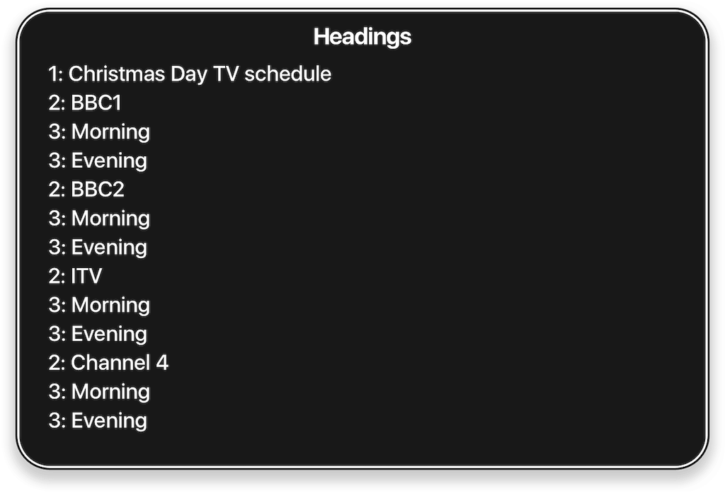
If we had a document for Christmas Day TV we might structure it something like this:
<h1>Christmas Day TV schedule</h1>
<h2>BBC1</h2>
<h3>Morning</h3>
<h3>Evening</h3>
<h2>BBC2</h2>
<h3>Morning</h3>
<h3>Evening</h3>
<h2>ITV</h2>
<h3>Morning</h3>
<h3>Evening</h3>
<h2>Channel 4</h2>
<h3>Morning</h3>
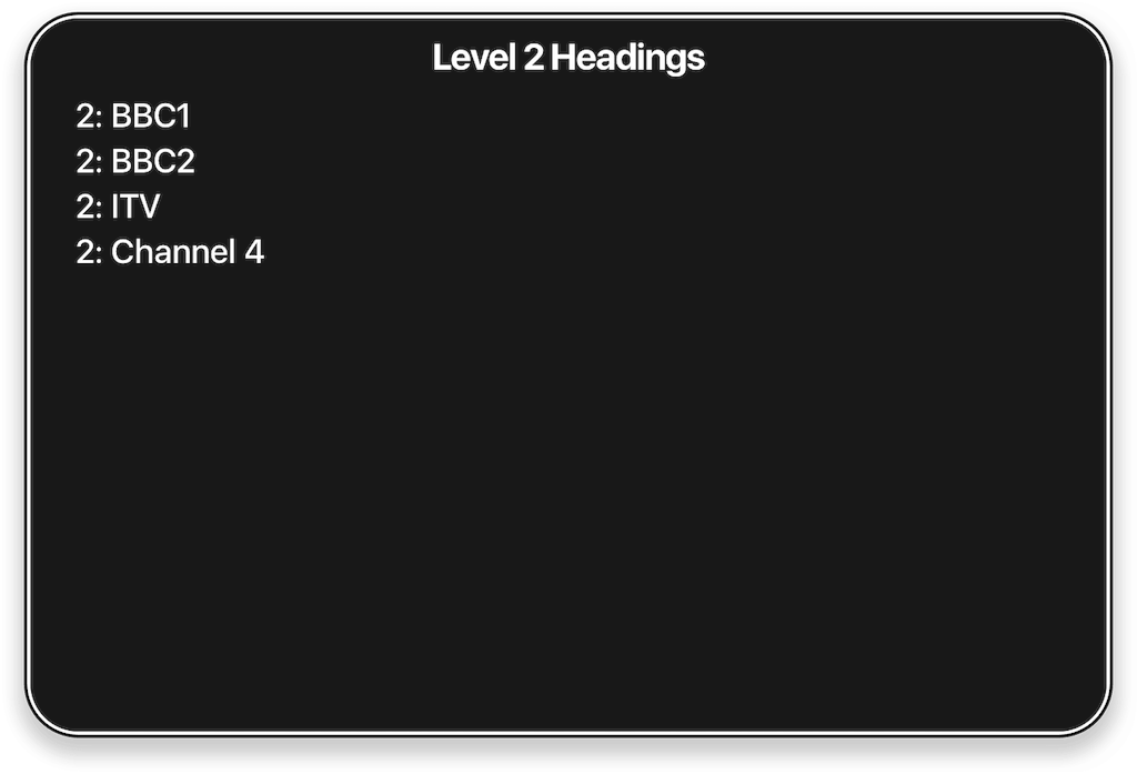
<h3>Evening</h3>If I use VoiceOver to generate a list of headings, I get this:
Once I have that list I can use keyboard commands to filter the list based on the heading level. For example, I can press 2 to hear just the <h2>s:
If we hadn’t used headings, of if we’d nested them incorrectly, our users would be frustrated.
Putting this together
Let’s put this together with an example of a button that, when pressed, toggles the appearance of a panel of links. There are numerous ways we could create a button on a web page, but the best way is to just use a <button>. Every browser understands what a <button> is, how it works, and what keyboard shortcuts should be used with them. The HTML specification for the <button> element says:
The
<button>element represents a button labeled by its contents.
The contents that a <button> can have include the type attribute, any relevant ARIA attributes, and the actual text label that the user sees. This information is more important than the visual design: it doesn’t matter how beautiful or obtuse the design is, if the underlying code is non-semantic and poorly labelled, people are going to struggle to use it. Here are three buttons, each created with the same HTML but with different designs:
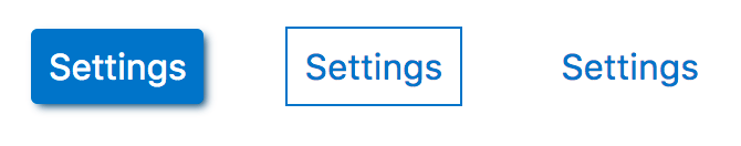
Regardless of what they look like, because we’ve used semantic HTML instead of a bunch of meaningless <div>s or <span>s, people who use assistive technology are going to benefit. Out of the box, without any extra development effort, a <button> is accessible and usable with a keyboard. We don’t have to write event handlers to listen for people pressing the Enter key or the space bar, which we would have to do if we’d faked a button with non-semantic elements. Our <button> can also be quickly findable: for example, in the same way it’s possible to create a list of headings with a screen reader, I can also create a list of form elements and then quickly jump to the one I want.
Now we have our <button>, let’s add the panel we’re toggling the appearance of. Here’s our code:
<button aria-controls="panel" aria-expanded="false" class="settings" id="settings" type="button">Settings</button>

<div class="panel hidden" id="panel">
    <ul aria-labelledby="settings">
        <li><a href="…">Account</a></li>
        <li><a href="…">Privacy</a></li>
        <li><a href="…">Security</a></li>
    </ul>
</div>
There’s quite a bit going on here. We’re using the:
aria-controlsattribute to architect a connection between the<button>element and the panel whose appearance it controls. When some assistive technology, for example the JAWS screen reader, encounters an element witharia-controlsit audibly tells a user about the controlled expanded element and gives them the ability to move focus to it.aria-expandedattribute to denote whether the panel is visible or not. We toggle this value using JavaScript totruewhen the panel is visible andfalsewhen it’s not. This important attribute tells people who use screen readers about the state of the elements they’re interacting with. For example, VoiceOver announces Settings expanded button when the panel is visible and Settings collapsed button when it’s hidden.aria-labelledbyattribute to give the list a title of “Settings”. This can benefit some users of assistive technology. For example, screen readers can cycle through all the lists on a page, so being able to title them can improve findability. Being able to hear list Settings three items is, I’d argue, more useful than list three items. By doing this we’re supporting usability and findability.<ul>element to contain our list of links in our panel.
Let’s look at the choice of <ul> to contain our settings choices. Firstly, our settings are related items, so they belong in a structure that semantically groups things. This is something that a list can do that other elements or patterns can’t. This pattern, for example, isn’t semantic and has no structure:
<div><a href="…">Account</a></div>
<div><a href="…">Privacy</a></div>
<div><a href="…">Security</a></div>
All we have there is three elements next to each other on the screen and in the DOM. That is not robust code that signifies anything.
Why are we using an unordered list as opposed to an ordered list or a definition list? A quick look at the HTML specification tells us why:
The
<ul>element represents a list of items, where the order of the items is not important — that is, where changing the order would not materially change the meaning of the document.
Will the meaning of our document materially change if we moved the order of our links around? Nope. Therefore, I’d argue, we’ve used the correct element to structure our content.
These coding decisions are information architecture
I believe that what we’ve done here is pure information architecture. Going back to Dan Klyn’s model, we’ve practiced ontology by looking at the meaning of what we’re intending to communicate:
- we want to communicate there is an interactive element that toggles the appearance of an element on a page so we’ve used one, a
<button>, with those semantics. - programmatically we’ve used the
type='button'attribute to signify that the button isn’t amenu,reset, orsubmitelement. - visually we’ve designed our
<button>look like something that can be interacted with and, importantly, we haven’t removed the focus ring. - we’ve labelled the
<button>with the word “Settings” so that our users will hopefully understand what the button is for. - we’ve used an
<ul>element to structure and communicate our list of related items.
We’ve also practiced taxonomy by developing systems and structures and creating relationships between our elements:
- by connecting the
<button>to the panel using thearia-controlsattribute we’ve programmatically created a relationship between two elements. - we’ve developed a structure in our elements by labelling our
<ul>with the same name as the<button>that controls its appearance.
And finally we’ve practiced choreography by creating elements that foster movement and interaction. We’ve anticipated the way users and information want to flow:
- we’ve used a
<button>element that is interactive and accessible out of the box. - our
aria-controlsattribute can help some people who use screen readers move easily from the<button>to the panel it controls. - by toggling the value of the
aria-expandedattribute we’ve developed a system that tells assistive technology about the status of the relationship between our elements: the panel is visible or the panel is hidden. - we’ve made sure our information is more usable and findable no matter how our users want or need to interact with it. Regardless of how someone “sees” our work they’re going to be able to use it because we’ve architected multiple ways to access our information.
Information architecture, robust code, and accessibility
The United Nations estimates that around 10% of the world’s population has some form of disability which, at the time of writing, is around 740,000,000 people. That’s a lot of people who rely on well-architected semantic code that can be interpreted by whatever assistive technology they may need to use.
If everyone involved in the creation of our places made of information practiced information architecture it would make satisfying the WCAG 2.0 POUR principles so much easier. Our digital construction practices directly affect the quality of life of millions of people, and we have a responsibility to make technology available to them. In her book How To Make Sense Of Any Mess, Abby Covert states:
If we’re going to be successful in this new world, we need to see information as a workable material and learn to architect it in a way that gets us to our goals.
I believe that the world will be a better place if we start treating front-end development as information architecture.
About the author
Francis Storr is the lead designer for Intel’s Software Accessibility Program. An ex-pat from the UK, he now lives in Portland, Oregon where he appreciates not having to commute from Kent to London five days a week.
Brought to you by
Related articles
-
The System, the Search, and the Food Bank
Lisa Maria Martin sorts the nuts from the berries by finding what lessons can be learned about our digital content from a few hours spent volunteering at the local food bank. When push comes to shove, do you know your broth from your biscuits and your pasta from your pulses?
-
URL Rewriting for the Fearful
Drew McLellan opens 24 ways’ ninth annual advent calendar with a primer on the sometimes arcane lore of rewriting URLs. But while Drew may ably match URL patterns using regular expressions, that shirt with the snowflake pattern clashes hideously with his holly and ivy tie…
-
Ghosts On The Internet
Gavin Bell takes some time to consider date-based content and how we publish it on the web. We’re generating more digital content than ever, and the date and time of creation is an increasingly useful metric. But how do we publish that in a way that remains useful for us now and the generations to come?
-
Easier Page States for Wireframes
Richard Rutter brings an interesting new tool to the wireframing table with the introduction of a smart and exceptionally useful jQuery plugin. If you ever get involved in designing or prototyping modern multi-state web sites or applications, you’ll want to check this out.