Have a Field Day with HTML5 Forms

Forms are usually seen as that obnoxious thing we have to markup and style. I respectfully disagree: forms (on a par with tables) are the most exciting thing we have to work with.
Here we’re going to take a look at how to style a beautiful HTML5 form using some advanced CSS and latest CSS3 techniques. I promise you will want to style your own forms after you’ve read this article.
Here’s what we’ll be creating:
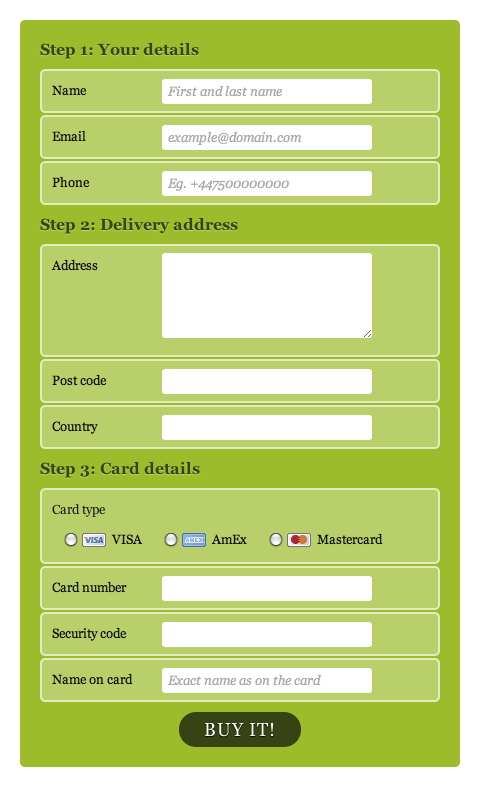 The form. (Icons from Chalkwork Payments)
Meaningful markup
We’re going to style a simple payment form. There are three main sections on this form:
- The person’s details
- The address details
- The credit card details
We are also going to use some of HTML5’s new input types and attributes to create more meaningful fields and use less unnecessary classes and ids:
email, for the email fieldtel, for the telephone fieldnumber, for the credit card number and security coderequired, for required fieldsplaceholder, for the hints within some of the fieldsautofocus, to put focus on the first input field when the page loads
There are a million more new input types and form attributes on HTML5, and you should definitely take a look at what’s new on the W3C website. Hopefully this will give you a good idea of how much more fun form markup can be.
A good foundation
Each section of the form will be contained within its own fieldset. In the case of the radio buttons for choosing the card type, we will enclose those options in another nested fieldset.
We will also be using an ordered list to group each label / input pair. This will provide us with a (kind of) semantic styling hook and it will also make the form easier to read when viewing with no CSS applied:
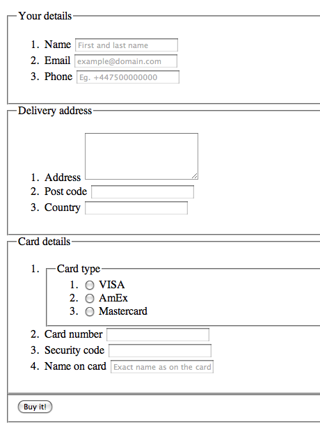 The unstyled form
So here’s the markup we are going to be working with:
<form id=payment>
	<fieldset>
		<legend>Your details</legend>
		<ol>
			<li>
				<label for=name>Name</label>
				<input id=name name=name type=text placeholder="First and last name" required autofocus>
			</li>
			<li>
				<label for=email>Email</label>
				<input id=email name=email type=email placeholder="example@domain.com" required>
			</li>
			<li>
				<label for=phone>Phone</label>
				<input id=phone name=phone type=tel placeholder="Eg. +447500000000" required>
			</li>
		</ol>
	</fieldset>
	<fieldset>
		<legend>Delivery address</legend>
		<ol>
			<li>
				<label for=address>Address</label>
				<textarea id=address name=address rows=5 required></textarea>
			</li>
			<li>
				<label for=postcode>Post code</label>
				<input id=postcode name=postcode type=text required>
			</li>
			<li>
				<label for=country>Country</label>
				<input id=country name=country type=text required>
			</li>
		</ol>
	</fieldset>
	<fieldset>
		<legend>Card details</legend>
		<ol>
			<li>
				<fieldset>
					<legend>Card type</legend>
					<ol>
						<li>
							<input id=visa name=cardtype type=radio>
							<label for=visa>VISA</label>
						</li>
						<li>
							<input id=amex name=cardtype type=radio>
							<label for=amex>AmEx</label>
						</li>
						<li>
							<input id=mastercard name=cardtype type=radio>
							<label for=mastercard>Mastercard</label>
						</li>
					</ol>
				</fieldset>
			</li>
			<li>
				<label for=cardnumber>Card number</label>
				<input id=cardnumber name=cardnumber type=number required>
			</li>
			<li>
				<label for=secure>Security code</label>
				<input id=secure name=secure type=number required>
			</li>
			<li>
				<label for=namecard>Name on card</label>
				<input id=namecard name=namecard type=text placeholder="Exact name as on the card" required>
			</li>
		</ol>
	</fieldset>
	<fieldset>
		<button type=submit>Buy it!</button>
	</fieldset>
</form>
Making things look nice
First things first, so let’s start by adding some defaults to our form by resetting the margins and paddings of the elements and adding a default font to the page:
html, body, h1, form, fieldset, legend, ol, li {
	margin: 0;
	padding: 0;
}
body {
	background: #ffffff;
	color: #111111;
	font-family: Georgia, "Times New Roman", Times, serif;
	padding: 20px;
}
Next we are going to style the form element that is wrapping our fields:
form#payment {
	background: #9cbc2c;
	-moz-border-radius: 5px;
	-webkit-border-radius: 5px;
	border-radius: 5px;
	padding: 20px;
	width: 400px;
}
We will also remove the border from the fieldset and apply some bottom margin to it. Using the :last-of-type pseudo-class, we remove the bottom margin of the last fieldset — there is no need for it:
form#payment fieldset {
	border: none;
	margin-bottom: 10px;
}
form#payment fieldset:last-of-type {
	margin-bottom: 0;
}
Next we’ll make the legends big and bold, and we will also apply a light-green text-shadow, to add that little extra special detail:
form#payment legend {
	color: #384313;
	font-size: 16px;
	font-weight: bold;
	padding-bottom: 10px;
	text-shadow: 0 1px 1px #c0d576;
}
Our legends are looking great, but how about adding a clear indication of how many steps our form has? Instead of adding that manually to every legend, we can use automatically generated counters.
To add a counter to an element, we have to use either the :before or :after pseudo-elements to add content via CSS. We will follow these steps:
- create a counter using the
counter-resetproperty on theformelement - call the counter with the
contentproperty (using the same name we’ve created before) - with the
counter-incremetproperty, indicate that for each element that matches our selector, that counter will be increased by 1
form#payment > fieldset > legend:before {
	content: "Step " counter(fieldsets) ": ";
	counter-increment: fieldsets;
}
Finally, we need to change the style of the legend that is part of the radio buttons group, to make it look like a label:
form#payment fieldset fieldset legend {
	color: #111111;
	font-size: 13px;
	font-weight: normal;
	padding-bottom: 0;
}
Styling the lists
For our list elements, we’ll just add some nice rounded corners and semi-transparent border and background. Because we are using RGBa colors, we should provide a fallback for browsers that don’t support them (that comes before the RBGa color). For the nested lists, we will remove these properties because they would be overlapping:
form#payment ol li {
	background: #b9cf6a;
	background: rgba(255,255,255,.3);
	border-color: #e3ebc3;
	border-color: rgba(255,255,255,.6);
	border-style: solid;
	border-width: 2px;
	-moz-border-radius: 5px;
	-webkit-border-radius: 5px;
	border-radius: 5px;
	line-height: 30px;
	list-style: none;
	padding: 5px 10px;
	margin-bottom: 2px;
}
form#payment ol ol li {
	background: none;
	border: none;
	float: left;
}
Form controls
Now we only need to style our labels, inputs and the button element.
All our labels will look the same, with the exception of the one for the radio elements. We will float them to the left and give them a width.
For the credit card type labels, we will add an icon as the background, and override some of the properties that aren’t necessary. We will be using the attribute selector to specify the background image for each label — in this case, we use the for attribute of each label.
To add an extra user-friendly detail, we’ll add a cursor: pointer to the radio button labels on the :hover state, so the user knows that he can simply click them to select that option.
form#payment label {
	float: left;
	font-size: 13px;
	width: 110px;
}
form#payment fieldset fieldset label {
	background:none no-repeat left 50%;
	line-height: 20px;
	padding: 0 0 0 30px;
	width: auto;
}
form#payment label[for=visa] {
	background-image: url(visa.gif);
}
form#payment label[for=amex] {
	background-image: url(amex.gif);
}
form#payment label[for=mastercard] {
	background-image: url(mastercard.gif);
}
form#payment fieldset fieldset label:hover {
	cursor: pointer;
}
Almost there! Now onto the input elements. Here we want to match all inputs, except for the radio ones, and the textarea. For that we will use the negation pseudo-class (:not()). With it we can target all input elements except for the ones with type of radio.
We will also make sure to add some :focus styles and add the appropriate styling for the radio inputs:
form#payment input:not([type=radio]),
form#payment textarea {
	background: #ffffff;
	border: none;
	-moz-border-radius: 3px;
	-webkit-border-radius: 3px;
	-khtml-border-radius: 3px;
	border-radius: 3px;
	font: italic 13px Georgia, "Times New Roman", Times, serif;
	outline: none;
	padding: 5px;
	width: 200px;
}
form#payment input:not([type=submit]):focus,
form#payment textarea:focus {
	background: #eaeaea;
}
form#payment input[type=radio] {
	float: left;
	margin-right: 5px;
}
And finally we come to our submit button. To it, we will just add some nice typography and text-shadow, align it to the center of the form and give it some background colors for its different states:
form#payment button {
	background: #384313;
	border: none;
	-moz-border-radius: 20px;
	-webkit-border-radius: 20px;
	-khtml-border-radius: 20px;
	border-radius: 20px;
	color: #ffffff;
	display: block;
	font: 18px Georgia, "Times New Roman", Times, serif;
	letter-spacing: 1px;
	margin: auto;
	padding: 7px 25px;
	text-shadow: 0 1px 1px #000000;
	text-transform: uppercase;
}
form#payment button:hover {
	background: #1e2506;
	cursor: pointer;
}
And that’s it! See the completed form.
This form will not look the same on every browser. Internet Explorer and Opera don’t support border-radius (at least not for now); the new input types are rendered as just normal inputs on some browsers; and some of the most advanced CSS, like the counter, :last-of-type or text-shadow are not supported on some browsers. But that doesn’t mean you can’t use them right now, and simplify your development process. My gift to you!
About the author
Brought to you by
Related articles
-
Designing Your Site Like It’s 1998
Andy Clarke tells a tale as old as time, a tale of tables, framesets, fixed widths and spacer GIFs (ask your parents). Harking back to the methods that were appropriate to used to build cutting-edge websites twenty years ago, not only can we see how far we’ve come but can be excited for what lies ahead.
-
Feeding the Audio Graph
Ben Foxall dives deep into the Web Audio API to serve up such well known Christmas hits as I’m Dreaming Of A White Noise Generator, and All I Want For Christmas Is 440Hz. Get ready to dance around your browser this season, because it certainly won’t be a silent night.
-
HTML5 Video Bumpers
Drew McLellan invites you to pull up to the 2012 24 ways bumper, baby, with an neat JavaScript solution to an HTML5
<video>branding problem. And that was “24 ways bumper” not “Christmas jumper”. He has enough of those already. -
Speed Up Your Site with Delayed Content
Paul Hammond injects some pace into page rendering with a nifty idea to allow the most important content to take precedence over your site’s more decorative baubles. What’s Christmas without the anticipation?
-
Real Animation Using JavaScript, CSS3, and HTML5 Video
Dan Mall breathes life into web standards-based animation. By striving for more than just mechanical movement, we can create more believable animated effects to enhance our users’ experience.
-
“Probably, Maybe, No”: The State of HTML5 Audio
Scott Schiller sounds out the possibilities of HTML5 audio, listening carefully to arguments about competing formats and the quirks in current implementations. When will we hear the sleigh bells in the snow on your website?