Cohesive UX

With Yosemite, Apple users can answer iPhone calls on their MacBooks. This is weird. And yet it’s representative of a greater trend toward cohesion.
Shortly after upgrading to Yosemite, a call came in on my iPhone and my MacBook “rang” in parallel. And I was all, like, “Wut?” This was a new feature in Yosemite, and honestly it was a little bizarre at first.
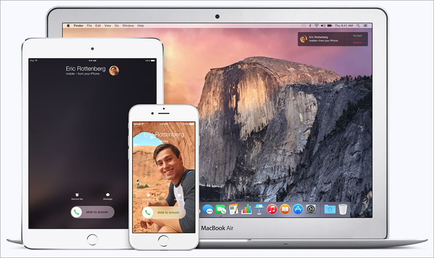 Apple promotional image showing a phone call ringing simultaneously on multiple devices.
However, I had just spoken at a conference on the very topic you’re reading about now, and therefore I appreciated the underlying concept: the cohesion of user experience, the cohesion of screens.
This is just one of many examples I’ve encountered since beginning to speak about this topic months ago. But before we get ahead of ourselves, let’s look back at the past few years, specifically the role of responsive web design.
RWD != cohesive experience
I needn’t expound on the virtues of responsive web design (RWD). You’ve likely already encountered more than a career’s worth on the topic. This is a good thing. Count me in as one of its biggest fans.
However, if we are to sing the praises of RWD, we must also acknowledge its shortcomings. One of these is that RWD ends where the browser ends. For all its goodness, RWD really has no bearing on native apps or any other experiences that take place outside the browser. This makes it challenging, therefore, to create cohesion for multi-screen users if RWD is the only response to “let’s make it work everywhere.”
We need something that incorporates the spirit of RWD while unifying all touchpoints for the entire user experience—single device or several devices, in browser or sans browser, native app or otherwise.
I call this cohesive UX, and I believe it’s the next era of successful user experiences.
Toward a unified whole
Simply put, the goal of cohesive UX is to deliver a consistent, unified user experience regardless of where the experience begins, continues, and ends.
Two facets are vital to cohesive UX:
- Function and form
- Data symmetry
Let’s examine each of these.
Function AND form
Function over form, of course. Right? Not so fast, kiddo.
Consider Bruce Lawson’s dad. After receiving an Android phone for Christmas and thumbing through his favorite sites, he was puzzled why some looked different from their counterparts on the desktop. “When a site looked radically different,” Bruce observed, “he’d check the URL bar to ensure that he’d typed in the right address. In short, he found RWD to be confusing and it meant he didn’t trust the site.” A lack of cohesive form led to a jarring experience for Bruce’s dad.
Now, if I appear to be suggesting websites must look the same in every browser—you already learned they needn’t—know that I recognize the importance of context, especially in regards to mobile. I made a case for this more than seven years ago.
Rather, cohesive UX suggests that form deserves the same respect as function when crafting user experiences that span multiple screens or devices. And users are increasingly comfortable traversing media. For example, more than 40% of adults in the U.S. owning more than one device start an activity on one screen and finish it on another, according to a study commissioned by Facebook. I suspect that percentage will only increase in 2015, and I suspect the tech-affluent readers of 24 ways are among the 40%.
There are countless examples of cohesive form and function. Consider Gmail, which displays email conversations visually as a stack that can be expanded and collapsed like the bellows of an accordion. This visual metaphor has been consistent in virtually any instance of Gmail—website or app—since at least 2007 when I captured this screenshot on my Nokia 6680:
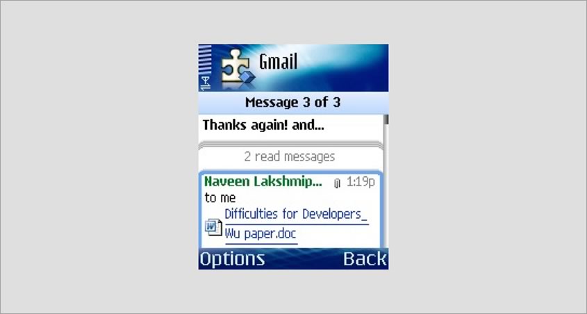 Screenshot captured while authoring Mobile Web Design (2007). Back then we didn’t call this an app, but rather a ‘smart client’.
When the holistic experience is cohesive as it is with Gmail, users’ mental models and even muscle memory are preserved.1 Functionality and aesthetics align with the expectations users have for how things should function and what they should look like. In other words, the experience is roughly the same across screens.
But don’t be ridiculous, peoples. Note that I said “roughly.” It’s important to avoid mindless replication of aesthetics and functionality for the sake of cohesion. Again, the goal is a unified whole, not a carbon copy. Affordances and concessions should be made as context and intuition require. For example, while Facebook users are accustomed to top-aligned navigation in the browser, they encounter bottom-aligned navigation in the iOS app as justified by user testing:
The iOS app model has held up despite many attempts to better it: http://t.co/rSMSAqeh9m pic.twitter.com/mBp36lAEgc
— Luke Wroblewski (@lukew) December 10, 2014Despite the (rather minor) lack of consistency in navigation placement, other elements such as icons, labels, and color theme work in tandem to produce a unified, holistic whole.
Data symmetry
Data symmetry involves the repetition, continuity, or synchronicity of data across screens, devices, and platforms. As regards cohesive UX, data includes not just the material (such as an article you’re writing on Medium) but also the actions that can be performed on or with that material (such as Medium’s authoring tools). That is to say, “sync verbs, not just nouns” (Josh Clark).
In my estimation, Amazon is an archetype of data symmetry, as is Rdio. When logged in, data is shared across virtually any device of any kind, irrespective of using a browser or native app. Add a product to your Amazon cart from your phone during the morning commute, and finish the transaction at work on your laptop. Easy peasy.
Amazon’s aesthetics are crazy cohesive, to boot:
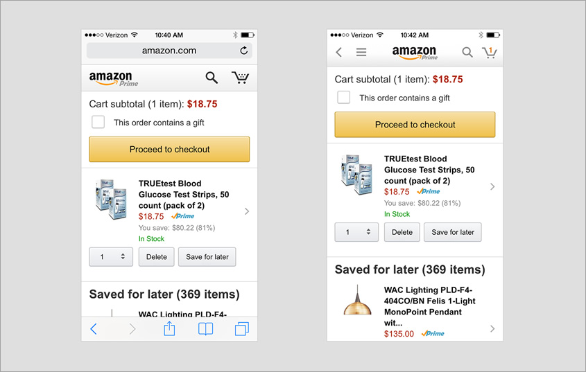 Amazon web (left) and native app (right).
With Rdio, not only are playlists and listening history synced across screens as you would expect, but the cohesion goes even further. Rdio’s remote control feature allows you to control music playing on one device using another device, all in real time.
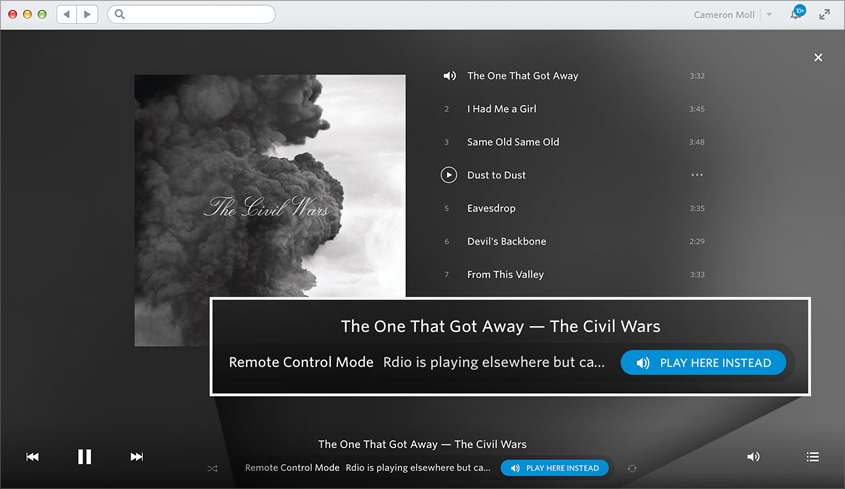 Rdio’s remote control feature, as viewed on my MacBook while music plays on my iMac.
At my office I often work from my couch using my MacBook, but my speakers are connected to my iMac. When signed in to Rdio on both devices, my MacBook serves as proxy for controlling Rdio on my iMac, much the same as any Yosemite-enabled device can serve as proxy for an incoming iPhone call.
 Me, in my office. Note the iMac and speakers at far right.
This is a brilliant example of cohesive design, and it’s executed entirely via the cloud.
Things to consider
Consider the following when crafting cohesive experiences:
- Inventory the elements that comprise your product experience, and cohesify them.2
Consider things such as copy, tone, typography, iconography, imagery, flow, placement, brand identification, account data, session data, user preferences, and so on. Then, create cohesion among these elements to the greatest extent possible, while adapting to context as needed. - Store session data in the cloud rather than locally.
For example, avoid using browser cookies to store shopping cart data, as cookies are specific to a single browser on a single device. Instead, store this data in the cloud so it can be accessed from other devices, as well as beyond the browser. - Consider using web views when developing your native app.
“You’re already using web apps in native wrappers without even noticing it,” Lukas Mathis contends. “The fact that nobody even notices, the fact that this isn’t a story, shows that, when it comes to user experience, web vs. native doesn’t matter anymore.” Web views essentially allow you to display HTML content inside a native wrapper. This can reduce the time and effort needed to make the overall experience cohesive. So whereas the navigation bar may be rendered by the app, for example, the remaining page display may be rendered via the web. There’s readily accessible documentation for using web views in C++, iOS, Android, and so forth.
Nature is calling
Returning to the example of Yosemite and sychronized phone calls, is it really that bizarre in light of cohesive UX? Perhaps at first. But I suspect that, over time, Yosemite’s cohesiveness — and the cohesiveness of other examples like the ones we’ve discussed here — will become not only more natural but more commonplace, too.
1 I browse Flipboard on my iPad nearly every morning as part of my breakfast routine. Swiping horizontally advances to the next page. Countless times I’ve done the same gesture in Flipboard for iPhone only to have it do nothing. This is because the gesture for advancing is vertical on phones. I’m so conditioned to the horizontal swipe that I often fail to make the switch to vertical swipe, and apparently others suffer from the same muscle memory, too.
2 Cohesify isn’t a thing. But chances are you understood what I meant. Yay neologism!
About the author
Cameron Moll is the founder of Authentic Jobs, maker of Structures in Type, and author of Mobile Web Design (2007). He resides in Sarasota, Florida with his wife and five sons. Find him on Twitter at @cameronmoll.
Cameron is looking to share the principles of Cohesive UX in 2015. Please get in touch if you’d like to have him speak at your conference.
Brought to you by

Related articles
-
Art Direction and the New WordPress Editor
Mel Choyce explores how the new WordPress editor (also know as Gutenberg) can be used to create more carefully art directed posts. Like gifts carefully arranged beneath the Christmas tree, it’s the contents that matters but the presentation that sells.
-
Be the Villain
Eric Bailey asks us to take on the role of King Herod in our projects to consider how the products, services and processes we design could be abused to cause harm rather than to do good. No matter how good our intentions, we must remember that not every user has pure motivations and that every tool is a weapon if you hold it right.
-
Creating a Weekly Research Cadence
Wren Lanier sets aside time to explore the benefits of a regular schedule for user research. Santa’s elves quickly discovered the benefits of working to a fixed schedule, which is of course why we don’t get presents at Easter.
-
How to Do a UX Review
Joe Leech offers a rundown on his UX review process, sharing tips about analysing data and creating personas, and setting out findings in a form that benefits clients. From quick wins to workshops, there are gifts here everyone will be grateful for.
-
How to Use Audio on the Web
Ruth John lets the bells ring out for Christmas with a look at a selection of inspiring sites with creative and effective use of audio. The days of jangly MIDI tunes to distract and annoy are thankfully long behind us, with browser APIs offering new and exciting ways to generate sound. Ahead is a beautiful sonic landscape. Ding dong!
-
What I Learned about Product Design This Year
Meagan Fisher casts a thoughtful glance back over her work this year and considers what it means to design a product rather than a marketing experience. Pour yourself a cup of eggnog, grab a mince pie or two and gather around the fireside. Are you sitting comfortably? Good, then we shall begin.